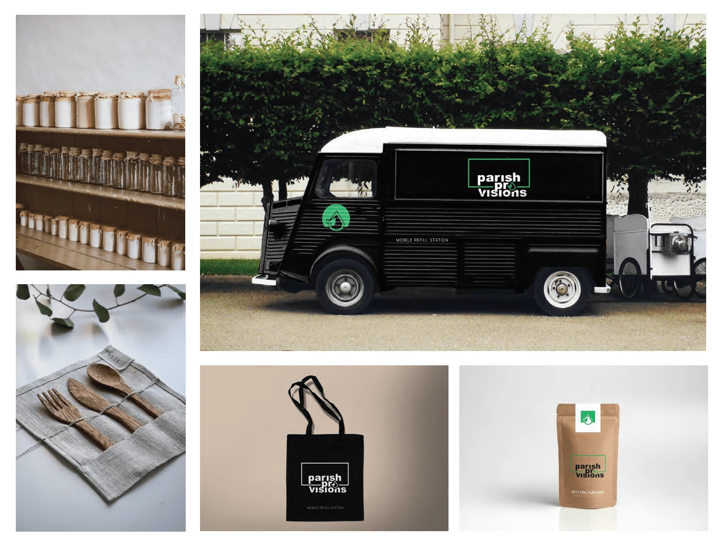
Mobile Refill Station

Kori Roseberry
Brand Strategist
Graphic Designer
Digital Marketer
Adobe Illustrator
Adobe InDesign
Adobe Photoshop
Concept no.1
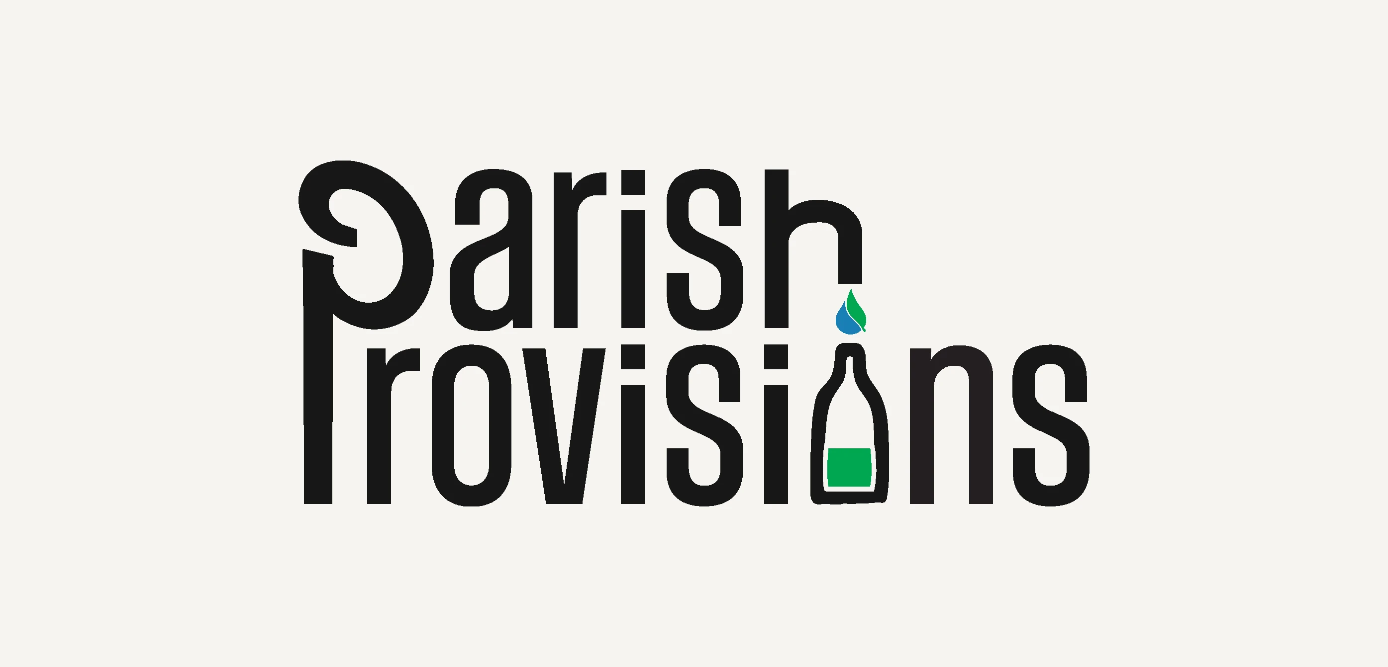
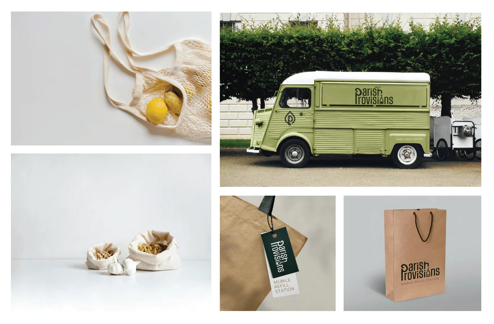
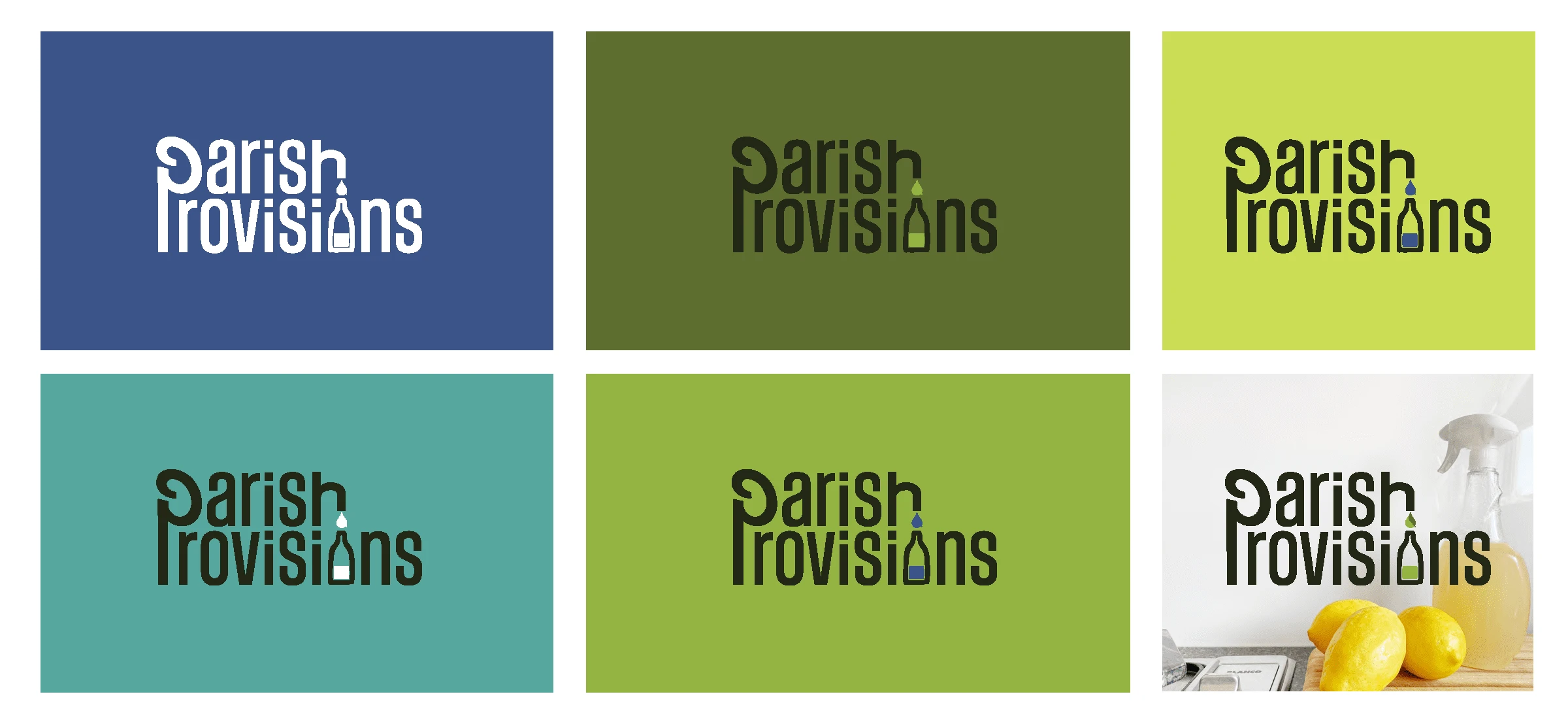
PLAYFUL — Show off your brand’s personality with a playful logo incorporating an illustration of a reusable canister being refilled in line with the brand's main directive.
The logo features lowercase font for an approachable feel, and the single curvy “P” for both words represents the brand’s efficiency and creativity. The green and blue color palette is a not-so-subtle hint to an eco-lifestyle.
Concept no.2
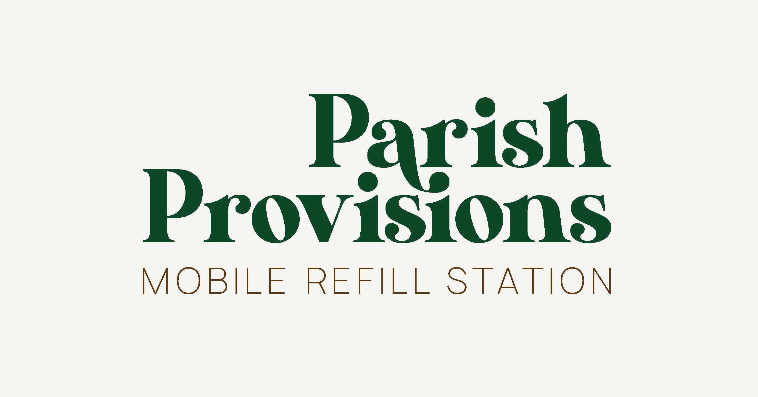
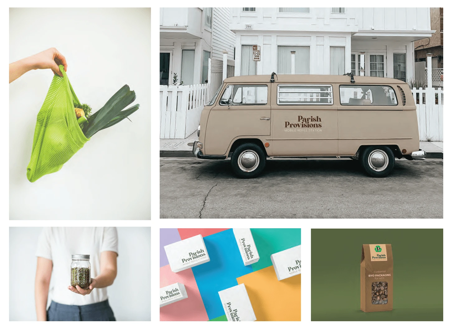
ELEGANT — Show customers your brand has the top-of-the-line experience they’re looking for with an elegant/luxury, whimsical typography logo. The logo features lowercase font for an approachable feel while appealing to customers who accept nothing less than the best. The dark green and brown color pallette is a more serious hint of an eco-lifestyle.
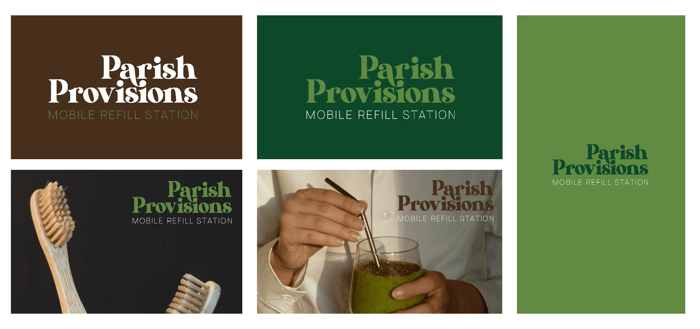
Concept no.3
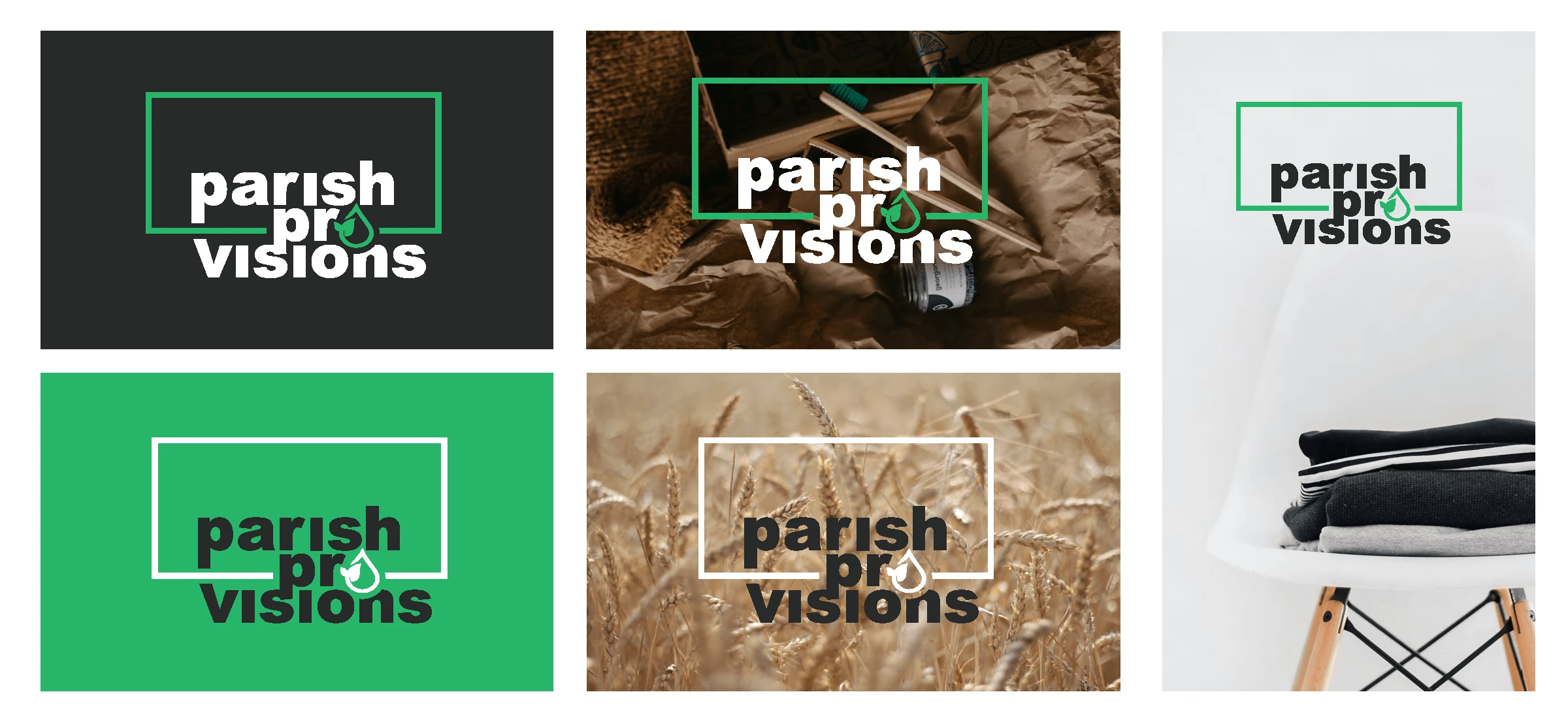
BOLD — An uncomplicated and well-balanced bold logo creates that embodies stability and appeals to a broad demographic by captivating them with simplicity and familiarity. The lowercase font creates an approachable feeling. With green as the only color in the palette, this doubles down on the theme of the simplicity of an eco-lifestyle.
