Sai Kishore Kalari’s Post

Sai Kalari

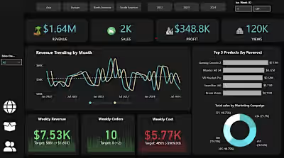
🚀 Sales Data Analysis Report | Power BI Problem Statement: The client needed a clear view of their sales performance, product trends, and revenue patterns to make data-driven decisions. Solution: I designed an interactive Power BI report using data modeling (pivoting/unpivoting), DAX calculations, and hidden filter panel buttons for seamless data exploration. The report is split into three dashboards: 1️⃣ Sales Overview Dashboard: KPIs: Total revenue, sales, and reviews. Line Chart: Revenue trending by month. Decomposition Tree: Revenue by product category. Donut Chart: Sales by product category. Card Visuals: Monthly revenue and sales. 2️⃣ Product Performance Dashboard: Ribbon Chart: Product category ranking over time. Scatter Chart: Sales vs review score. Line and Column Chart: Sales and average price relationship. Heat Map: Sales density across regions. 3️⃣ Product Insights Dashboard: Table Visual: Rank by revenue, product name, price, sales, revenue, review score, and review count. Key Features: ✅ Hidden filter panel buttons for intuitive data filtering without crowding the visuals. ✅ Pivoting/unpivoting for flexible data shaping. ✅ Dynamic DAX measures for calculating revenue, sales, and reviews. ✅ Interactive visuals for drill-down analysis and real-time insights. Transforming raw sales data into actionable insights — that's the power of Power BI! Let’s connect if you want to uncover hidden trends and drive smarter decisions with data! #PowerBI #SalesDashboard #DataModeling #DAX #BusinessIntelligence #DataAnalytics
Like this project
Posted Mar 2, 2025
🚀 Sales Data Analysis Report | Power BI Problem Statement: The client needed a clear view of their sales performance, product trends, and revenue patterns to…
Likes
0
Views
1