Brochure Design
Josefina Poventud
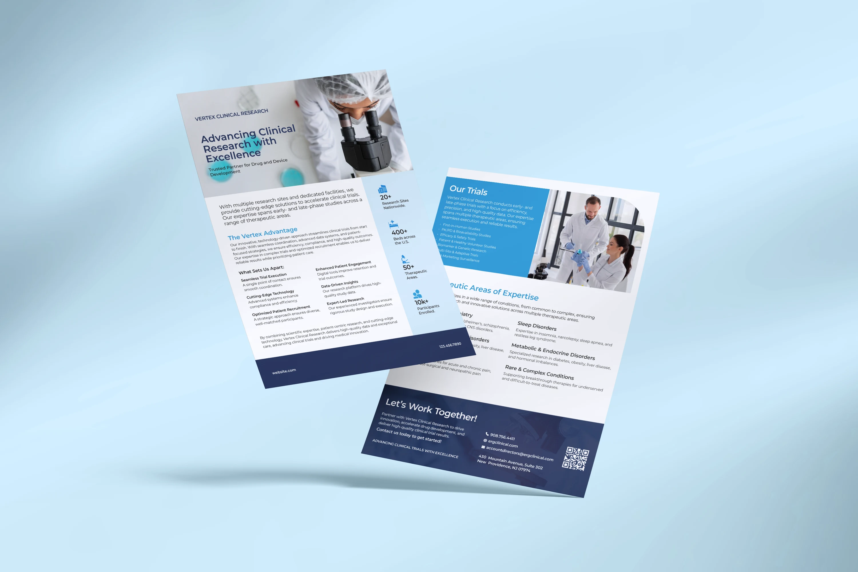
I designed a professional, clean, and informative brochure for Vertex Clinical Research to highlight their expertise in clinical trials across various therapeutic areas. The goal was to convey their strengths—such as cutting-edge technology, seamless coordination, and expert-led research—in a way that feels trustworthy and sophisticated.
Concept Development:
I structured the brochure to make it easy to read and follow, breaking it down into clear sections: Overview, What Sets Them Apart, Therapeutic Areas, and Contact Info. This approach keeps the content organized and straightforward.
Design:
I used blues and grays to convey trust, professionalism, and innovation—perfect for a clinical research company. A clean, modern sans-serif for headlines adds authority, while a softer sans-serif for body text makes detailed info easy to read. Simple icons break up the text and make complex ideas easier to grasp. They also add to the clean, tech-focused vibe. I used a structured grid with white space to keep things neat and guide the reader's attention. I kept everything consistent with their branding—colors, fonts, and style—to reinforce their identity.
The result is a clean, polished brochure that feels professional and approachable.
Like this project
Posted Mar 28, 2025
Brochure design for clinical trial company.
Likes
1
Views
10