NÆSTEN RIGTIG Font Design
carl svendsen
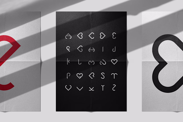
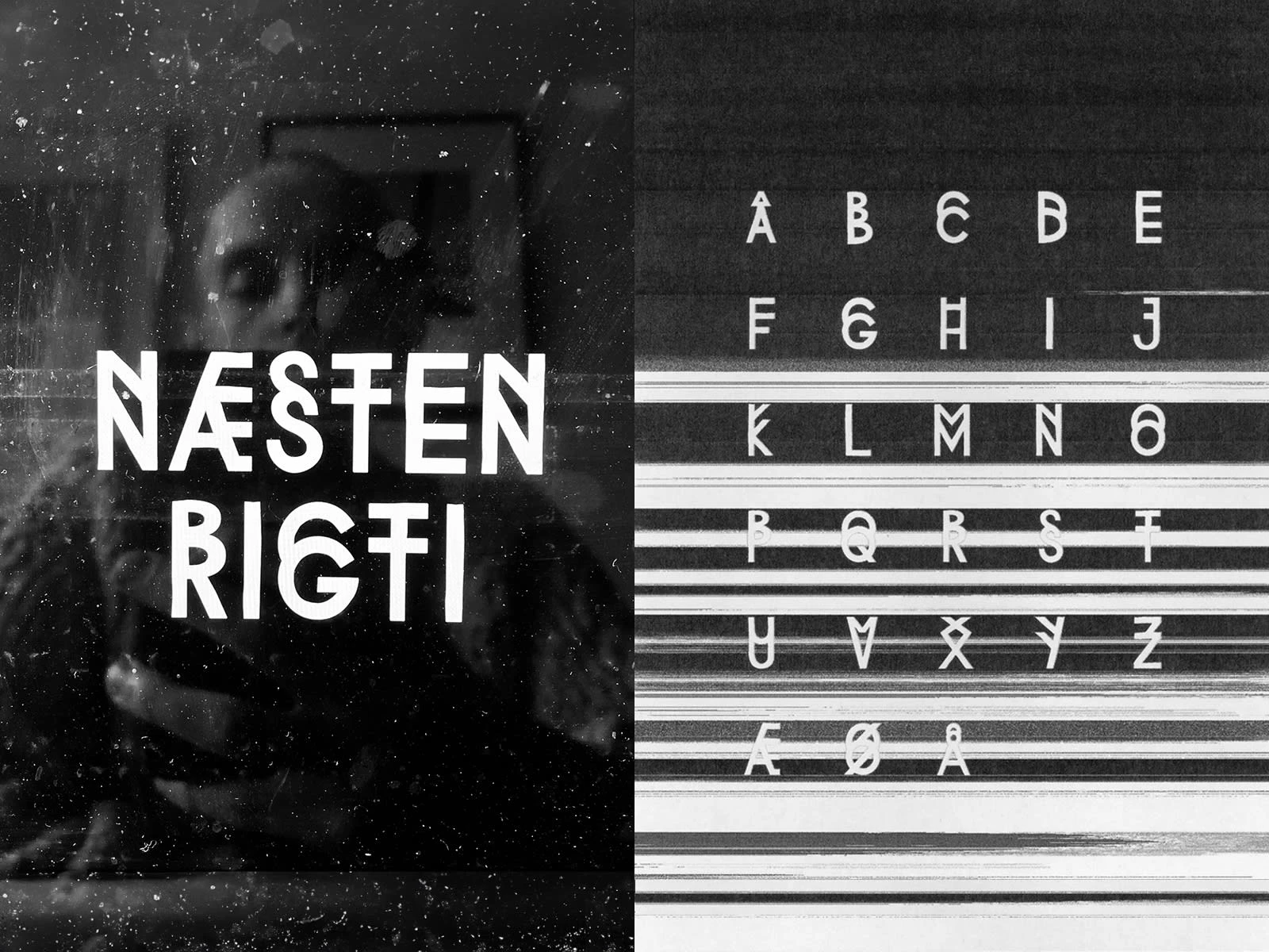
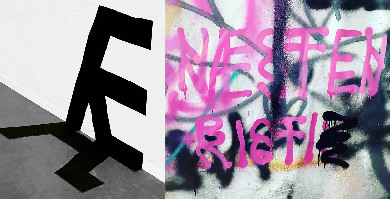
Næsten Rigti is a display-type. The name of the font can loosely be translated to “almost correc” (yes, without the t). Creating a jittering text image which some may consider an eye-sore, this font challenges the ruleset of type-design.
This mutated and mutilated typeface plays with the general conception of letter-forms’ anatomy.
Like this project
Posted Aug 3, 2025
Næsten Rigti is a display-type. This mutated and mutilated typeface plays with the general conception of letter-forms’ anatomy.
Likes
0
Views
2
Timeline
Jan 1, 2022 - Jan 15, 2022