RetroVentures: Modern Visual Identity
Syed Usman Ali
RetroVentures | Where Nostalgia Meets the Future
Description
How do you make an investment firm look as bold as the startups they fund? For RetroVentures, I ditched the boring "blue-and-gray" corporate playbook. Instead, I built a visual identity that bridges the gap between mid-century reliability and futuristic ambition. It’s not just a logo; it’s a statement of momentum.
The Strategy: "The Upward Pivot"
The venture capital space is crowded. To stand out, RetroVentures needed to look established but agile.
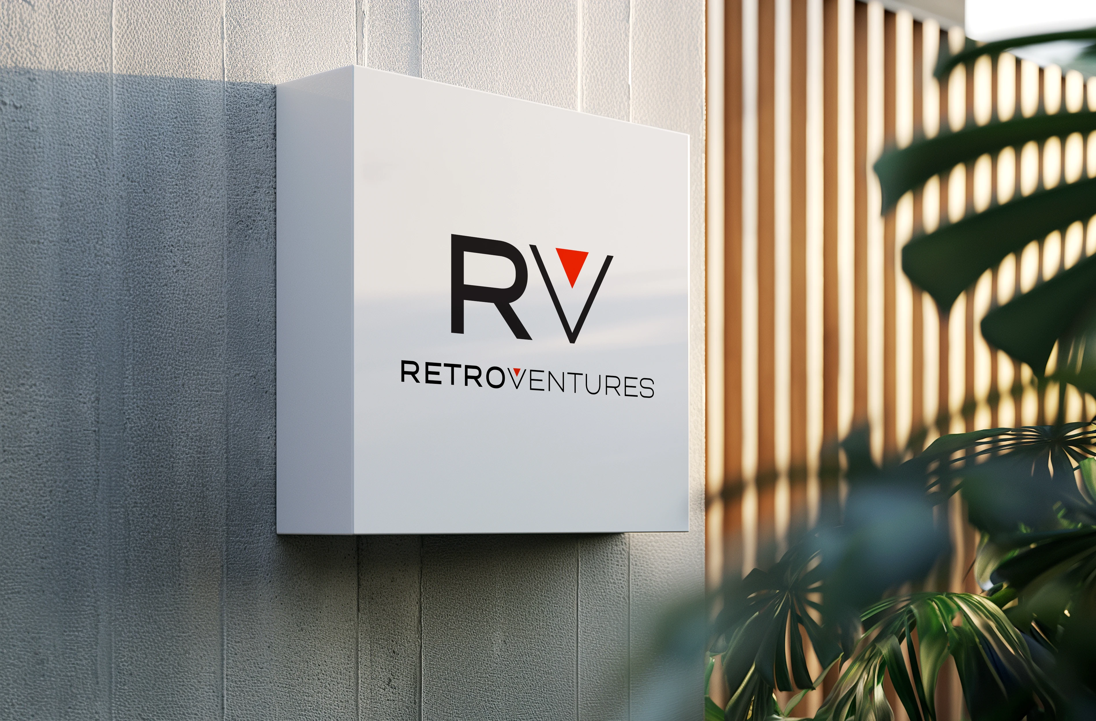
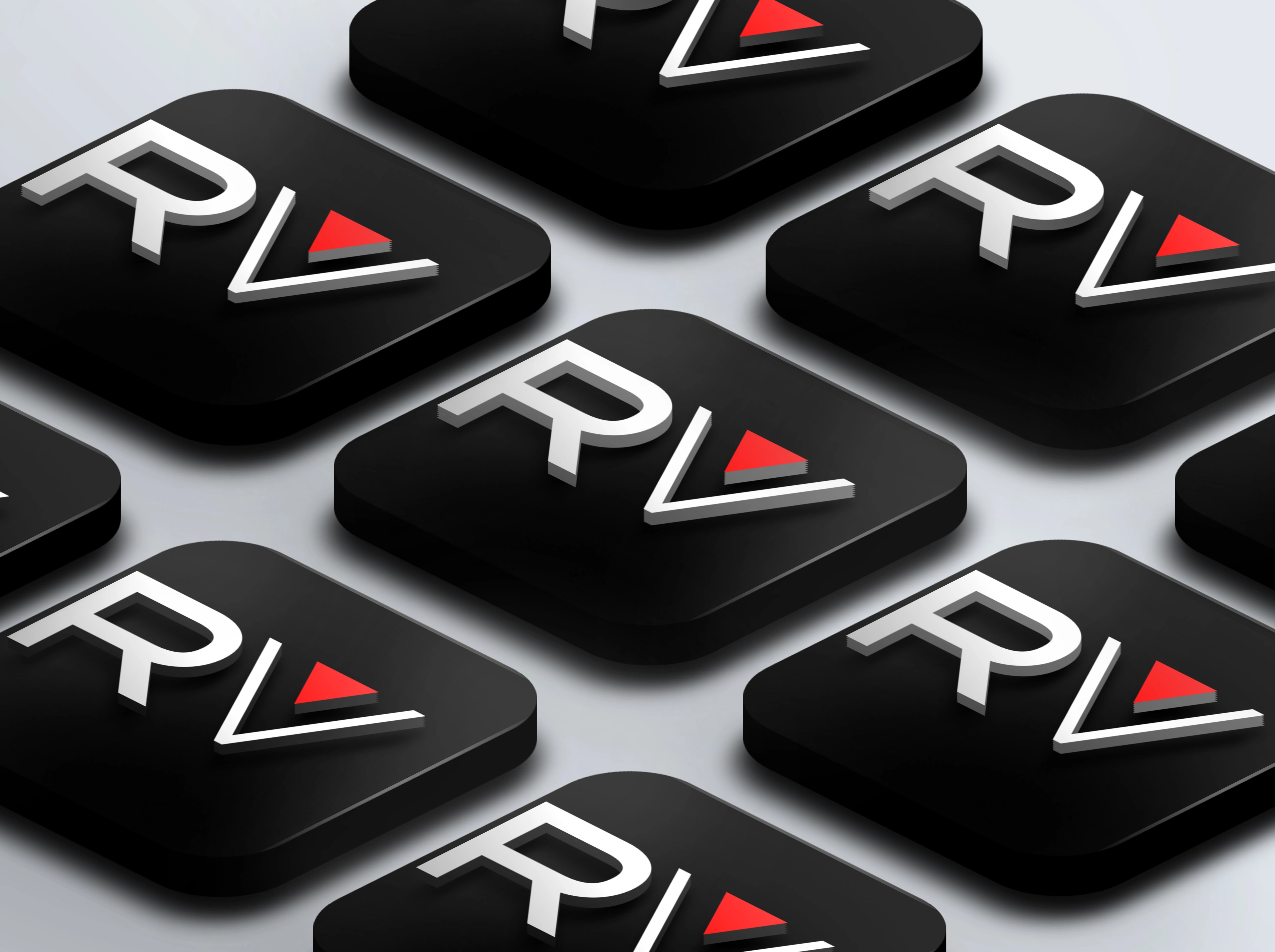
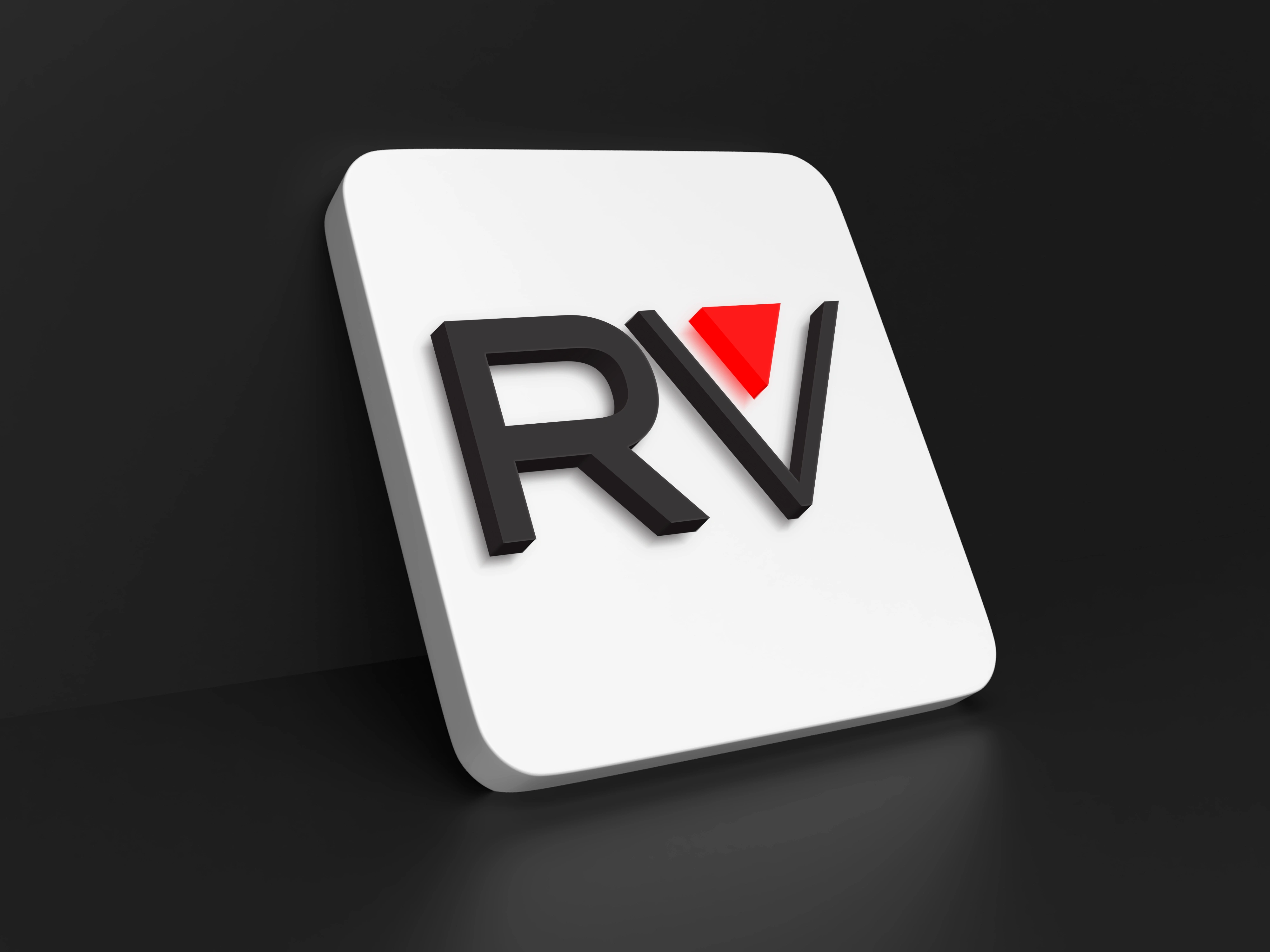
The Monogram: The 'RV' lockup isn't just letters. I integrated a Signal Red triangle into the 'V' to act as a permanent "Up" arrow—a subtle psychological nod to ROI and growth.
The Vibe: We went for "Industrial Luxury." High-contrast blacks, clean whites, and a pop of red that screams "Action."
The Typography: Using an ultra-wide geometric sans-serif to give the brand "room to breathe" and a sense of architectural scale.
The Results (Why it works)
Instant Authority: The thick line weights and wide kerning make the brand feel like it's been around for 50 years, even if it's brand new.
Digital-First: The 'RV' icon is designed specifically to pop as a social media avatar or a mobile app icon, where space is tight.
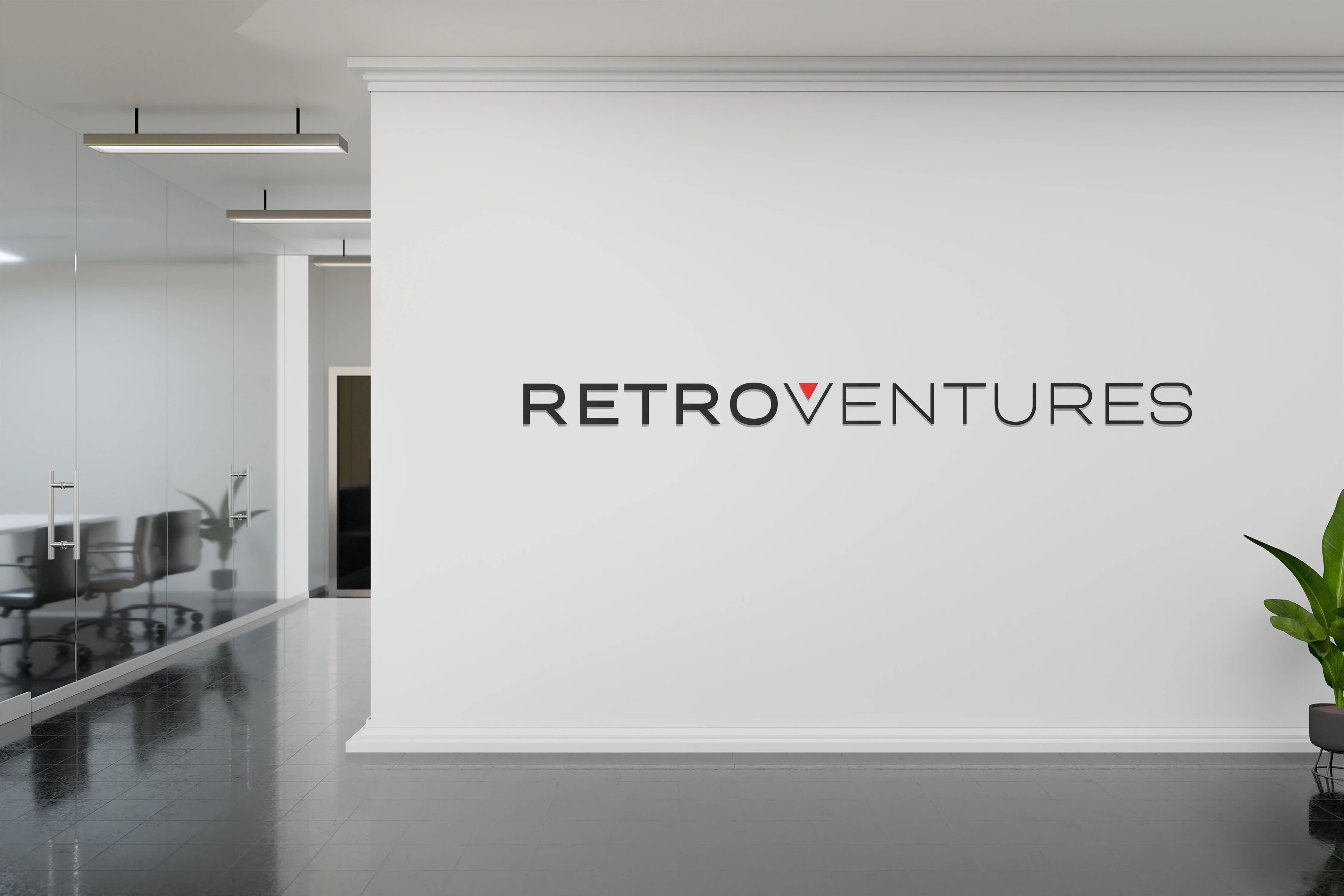
Physical Presence: As seen in the mockups, the brand translates seamlessly into high-end physical environments, boosting investor confidence the moment they walk through the door.
/
📖 The Case Study: RetroVentures Brand Identity
The Challenge
RetroVentures needed a brand identity that communicated both experience (Retro) and forward momentum (Ventures). The challenge was to create a logo that felt established and trustworthy while remaining sleek enough for a modern, tech-forward investment landscape.
The Creative Solution
I designed a visual system centered around a "minimalist-modernist" aesthetic.
The Logomark: I developed a custom "RV" monogram where the "V" is represented by a bold, red geometric triangle. This serves as a "directional arrow," symbolizing growth, precision, and upward trajectory.
Typography: I selected a wide, geometric sans-serif typeface. The generous letter spacing conveys stability and high-end positioning, ensuring readability across physical signage and digital platforms.
Color Palette: A foundation of slate black and off-white provides a professional "corporate" feel, while the "Signal Red" accent adds energy and calls attention to the brand's innovative edge.
Key Achievements
Versatile Iconography: Created a scalable monogram that remains legible as a favicon or a large-scale architectural sign.
Environmental Branding: Delivered a suite of high-fidelity mockups showing the brand applied to office interiors and exterior signage to help stakeholders visualize the physical brand presence.
Design System: Established clear guidelines for spacing and color usage to ensure brand consistency across all future touchpoints.
Like this project
Posted Apr 2, 2026
The project included logo design, typography selection, and architectural brand application, blending mid-century modern aesthetics