Burgas Public Transportation Map/Diagram Redesign
Ivan Manolov
Burgas was the first city in Bulgaria funded by the European Union on the program called “Regional development 2007–2013” to begin the project of reorganization and improvement of its public transport. The visible results of which have been new buses, bus lines, terminals, and bus stops. All changes were made based on research done by foreign specialists, and a lot of public discussion including significant differences from the previous transportation scheme . However, in spite of those very important steps in the right direction, there are a lot of unaddressed problems which need solving. One of which was the diagram of the new transportation diagram.
Burgas definitely needed those changes, but there are many other things still to do, which would make transportation in the city a lot more accessible for foreigners and city visitors. For example, there is no adequate information about bus stops or timetables in popular mobile apps used for navigation such as Google Maps or Apple Maps. Not only that, also Google and Apple’s map still have the old transportation scheme which further confuses. Even after the introduction of numerous technologies for tracking the arrival time of buses, the ways for a tourist to figure out how to get from one place to another remained limited.
Though Burgasbus has been trying to implement half-decent transportation diagrams and putting schedules at bus stops, it hasn’t been of much help, due to inappropriate weather protection and visual design. Even the recently developed online app for creating bus itineraries in the city hasn’t been that useful due to the fact it’s still not that user friendly, and needs further development and marketing. Further to this, it’s hard to promote a specific tool or a website to be used when you are already accustomed to using Google Maps and Apple maps on your phone.
One step into the right direction would be to completely redesign the existing map positioned in the busses and at the bus stop shelters. Improvements such as including all the names of the bus stops, adding English labels, and other, would increase the accessibility of the map a lot, along with properly distributing it and protecting it from weather.
Historical evolution of transportation diagrams and maps
Before we get further into Burgas map design, let’s take a look at the past, and see what we can learn from it. In the history of transportation maps, there are two diagrams/maps which have defined the rules followed by many designers even today.
Of course, we have to start with the one of the London Underground, and the person behind it — Harry Beck, electrical engineer and draftsman, who first suggested at the time radical theory that people using the underground aren’t as interested in the exact geographical position of the stations, but rather how to move between them (to and from).
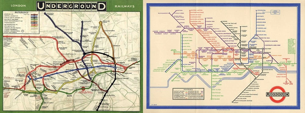
Based on that idea Beck creates a scheme which resembles an electric diagram, with a design focused on simple, straight and easy to follow lines, crossing at the same and exact angles (45° and 90°). As for the names of the stops, they are laid out in an orderly manner, put wherever they’re easy to read, doing their best to never intervening with the lines.
To this day the diagram of the London Underground follows the same principles which Harry Beck established in 1933. Furthermore, there are numerous cities like Berlin, Washington, Barcelona, Stockholm, Tokyo, Moscow, etc. — which have used similar principles in creating their transportation maps.
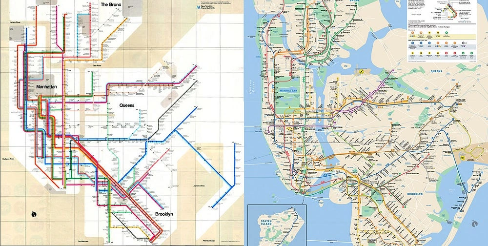
It is just as important to mention the exception, or the second diagram designed by a big name — Massimo Vignelli, and the New York Underground map. After Massimo and his wife created an way-finding system of signs of the underground, MTA hired them to redo the map. Although it followed all of Beck’s principles, and became a part of the stationary exhibition in the Museum of Modern Art, the map was a complete failure. Five years of public dissatisfaction went by and MTA dropped it. Vignelli’s problem was that he followed Beck’s principles, which were inapplicable when it came to Manhattan. In contrast to London, the street layout of Manhattan is not as random, and rather systematically designed. The names of the streets are growing numbers from South to North, and the avenues, with some exceptions, growing numbers from East to West. This makes navigation in Manhattan very logical — people living in the city have an easy time finding their way around using the number system and also measuring distances using the perfect equally sized blocks. In the attempts of creating a simple scheme with exact angles, Vignelli needlessly twisted the already functional orientation system.
Welcome to Bulgaria
Where everything concerning any type of environmental and accessibility design is outdated or non-existent in comparison to the Western world. Even now most towns don’t have street name signs, and the street addresses labeling are often random or missing. There is often no regulation regarding the orientation in an urban environment, and even if it exist, it’s are rarely applied. There’s lack of investments and control due to the simple fact that Bulgarians are used to getting by, and to learning the urban “know-how” from experience. I know every Bulgarian has at least one childhood memory of their parents trying to explain them how to get the bus from point A to point B. However, the situation now is not quite as bad, and there has been some noticeable improvement. In the last couple years, the organization called “Save Sofia” has started an effort to design Sofia Underground way-finding signs, and a bilingual map as a pilot project with Sofia municipality. Furthermore, though with a plagiarized design, the company True North is working on creating transportation maps in Sofia. Thus, somewhat gradually and hesitantly, the design of way-finding information in an urban environment has begun its baby steps towards improvement.
The Burgas transportation system
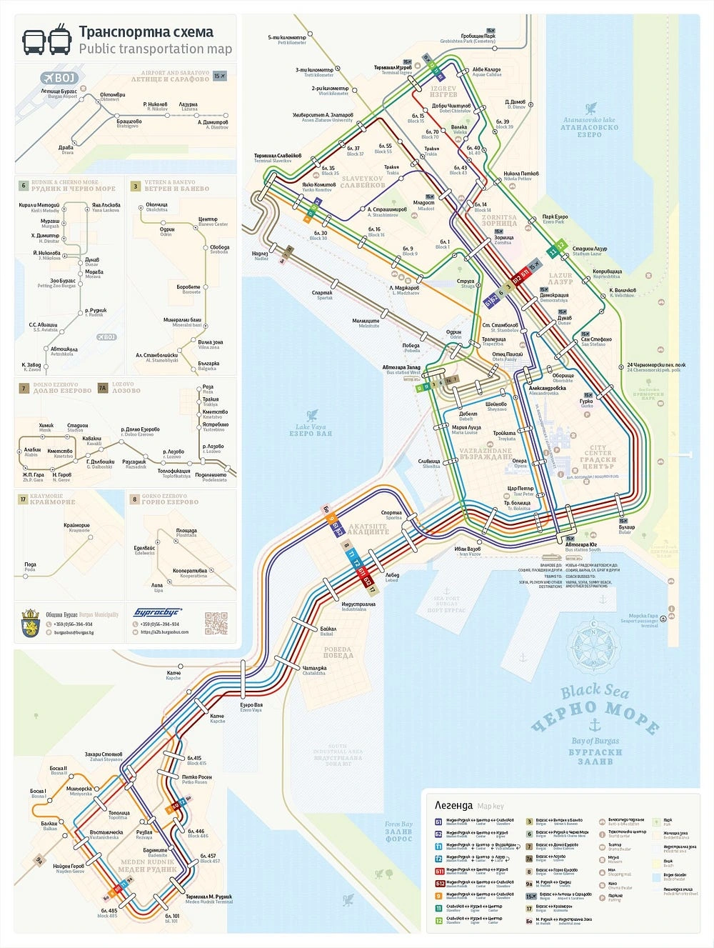
In the city of Burgas the project for improving the public transport concluded with the change of almost all the bus and trolley bus lines revising the whole transportation scheme of the city. However, the transportation diagam of the city remained roughly sketched, just like its ancestor, on top of the geographical map. And unfortunately, the quality of information distribution didn’t undergo the improvement it needed along with a few newly introduced problems.
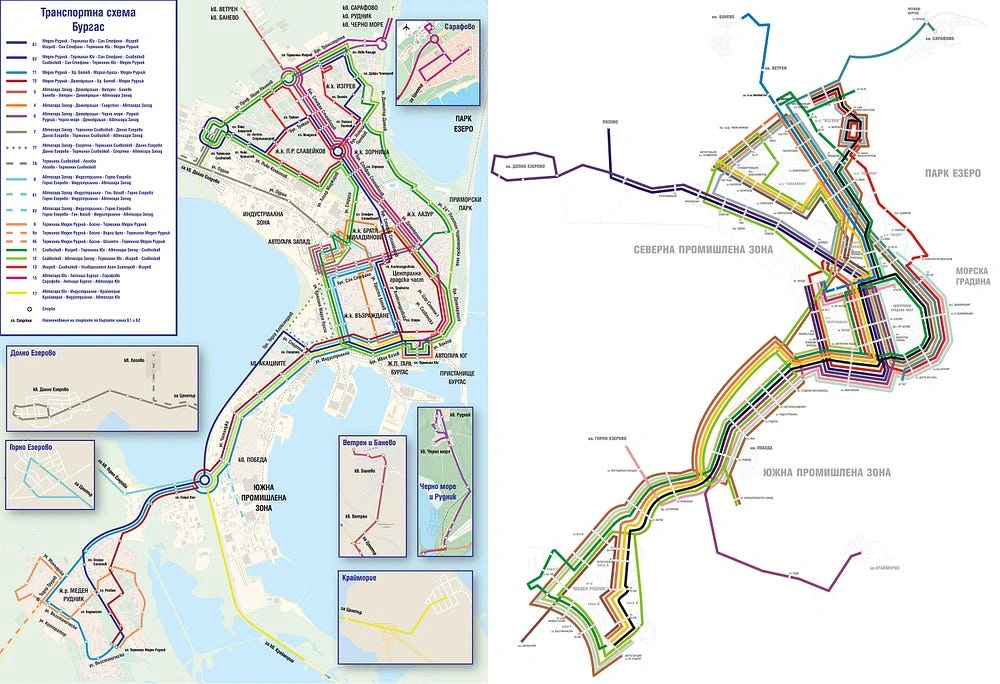
Some of the problems which remained unsolved on current diagram are:
Not being bilingual(Bulgarian and English), which straight off the bat limits foreigners from being able to use it.
There are some bus stops which haven’t been included at all.
There is no visual information hierarchy (example — there is no distinguishable difference between residential complex Zornitsa, and Burgas Bus Station — two places with completely different function and importance in the contest of transportation diagram).
The lines are incredibly hard to follow. It’s unclear why the designer of the current map has decided to include road roundabouts (rotaries)— unnecessary information for a passenger.
The talk
After a short conversation with the municipality of Burgas and Burgasbus regarding these problems, it became clear that they’re willing to work together towards solving them. Burgasbus provided the necessary timetables and last changes on the scheme, and expertise in the industry and we began working.
The idea
The main task was to address the four main issues mentioned above, as well as to include recognizable places in the city to serve as a guiding points. That would make the map useful not only for city residents, but also for tourists and city guests. Based on the results of that and the time we thought we would dedicate some time in hinting as much tourist information and/or locations as possible.
The city — geography, dimensions, and shape
Burgas and its surrounding neighborhoods is situated between a few water bodies — the Black Sea on the east, the Burgas lake Vaya on the west, lake Madrensko on the south, lake Atanasovsko on the north-east, and their adjacent salt marshes.
One of the biggest neighborhoods in population and transportation connectivity — Meden Rudnik is situated 10 km Southwest of the center. As a result of that, even a minimalistic diagram of the city looks quite stretched out leaving a lot of empty spaces on any rectangular canvas.
Changes
There can be some geographical or scaling inaccuracies in every public transportation diagram, within reason of course. That is why, I prefer to refer to it as “diagram” instead of “map”, because map assumes geographical accuracy. Even the current NYC metro map is not an accurate geographical map. Inaccuracies only make sense if they are in favor fo the viewer. Big distances for example should be shortened to avoid asking the traveler to eye track long lines. On the other side of the spectrum, dense spots with a cluster of transportation lines should be blown up (enlarged) to avoid unreadability and the discouraging sense of yarn ball of colored lines.
One of the first important changes to be done was to include such blow-ups of a few of the main streets in downtown Burgas, where the number of lines on one street went up to 10. On the other end, the distance between Meden Rudnik residential area and the center of the city had to be significantly reduced.
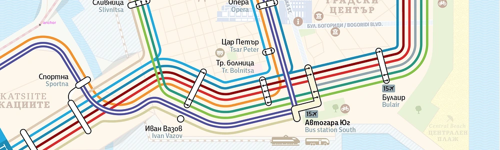
Another important change was putting the focus on the fast bus line (B1 and B2). Technically two separate lines traveling for the most part to the same locations with the one split to 2 different residential areas. The idea of the fast line was to represent the frequent buses which provide quick transportation from suburban neighborhoods to the center. The high frequency and importance of the line had to be put forward on the scheme. Central stops and terminals also, had to have higher hierarchy level than the rest of the bus stops, due to the fact that the fast bus line was skipping some of the smaller ones.
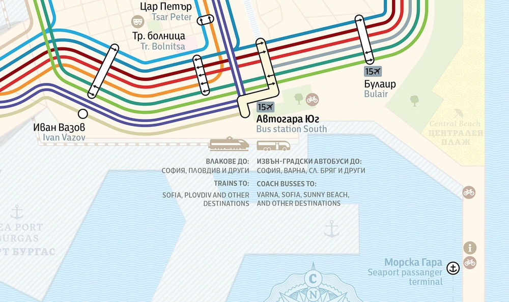
For the sake of usefulness, we decided to put additional information about the main connections to other cities and locations— such as the airport, bus and train stations, and other important terminals. Furthermore, the bus stops with a connection to the airport have been marked with the number of the bus (15) and a small plane pictogram.
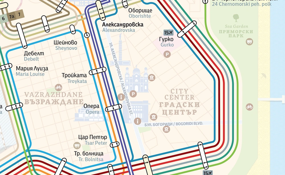
It’s interesting to note that a big part of the lines travel through the same streets which left open a lot of free space in the rest of the map to to take advantage of. As a result we added the central pedestrian streets of Burgas which have big cultural and commercial significance to the city. The streets feature some important city landmarks, such as museums, monuments, and farmers markets and other helpful places rent a bike stations, information desks, coffee shops, restaurants, and bars. By doing that visitors will have a much easier time finding their way around the city. However, knowing that these features are not the primary purpose of the map I’ve chosen low contrast colors to keep them at a lower tier of importance compared to the bus lines and stops names.
I chose the colors for the bus lines leading to and from Burgas’ suburbia (peripheral lines) using the same principle of lower contrast for less significance and lower frequency. That way the focus remains on the more frequently used lines, reducing the visual noise to a minimum by integrating a color hierarchy. Bright and contrasting colors for the more utilized lines and elements, and less vibrant colors for the remaining secondary and tertiary elements.
As you can probably see, establishing a visual hierarchy based on importance and/or utilization frequency is a very important principle when designing visual information systems meant to make everyday use easier for numerous people with different needs.
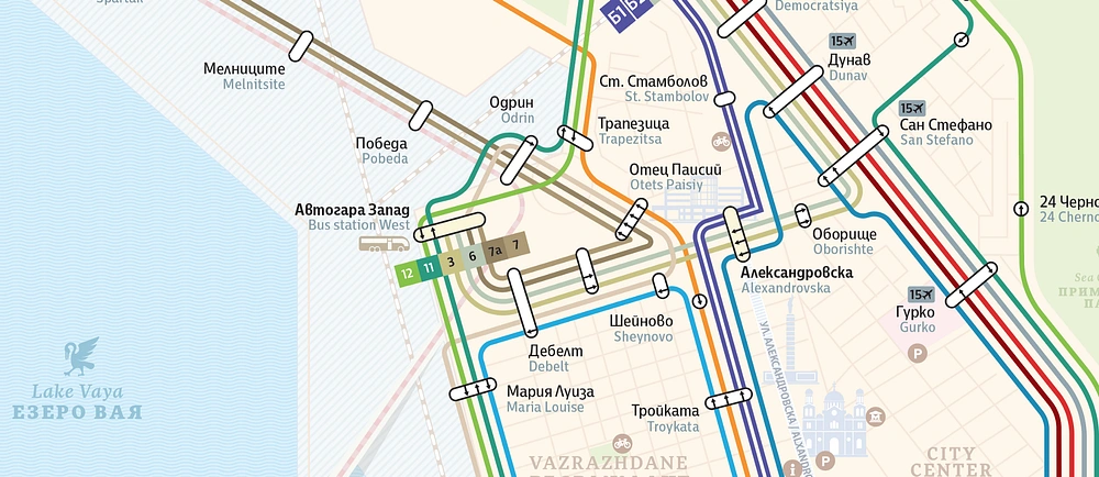
Other aspects we worked on were the introduction of bilingualism, keeping the focus on Bulgarian, due to the higher percentage of riders being Bulgarian obviously. We introduced indicating labels for neighborhoods and residential areas, parks, and water bodies, as well as a system of smaller but very detailed thumbnail maps of all the peripheral lines. That allowed keeping the size of the map fairly manageable.
In order to further facilitate the use of the map, we’ve added, wherever possible, small square labels along the paths of the lines indicating the line number. The urban and suburban lines can be distinguished by the color of the label number as well — white for urban, and black for suburban.
The end goal
My goal for the new map is to be significantly more accessible and user friendly both for the citizens, and the visitors of Burgas, and to serve as a useful addition to the information screens in buses, and the timetable boards at bus and trolley stops.
What follows
There are a few steps left concerning the municipality of Burgas and Burgasbus until the map is printed out and fully introduced to the public. I hope this can be a good beginning and a base for future projects such as improving the bus stop timetables and signs.
Like this project
Posted Mar 21, 2025
Step by step process of redesigning the public transportation diagram of small city of Burgas, Bulgaria and how the history of designing London Underground and…

