Subaa - Rent financing for UAE residents
Project Overview
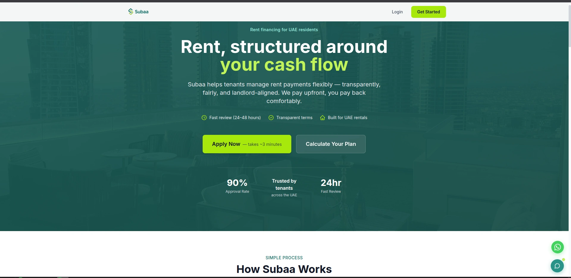
I developed Subaa, a Fintech-driven real estate platform designed to revolutionize how tenants handle one of their biggest expenses: rent. The platform allows tenants to pay their annual rent upfront to landlords while repaying Subaa in flexible monthly or quarterly installments.
The goal was to create a seamless, high-trust user experience that simplifies complex financial calculations into a straightforward, four-step application process.
Key Features & Functionality
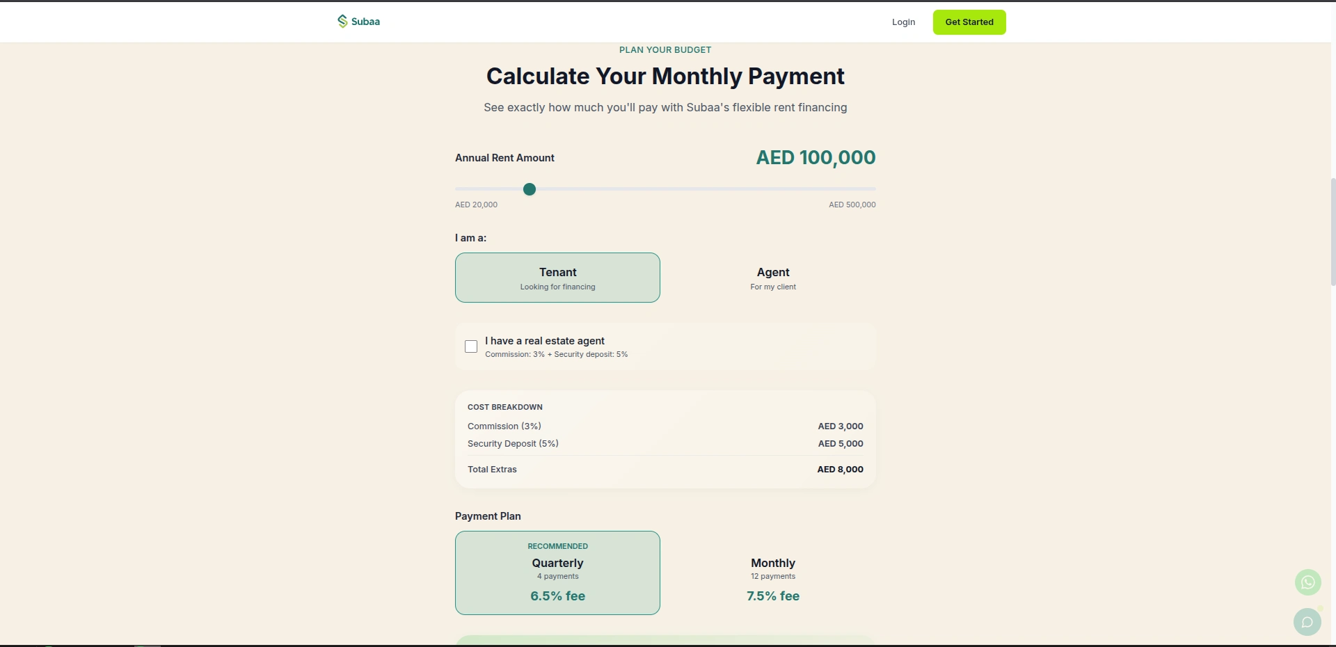
Dynamic Rent Calculator: A sophisticated tool that allows users to toggle between annual rent amounts (ranging from AED 20,000 to AED 500,000) and see real-time cost breakdowns.
Dual User Flow: Specialized interfaces for both Tenants looking for financing and Agents managing clients.
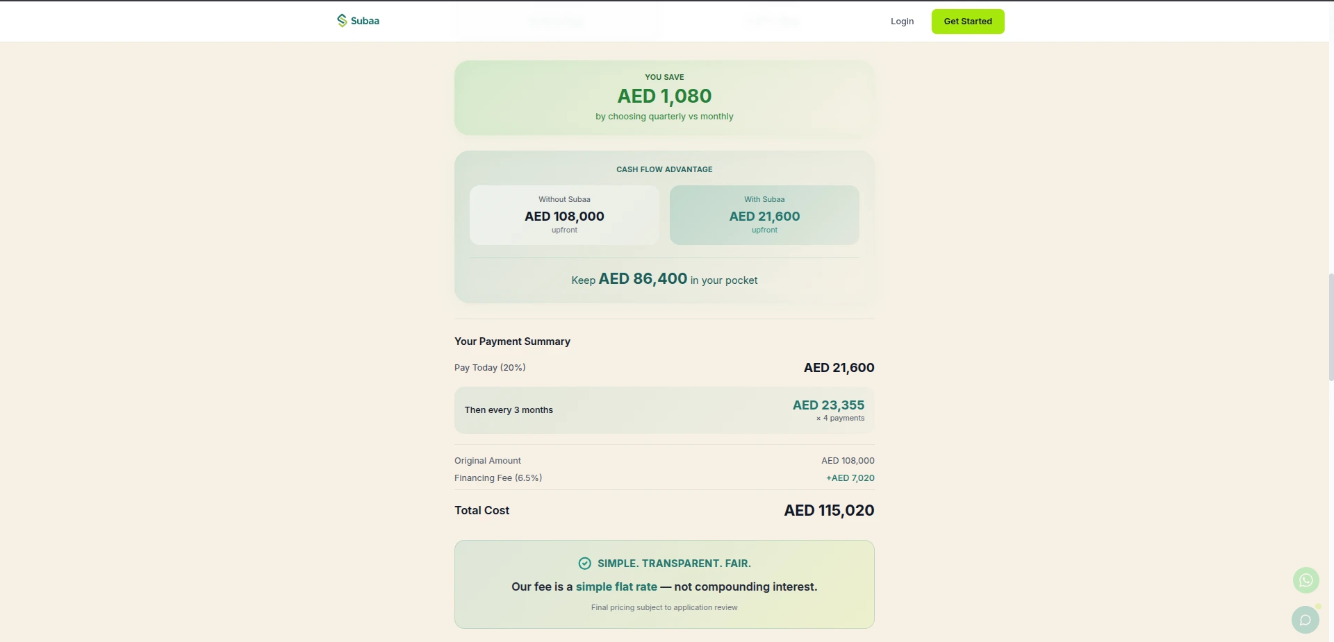
Automated Cost Breakdown: Real-time calculation of real estate commissions (3%), security deposits (5%), and service fees based on chosen payment plans (Quarterly at 6.5% or Monthly at 7.5%).
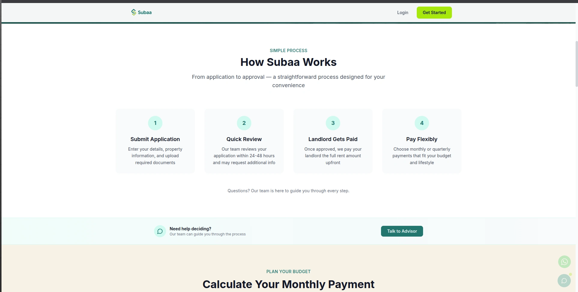
Streamlined Application Funnel: A 4-step "How It Works" logic (Submit Application → Quick Review → Landlord Paid → Pay Flexibly) designed to reduce user friction.
Trust Indicators: Integrated data points highlighting a 90% approval rate and a 24-hour fast review promise to build immediate user confidence.
The Challenge & Solution
In the UAE market, rent is often paid in a few large checks, which can strain a tenant's cash flow. The challenge was to present a "Loan-as-a-Service" model that felt like a helpful tool rather than a daunting financial burden.
I solved this by designing a clean, minimalist UI that prioritizes clarity. The use of sliders and toggle buttons in the calculator makes the financial commitment feel manageable and transparent. By visualizing the "Simple Process" section, I ensured users understood the value proposition within seconds of landing on the page.
Technical Stack
Frontend: Next.js, Tailwind CSS
State Management: Complex React state handling for the real-time calculator logic
Optimization: High-speed performance to ensure the "3-minute application" feel starts with the site load time
Project Achievements
Financial Transparency: Successfully built a logic engine that accounts for various UAE real estate fees, providing users with "to-the-fils" accuracy.
Conversion-Oriented Design: Optimized the Hero section to drive users toward the "Calculate Your Plan" and "Apply Now" CTAs immediately.
Market-Specific UX: Tailored the entire experience to the specific regulatory and financial nuances of the UAE rental market.
Like this project
Posted Feb 11, 2026
Fintech-driven real estate platform designed to revolutionize how tenants handle their rent payments.
Likes
0
Views
1
Timeline
Feb 2, 2026 - Feb 2, 2026

