Vyrill's rebranding, content development, and website redesign

Charly Agency
Brand Designer
Web Designer
Web Developer
Figma
Shopify
Key Services
Branding, Strategy, Content Writing, Web Design, Development
Description
The project marked a profound business and marketing transformation for Vyrill, involving rebranding, creating a brand book, developing compelling content, redesigning and developing the website.
Our primary aim was to establish a unique identity for our tech product. To achieve this, we carefully curated a distinctive color scheme. In a thorough discovery phase, we explored market differentiators, crafting intricate content, especially highlighted in the pricing page, to optimize the company's presentation.
These efforts culminated in the company securing substantial funding shortly after the rebrand, sparking a notable improvement in sales performance.
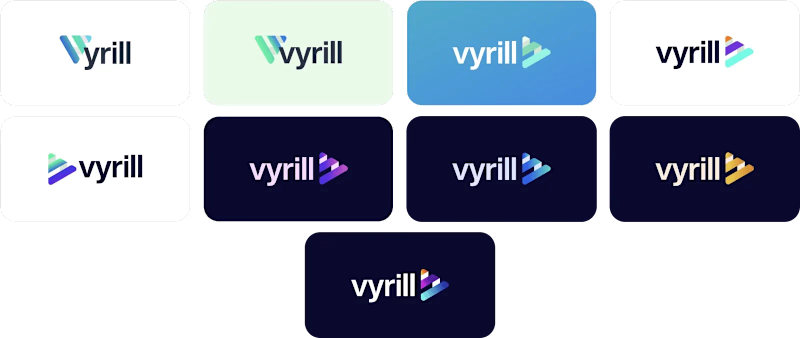
Logo Iterations
Phase 1

Phase 2
The concept is praised for its dynamic spring movement within the V, symbolizing growth, but criticized for being underdeveloped and lacking clarity in its message.

Phase 3
In this phase, we experimented with a broader color palette, including dark backgrounds, soft green, and purple hues for the icons, enhancing visual diversity and vibrancy.

Phase 4
The icon is commended for its clean, simple, and cohesive design, particularly for incorporating a play button and symbolizing integration. However, concerns arise regarding thickness and color representation.

Final Logo

Master Logo
The updated look of the logo stands out by its unique, modern, and clean features. The logo was made available in three versions: colored (Purple, Raspberry, and Turquoise) Black, and White.

Logo Clear Space
Clear space is the area surrounding our logo that must be kept free of any text or graphic elements. By leaving space around the logo, we make sure it stands out in all of our communications.

Stationery
The stationery set utilizes the brand colors. Special print finishes such as foiling of the logo and duplexing the business card are recommended.

Email Signature
An email signature was designed to maintain consistency in corporate communication. To achieve this, no additional statements or taglines beyond the proposed design were allowed.

Social Media

Mockup Examples

Mockup
Examples

Global Design System
Consistency in the primary color palette is maintained across all communications. A color hierarchy has been established, with Raspberry being the most significant, used primarily for conveying importance. Grape also serves this purpose. Meanwhile, Navy is predominantly employed for text and background.

Web Design
Discover the outcome of our web interface redesign project tailored to meet Vyrill's goals visiting vyrill.com.
Before

After

Homepage

Products / Vyrill Platform

Discover Tab

Analyze Tab

Campaigns Tab

License Tab

Commerce Tab

Products /Vyrill Video API

Products / Shopify App


