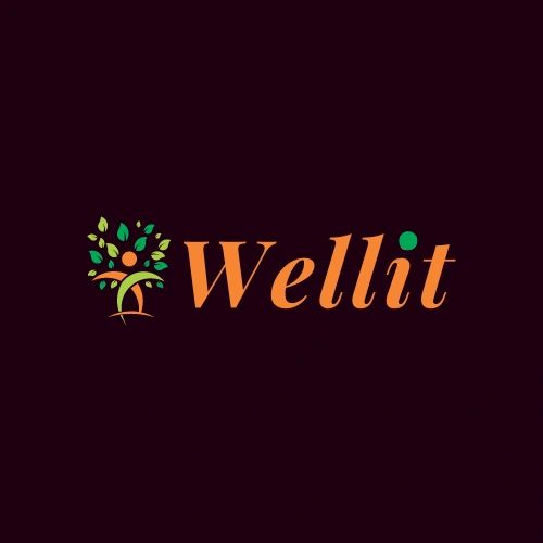
Wellit Logo Design Embracing Nature with Elegance
Padm R
Wellit Logo Design Embracing Nature with Elegance
Description:
Here is the Wellit logo design: The cultivated beauty of nature and sophistication A precise composition of the elements of nature and the principles of elegance that embodies the fundamental ideas of healing and development. In this project, the following logo is one of the potential examples of suitable logo design for Wellit:


Color Palette:
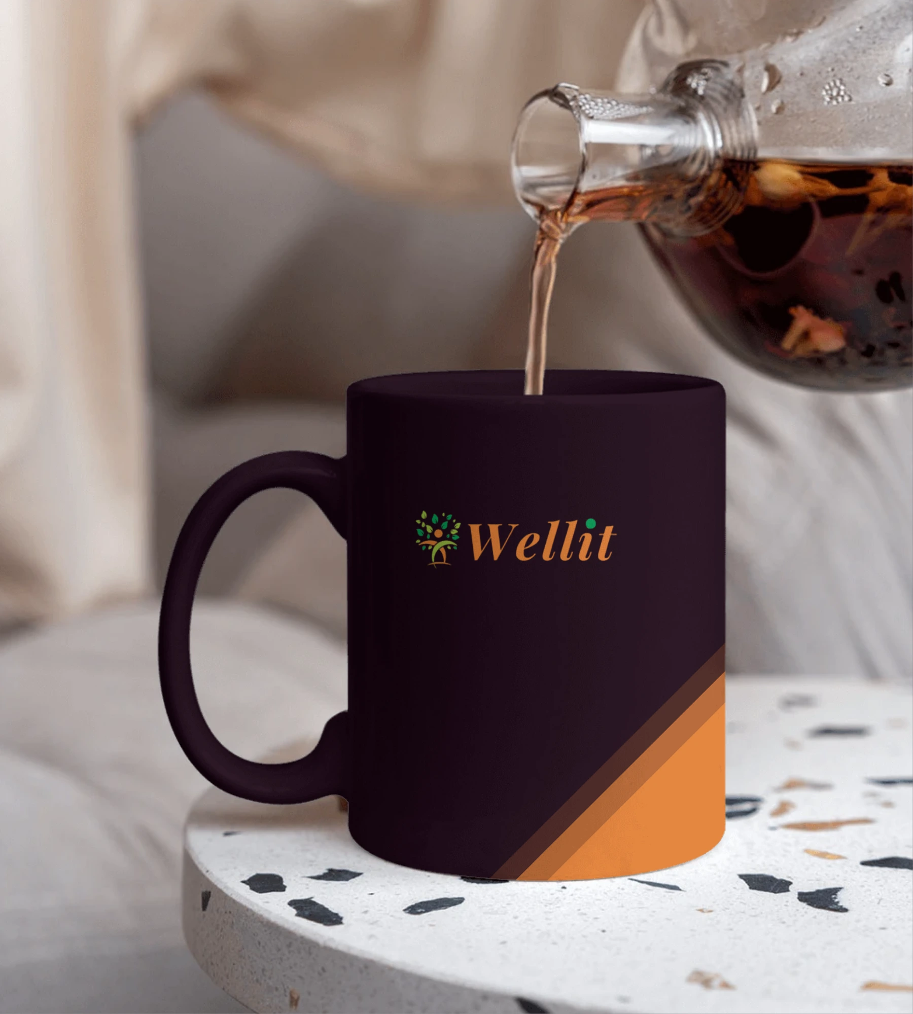
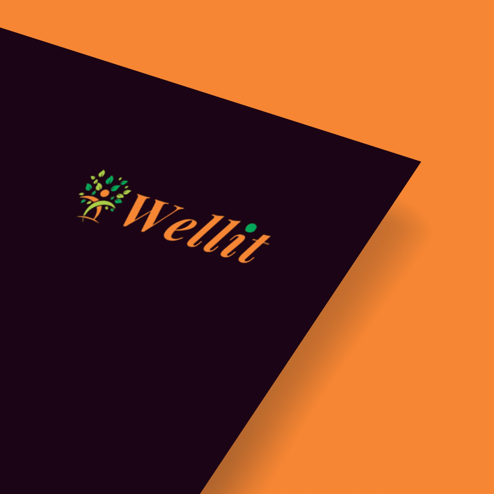
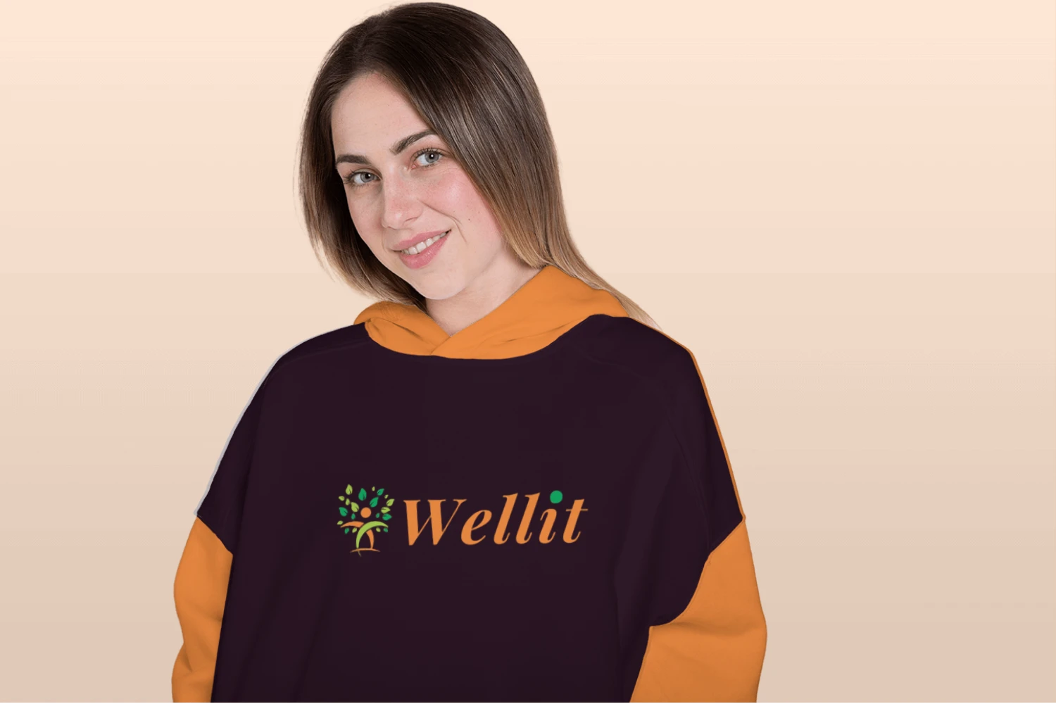
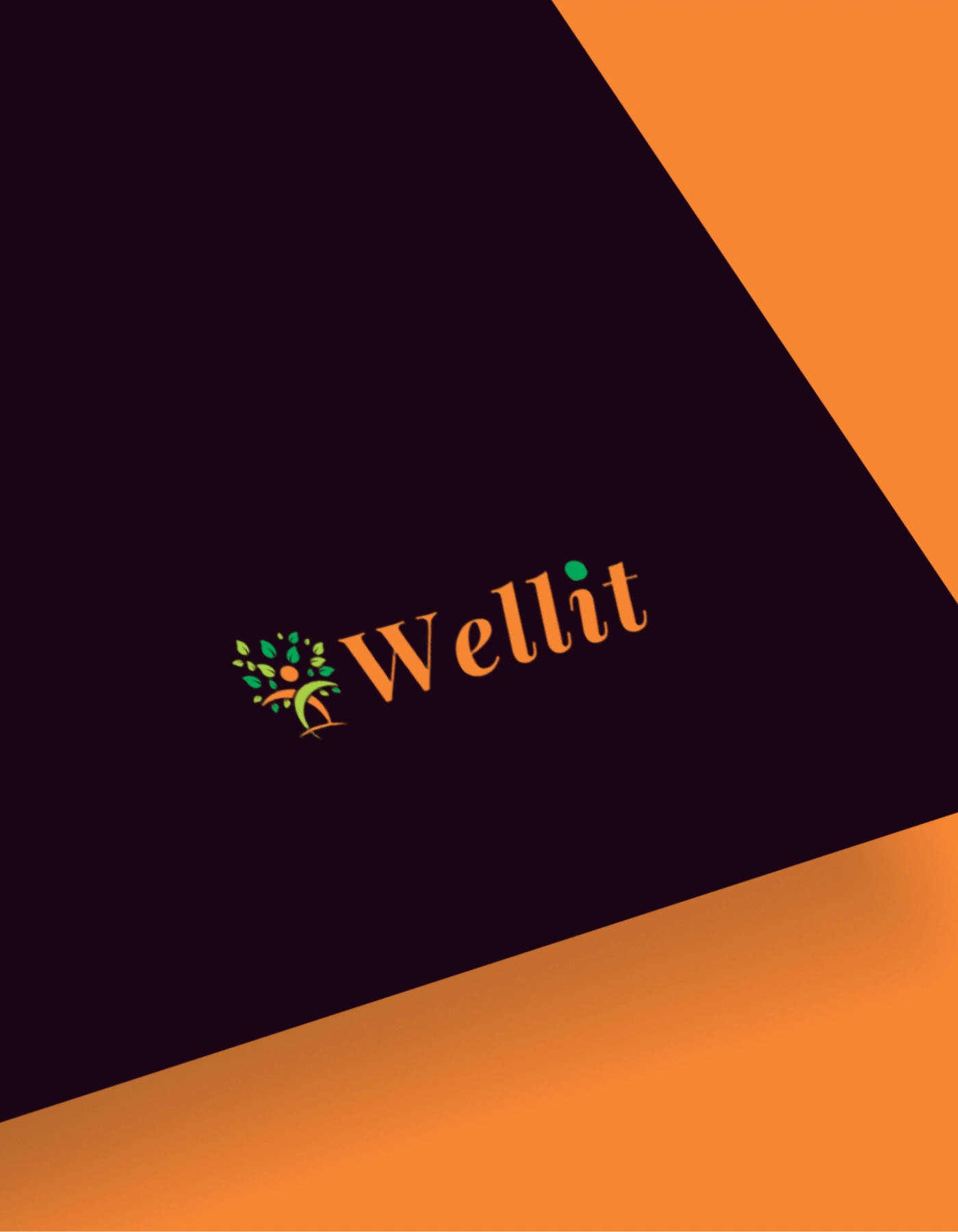
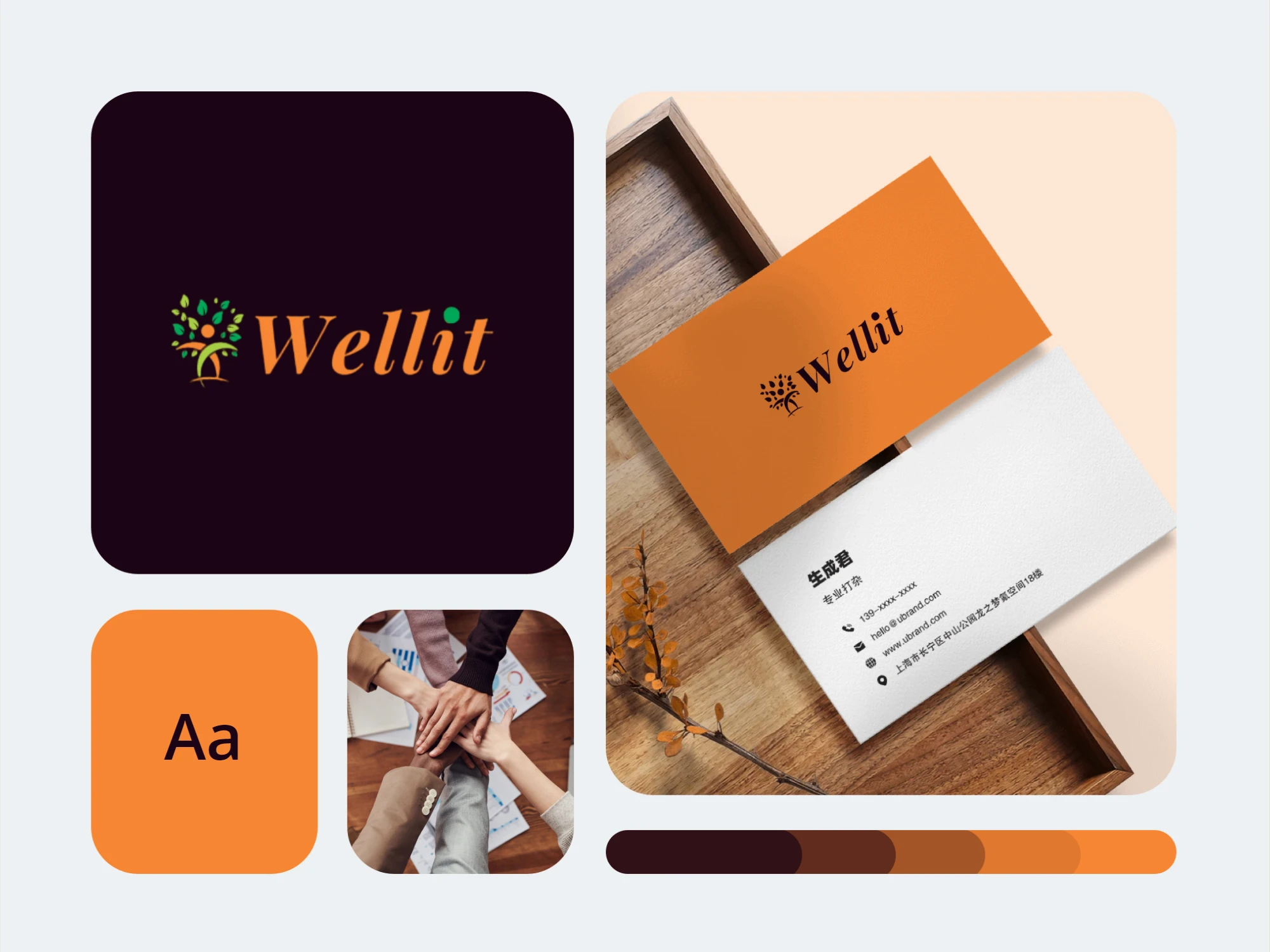
The Wellit logo is a truly colorful screamingly bright orange combined with bright green and luxurious purple colors. There has been a proper selection of colors for a specific emotion or psychological effect to be associated with the logo to get the company’s message of the brand through accordingly.
Orange:
It is bright and warm, codes for enthusiasm and creativity, as well as success, and is always associated with communicative logos.
Green:
Symbolizing increase, balance, and vitality, green supports continuity and emphasizes the relation of the brand to the outside world.
Royal Purple:
Representating grandeur, aspiration and enlightenment, royal purple brings depth and elegance to an artwork.


Logo Symbol:
In the Wellit logo the most central element is the tree – a symbol of the firmness that exists across the different aspects of life. The tree is a piece of sculpture with smooth curves that form a blood-like way of growth. Its branches go up and outwards symbolizing the growth and progress of well-being that is the greater focus of Wellit.
Typography:
Font and color choices also play a role in the positive example to the brand. The use of a handwriting font for the brand name “Wellit” reads as a personalized and authentic brand. It is the simplicity that makes it sophisticated and beautiful for the original design of the logo.
Design Rationale:
The Wellit logo design reflects the concept of looking at wellness from a holistic perspective. The colors used to represent the emotional response produces meaning associated with wellness, a symbol to differentiate the natural growth process and honest typography creates overall connection of the message of wellness generated by the brand. It should have enough flexibility but also be visually memorable and instantly recognizable.
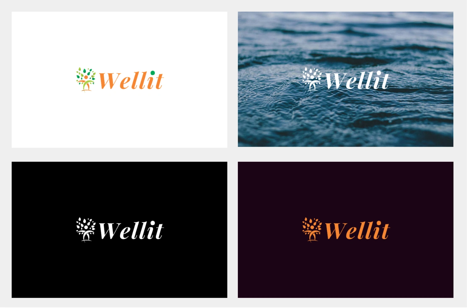
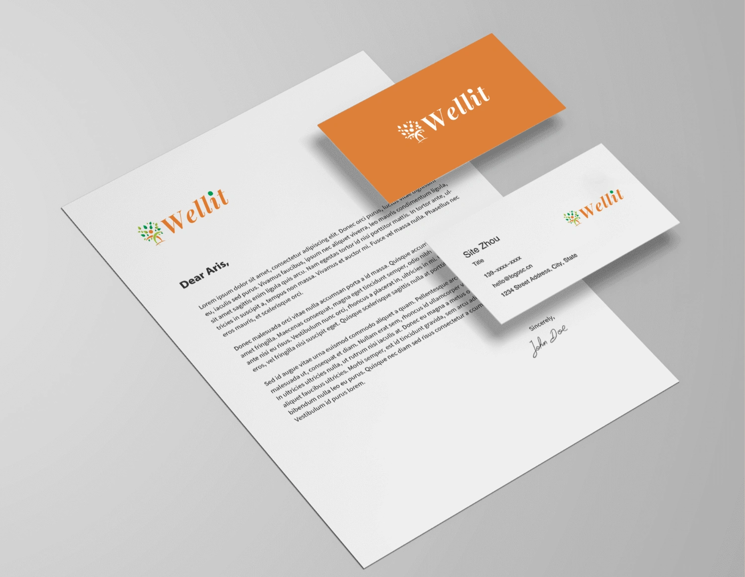
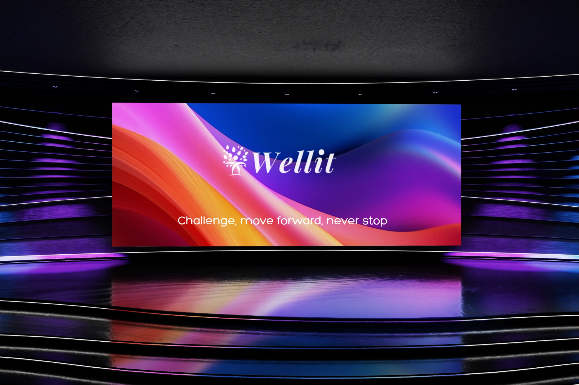
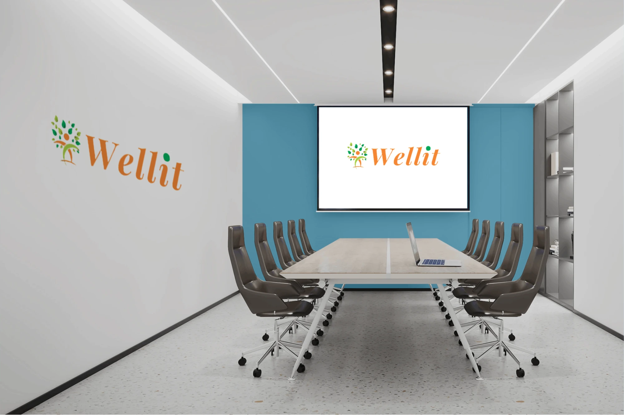
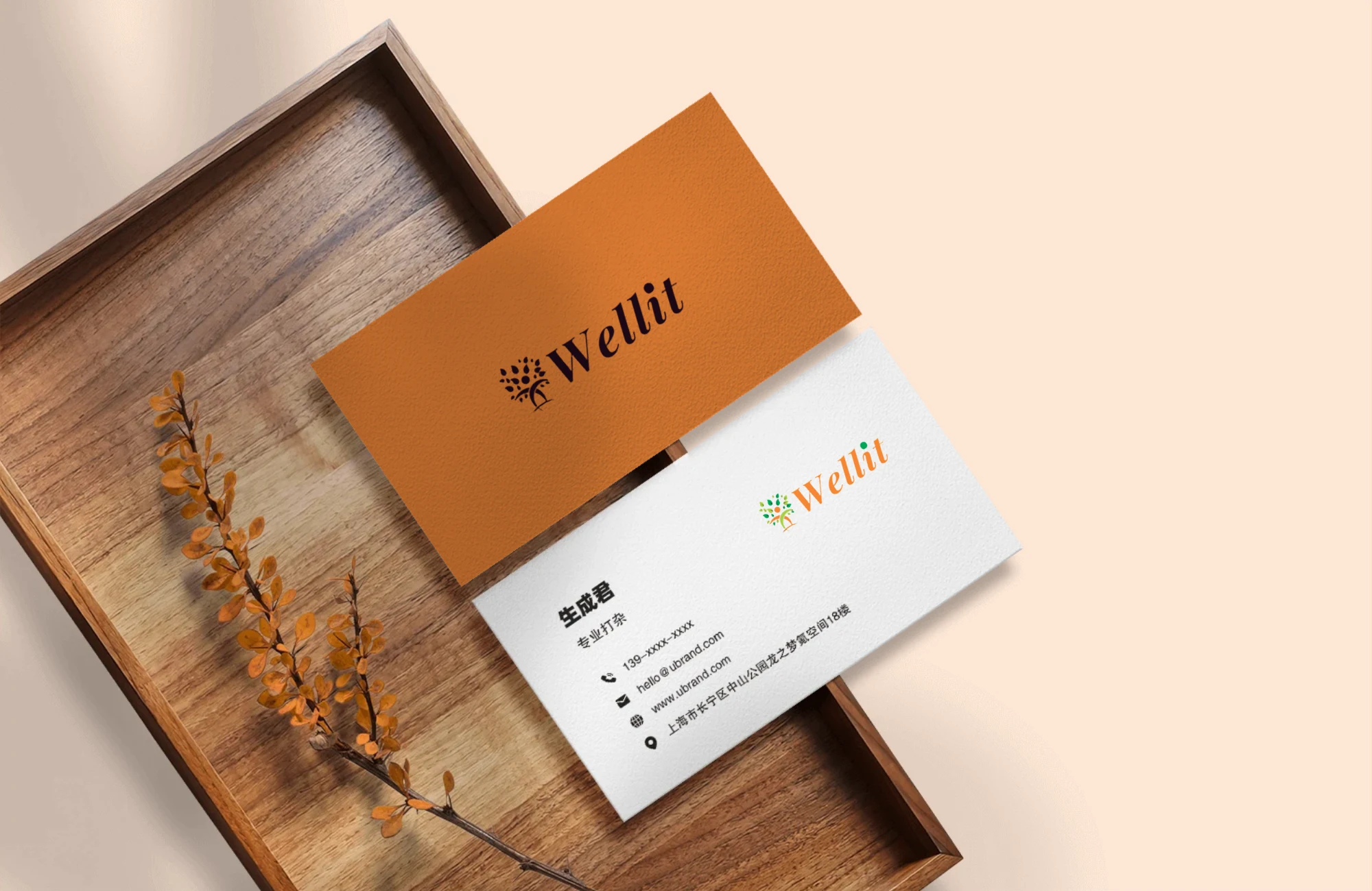
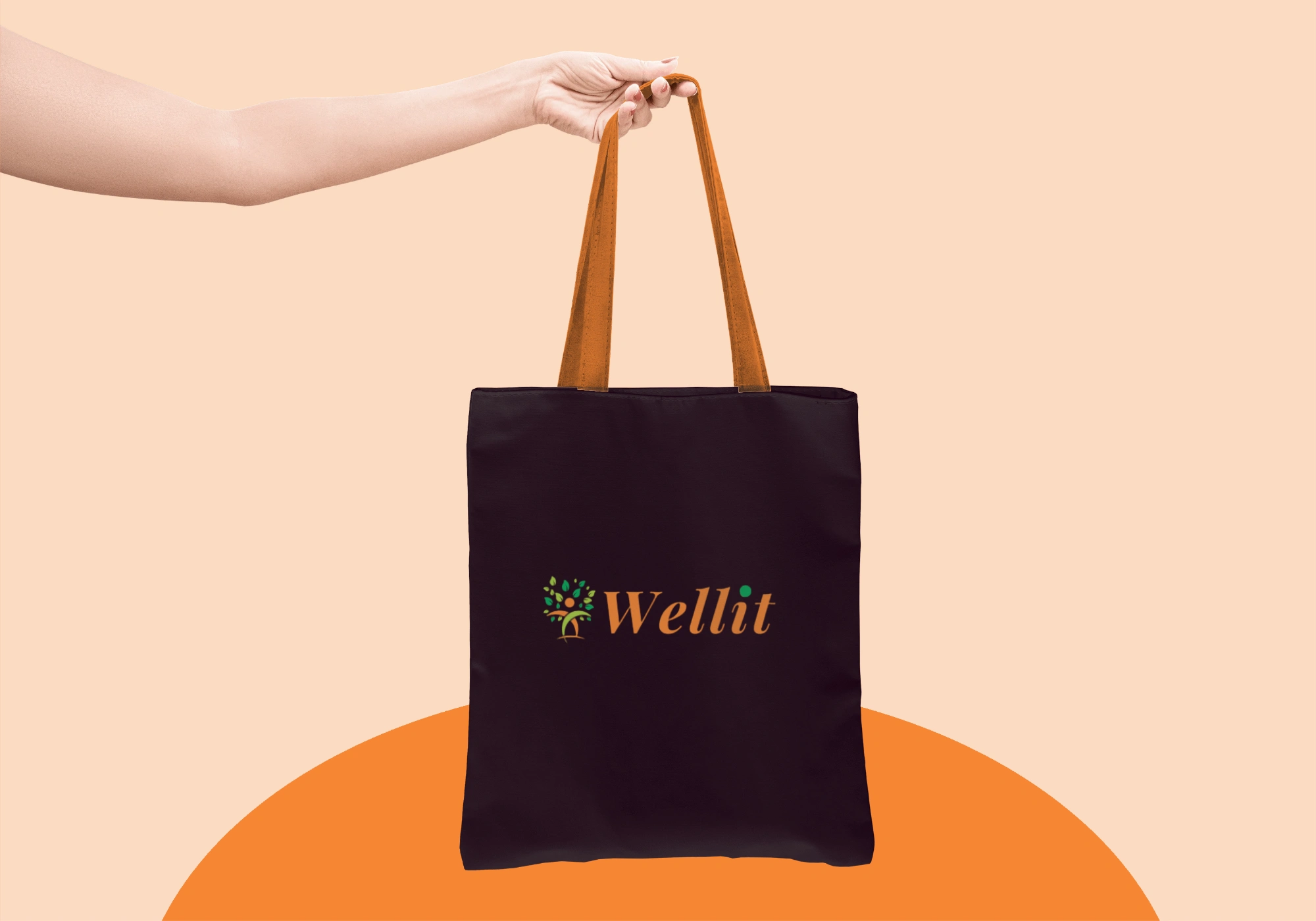
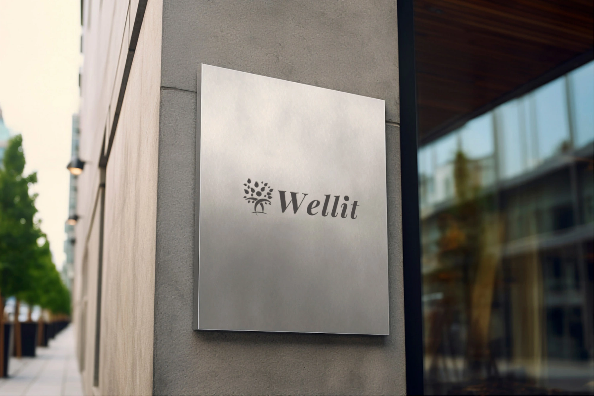
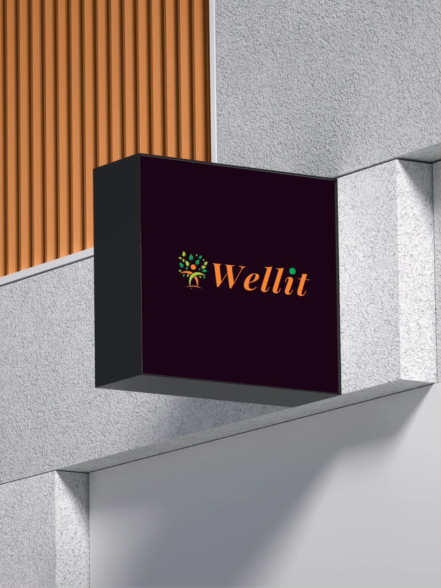
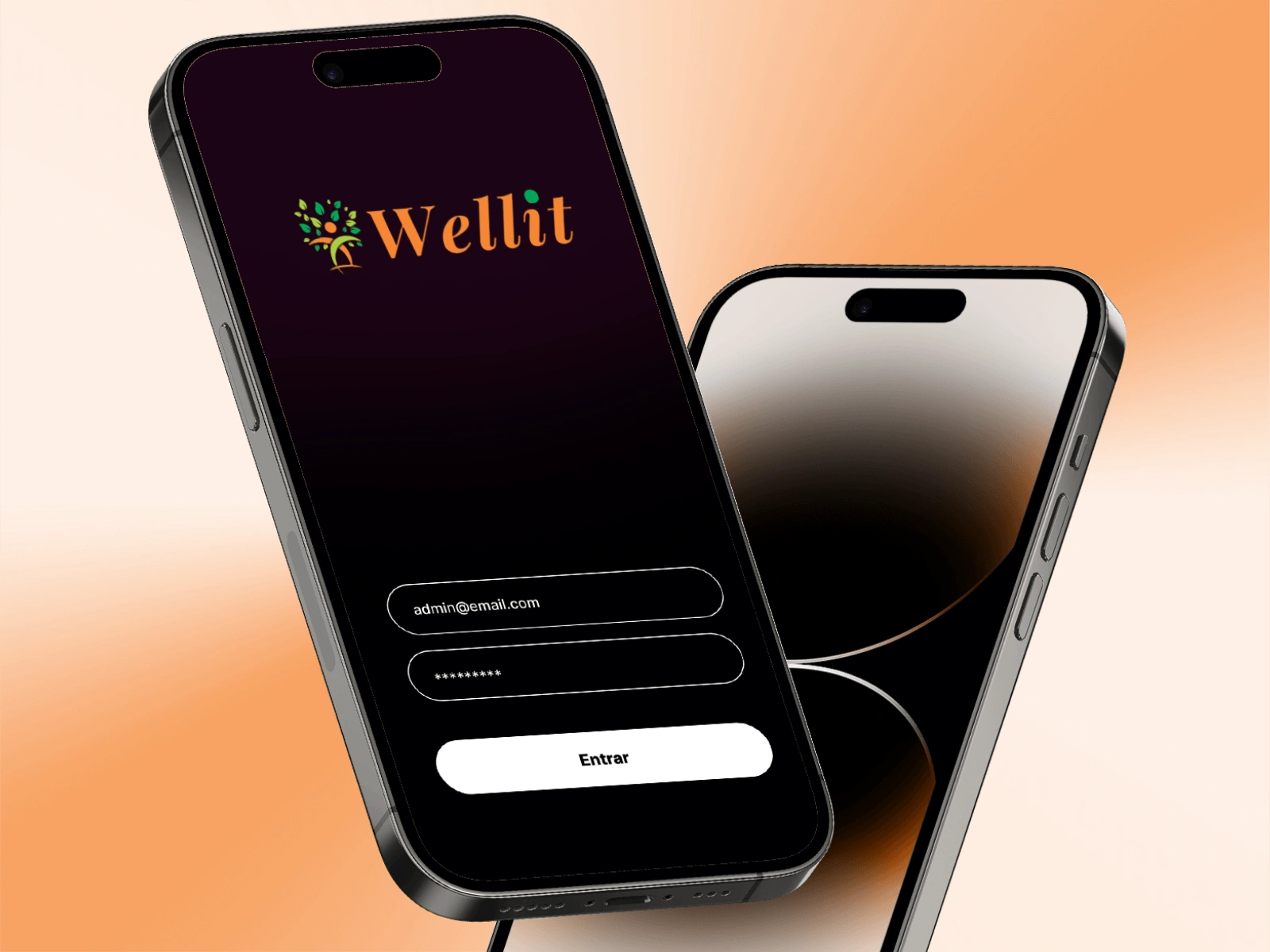
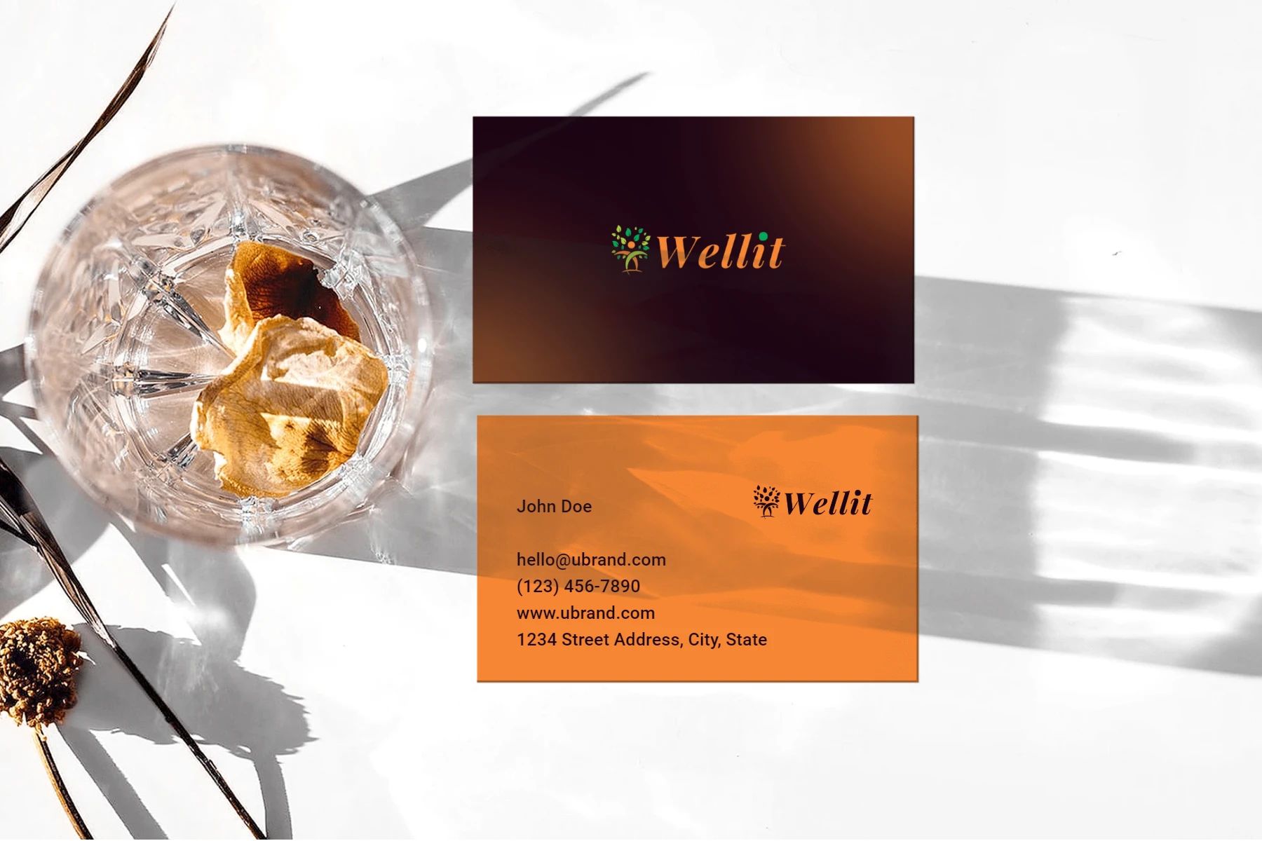
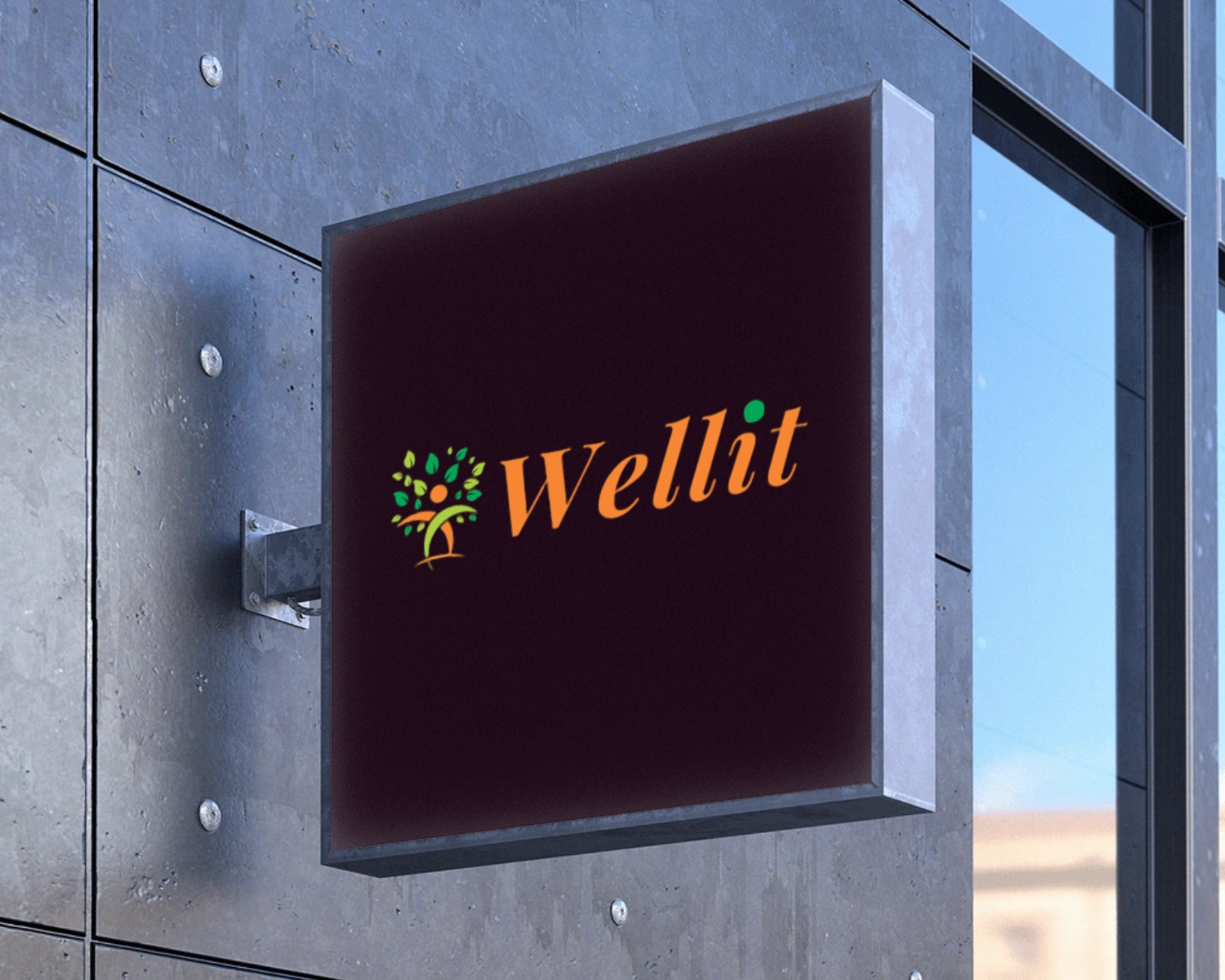
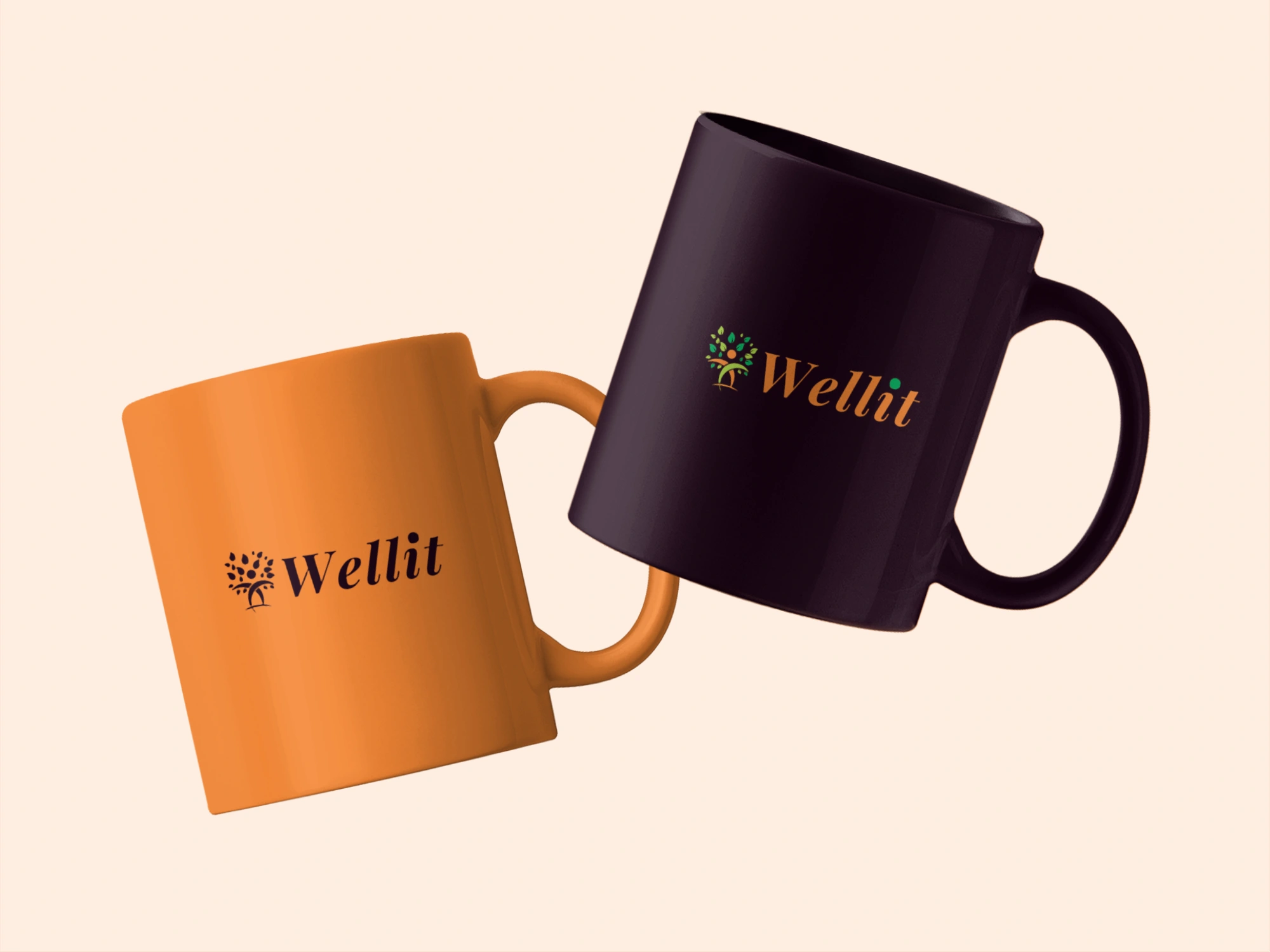
Applications:
I have designed the logo of Wellit company using bold and minimalistic lines so that it can be used in a variety of media formats including digital and print. A logo is an expressive and concise representation of the business’ identity and purpose in a form of a recognizable mark that is used on a website, business card, or on product packaging to identify and publicize the business in question.

Conclusion:
The Work for the Wellit Logo Design is case study that demonstrates the importance of design when it comes to brand identity. It reflects the key idea of Wellit – a company that provides services for enriching and improving well-being of people and presents it in an interesting and meaningful logo. This project helps to demonstrate how color theory, symbolism, and typography are used to create a visual representation that is not only a thing of beauty, but also stimulates the right emotions and thoughts for the viewer.
Like this project
Posted May 4, 2025
Wellit Logo Design Embracing Nature with brand colour palate
Likes
1
Views
3