Intern Guys
Tina Lin
Working alongside the UX/UI team, we conducted user interviews to gain valuable insights from our target audience. These invaluable feedback guided us in the comprehensive redesign of the website, resulting in a significantly improved overall user experience.
Project Overview
Teammates
Jonathan Yip - UX/UI Designer
Christopher Kwan - Project Manager
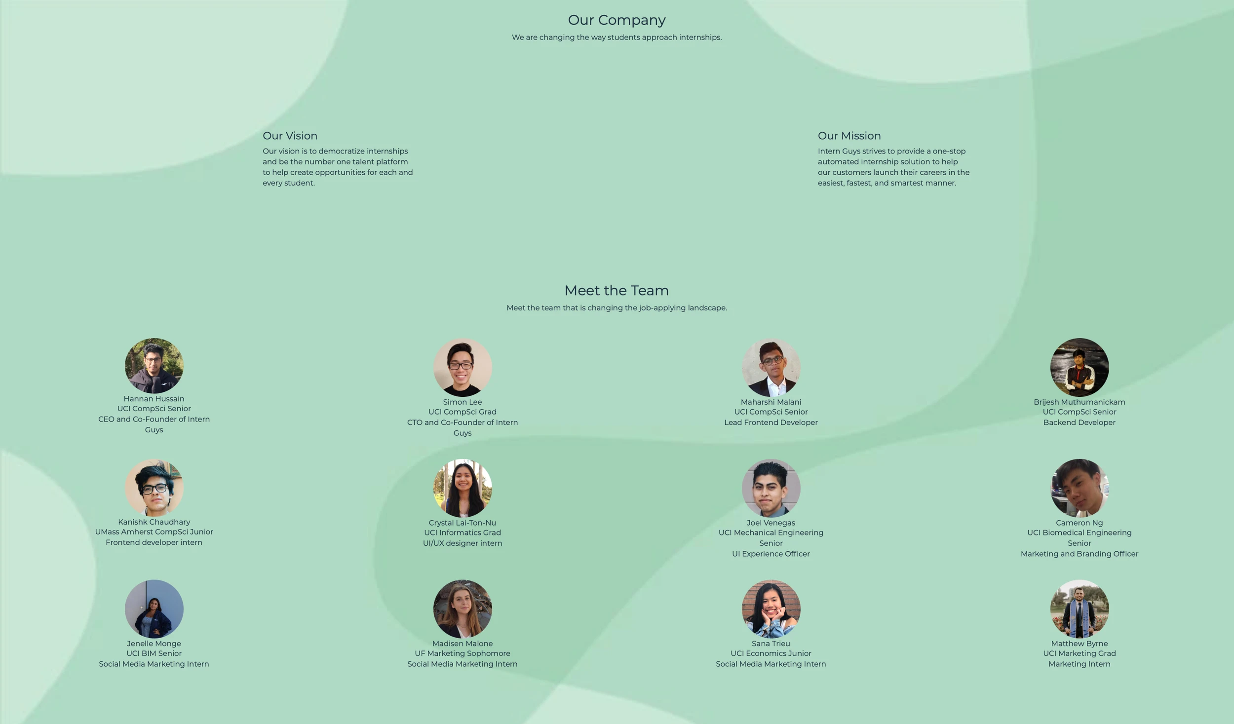
Hannan Hussain - Founder
Timeframe
Jan 2023 - Mar 2023 | 10 weeks
Role
UX Design, User Research
Tools
Figma, Google Docs, Pencil & Paper
Problem
Intern Guys had a clear objective: to enhance the connection between students and recruiters during the internship hunt. To achieve this goal, our team focused on creating a user-friendly and easily navigable website.
When I became a part of Intern Guys, it was in its early stages as a startup, striving to establish its reputation in the industry. As the primary medium for user interactions, the website's accessibility held paramount importance. However, it was evident that the website had only undergone one design iteration, and there had been no usability testing conducted since its initial launch. This highlighted the need for a comprehensive evaluation and revamp to ensure an optimal user experience and strengthen the company's online presence
Objectives
Conduct thorough usability testing to observe and analyze users' interactions with the website
Synthesize the feedback received during usability testing, identifying key pain points and areas that require attention in the redesign process
Redesign the pages, focusing on making them more intuitive and accessible, tailored to meet the specific needs of the users
How can we redesign the website for more intuitive user flow?
Goal
current page
current page
Research
Our team carried out comprehensive usability testing involving twenty university students, with a specific focus on those seeking internships. During the interviews, we requested each participant to guide us through their experience while exploring the website, encouraging them to share their thoughts and impressions. Additionally, we posed follow-up questions strategically to assess specific interactions and the overall user flow. This approach allowed us to gain valuable insights into the users' perspectives and enabled us to identify areas for improvement effectively.
Here are some key observations:
About page was somewhat as they anticipated, but it lacked substantial information about the company
Uncertainty about what sets this company apart from its competitors
Difficulties encountered while reading the smaller text on the website
Cursor change when hovering over photos indicated click-ability, but only one photo was actually clickable
Competitor Analysis
To get a better feel for how the existing solution, I look at another websites’ about pages
Here are some key observations:
Incorporated a captivating story or history about the company which allows users to connect on a deeper level
Positioned the sign-up option at the bottom of the page, ensuring users can easily register after learning more about the company.
Placed taglines throughout the website, making them memorable and reinforcing the brand's message
Ideation
Low Fidelity Wireframe
Adding a short blurb with more details on the company
A new feature that entices people to sign up (ie. reviews, history)
Bigger text sizes for readability
Establishing clearer visual form hierarchy by grouping related fields
Create consistence in the cursor and click-ability of the images
Based on the above problems identified, I worked towards addressing these pains by coming up with potential solutions:
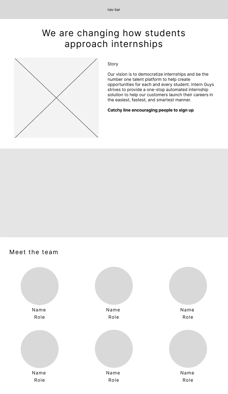
After consulting with the UX/UI team, we reached a consensus to relocate the review portion from the home page to the about page for a better fit. During the discussion, we debated the inclusion of everyone's LinkedIn profiles, and after a majority vote, we decided to include them. The team expressed satisfaction with the low fidelity wireframe, which served as a solid foundation for the subsequent development of high fidelity wireframes.
I designed three different versions for both desktop and mobile platforms.
High Fidelity Wireframe
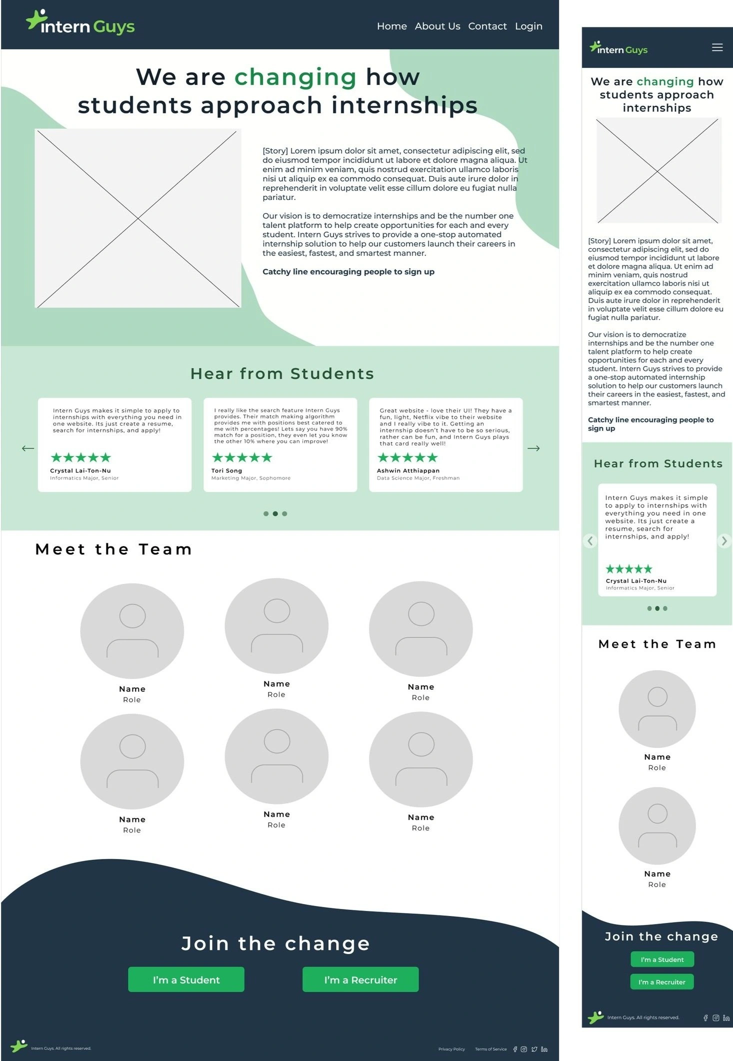
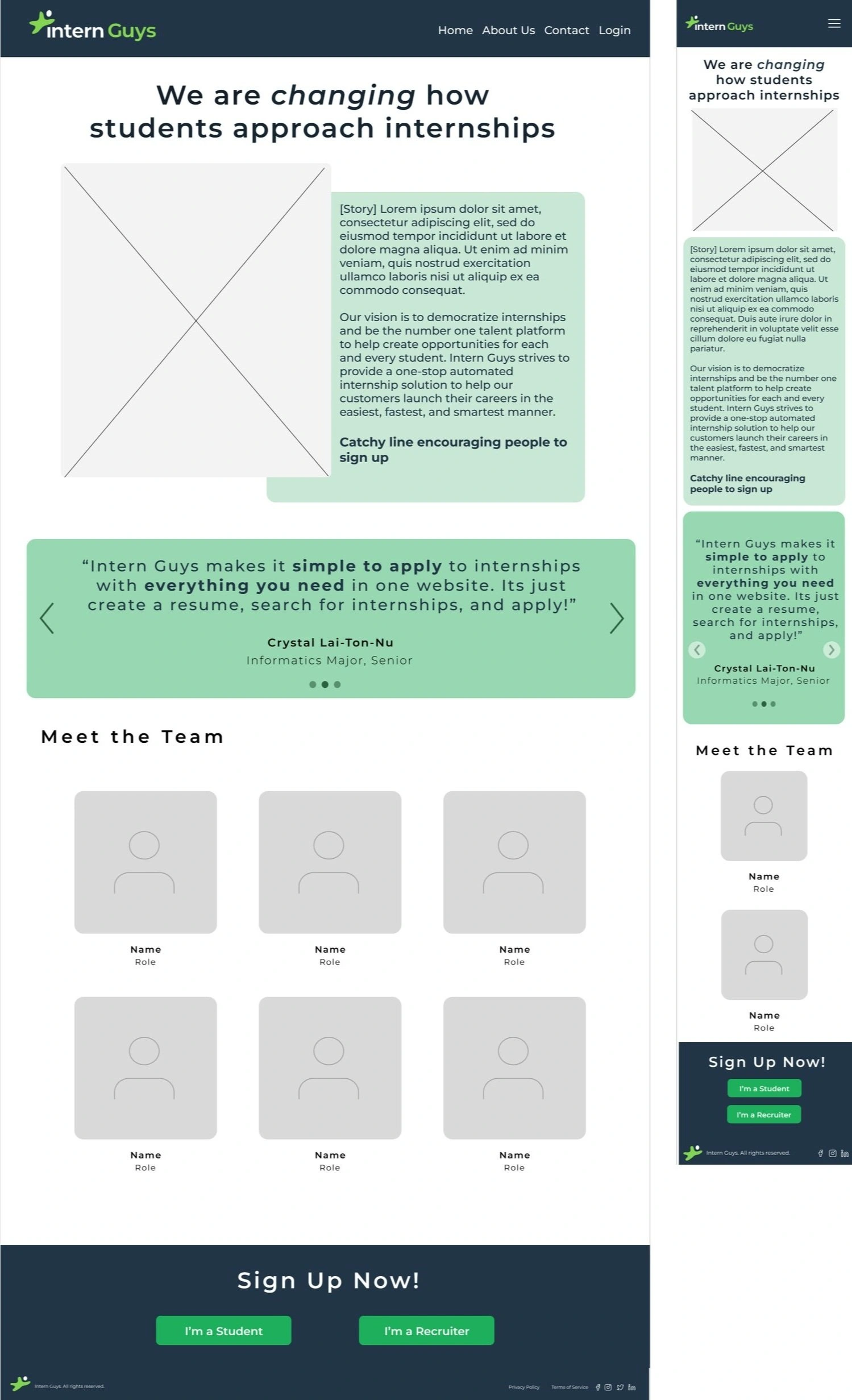
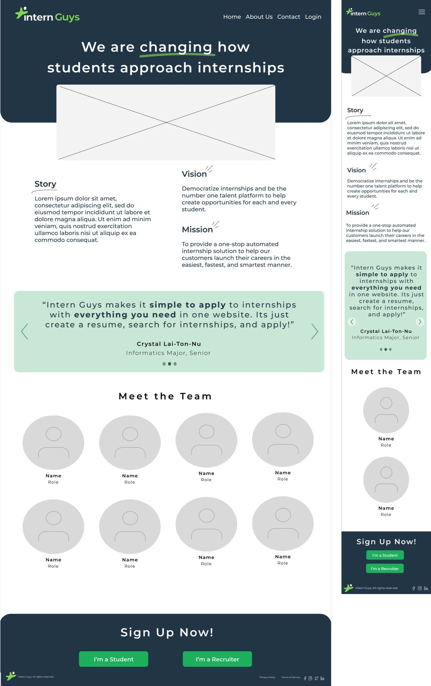
During the company-wide presentation of my final design, a valid point was raised about the redundancy of the mission and vision sections. To address this, I proposed replacing them with a section dedicated to our company's history. While the founder initially hesitated to remove the mission and vision, we conducted a vote, and the final decision favored the inclusion of the history feature.
As this was a novel addition, the founder and I had a one-on-one discussion, during which I shared my drafted sketches of the history feature's potential appearance. After gathering feedback and considering which design aspects to modify and retain, I worked on refining the final design, incorporating the suggested changes to create an optimal version.
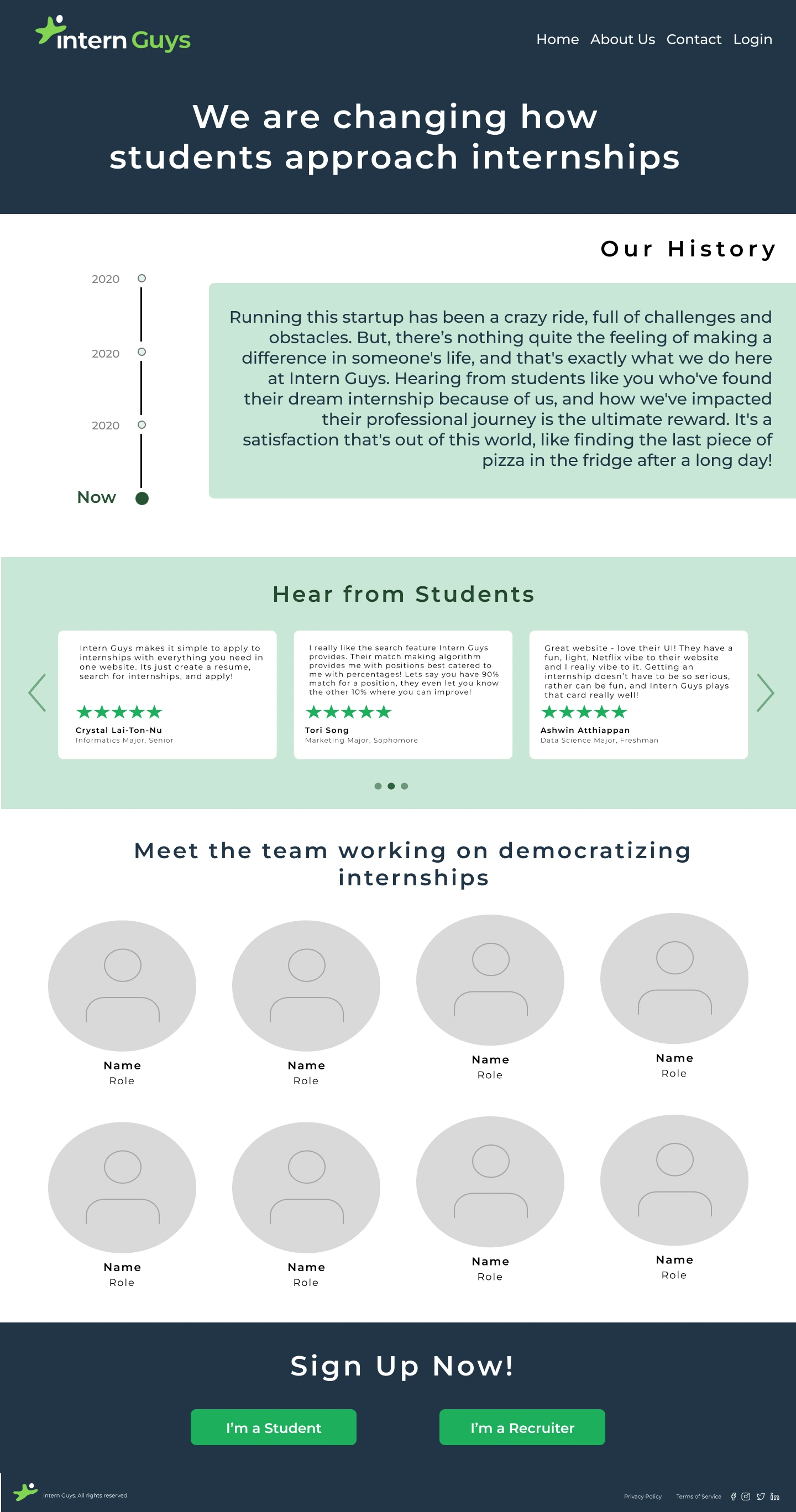
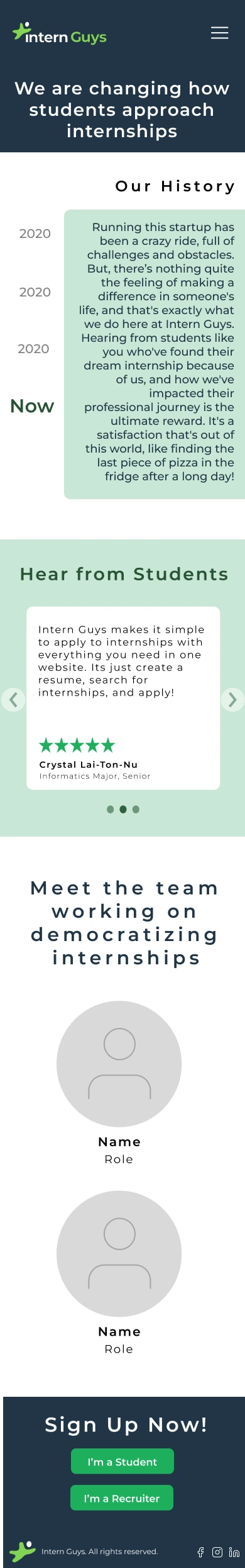
Final Design
Reflection
Due to our time constraints and other projects that we had to work on, once the high-fidelity model was finished, we agreed that it was ready to send to the developDue to time constraints and other ongoing projects, the final high fidelity design received approval for submission to the developers. Given more time, I would have conducted user testing to gather additional feedback and iterate on the high fidelity model to further enhance its usability.
This internship marked my first experience joining a project that was already in progress. It proved to be an incredibly rewarding learning journey, as it allowed me not only to collaborate with individuals from different teams but also to challenge myself in exploring various aspects of human-centered design. The valuable feedback I received emphasized the significance of paying attention to the finer details in design, which I now deeply appreciate. It highlighted how even seemingly simple elements like an about page can make a lasting impression on the user's experience.
Working alongside everyone on this project was truly enjoyable, and I extend my best wishes to them for their future endeavors.
Students developed a mobile app to support the mental health of university students. The project involved interviews, a prototype created with HTML, CSS, and Javascript, and extensive testing. The final app was presented at the CS 160 symposium at Berkeley, showcasing its potential impact on promoting mental well-being among students.
Project Overview
Catherine Zhao, Hridhay Suresh, Joymaneet Kaur, Karen Ting, Saiteja Kambhampati
Teammates
Timeframe
July 2022 - Aug 2022 | 3 weeks
Role
Product Design, User Research, Prototype & Testing
Tools
Figma, Google Docs, Pencil & Paper, HTML, CSS, Javascript
Problem
Many students at Berkeley actively engage in numerous activities alongside their demanding coursework, which requires a significant time commitment. Balancing participation in clubs, involvement in research programs, maintaining a social life, and excelling academically can sometimes take a toll on a student's mental health. Due to Berkeley's size, it may not always be able to promptly offer the necessary resources for every student when needed.
"My Check-in" is a centralized mobile app that provides essential mental health resources to all Berkeley students. The app allows students to connect with their peers, communicate with healthcare professionals, maintain a virtual journal to track their emotions and thoughts, and stay informed about mental health events on and around the campus.
Objectives
Understanding the frustrations and aspirations of students regarding their mental health
Create a novel product that provides convenient access to mental health resources, encompassing unique features currently unavailable in any single platform
Goal
How can we keep students accountable for their mental health?
Research
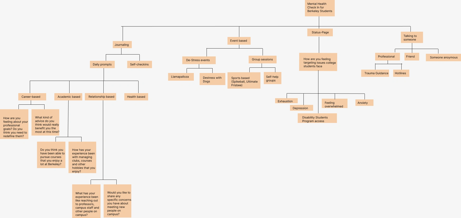
Hierarchical Task Analysis
As our next course of action, we opted to analyze the various features our Mental Health app will incorporate, drawing insights from our own experiences and feedback from fellow Berkeley students. To achieve a clear and comprehensive outline of the concepts we wanted to explore, we employed an Hierarchical Task Analysis (HTA) tree. We focused on four main verticals: journaling, event planning and tracking, a status page, and a chat feature.

The observational interview involved two UC Berkeley students. The initial interviewee was a four-year Berkeley student who had previously engaged in therapy but had not availed themselves of UC Berkeley's mental health resources. The subsequent interview was conducted with a third-year UC Berkeley student who had briefly tried some professional services in the past and made efforts to connect with UC Berkeley's mental health services before.
Here are our key findings:
Observational Interviews
Expressed a preference for confiding in friends rather than seeking help from professionals
Emphasized their reliance on methods such as journaling, expressing their thoughts in writing, and engaging in self-reflection as effective ways to seek help
Crucial to encourage users to establish a consistent routine with journaling and self-reflection, as doing so can help them maintain awareness and mindfulness regarding their thoughts and decisions
Utilizing our findings, we updated our HTA tree.
Persona & Scenario
To gain a deeper understanding of the end-users and to fully meet their needs, we developed a persona and a textual scenario that exemplifies how this app would be of great assistance.
LOGAN
A 20 year old undergraduate student at UC Berkeley, majoring in Molecular and Cell Biology (MCB) and minoring in Data Science.
FRUSTRATION
maintaining a healthy work-life balance and feels overwhelmed by an excessive workload
GOAL
shift her mindset and improve his current situation, seeking a more balanced and manageable approach to her academic and personal life
Ideation
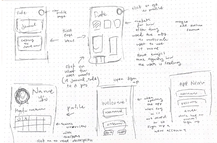
Sketches
Drawing from the observational interviews, synthesis from the studies, and the revised HTA tree, we have identified several features that warrant exploration. Subsequently, we created sketches of the home page, essential features, and potential interactions between various screens.
Notable features highlighted in the sketches include:
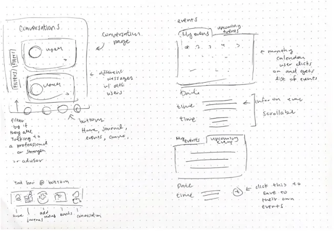
Journaling: Users can maintain a journal using creative system-generated prompts.
Chat Feature: Users can connect with peers who share similar interests and backgrounds, or seek assistance from available healthcare professionals.
Events Page: A dedicated page to keep track of events happening in and around Berkeley and the campus, catering specifically to Berkeley students.
Relatable Conversations: Users can filter other users by their major, use emojis to track their emotions throughout a day or week, fostering relatable conversations.
Central Navigation: A bottom navigation button provides seamless access to all features.
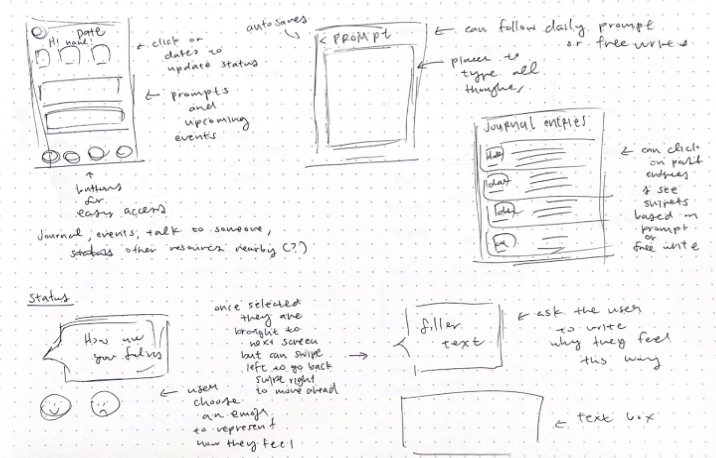
As a next step, we refined the scope to focus on three crucial features: the events page, journal entries tracker, and the chat feature. Additionally, we envisioned a homepage and a personalized profile screen, where users can provide more information about themselves to receive tailored recommendations and connect with individuals who share similar interests. To visualize the flow and interactions between all the screens, we created a wireframe that illustrates the various possible connections between them.
Low Fidelity Wireframes
High Fidelity Wireframes
After assessing our progress, we recognized the significance of replicating the wireframe, proposed interactions, and features as high-fidelity wireframes before commencing the actual coding process. This step played a crucial role in finalizing the design, as it allowed us to make informed decisions about the user interface and prevented the need for excessive code revisions later on. By creating high-fidelity wireframes, we ensured that the UI elements were well-defined and provided a clear visual representation of the app's layout and functionalities.
home page
past journals
daily prompt entry
new chat
recent chat
events page
profile page
Once our design was solidified, we proceeded to implement it by utilizing HTML, CSS, and Javascript to develop an interactive prototype. This prototype allowed us to bring our envisioned features to life and provided a tangible representation of the app's functionality and user experience.
Interactive Prototype
navigation bar interactions
journal page
conversation page
events page (used an api)
Usability Test
Could easily navigate through the website and interpret the meanings of icons on buttons.
Uncertainty about certain interactions such as the "generate" button for generating prompts was not entirely clear in its purpose
Unsure about the meaning of each filter in the conversation page
Suggested improvement: Add small descriptive or more explicit phrases to clarify actions and ease confusion
Layout appeared self-explanatory, enabling users to easily find the buttons and input fields
Some expected features, like an archive of moods, were missing from the application and should be considered for inclusion
Upon completing our prototype, we had users engage with our interactive prototype. We sought their input on their initial reactions upon opening each page, their perceptions of certain buttons or interactions, and observed how they interacted with the app through various scenarios.
Here were our key findings:
Presentation
Reflection
Reflecting on the project, it was rewarding to see how conversations between users with similar backgrounds and interests provided valuable support. The feature allowing direct chats with healthcare professionals was well-received, offering a convenient alternative to the eTang appointment system. Encouraging regular journaling through system-generated prompts proved effective in helping users de-stress and express their thoughts.
Looking ahead, our next steps involve integrating Berkeley students into the platform with active journaling, events, and chat with peers features. This step will foster a community where like-minded individuals can connect. Building self-help groups based on majors, colleges, and activities is a promising way to establish a robust support network for students in need.
Conducting early user testing with Berkeley students is a strategic move, as their feedback will play a pivotal role in refining the app's features further. The time constraints during the coding phase affected the prototype's resemblance to the wireframes, but with more time, we would aim to improve its alignment with our original design vision, particularly addressing the appearance of the calendar portion that used API.
Throughout the project, I assumed multiple roles, spanning research, design, and development, which was an eye-opening experience. Witnessing the project from inception to completion provided valuable insights into the challenges and dedication required in each role. Personally, I found the project fulfilling, and it shed light on my preferences for future endeavors. Given the freedom to explore and innovate due to less restricted requirements for the final project, we were able to delve deeper into the design process, leading to a more meaningful outcome.
Like this project
Posted Nov 2, 2023
Redesign of the website, resulting in a significantly improved overall user experience.
Likes
0
Views
30