Pocket Fintech Landing Page Design

Bahjat arshi


Pocket — Designing a Fintech Landing Page That Feels Human
Overview
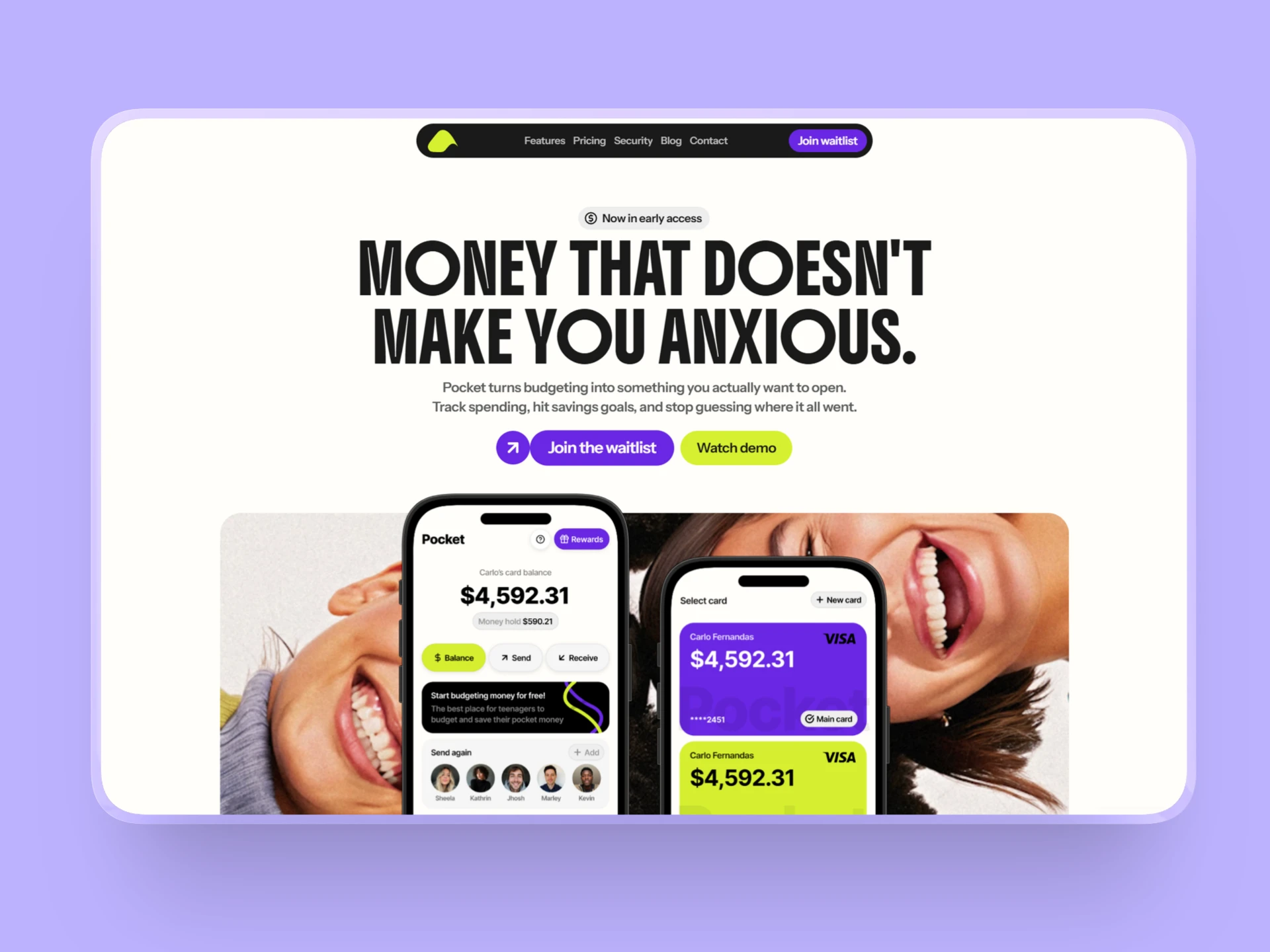
Pocket is a premium Framer template designed for modern fintech startups. The goal wasn't to create another banking landing page—it was to rethink how financial products can build trust without sacrificing personality.
Instead of following the typical "corporate fintech" formula, I explored a direction that feels approachable, memorable, and conversion-focused while remaining credible enough for financial products.
The Problem
After researching dozens of fintech websites and templates, I noticed the same patterns repeated everywhere.
Most products relied on nearly identical layouts, generic illustrations, and safe visual decisions. They looked professional, but they also felt interchangeable.
The biggest challenge wasn't making a website that looked trustworthy.
It was making one that people would actually remember.
Many fintech brands unintentionally communicate complexity instead of clarity. Heavy dashboards, dark interfaces, endless feature lists, and technical language often create distance between the product and the person using it.
For newer audiences especially, finance can already feel intimidating. Their first interaction with the product shouldn't make it feel even more complicated.
The Goal
Design a landing page that:
Builds trust without feeling overly corporate.
Feels memorable in a crowded fintech market.
Explains value through visuals instead of long paragraphs.
Creates a friendly first impression while maintaining credibility.
Is easy for founders to customize and launch inside Framer.
Design Approach
Trust through clarity
Rather than relying on dark enterprise aesthetics, I focused on strong hierarchy, generous spacing, and clear messaging. Trust comes from reducing friction, not simply using blue gradients.
Personality with purpose
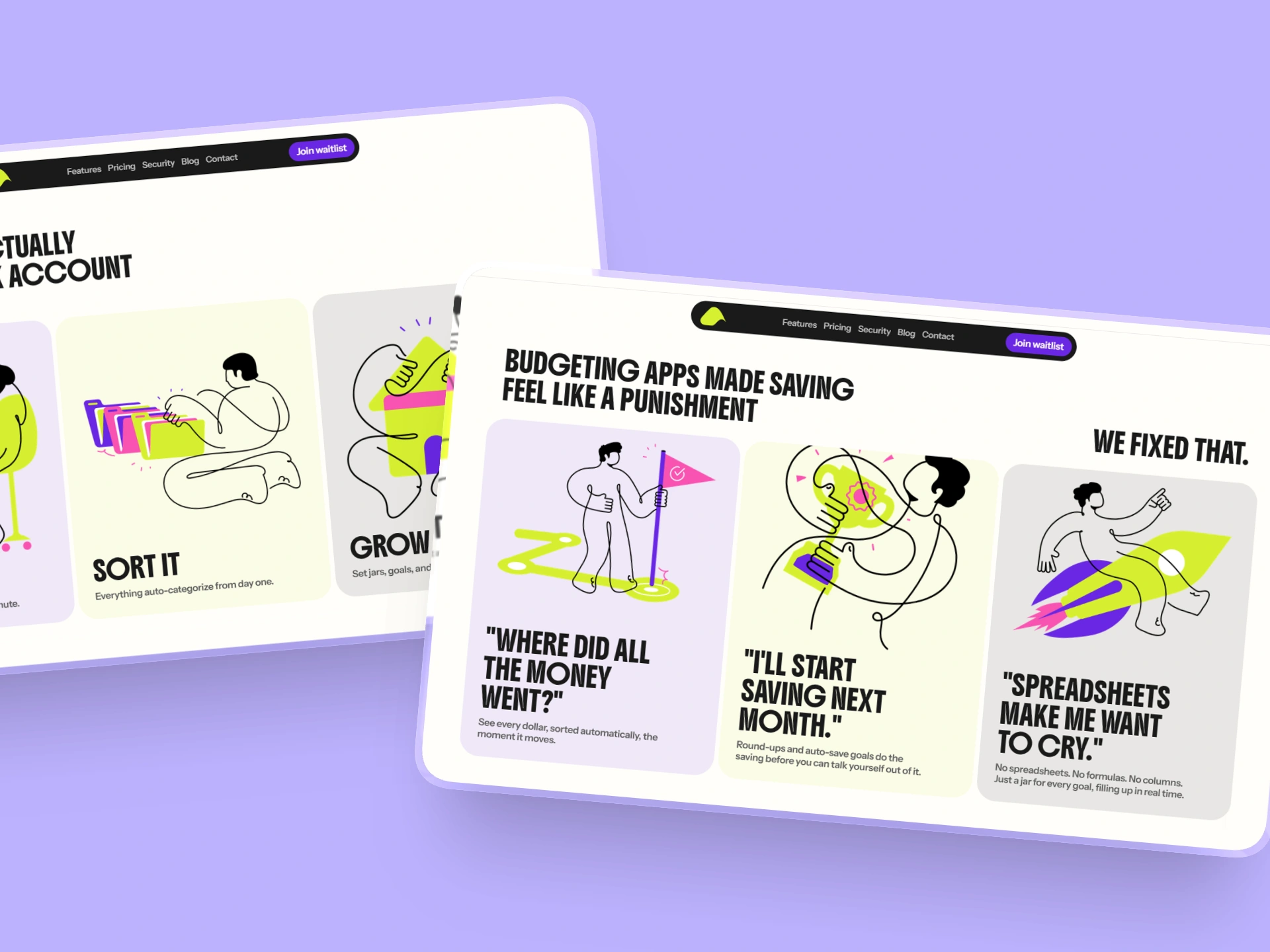
Every illustration, color choice, and interaction was designed to make the brand feel approachable. Personality wasn't added as decoration—it became part of the user experience.
Mobile-first thinking
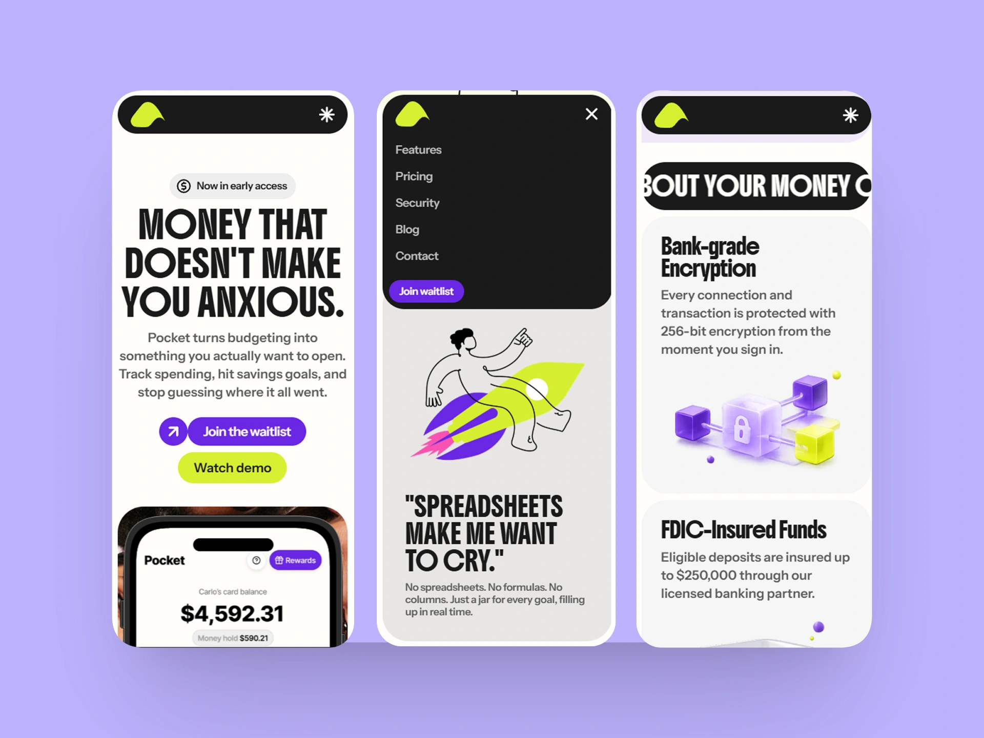
Since many fintech products are primarily mobile experiences, the template was designed around showcasing mobile screens naturally throughout the page instead of treating them as an afterthought.
Visual storytelling
Instead of listing features, the layout guides visitors through a story: the problem, the solution, the experience, and finally the reason to trust the product.
Solution
The final result is a Framer template that balances playful branding with a professional user experience.
Pocket includes:
A high-converting landing page structure.
CMS-powered sections for easy content management.
Fully responsive layouts.
Custom illustrations and polished UI.
Smooth interactions and thoughtful micro-animations.
Components that are simple to customize without touching code.
Every section was designed to reduce cognitive load while making the product feel modern and welcoming.
Outcome
Pocket demonstrates how thoughtful visual design can help financial products stand out in a saturated market.
Rather than competing by adding more features, it competes by creating a stronger first impression, communicating value more clearly, and making complex products feel approachable.
This project reflects my approach to design:
Create websites that don't just look good—they help products communicate, build trust, and convert visitors into customers.
Tools
Framer
Figma
Looking for a landing page that stands out?
If you're building a SaaS, AI, fintech, or startup product, I can help transform complex ideas into websites that are clear, memorable, and designed with conversions in mind.
Like this project
Posted Jul 31, 2026
Designed a unique, trust-building landing page for fintech startup Pocket.
Likes
0
Views
2