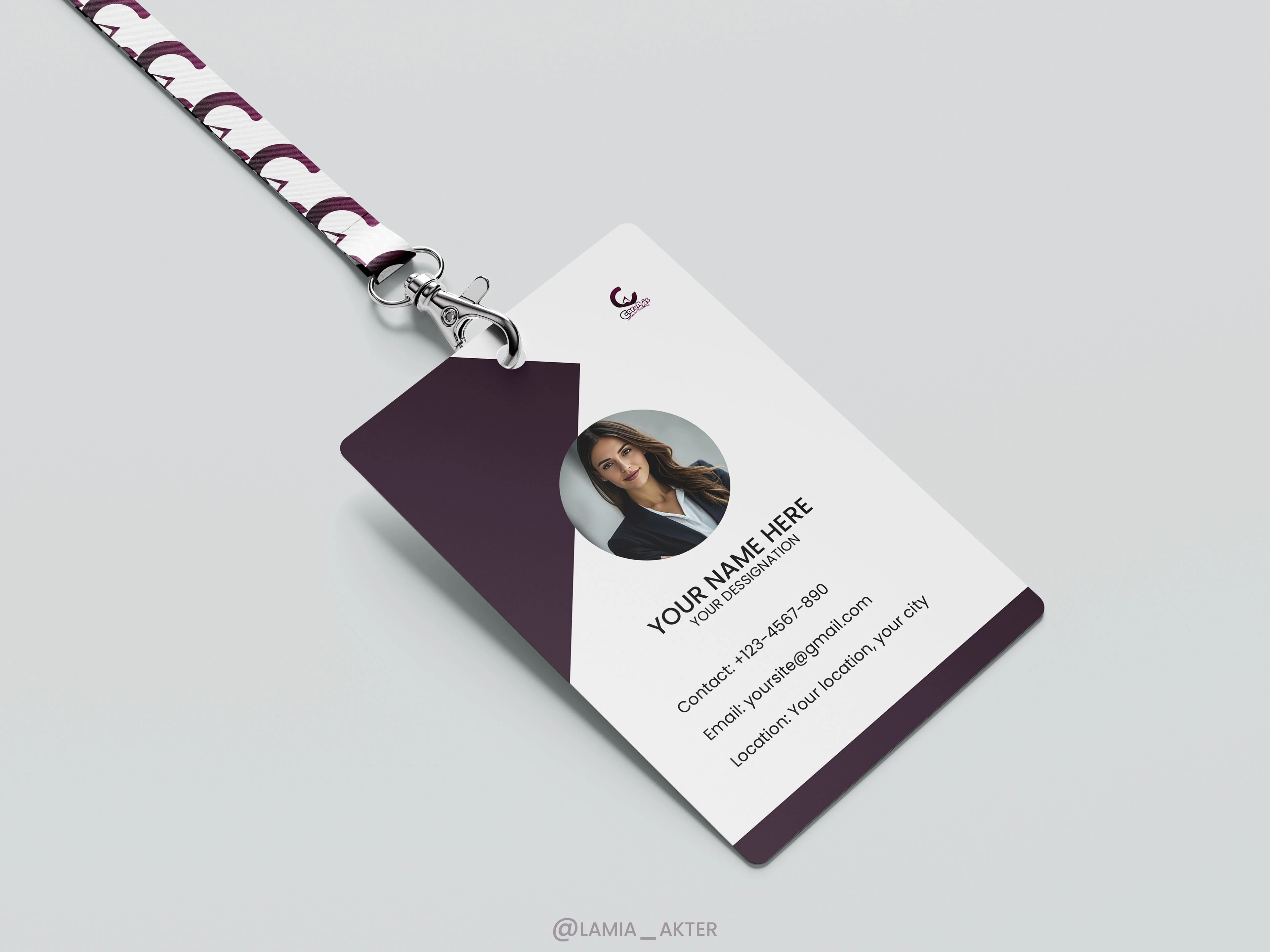
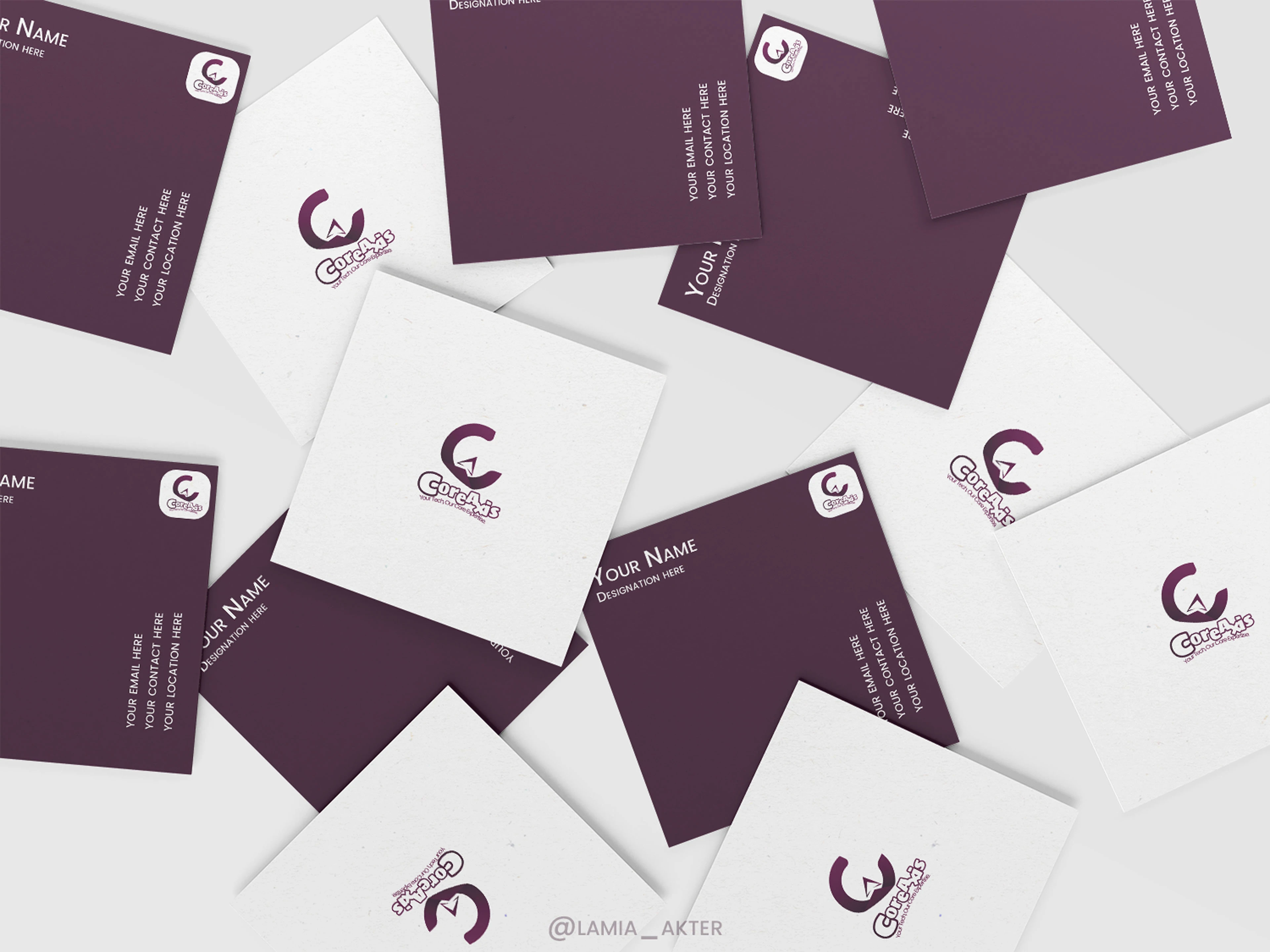
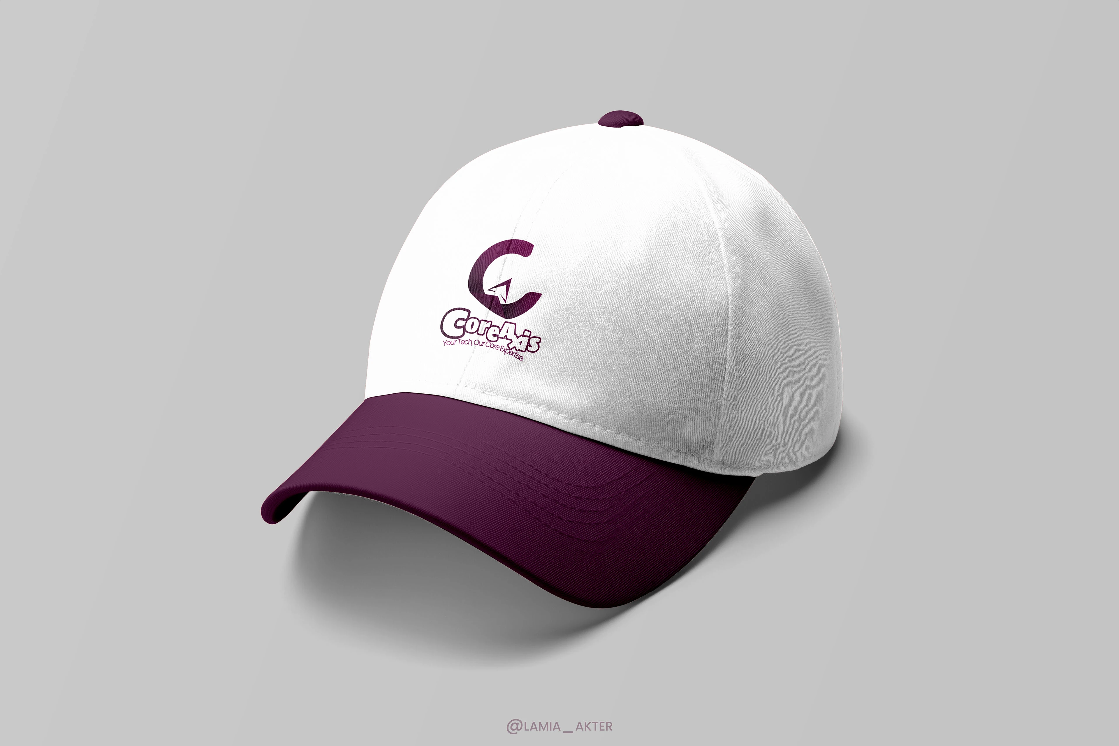
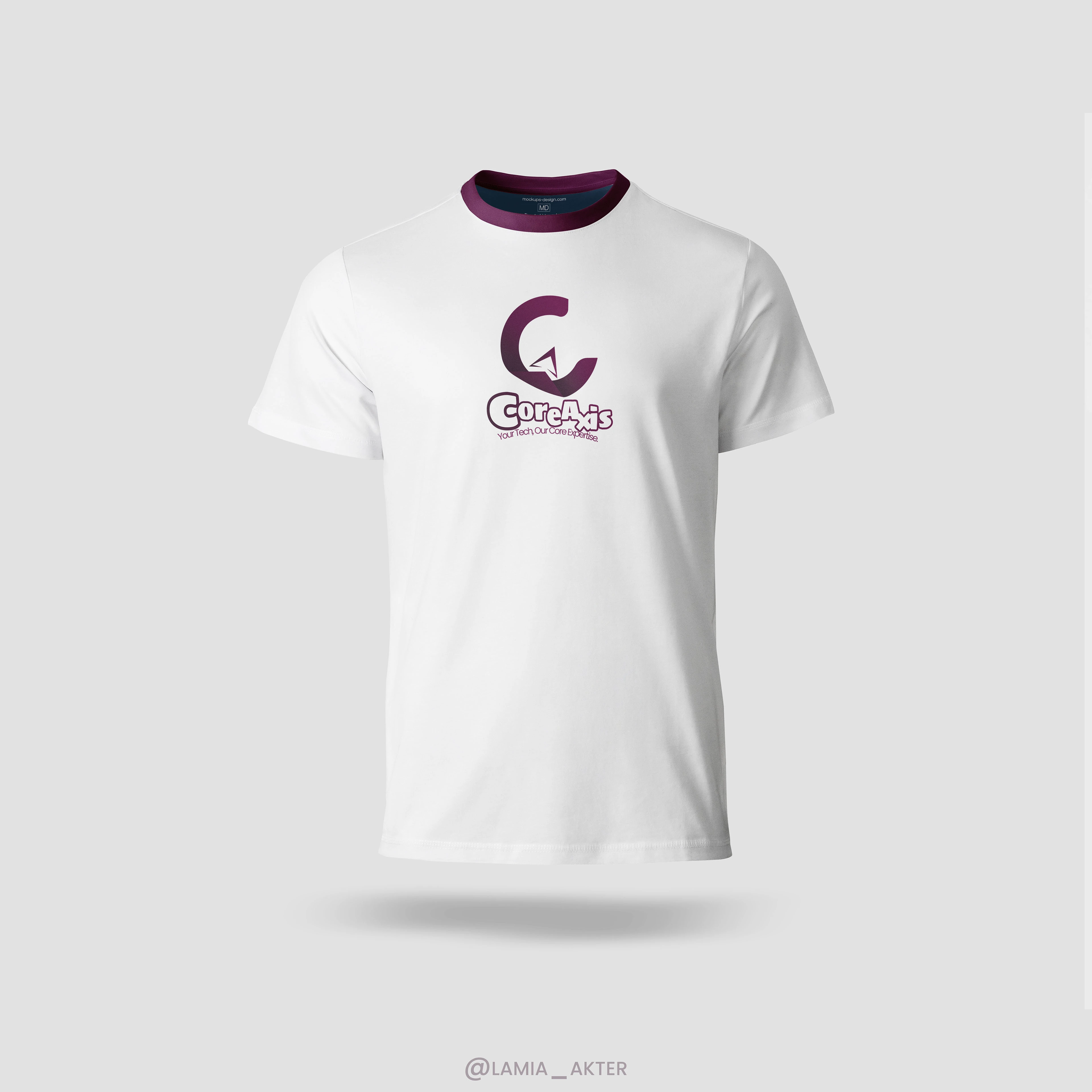
CoreAxis Logo
Lamia Akter
CoreAxis Logo
A Fusion of Innovation, Precision, and Growth
Logo Breakdown & Meaning
The CoreAxis logo is a seamless blend of the letters C and A, representing the brand's identity in a modern and dynamic way.
🔹 C as the Foundation – Forms a strong, stable base, symbolizing expertise and reliability.
🔹 A as an Arrow – Represents growth, movement, and technological advancement.
🔹 Gradient Colors – The deep purple-to-burgundy gradient conveys sophistication, innovation, and trust.
🔹 Minimalist & Modern Aesthetic – Balances stability and adaptability, essential in software development.
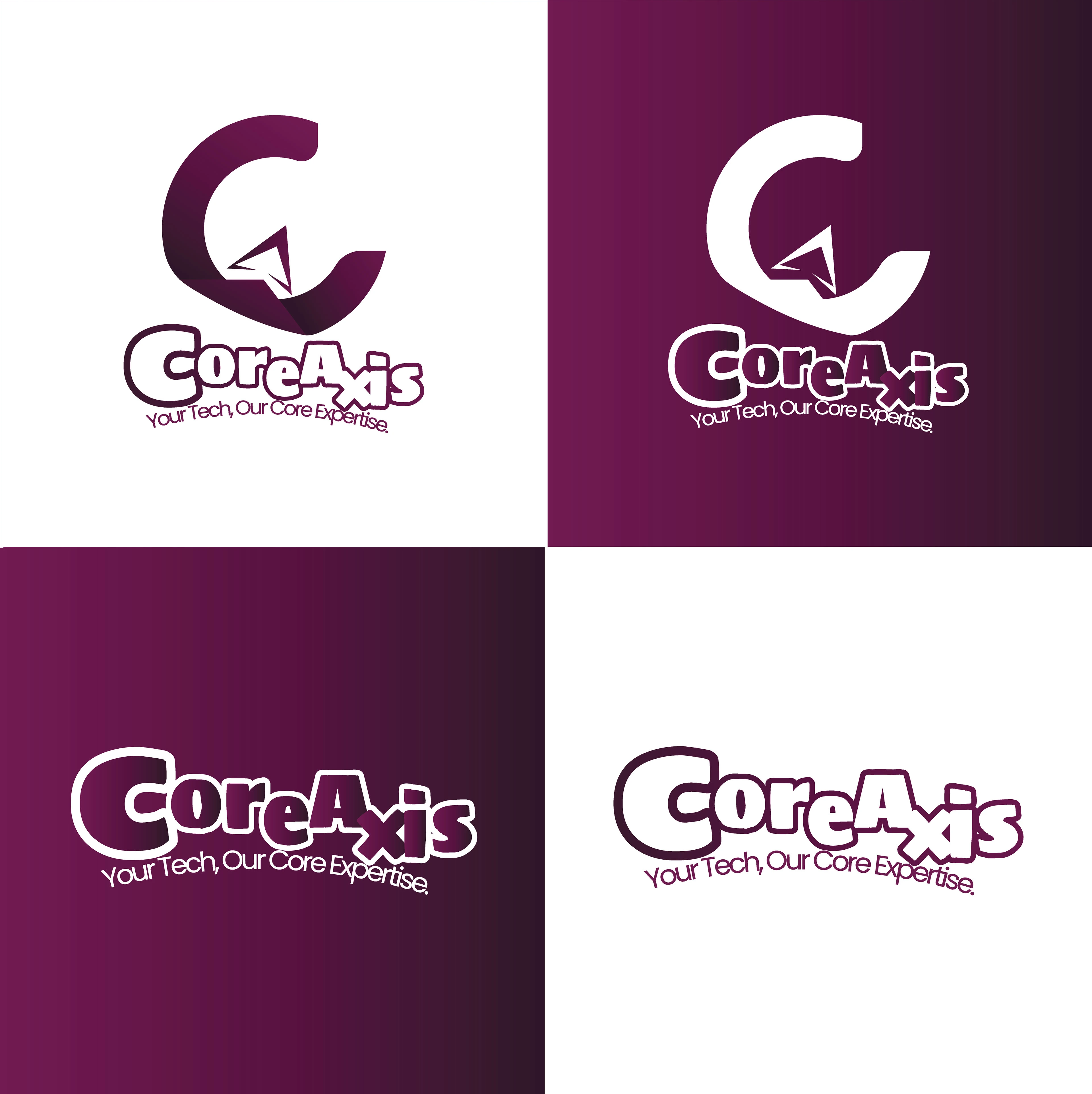
Brand Representation
"Core" – The circular C symbolizes a solid foundation in software solutions.
"Axis" – The arrow conveys direction and evolution, reinforcing CoreAxis as a leader in tech innovation.
Precision & Innovation – Sharp angles and clean lines reflect technical excellence.
This logo visually embodies CoreAxis’s mission: to provide solid, innovative, and forward-moving software solutions.

Like this project
Posted Mar 7, 2025
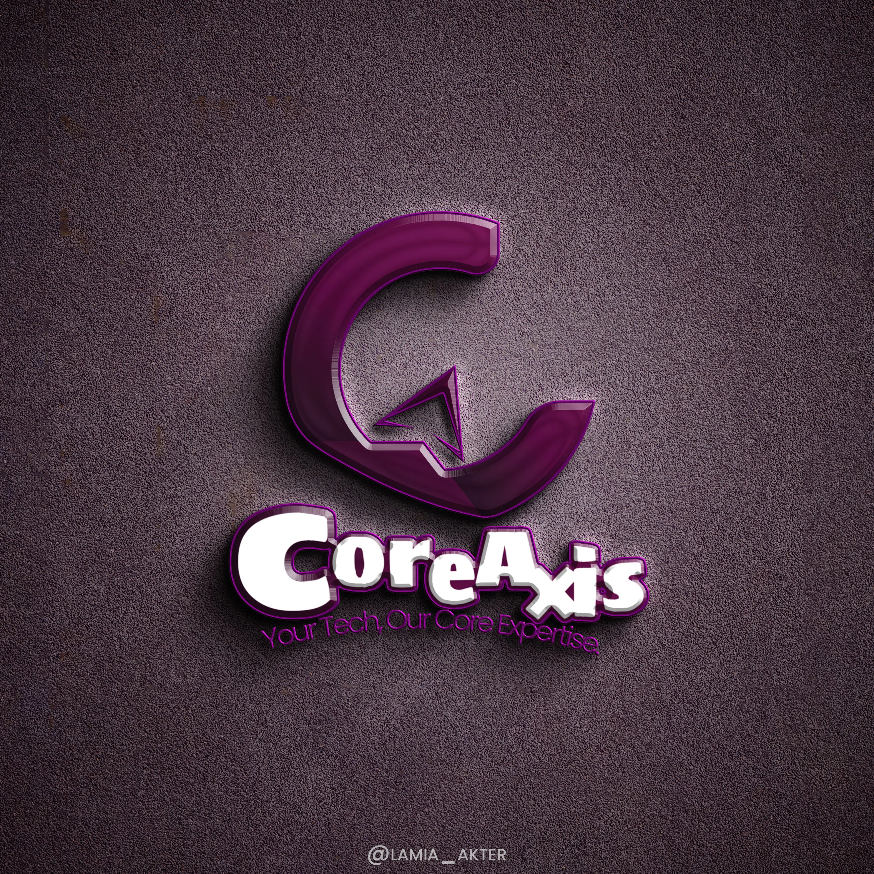
The CoreAxis logo merges C (stability) and A (growth), with a modern design and gradient colors, symbolizing trust, innovation, and technological excellence.