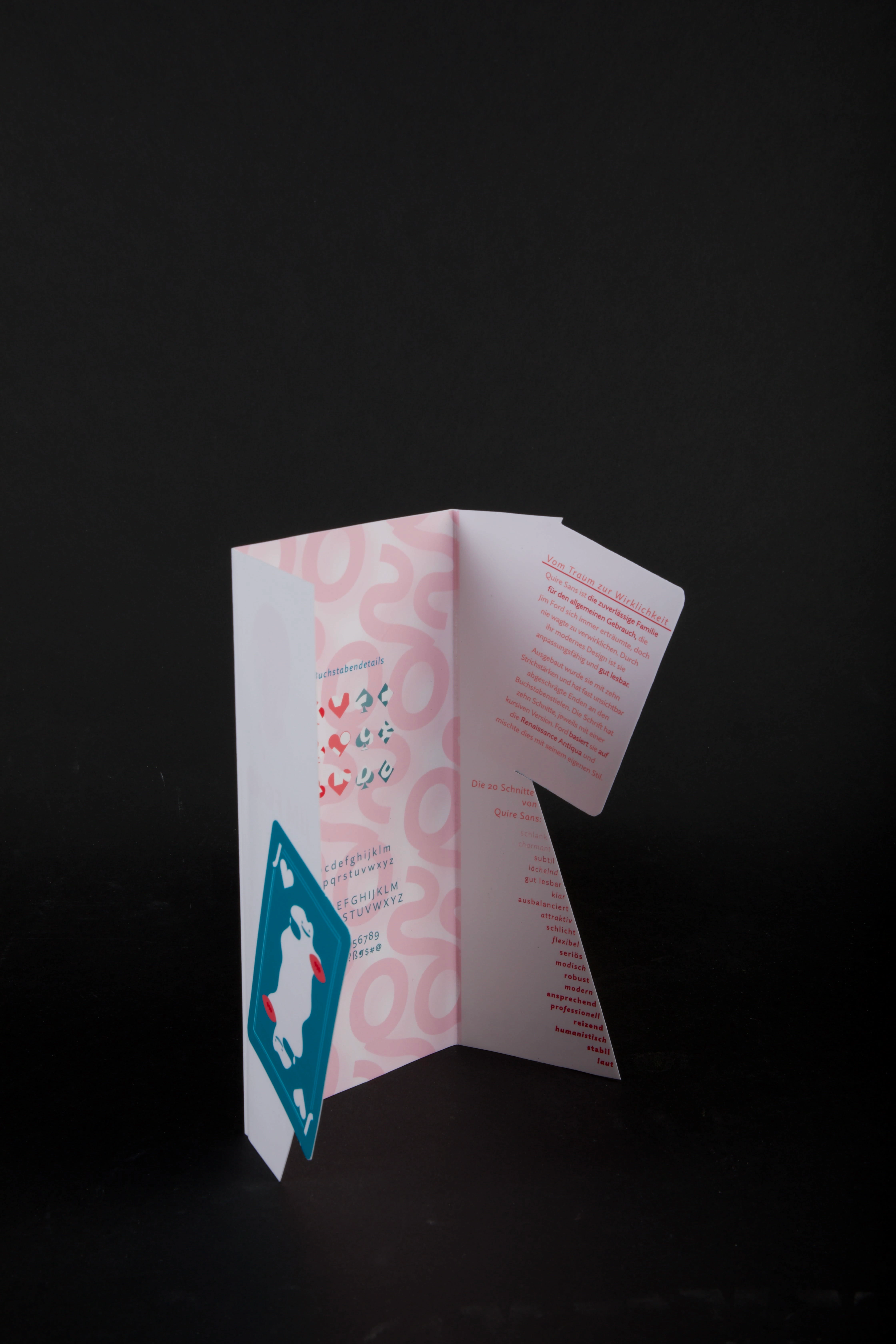
Quire Sans – Information Design
Kayla-Mariell Reyes
Project language: German
To showcase the various charming traits of the font Quire Sans (2014) by Jim Ford, a concept was developed: Ditto the Jack.
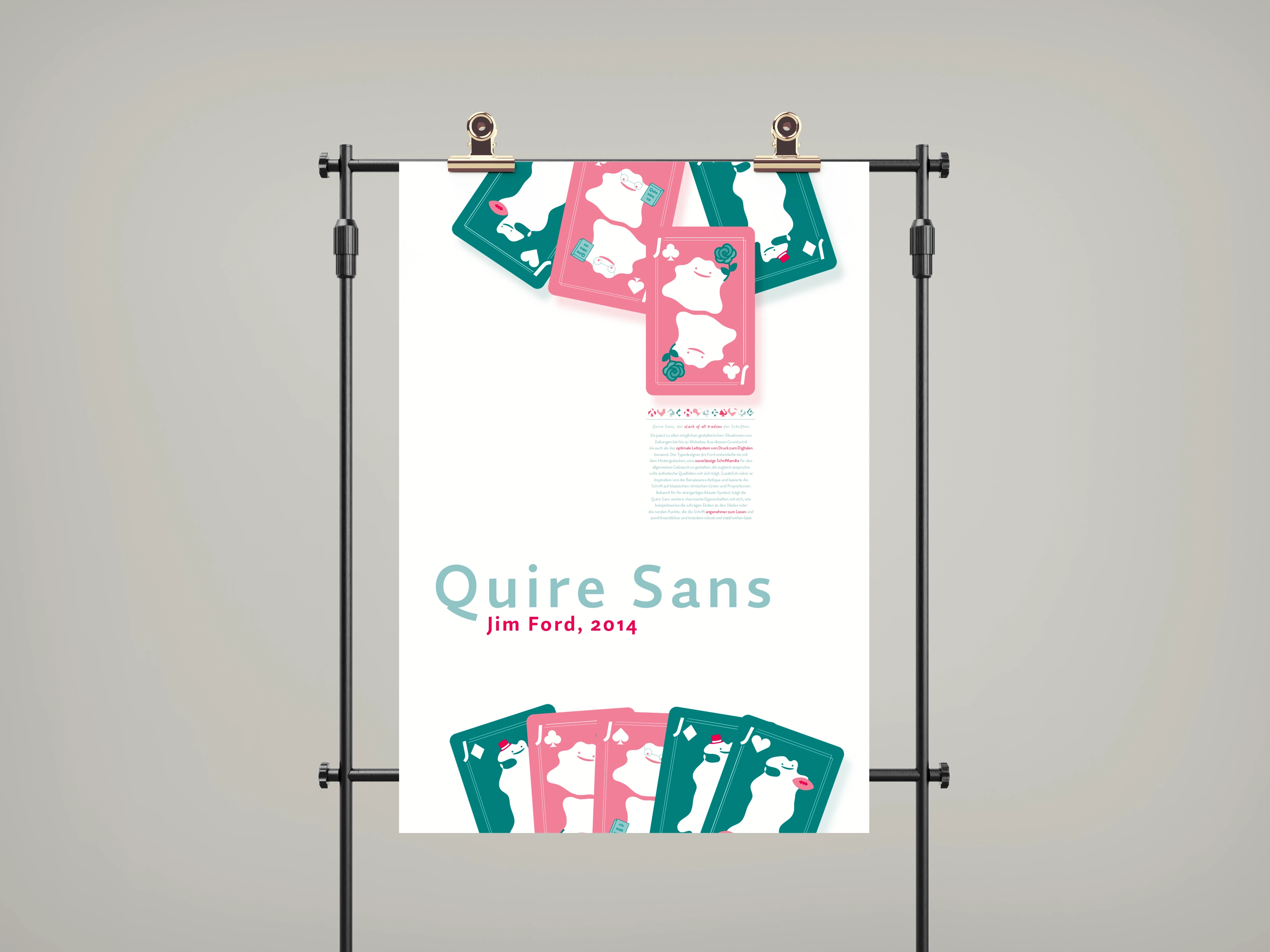
Poster depicting two people sitting across from each other playing cards
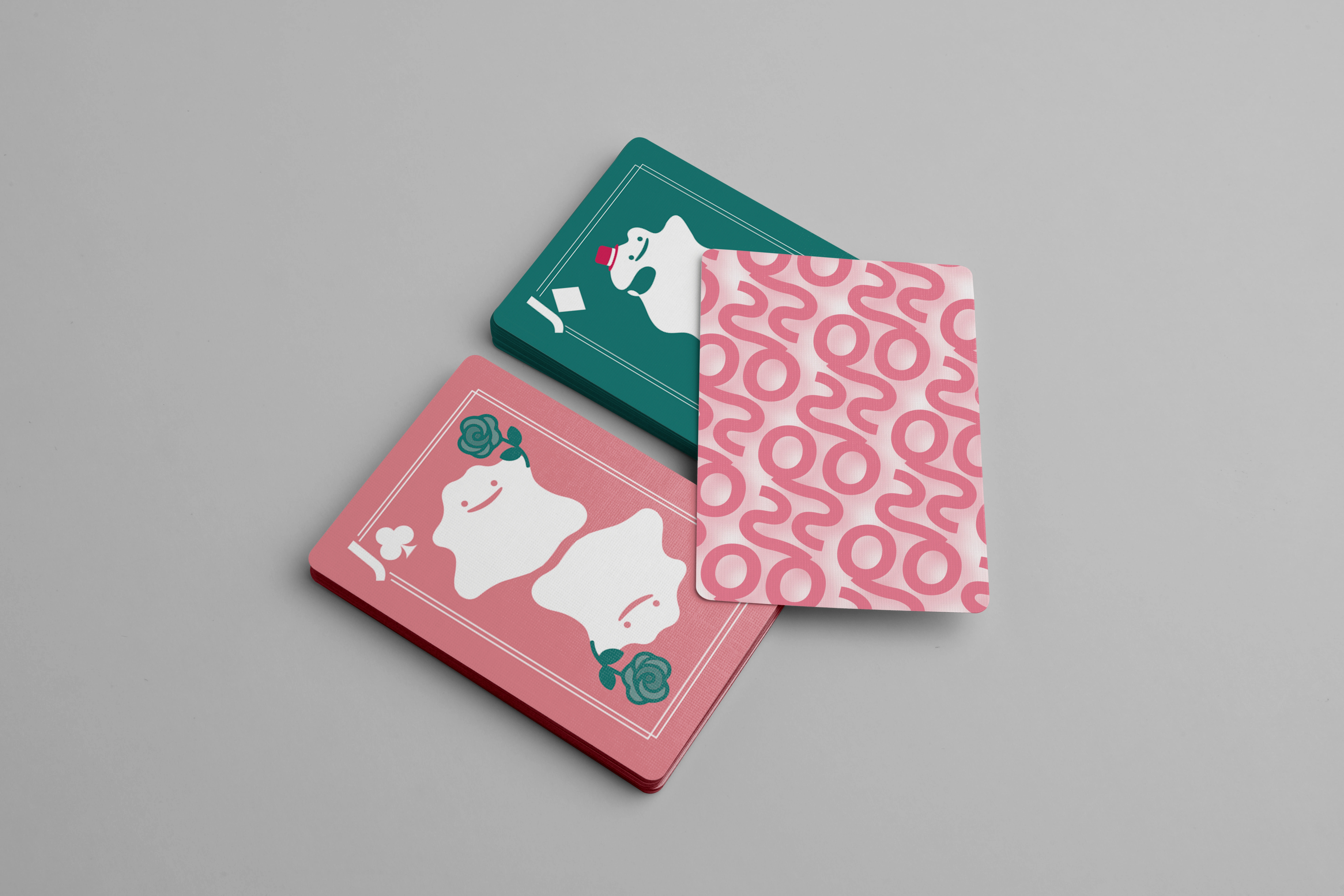
Quire Sans playing cards
The font was associated with a jack playing card, because it is suitable for both displays and prints – a jack of all trades. Additionally, due to this trait, the Pokemon named Ditto (a shapeshifter) was used as the face of the playing card to further depict its ability to be able to fit into every concept.

The little items that are being held by the Dittos each represent a characteristic of the font. For example the top hat stands for fancy because of the font's elegant curves. The rose stands for beauty, the football for playful and the book for classic.
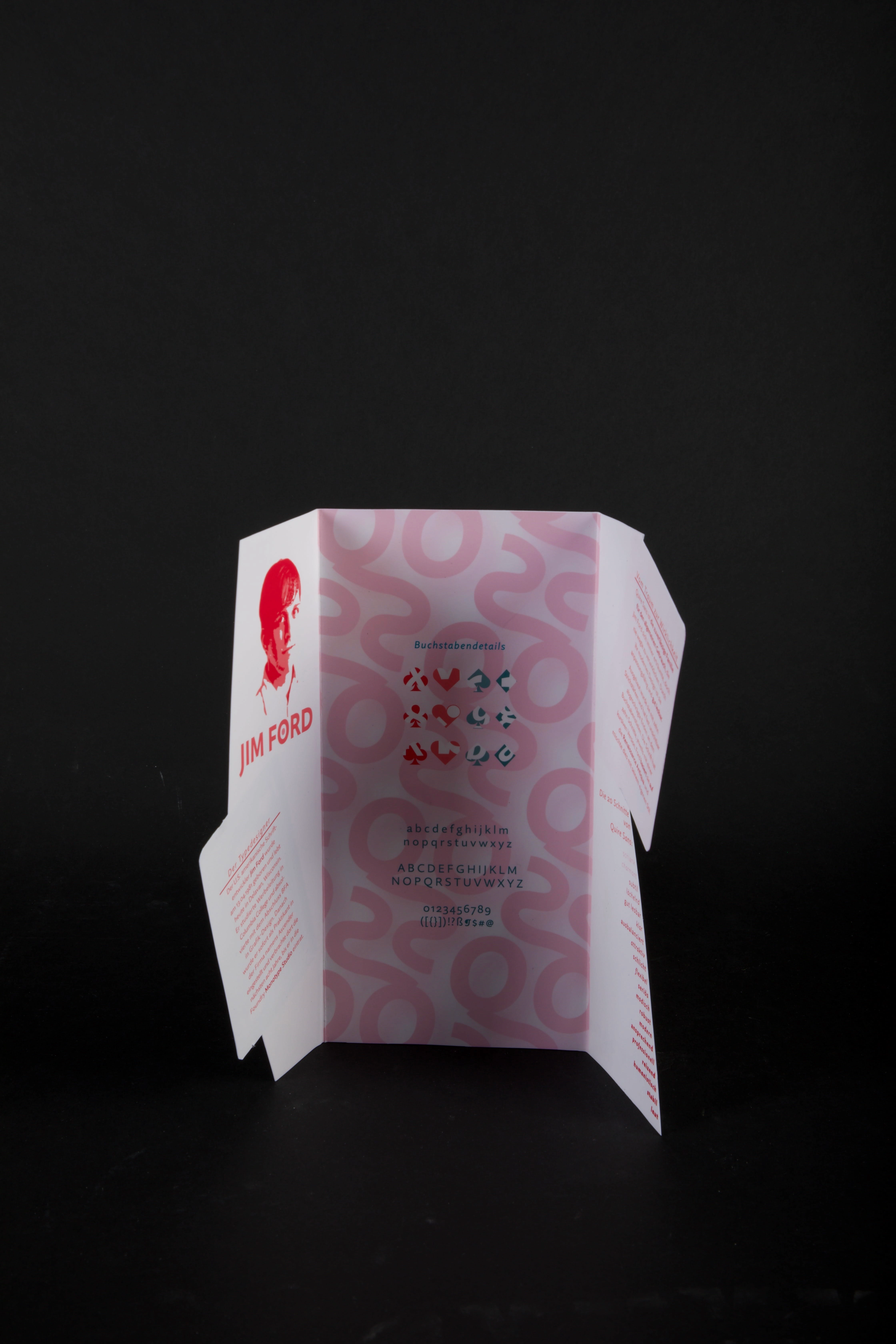
Brochure
Like this project
Posted May 9, 2023
Introduced the font Quire Sans (2014) by Jim Ford through posters, a brochure and a playful concept matching the energy of the font's characteristics.
Likes
0
Views
20