Telikin Computers Website Redesign
Robby Tuttle
Telikin Computers website redesign
7 min read
·
1 day ago
Project overview
Redesigning the Telikin website to be easier to use and senior-friendly, and to streamline online purchasing options.
Role
Lead Designer
User Research
Why?
Telikin is a simple, easy-to-use computer for seniors that thrives off of phone call sales for most of their orders. By redesigning the website, we can grow the user purchase rate on the web without the need for them to call and order with a salesperson. This would also lower sales call rates of potential customers, who call in with standard questions that can be answered on the website.
Project background
The target audience for the Telikin computer is senior citizens, many of whom do not know how to use computers. A more robust website would help tech-savvy customers, as well as customers’ kids and grandkids who want to check out the company to see if it’s a good fit for their parents.
Methodologies
User Research
Competitive Analysis
Roadmap:
User Research
Competitive Analysis
User Research
Overview
Five people were interviewed:
2 Senior citizens, ages 79 and 86
2 Adults, ages 60 and 63
1 Teenager, age 17
One interview was conducted over Zoom; all others were conducted in person.
Key Findings
Overwhelming pages with too much information dumped on them.
Checkout made difficult with too many options.
Seems sketchy and outdated.
Competitive Analysis
Personas
Persona 1: Helen Mitchell
Age: 81
Occupation: Retired Schoolteacher
Tech Comfort Level: Low
Location: Sarasota, FL
Background:
Helen lives alone but regularly video chats with her children and grandkids. She heard about Telikin through a TV ad and is interested in having a simple computer to email, browse photos and occasionally video call family. She has never bought anything online and usually asks her daughter for help when needed.
Goals:
Understand what Telikin does in plain, simple language
Feel secure and confident while browsing the website
Easily find a way to order the computer (preferably via phone or simple checkout)
Avoid confusing tech jargon
Frustrations:
Gets overwhelmed by too much text or flashing graphics
Doesn’t trust websites that “look old” or cluttered
Can’t tell which model or version is right for her
Gets confused by multiple checkout options or upsells
Needs from the Telikin Site:
Clear call-to-action (“Call Now” or “Buy Now”)
Large, legible text and buttons
Visual step-by-step instructions
Reassurance that she’s buying from a trustworthy source
👨👧 Persona 2: Jason Rivera
Age: 42
Occupation: IT Consultant
Tech Comfort Level: Expert
Location: Denver, CO
Background:
Jason is researching Telikin for his aging father, who struggles with using regular computers. Jason wants to ensure that the product is as senior-friendly as it claims. He’s doing all the research and will likely be the one purchasing it online.
Goals:
Quickly assess if Telikin is worth recommending
Easily compare features and pricing
Locate tech specs and compatibility with internet services
Easily complete an online purchase on behalf of his father
Frustrations:
Outdated or vague product information
Slow or nonresponsive website
No clear breakdown of what makes Telikin better for seniors
Lack of trust signals (reviews, certifications, support contact)
Needs from the Telikin Site:
Trustworthy, modern design that offers reassurances
Ability to easily compare models
Fast checkout without unnecessary steps
Contact info or chat option if more questions arise
The main problem
Online checkout seems to be the issue most struggle with. Checkout combined with outdated and confusing graphics and information dumps make the customer feel uneasy and reluctant.
UX Design
Project Goals
Project Goals Description
The project goals represent the intersection between business needs and user needs, ensuring the redesign benefits both sides. The focus is on improving the overall experience by making the website more intuitive, efficient, and user friendly while supporting the company’s objectives.
Key goals include:
Make navigation easier — Simplify the site structure so users can quickly find what they need, reducing frustration and increasing efficiency.
Provide clear, easy to read information — Present content in a straightforward and digestible way, eliminating clutter and confusion.
Streamline checkout — Design a smooth, hassle-free purchasing flow that makes transactions faster and easier for both the user and the business.
Together, these goals balance usability with business growth by reducing barriers to purchase, minimizing unnecessary communication steps, and creating a professional, accessible online presence.
User Flows:
User Flow
Problem
The original website made it difficult for users to find information quickly, compare products, and complete purchases without assistance from sales. This led to friction in the buying process, unnecessary sales calls, and lost opportunities for fast conversions.
Flow Overview
The redesigned user flow was created to simplify navigation, reduce clutter, and provide a clear path toward conversion.
Homepage → Main Navigation
Visitors land on the homepage and are directed to clear navigation options.
User Navigation Choice
From here, users can decide their next step:
About Us section — Learn about the company, values, and credibility.
Products section — Browse offerings and explore product details.
Contact section — Access contact information or reach out for assistance.
Product Exploration & Decision
Within the Products section, users can view details for any product.
If ready to purchase, user proceeds to Buy Online, seemlessly completing their order.
Conversion Paths
Direct Purchase: Complete checkout online, leading to Purchase Completion.
Contact Sales: Submit an inquiry for more details, which can also result in purchase completion after interaction with sales.
Outcome/Impact
This streamlined user flow supports multiple user intents — whether browsing, learning, or buying — while ensuring business goals are met.
Users experience easy navigation and a clear path to purchase.
The business benefits from fewer manual sales interactions and faster conversions.
The flow balances self-service convenience with the option for personalized support, increasing overall usability and satisfaction.
Information Architecture:
Wireframes
Low-fidelity wireframes exploring the basic layout, structure, and flow of the design. Focused on user journey, content placement, and functionality rather than visual style or final aesthetics.
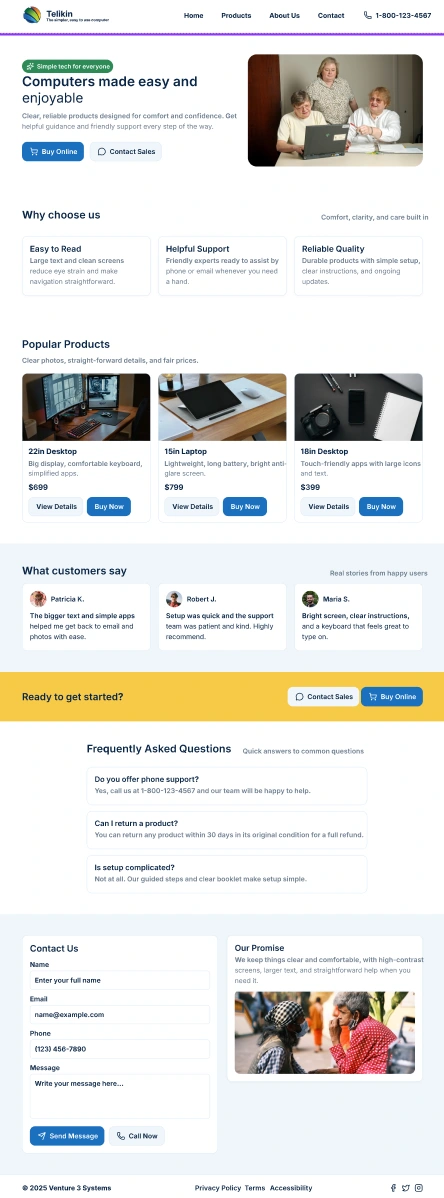
High-Fidelity Screens
Try out the rough prototype!
https://www.figma.com/proto/vmHR1lGLPWNIqgNWBnAtys/Telikin-Good?page-id=0%3A1&node-id=6003-2597&p=f&viewport=248%2C310%2C0.32&t=yvx6A4z8Tss2Ujlc-1&scaling=contain&content-scaling=responsive
Usability Testing
I had the target market users try out the new prototype I created with the finished designs. I chose to keep everything minimal as to the goal of the project. No flashy animations, no confusing work flows, just simple and straight to the point.
Here are the outcomes:
Outcomes
Overall usability testing went great! All users were able to successfully navigate the website and find out the information they would be looking for.
Key Takeaways
Challenges
Designing for multiple audiences: Seniors with limited tech comfort needed extremely simplified layouts, while their adult children (often the actual purchasers) wanted detailed product information and modern trust signals.
Balancing simplicity with credibility: Too little information felt untrustworthy, but too much created overwhelm for seniors, so finding the right balance was critical.
Outdated brand perception: The old site’s design felt “sketchy” to users, lowering trust. Updating visuals without alienating non-tech-savvy seniors was a key challenge.
Streamlining checkout: The original flow had too many steps and options, which frustrated seniors and discouraged online orders.
Lessons Learned
Clarity beats complexity: Seniors responded far better to large, legible text, step-by-step instructions, and simple calls to action than to marketing-heavy or cluttered layouts.
Trust is everything: Small design details like modern typography and visible contact information greatly improved users’ confidence in purchasing online.
Multiple user paths are essential: Allowing both “self-serve” checkout and “contact sales” flows supported different comfort levels, reducing friction while preserving conversions.
Research diversity pays off: Testing across seniors, middle-aged adults, and even a younger user revealed how decisions were often influenced by family, not just the end user.
Minimalism works: Avoiding flashy animations and focusing on straightforward navigation proved far more effective for this audience than over-designing the interface.
Like this project
Posted Sep 23, 2025
Redesigned Telikin's website for senior-friendly use and streamlined online purchasing.
Likes
0
Views
1
Timeline
Sep 1, 2025 - Ongoing