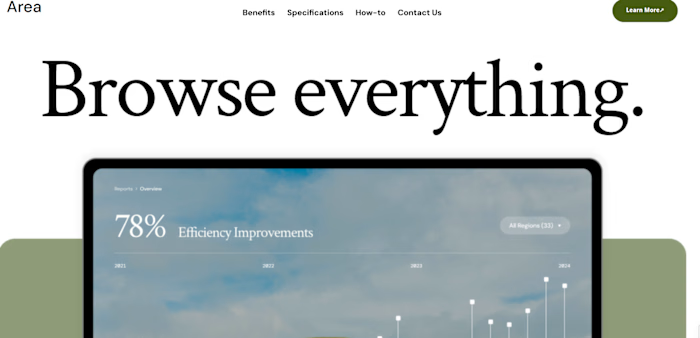
AI Tools Platform

Daniela Ivanova


This is a self-initiated project where I took a SaaS landing page design from Figma and built it out as a fully responsive site in Webflow.
The Challenge
The design featured a layered background with multiple decorative elements that needed precise positioning. Getting these elements to sit correctly across different screen sizes was the most time-consuming part of the build — not because any single piece was difficult, but because each one had to be placed accurately relative to the Figma design and then adapted for every breakpoint.
Desktop

AI Tools Platform — Full desktop view
Approach
I worked to match the Figma design as closely as possible, while accounting for the natural resolution differences between Figma and Webflow. Pixel-perfect replication isn't always realistic between the two tools, so I focused on preserving the design's intent — its spacing system, typographic hierarchy, and overall aesthetic.
On the structural side, I kept my class naming clean and organized so the build stays maintainable and easy to hand off. Responsiveness was handled breakpoint by breakpoint, adjusting layout, spacing, and typography where needed.
Tablet
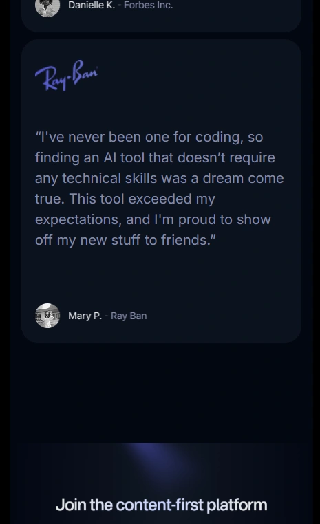
AI Tools Platform — Tablet view
Mobile

AI Tools Platform — Large mobile view

AI Tools Platform — Small mobile view
Background Elements — Close-Up
The trickiest part of this build was positioning the decorative background elements. Here's a closer look at how they sit in the final build:

Background elements detail — hero section

Background elements detail — mid section

Background elements detail — lower section
Result
The final build is a fully responsive site that stays true to the original design across devices. The spacing system is consistent, typography scales properly, and the background elements are adapted to look right at every breakpoint while staying close to the Figma source.
Like this project
Posted Jun 16, 2026
A self-initiated SaaS landing page built in Webflow from a Figma design, with a focus on precise background element positioning and clean responsive adaptation across all breakpoints.
Likes
0
Views
3