Pesa Website Redesign for Enhanced User Engagement

Ozenua Framer 🚀


Overview:
Pesa is a fast-growing fintech platform that makes it simple for users to send, spend, and save money across borders. While the app offered powerful features, such as international transfers, smart savings, and business tools, the website wasn’t fully communicating its value, nor converting visitors into app users at scale.
Goals:
This redesign project set out to reposition Pesa as more than a remittance app, showcasing it as a complete financial ecosystem built for everyday people and businesses alike. The goal was to create a website experience that drives app downloads, builds trust, and highlights Pesa’s global reach, all while reflecting the brand’s premium yet approachable identity.
Timeline: 48 hours
Cost: $1200
Deliverables: Functional landing page design on Figma and Framer
Approach:
To deliver a solution that was both creative and functional, I began by examining the competitive landscape, studying leading fintech players to understand what worked and where Pesa could stand out. This informed a design direction that aligned with Pesa’s brand values, positioning it as approachable, personal, and user-centric.
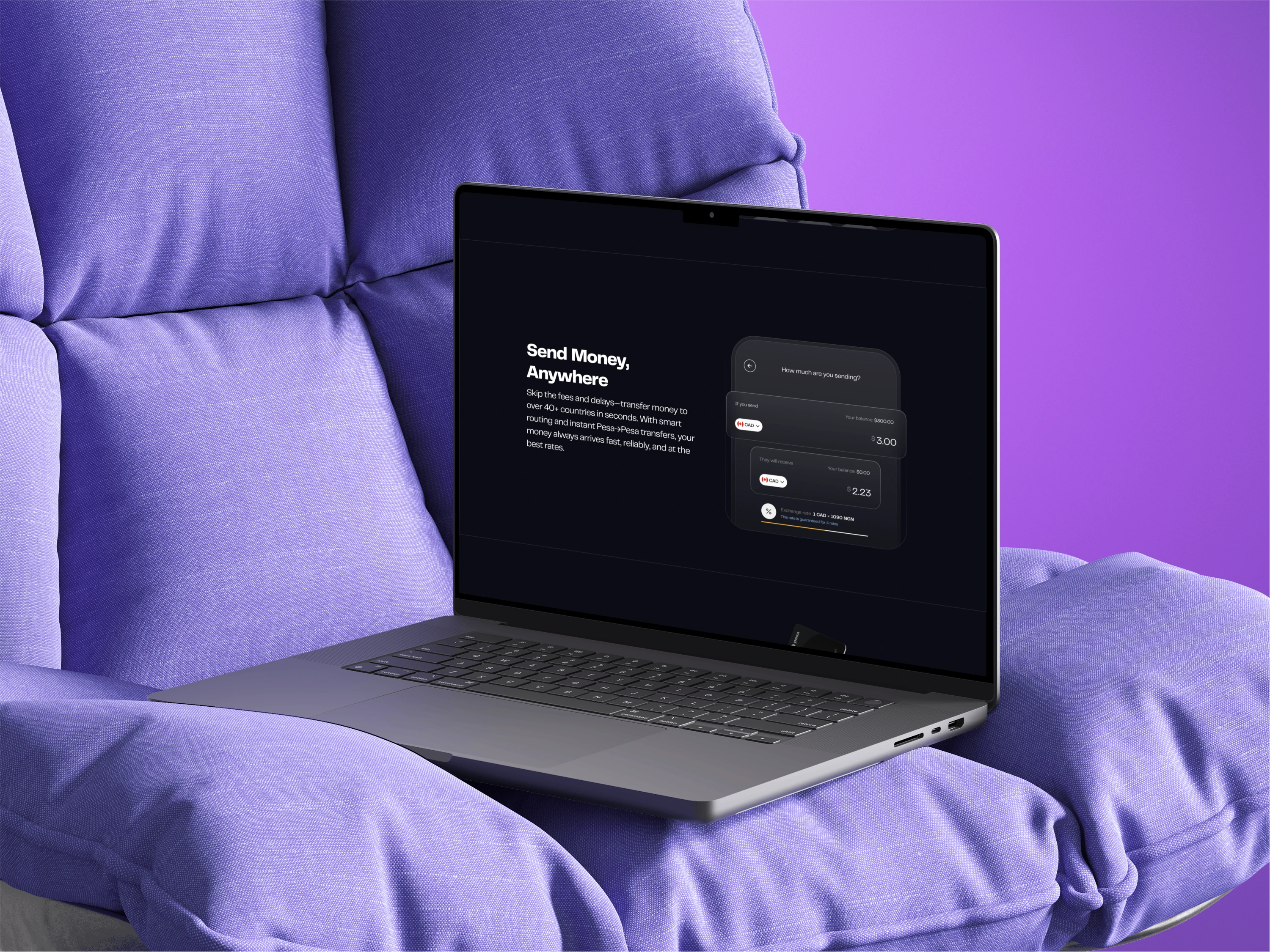
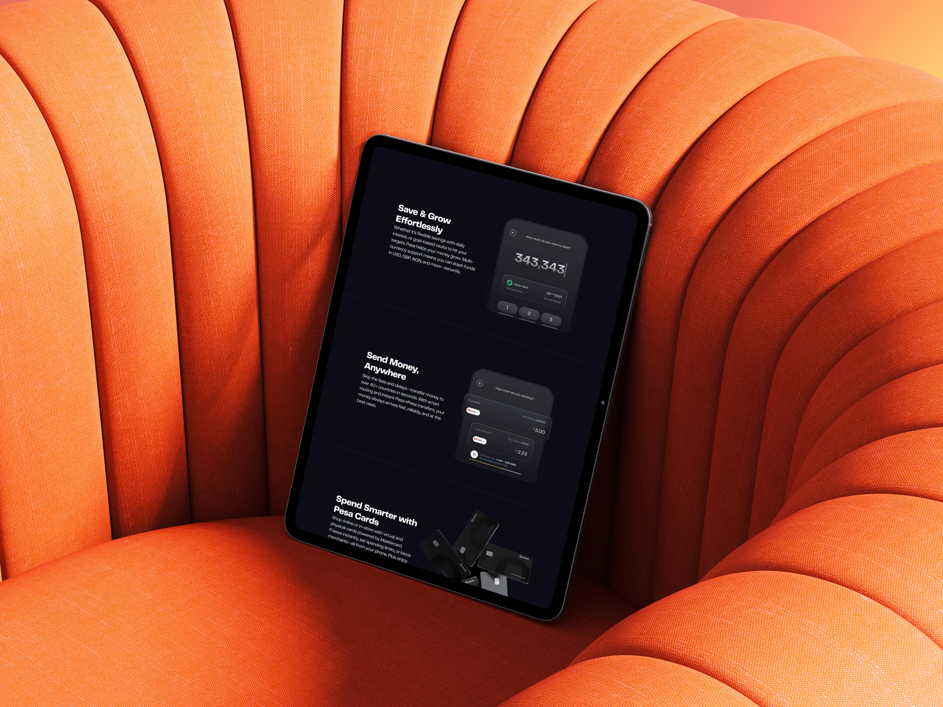
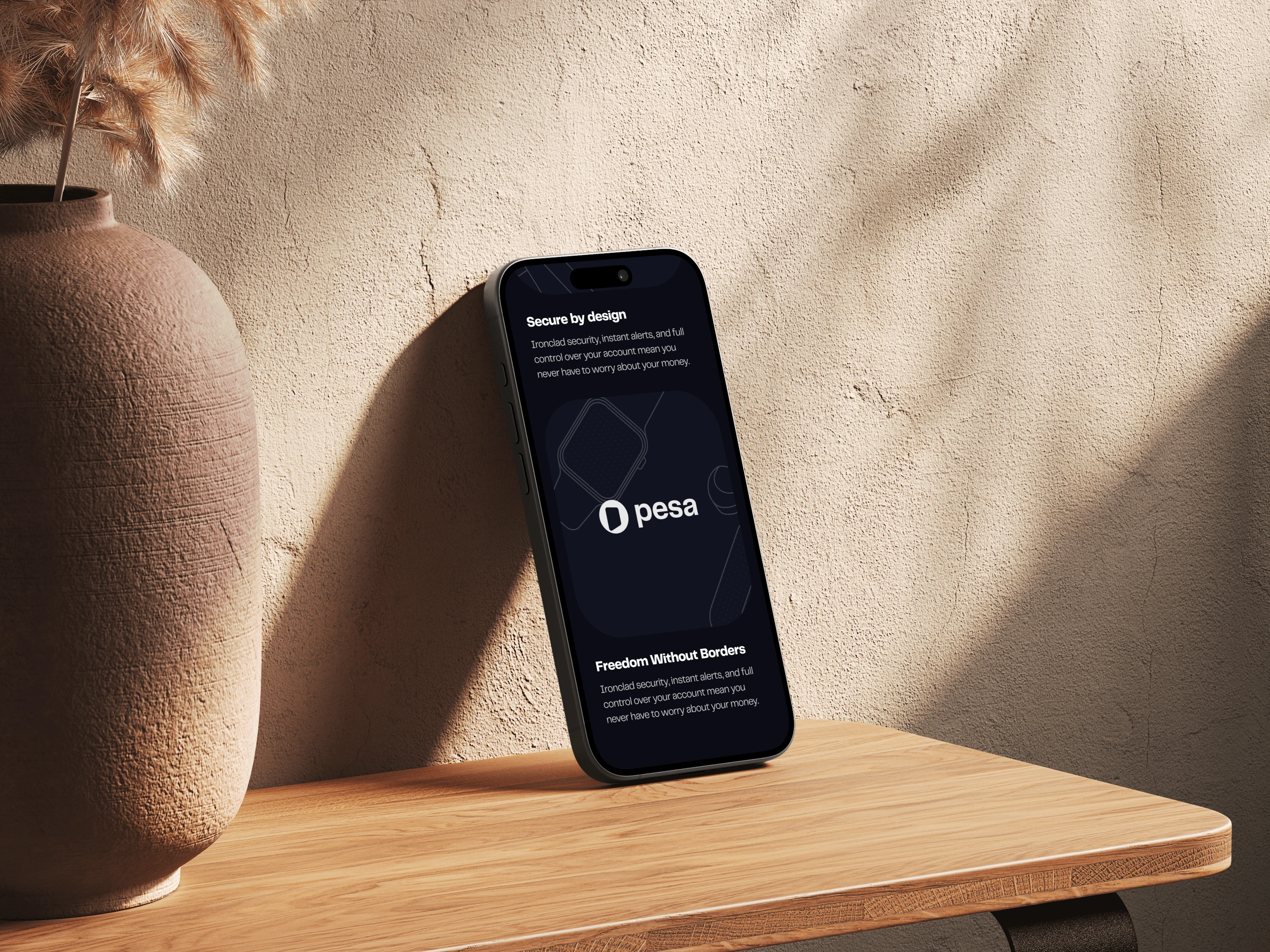
A key part of the creative strategy was introducing a new line-illustration style, giving the interface a modern yet relatable feel. This visual language reinforced the idea of Pesa being “personal and close to me,” making the platform feel less like a financial tool and more like a trusted companion.
Implementation:
The design process took place in Figma, where I explored multiple directions, refined user flows, and ensured a smooth balance between clarity and emotional connection. Once the design system was established, I transitioned into Framer for implementation. Leveraging Framer allowed me to bridge the gap between designer and developer, turning static visuals into an interactive experience while maintaining pixel-perfect fidelity.
By combining expert design thinking with hands-on implementation, I was able to create a solution that not only elevates Pesa’s brand but also empowers users with a seamless and engaging digital journey.

Outcome:
The redesign delivered measurable impact for Pesa, validating both the creative direction and technical execution. By aligning the brand with a more personal, user-centric design and implementing it seamlessly in Framer, the project achieved:
📉 60% reduction in churn — more users stayed engaged after signing up.
📉 15% decrease in bounce rate — visitors spent more time exploring the site.
📈 2,000+ new downloads in just 4 weeks — proving the redesigned funnel drove real conversions.
These outcomes not only boosted adoption but also strengthened Pesa’s position as a trusted, modern financial platform.
Let's start working on your next project
Like this project
Posted Sep 30, 2025
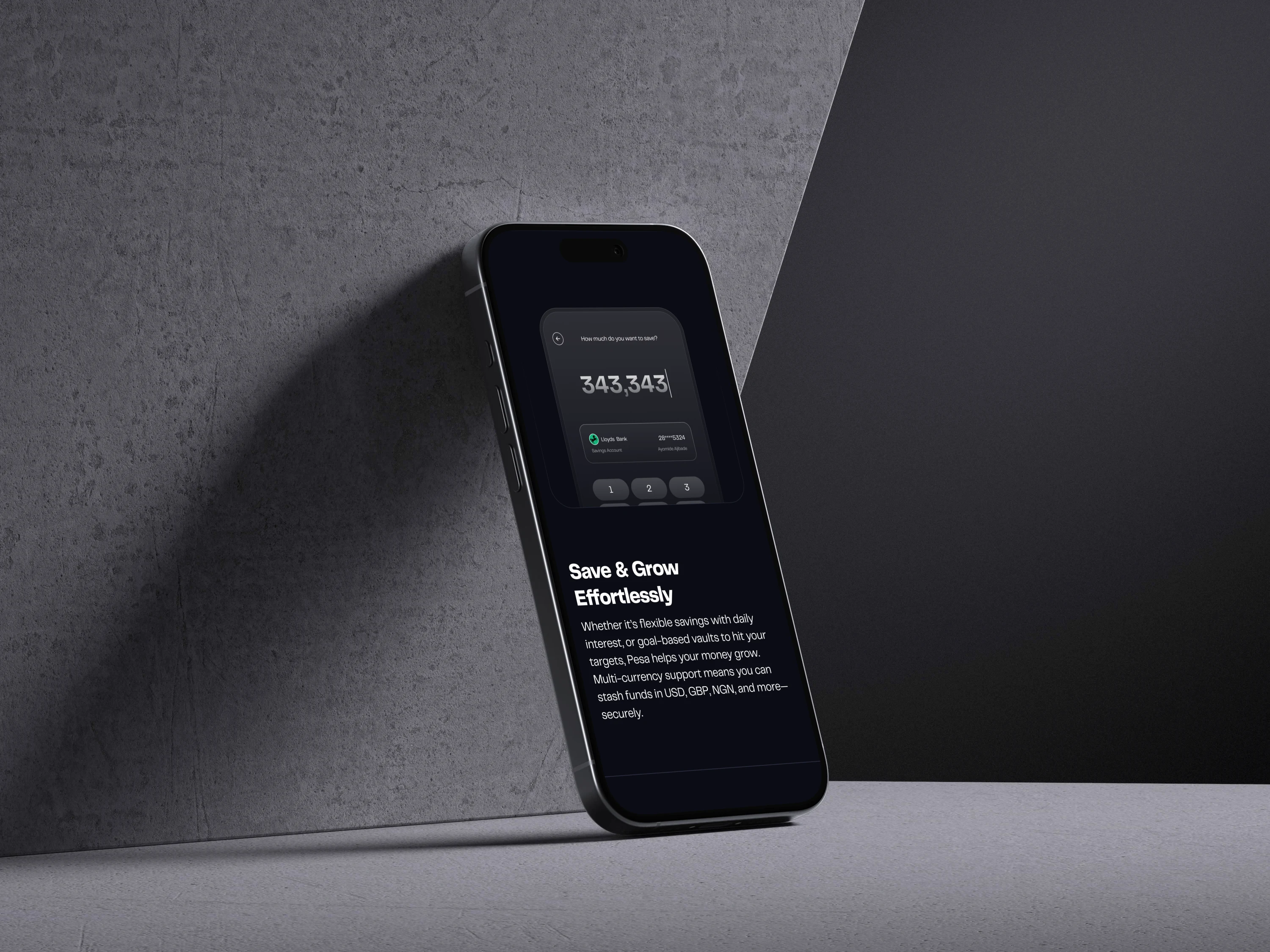
Pesa is a global financial service. I redesigned Pesa's website to boost app downloads and user engagement. Using a new visual style that aligns with the brand.
Likes
9
Views
95
Timeline
Sep 25, 2025 - Sep 29, 2025
Clients
Pesa


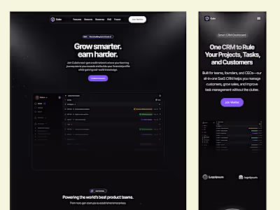
Framer - Creative Studio Landing Page
Studio Basee Website Transition and Redesign
Pody Web3 Platform UI Redesign
Cube Template Development