Match Realty Website Redesign for Enhanced UX
Rifqi Zufar
Hi Everyone! A new redesign is finally here.
Match Realty is a website to buy or list a home with 24/7 expert support. Their current website isn't applying UX principles, causing usability issues and hard navigation for users.
So I decided to do quick evaluation with the heuristic evaluation method, analyzing the common mental model for real estate buyers, and applying some UX laws like Hick's, Jakob, & Miller's laws.
Problem Background
Match Realty website has so many usability issues, causing the website is hard to navigate and potentially led user to be overwhelmed which can be resulting a bounce rate.
Solution
Addressing this problem can be initiated with heuristic evaluation method, a tools like a rules of thumb founded by Don Norman, the father of user experience design.
Using his methodologies, I found these issues on Match Realty websites.
The navbar overlaps the background, making the important message unclear
Generic heading hook, causing potential users to lose interest.
Search bar feels like a break line, making it looks less important.
The CTA button on hero section is too far from the action-driving message, disrupting the reading flow and making it less effective for user engagement.
Inconsistent emphasis on listing information may lead to user confusion.
Poor visual hierarchy makes listing section overwhelming, adding cognitive load.
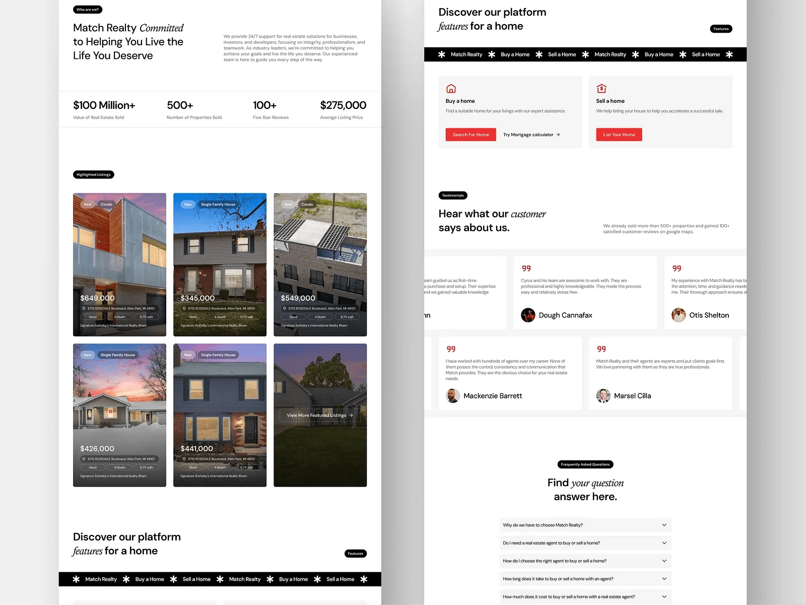
CTA better placed on bottom section because we need to build user trust first on each section to create climax effect on bottom section.
More Listings CTA are to small and has a bad contrast, make it hard for user to realize.
Discount price colour on the listing card is not contrast with the background.
About section seems like to tell about Match Realty value but it is not well served and not engaging.
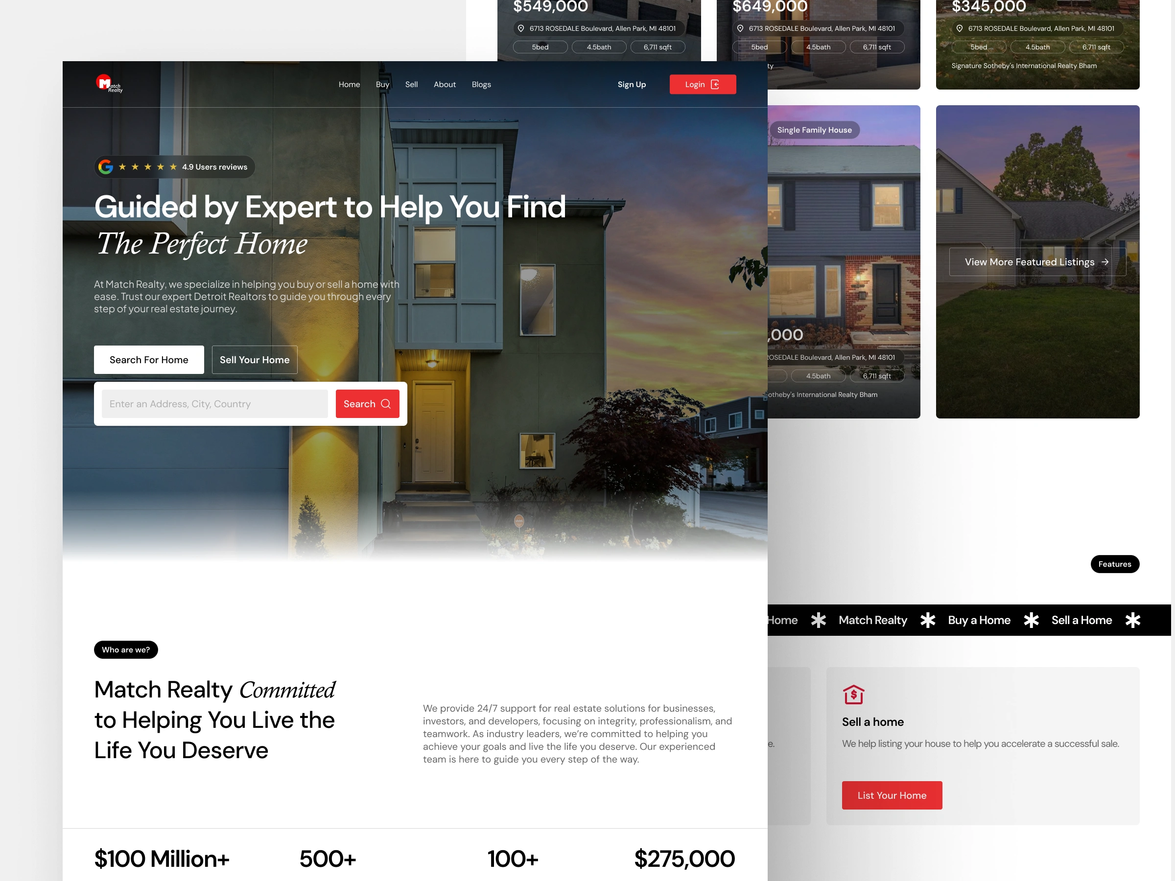
To address all of those problem, I redesign the section with the following hierarchy
Hero Section : This section must include social proof like testimonials or brand partnership with catching hook which selling solution to the problem that user faced. However, the CTA should be clear with customer oriented copywriting in front of a high quality hero image related to the brand product or services.
About Section : Since the brand isn't a big brand, telling about the brand will be a good point to introduce why the brand is different with others.
Listing Section : Should be providing consistent layout with clear information hierarchy for each card, emphasizing most needed information for user (in this case is price).
Featured Section : Can serving information like main features or any product features.
Testimonials Section : Providing last client feedbacks which able to make user give their trust to the brand.
FAQ Section : Good site will help you understand more if you're curious more about the brand.
CTA & Footer : Call to action section should be catching to take user attention after they are building their trust for the brand after taking a funnel journey.
Results
Like this project
Posted May 4, 2025
Redesigned Match Realty's website to improve UX and usability.
Likes
0
Views
3
Timeline
Feb 22, 2025 - Feb 28, 2025