Zhulong: Narrative-driven Website Design

Guilherme Moura


Zhulong — Designing a Website That Performs Like a Film
A case study on building a narrative-driven Framer template, from first sketch to final scroll.
Live template: https://zhulong.framer.website/
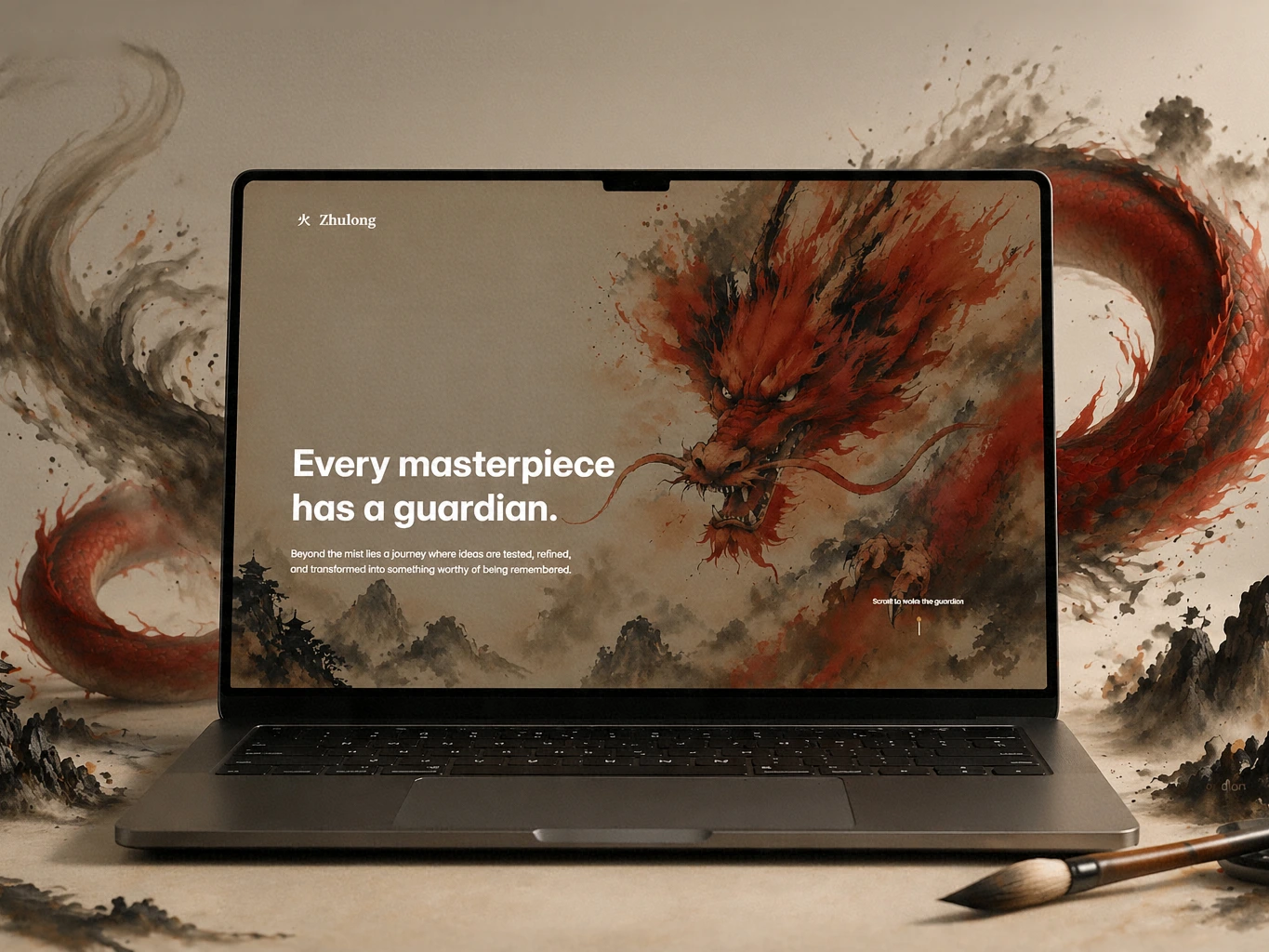
Zhulong Hero Section
The problem
Open ten agency websites in a row and try to remember three of them by the time you close the tenth tab. Most portfolio sites are assembled the same way: hero, services, work, about, contact — five sections stacked with nothing holding them together except a shared color palette. They look competent. They rarely make anyone feel anything.
That's the gap Zhulong was built to close. Not another beautifully-styled template — a website that behaves like the opening scene of a film, so that a visitor's first impression of the studio is formed before they've read a single line of copy.
The idea
The starting image was a single painting: a dragon rendered in an ink-wash, East Asian style, made of smoke and ember rather than scales. In Chinese and Japanese mythology, dragons don't just look powerful — they guard things. Temples, pearls, treasures. Nothing gets past them unless it's earned the right to.
That single idea — the guardian who tests what's worthy — became the whole thesis of the site: "Every masterpiece has a guardian." A studio's website isn't a brochure. It's the guardian at the gate, deciding whether a visitor's idea is ready to be taken seriously.
To give that thesis real structure instead of leaving it as a mood board, I anchored the page around Shu-Ha-Ri (守破離) — a Japanese concept of mastery used in martial arts and traditional crafts:
守 Shu — learn the fundamentals, follow the form.
破 Ha — break from the form, test it, refine it.
離 Ri — transcend the form; the work no longer looks like it's "following a rule."
That progression maps almost exactly onto how a design studio actually works: Services → Process → Portfolio. So instead of writing a generic sitemap, the page became four acts, each one a stage of that same journey — with the ink-dragon hero as the cold open that sets the rule of the story before anyone reads a headline.
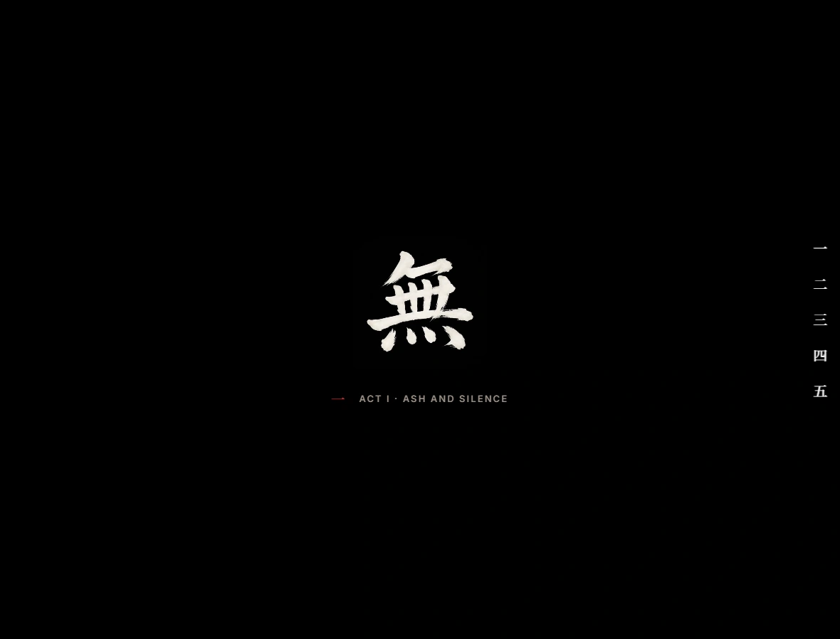
Act I — Ash and Silence
The four acts
Act I — Ash and Silence. After the dragon strikes and the screen cuts to black, the page doesn't explain itself — it states a philosophy, one short line at a time, out of near-total darkness. This is the manifesto, and it's the only place the site explicitly resolves its own name: "What's left when the fire settles — that's an ember. That's what we build from."
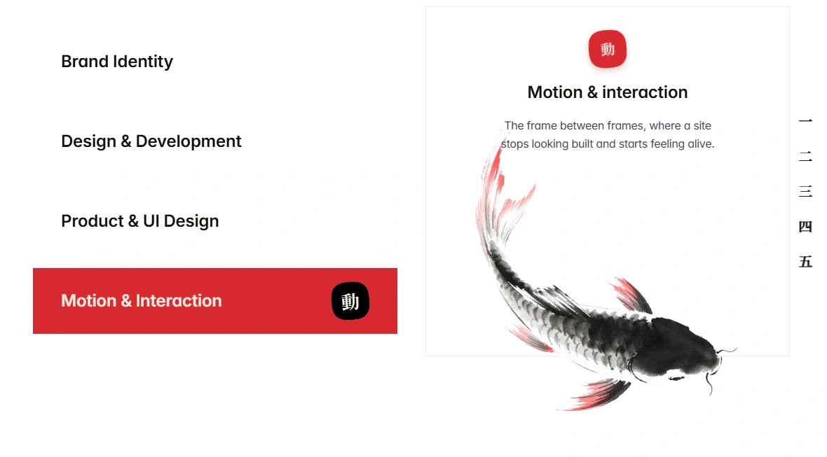
**Act II — The Discipline**
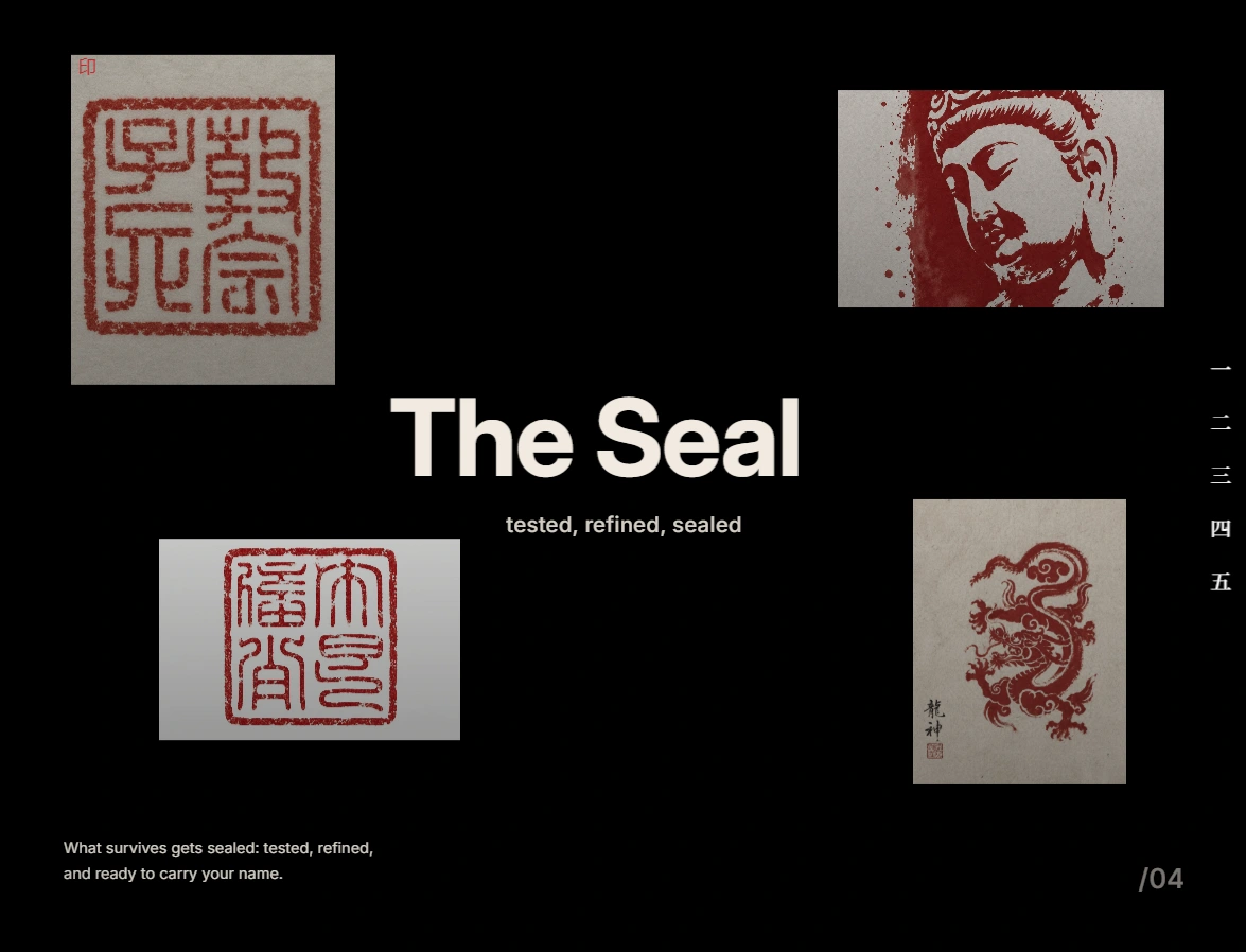
Act II — The Discipline. The Shu phase. Services are presented as stamped seals rather than a bullet list — each one a discrete, deliberate mark, reinforcing that these aren't add-ons, they're a craft with fundamentals.
Act III — The Trial
Act III — The Trial. The Ha phase, and the most technically ambitious section of the build. The design process is shown as a traditional Japanese handscroll (emakimono) that unrolls horizontally as the visitor scrolls vertically — a literal pun on "scrolling" that turns the least glamorous part of any studio's site (the process explainer) into the most memorable one.
Act IV — Guarded Treasures
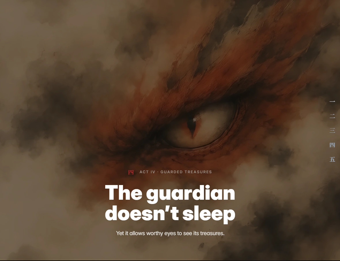
Act IV — Guarded Treasures. The Ri phase. Finished work, framed the way the dragon frames everything else in the story: something worth guarding, not just displaying. Projects surface out of a mist effect rather than loading flatly onto the grid, and each one carries its own kanji mark tied to its subject.
The Gate
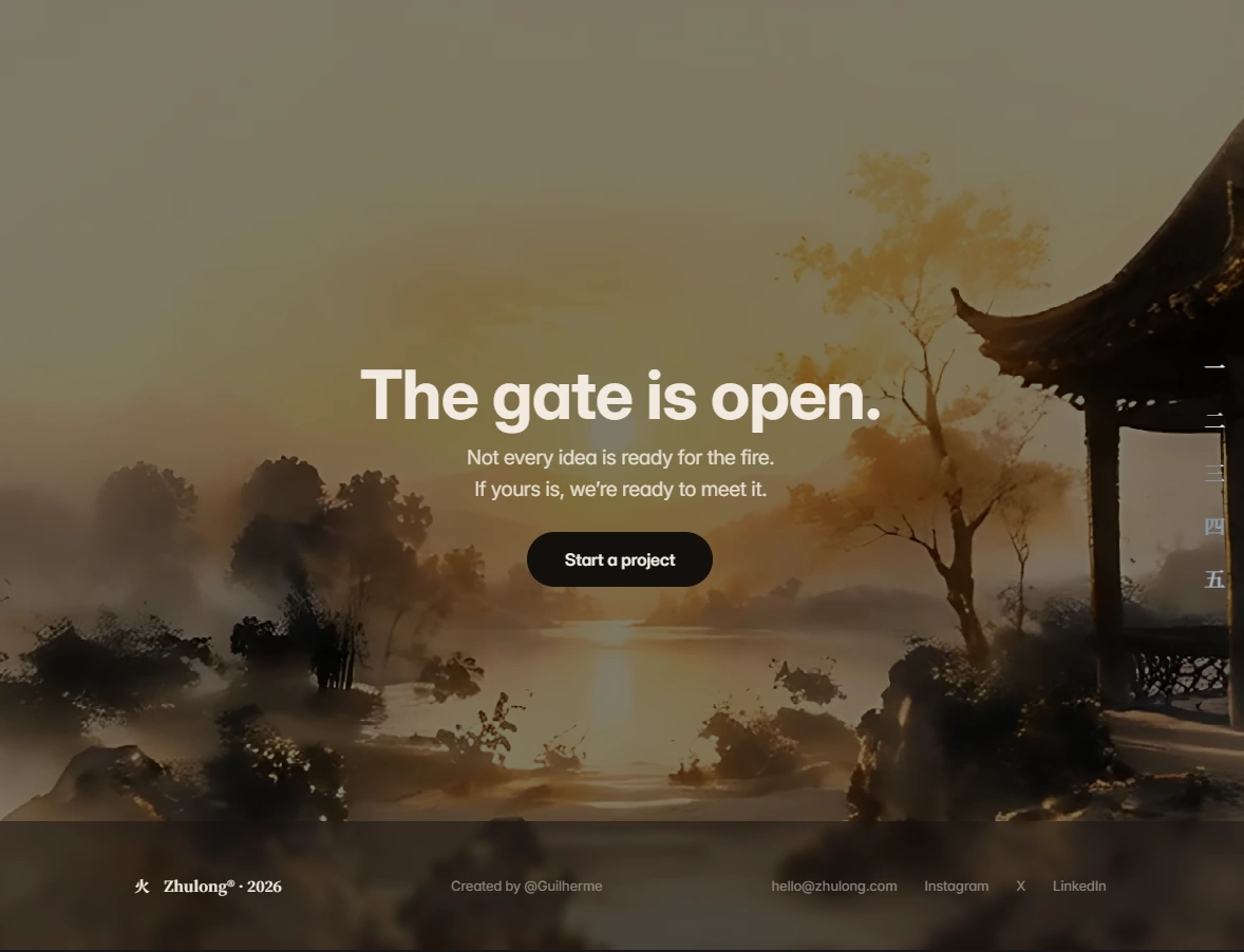
The page closes with The Gate — a symmetrical bookend to the hero. The dragon guarded the threshold at the start; by the end, the gate opens, and the palette itself shifts from a night-ember tone to a warm dawn gold. It's the only moment in the entire site that doesn't return to black — which is exactly why it reads as an ending.
What makes it hold together
None of the acts would land if they were connected by a plain crossfade. So the whole page runs on a single recurring transition grammar instead of eight different ones: every section "exhales" back into black ink before the next one "inhales" out of it — the same gesture, repeated with a different surface trigger each time (a bite, a flood of ink, a scroll rearranging into a hidden shape). It's a small rule, but it's the reason the page feels like one continuous take instead of eight sections bolted together.
The technical build
This is the part that doesn't show up in a screenshot: Zhulong isn't styled with Framer's stock effects. The signature moments are custom-built interactive components, written in React and wired directly into the Framer canvas.
Scroll-Scrub Hero: A cinematic opening where the video progresses frame-by-frame as visitors scroll.
Layered Parallax Gallery: Images move at different depths to create a rich, immersive feeling impossible with standard layouts.
Fullscreen Case Studies: Projects expand into fullscreen experiences with smooth transitions and horizontal storytelling.
Everything is already integrated into the template and exposed through Framer's property controls, so customizing colors, copy, and timing doesn't require touching the underlying code.
The result
Zhulong isn't trying to be a flexible, do-anything agency template — it's opinionated on purpose. It's built for studios and freelancers who already do considered work and are tired of a website that undersells it. The bet is simple: presentation is part of the product, and a visitor decides how premium your studio is before they've read a single word of your portfolio.
Try it: https://zhulong.framer.website/
Like this project
Posted Jul 19, 2026
Developed a narrative-driven Framer website template with custom React components.
Likes
1
Views
22