Studio Termini Interactive Portfolio Development
Approve request to show earnings
View
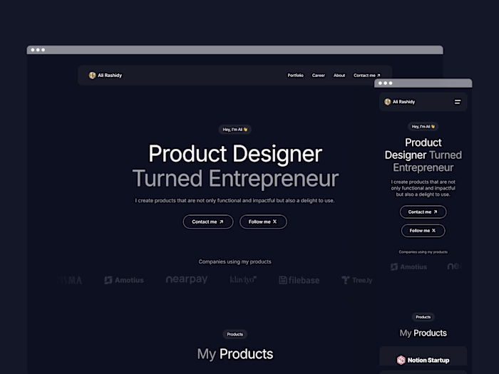
Ali Rashidy
Verified
Studio Termini's hero section eye component
Overview
Studio Termini is Brandon Termini's studio. A creative director with two decades of work spanning brand, product, and experience for clients like Meta, Audi, Dell, Visa, and Nickelodeon. The brief was simple to state and hard to earn: build a portfolio that is considered as the work it showcases. Fast, expressive, easy to maintain, and unmistakably his.
It's built natively in Framer, leaning on its CMS, responsive tooling, and animation primitives, with two custom-coded centerpiece that the platform couldn't deliver on its own.
The signature: an "O" that watches you
The masthead wordmark reads STUDIO TERMINI. But the "O" isn't a letter, it's an eye. As you move your cursor, the pupil tracks it in real time, so the whole site feels like it's looking back at you. It's the first thing you see and the thing people remember.
This piece was designed and animated by Brandon using AE. To bring it to life, I used Claude Code as a starting point for the code structure and then iterated on it until we fully matched the result Brandon envisioned.
The work was less about "make a circle follow the mouse" and more about making it feel alive and intentional: cursor-position math that stays accurate across breakpoints, motion that eases rather than snaps, and behavior that degrades gracefully on touch devices where there's no cursor to follow. The result is a brand mark that doubles as an interaction, exactly the kind of detail that separates a template from a studio.
Outcome
A live, self-maintainable portfolio with a brand interaction people actually talk about.
View it Live
Homepage layout
Project details page
About & contact sections
Build highlights
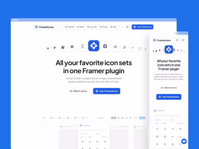
Custom code in a no-code tool. The eye masterhead is hand-built with Claude Code and integrated as a Framer code component. Extending Framer past its out-of-the-box ceiling without leaving the platform.
2-Column text layout. The website features a 2-column text layout that I had to build a custom code component for, as there was no way to achieve this editorial style natively without sacrificing SEO or editability.
Intrinsic Aspect Ratio for Images. Framer can size a fluid-width image
width: 1fr) only via a fixed pixel height OR a locked aspect ratio on the container. Both misbehave on narrower screens or in variants where the container is constrained to a different shape than the image, leading to cropping (object-fit: cover) or letterboxing. To achieve an ultra-responsive site, I created a code override for images to preserve their natural proportions across all screen widths.Smooth scroll that's actually "smooth". Unlike several Framer components available that offer a smooth scroll experience that's mostly overshooting or not very smooth, I used Lenis smooth scroll, plus scroll-triggered reveals, to give the long-form home page a deliberate, gallery-like rhythm.
Holds up everywhere. Responsive from wide desktop down to mobile, with cross-browser QA and accessibility checks before publishing.
Like this project
Posted Jun 9, 2026
Built a responsive, interactive portfolio for Studio Termini on Framer.
Likes
0
Views
2
Timeline
Apr 13, 2026 - Jun 9, 2026
Clients
Studio Termini