Responsive Corporate Website Design with Webflow

Eniola Sarah


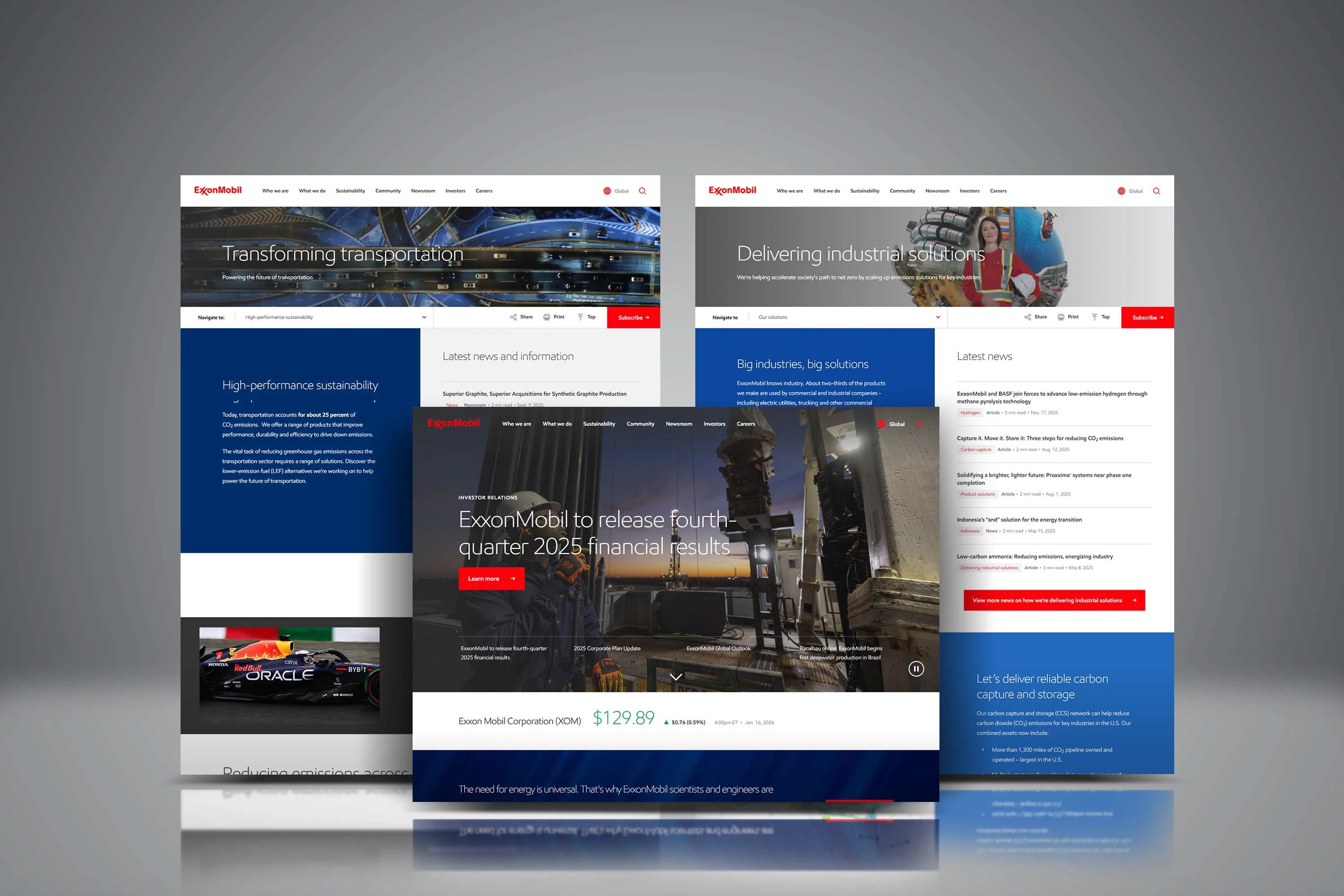
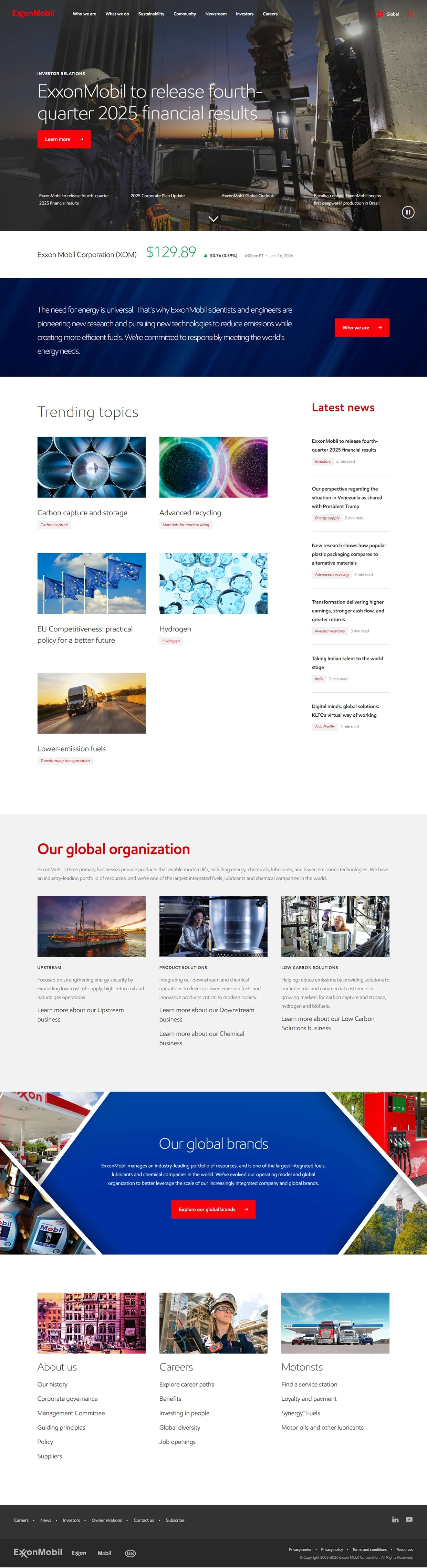
KEY FEATURES AND FUNCTIONALITIES
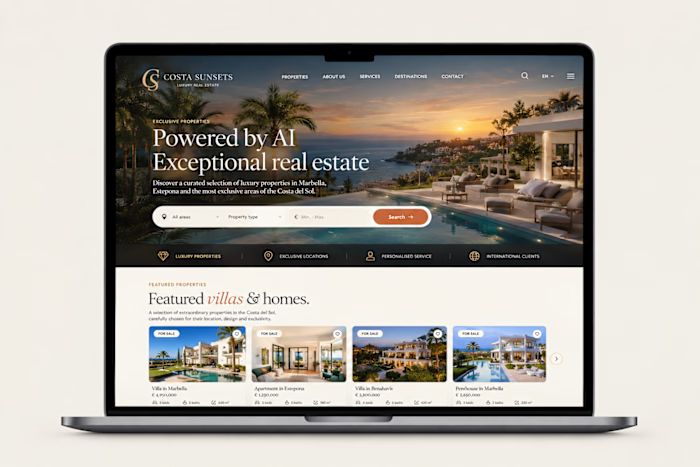
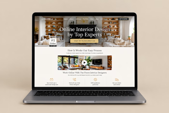
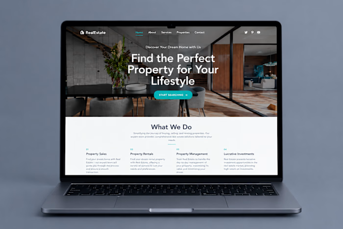
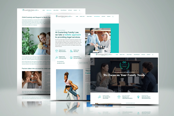
Responsive Webflow Design
The website was structured to provide a consistent experience across desktop, tablet, and mobile devices. Layouts, typography, imagery, and spacing were optimized for different screen sizes.
Custom Hero Sections
Large visual hero sections combine high impact imagery with clear headlines and supporting content. These sections create strong visual introductions while directing users toward relevant content.
Interactive Navigation
A structured navigation system organizes the website's major content areas and makes important pages easy to access. The navigation was designed with a clean corporate interface and intuitive user flow.
Sustainability & Industry Sections
Dedicated content sections present sustainability initiatives and industry solutions using structured layouts and visual storytelling. This helps organize complex corporate information into easier to scan sections.
News & Insights Layout
A dedicated news structure presents articles, updates, and featured stories in an editorial style layout. Content blocks are organized to make important updates easy to discover and browse.
Investor Relations Section
The design includes a dedicated area for investor focused information and corporate updates. Content is presented with a clear hierarchy so visitors can quickly find relevant financial and company information.
Interactive Calls-to-Action
Strategically positioned buttons and links guide visitors toward important pages and actions. Hover states and visual feedback provide a more engaging and polished Webflow experience.
Like this project
Posted Sep 30, 2026
A Webflow website designed for responsive user experience and engaging content navigation.