The Barracks — Three-Direction Brand Rebrand

Haemish O'Donnell


The Barracks is a 32-year-old leather-and-brotherhood institution. The owner is relocating from Palm Springs to a 4,600 sq ft space in Phoenix's Melrose District — and the move opens the door to a full rebrand.
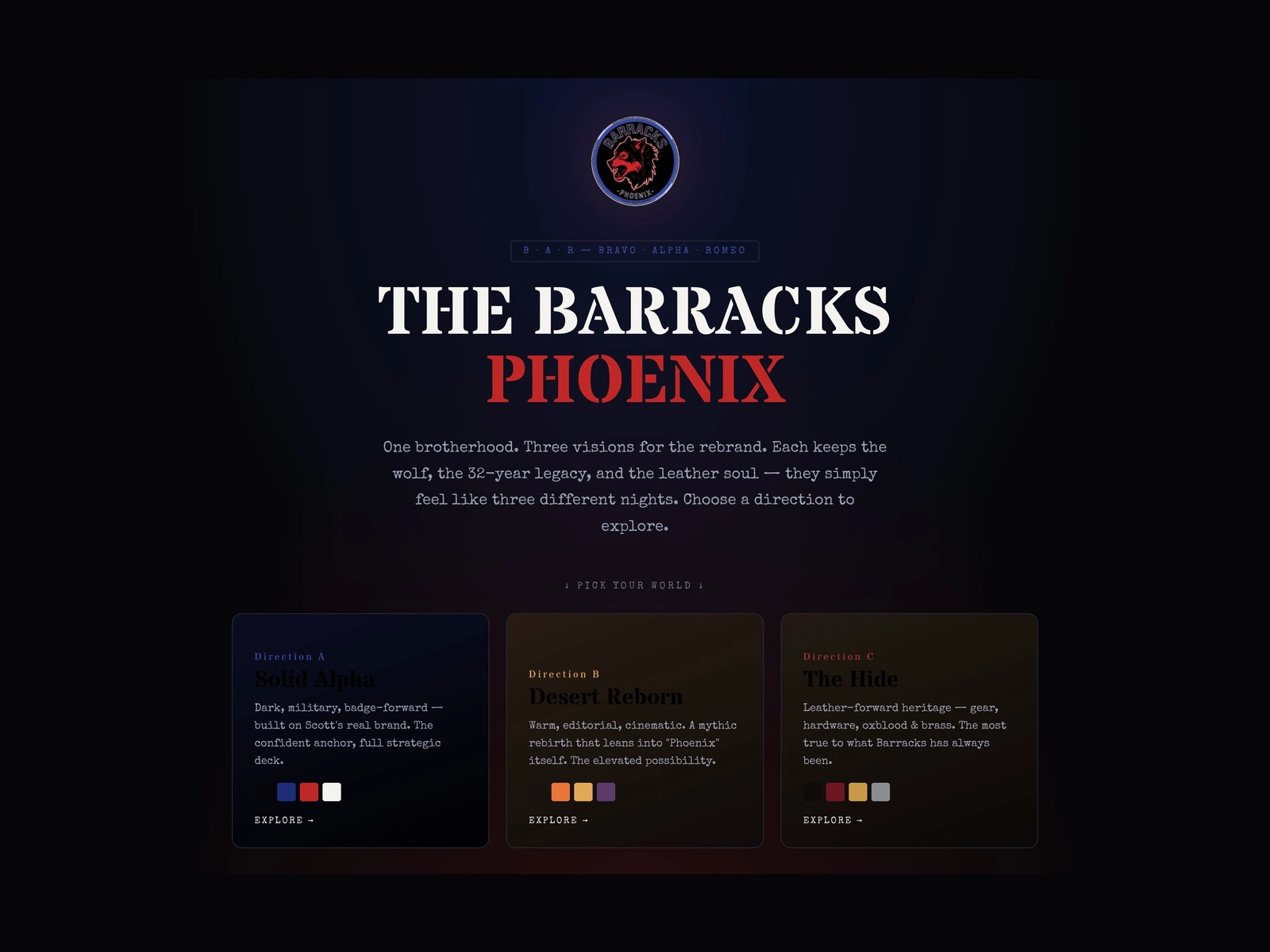
I built a single interactive deck giving the client three full strategic directions to choose from, each rendered as its own self-contained brand world inside one URL.
Three directions
Solid Alpha — dark, military, badge-forward. The confident anchor, built on the venue's existing brand colors.
Desert Reborn — warm, editorial, cinematic. A mythic rebirth that leans into "Phoenix" itself.
The Hide — leather-forward heritage. Gear, hardware, oxblood and brass. The most true to what The Barracks has always been.
Each direction keeps the wolf, the 32-year legacy, and the leather soul — they simply feel like three different nights.
Technical approach
Engineered as a gateway landing with a sticky switcher, each direction loaded as an isolated full pitch deck (iframe srcdoc) so their separate color systems never collide. One URL, three full brand visions, frictionless comparison.
Built end-to-end under Rare by Design. The full interactive deck is available on request.
Like this project
Posted Jul 10, 2026
Three full brand directions for a 32-year leather institution relocating to Phoenix. One interactive deck, one URL, three complete worlds.