PhonePe App UX Overhaul
Satyaprakash Ray
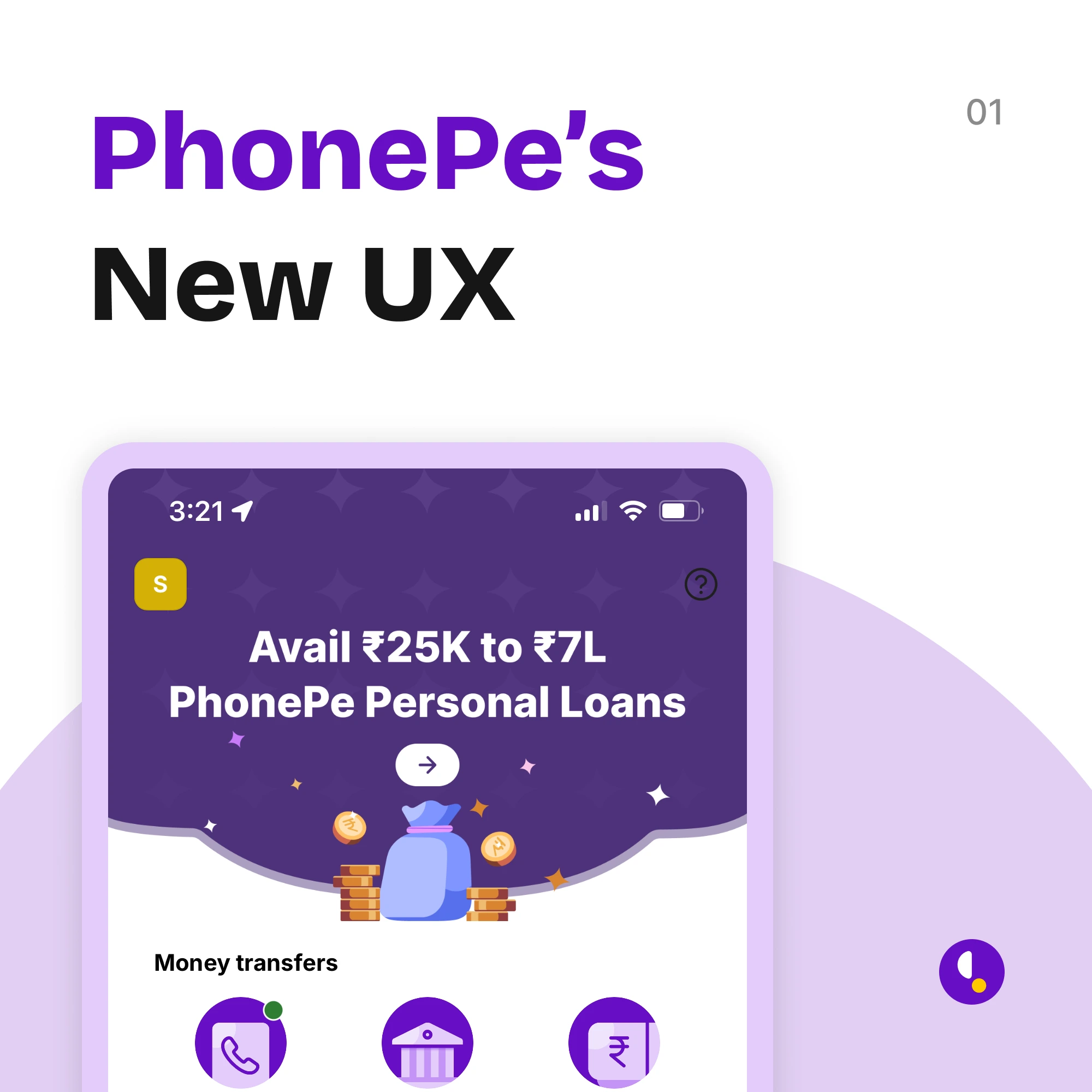
What’s Better & What Still Needs Work
The home screen is cleaner now, cutting down on the previous visual clutter.
Ad banners that used to interrupt the experience are less intrusive.
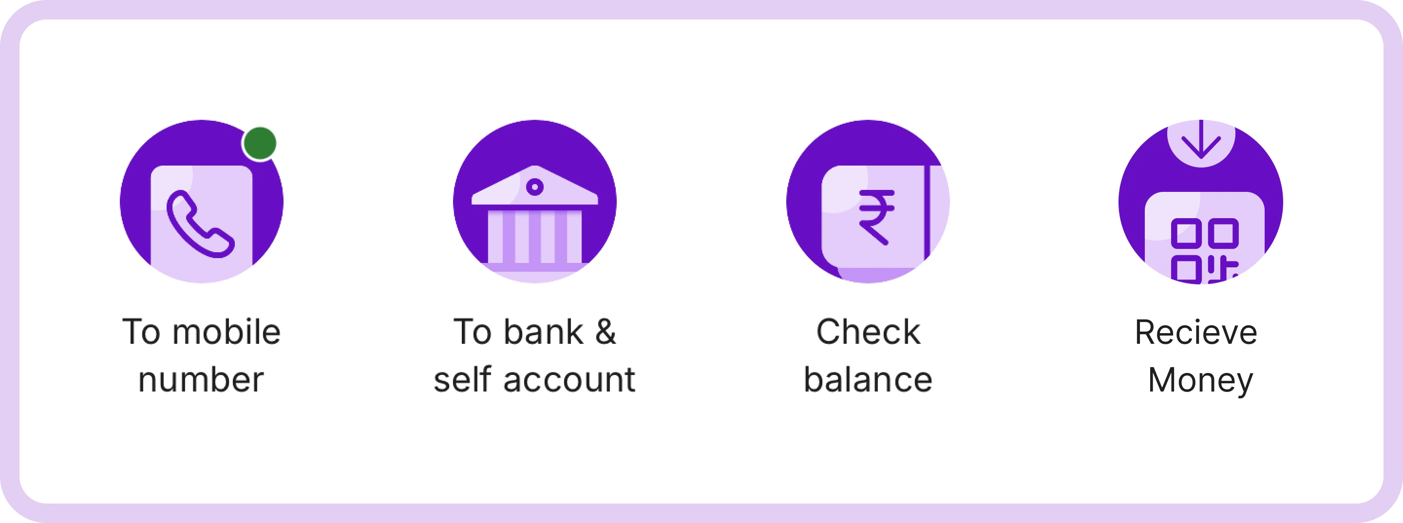
Overloaded icons have been smartly grouped, reducing cognitive load and making navigation simpler for users.
👏 These changes have made the app feel lighter, faster, and more user-friendly.
But, there are some major issues also.
Problems
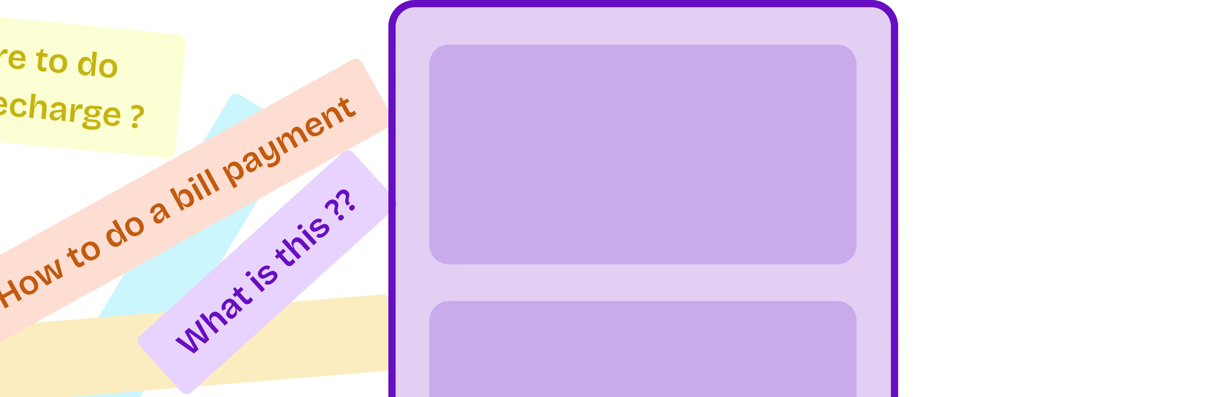
Elderly users are finding it difficult to adapt, as familiar flows like Recharging tolls or EMIs have shifted, creating a learning curve for those less tech-savvy.
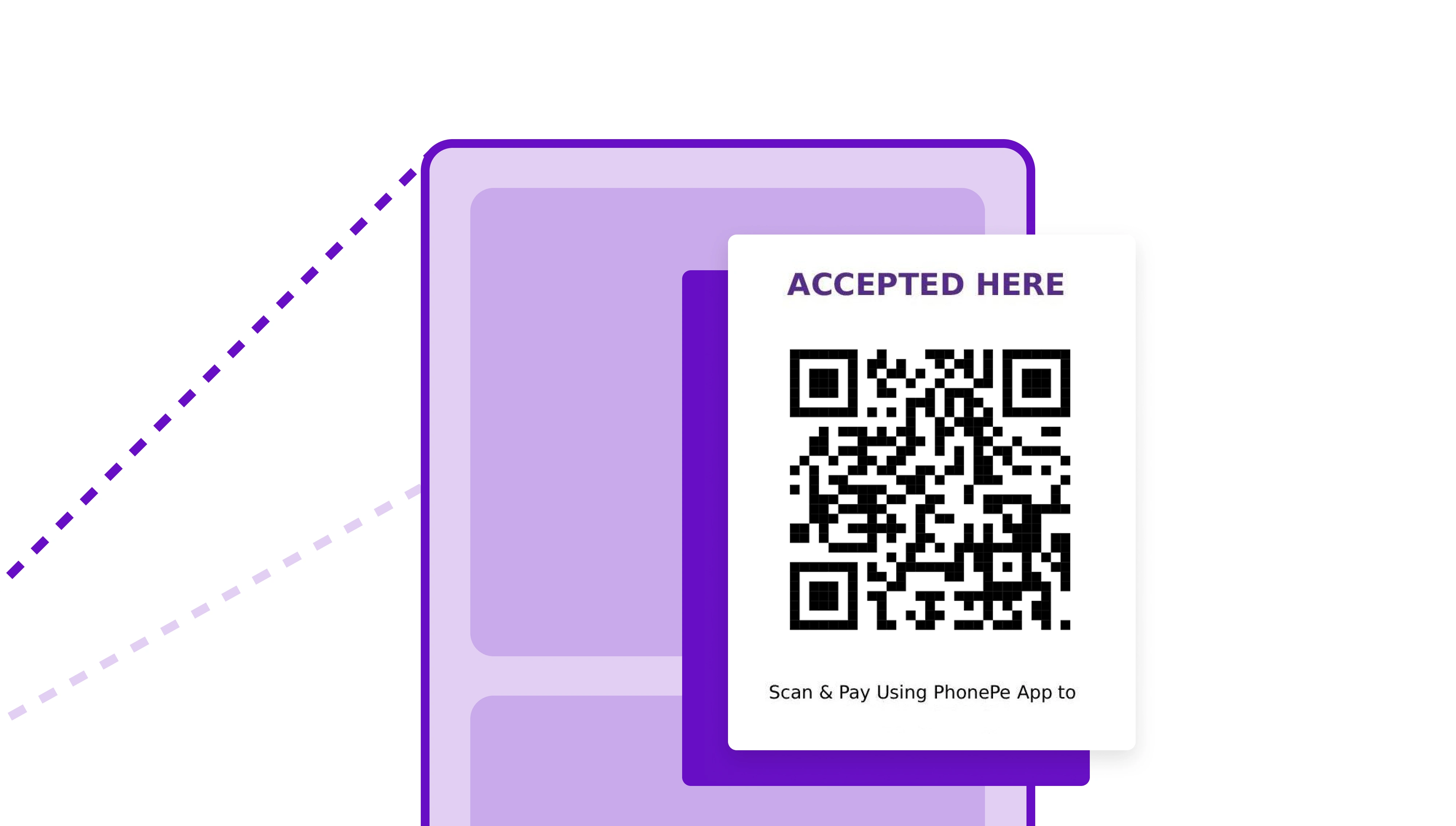
The QR code payment receiving flow, despite the UX overhaul, hasn’t become noticeably simpler or faster.
Missed Opportunity
PhonePe could have taken a more incremental approach—rolling out UX changes module by module. A phased transition might have resulted in smoother onboarding, especially for users who aren’t as digitally fluent.
One small change with bigger impact
Despite the improvements, small vendors and drivers still report friction when receiving payments—something that impacts their daily operations and trust in digital transactions.
Introducing an entry point to Receive money
Like this project
Posted Sep 2, 2025
Redesigned the PhonePe app with a cleaner, user-friendly experience — boosting usability while reducing clutter for smoother navigation.
Likes
3
Views
8