Brand Case Study HexoMarket

Nathanael Mbale


Brand Kit
🖥 Results
Brand guide - the video above is a recording of the PowerPoint presentation
Website here (In progress)
🎯 The Challenge
HexoMarket is a bold, next-gen online marketplace offering minimalist fashion essentials and stylish tech accessories for the modern creative. The founder came to us with a clear goal: to stand out in a sea of generic dropshipping stores by crafting a premium yet artistic brand—something that felt confident, clean, and culturally expressive.
The original idea had no logo, no defined aesthetic, and no brand direction—just a big vision. Everything was stored in Notion documents, moodboard pins, and scattered inspiration from other e-commerce startups. So our challenge was to translate the ambition into a full brand experience, starting from scratch:
Build a strategy-first identity
Create a logo and full brand suite that captures their values
Design a visual language that reflects creativity, elegance, and ambition
Prepare assets for a Webflow and Framer site launch
🧠 The Strategy
We didn’t start with visuals. We started with meaning.
Before putting pen to paper (or pixels to screen), we did a deep dive into what HexoMarket stood for. Through 1:1 discovery calls, market analysis, and positioning workshops, we landed on a few core pillars:
HexoMarket = Direction. Clarity. Ambition.
The name itself hints at structure ("Hexo" for hexagons, design systems, and tech) while “Market” grounds it in commerce and culture. We framed the brand around a customer who’s both stylish and intentional—people who don’t just consume, but curate.
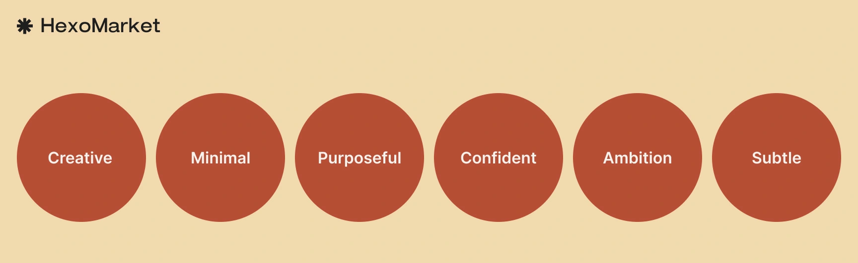
To express this, we mapped out four key brand traits:
Confidence: Premium feel without being flashy
Creative: Artistic use of contrast, bold shapes, and motion
Minimal: Focused, stripped-back product and UI
Purposeful: Everything is designed with intent
Subtle: Standing out but not shouting
✍️ From Words to Form
Once the core was set, we translated it into visuals.
We explored how to visually represent "direction" and "clarity" in a brand mark. Sketches ranged from compass shapes to abstract hexagon forms.
We also experimented with wordmarks using contemporary sans-serif fonts, and eventually crafted a custom logotype that paired well with the icon and felt just right on packaging, the web, and social.
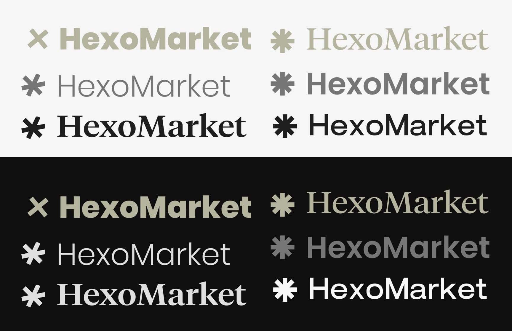
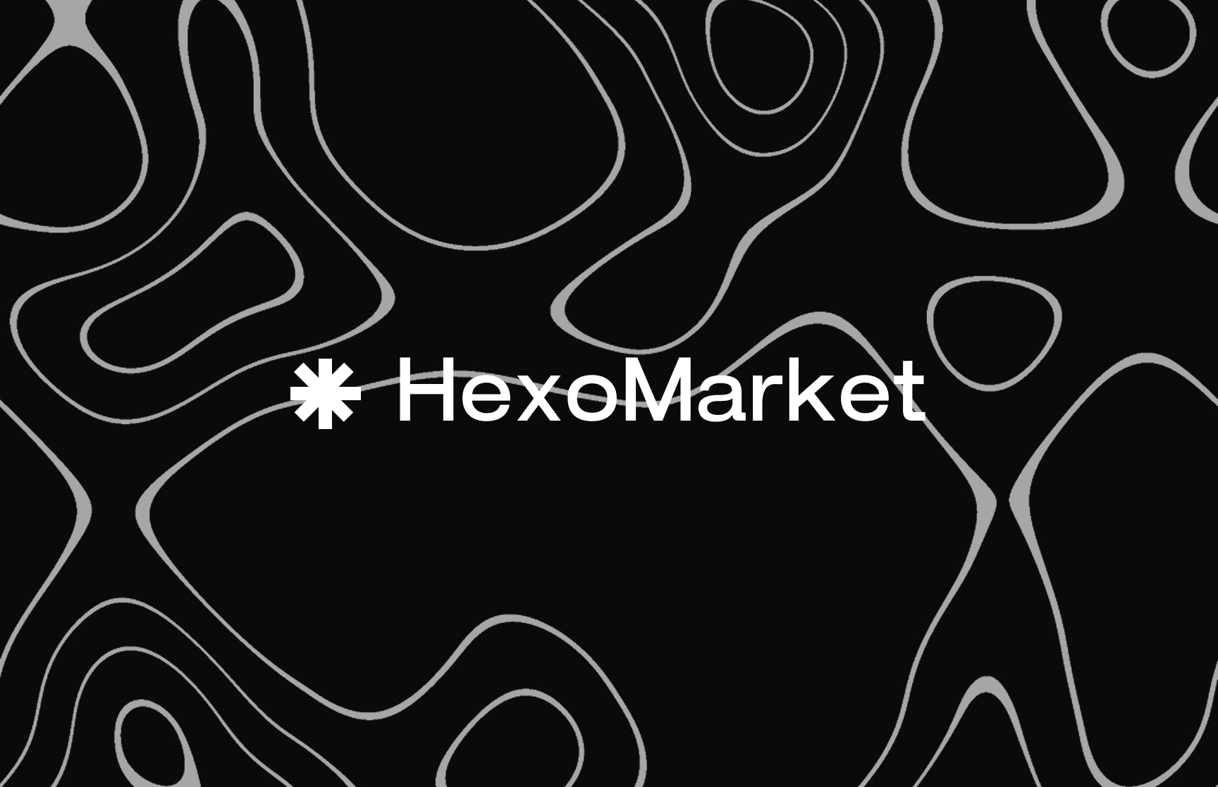
As we translated HexoMarket’s strategy into visual form, the logo had one core responsibility — to stand out without shouting. We didn’t want a generic tech or fashion mark. We wanted a symbol of individuality.
That’s why we chose a simple geometric star.
Primary Logo
Not for tradition, but for rebellion. It’s not the North Star or a typical badge — it’s a modern mark of boldness. A reminder that HexoMarket is here for those who choose to be seen differently. People who move with purpose, wear with pride, and buy with meaning.

Secondary Logo
🎨 Moodboard & Inspiration
HexoMarket’s style needed to balance two worlds:
Design-forward aesthetic like Nothing, Apple, or Ader Error
Culture-rich personality like Corteiz or Daily Paper
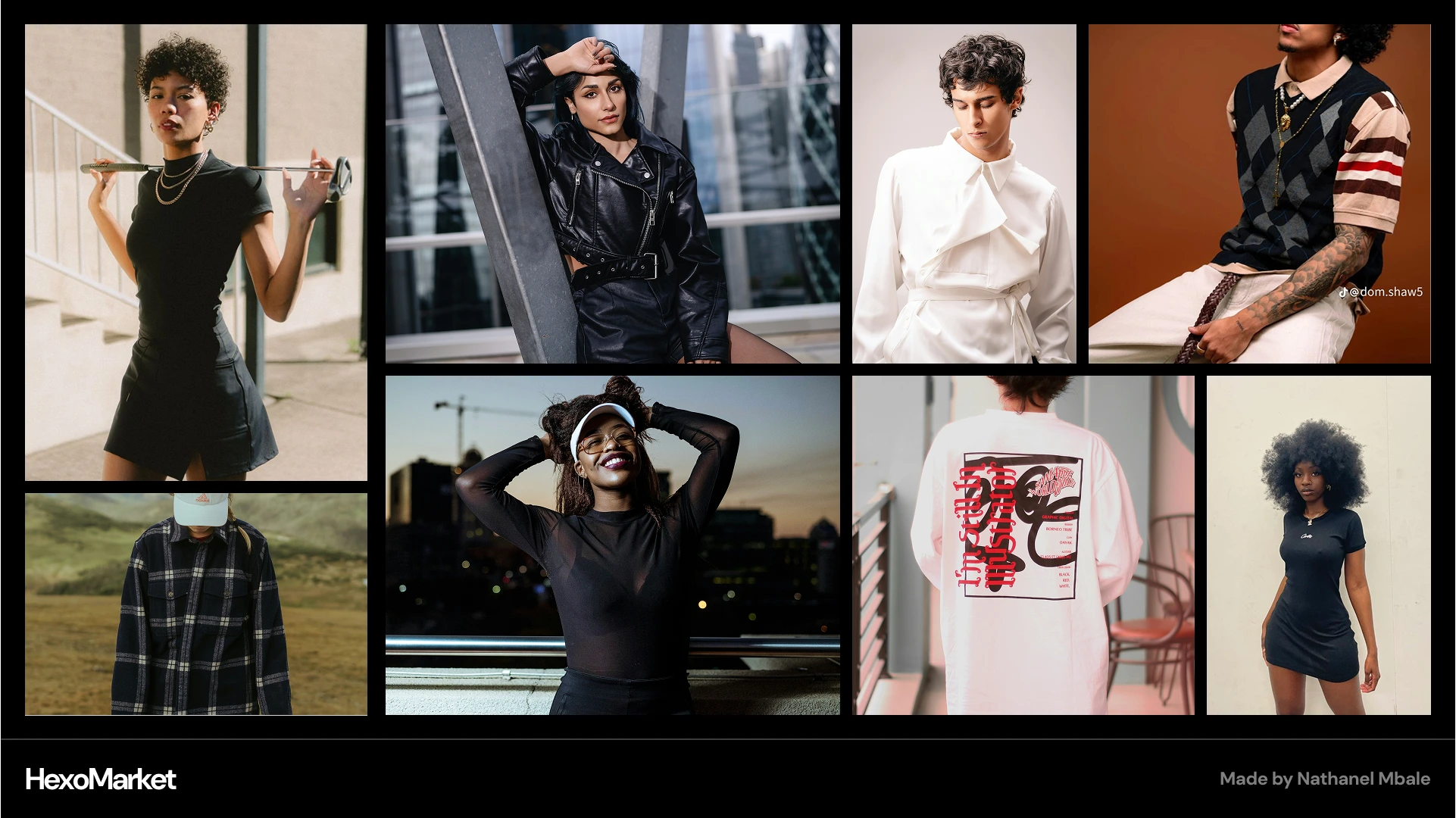
Mood board
The moodboard mixed clean, white-space-heavy product layouts with editorial-style images and subtle textures. Inspiration came from a blend of Brutalism meets Swiss minimalism, mixed with bold Afro-Asian graphic cues.
We wanted the visuals to feel expensive, but not sterile. Thoughtful, but not boring.
🧵 Brand Elements
We built out a cohesive brand system from the ground up:
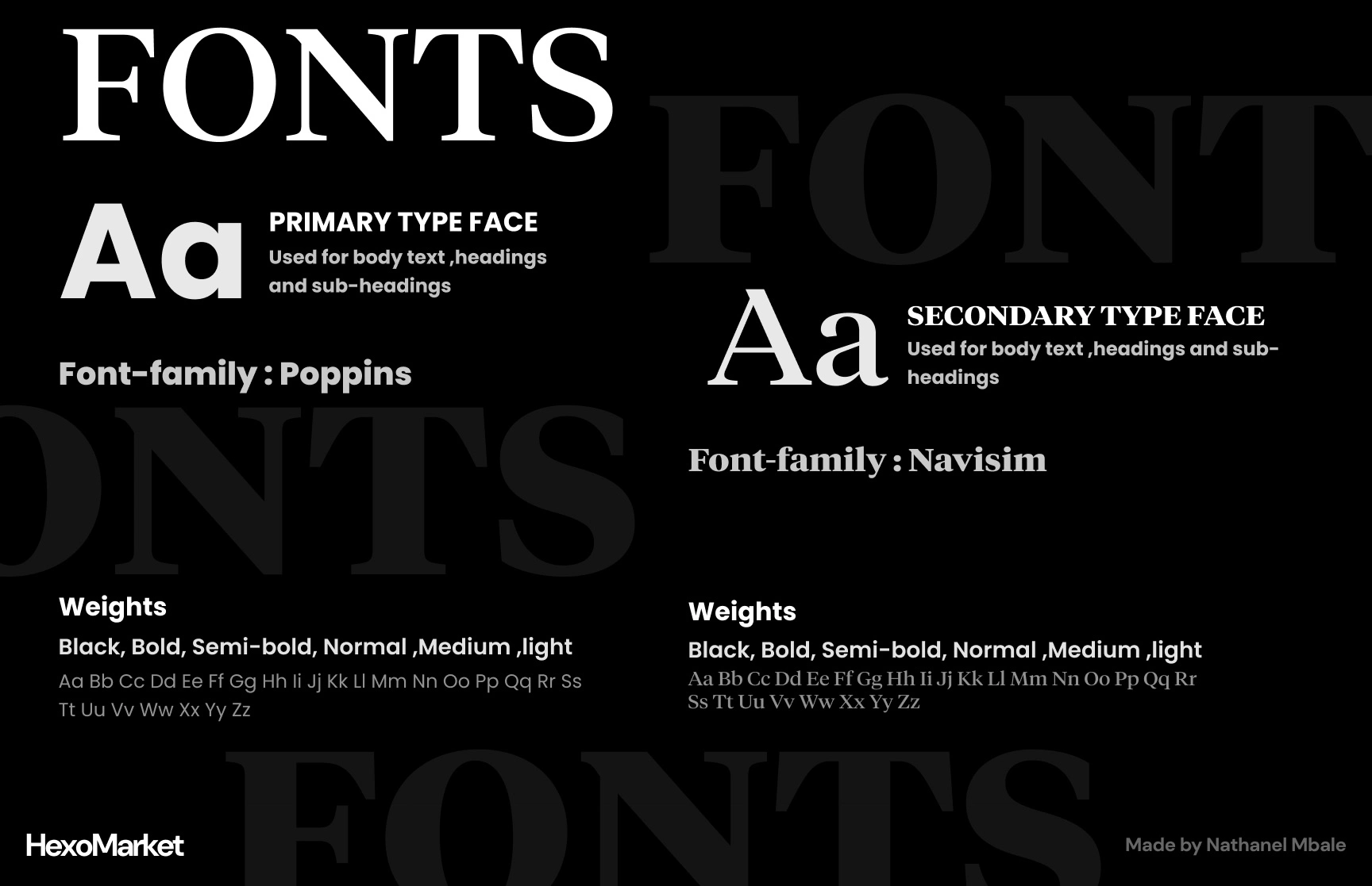
🔤 Typography
A confident sans-serif for headlines, paired with a clean mono or humanist serif for body text(used alternatively). This created a hierarchy while keeping things modern and structured.
🌈 Color Palette
HexoMarket’s primary colors are bold yet refined. Muted darks, sharp whites, and a vibrant accent color that pops on hover states and product tags.
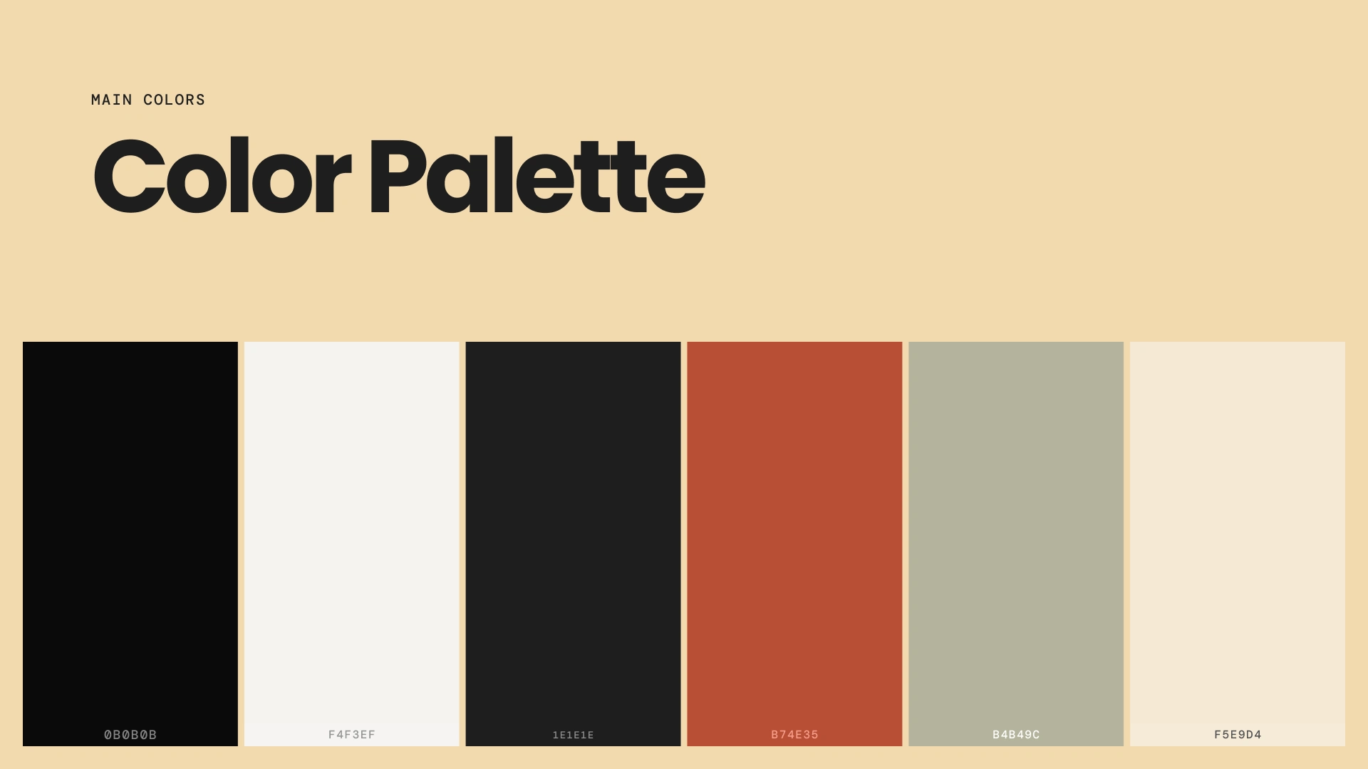
Color palette
Visual system
We extended the visual language through custom brand patterns, tailored iconography, and high-fidelity mockups, ensuring visual consistency across all digital and physical touchpoints. Together, these assets create a brand that’s not just seen—but felt.
Brand Pattern
Mockup
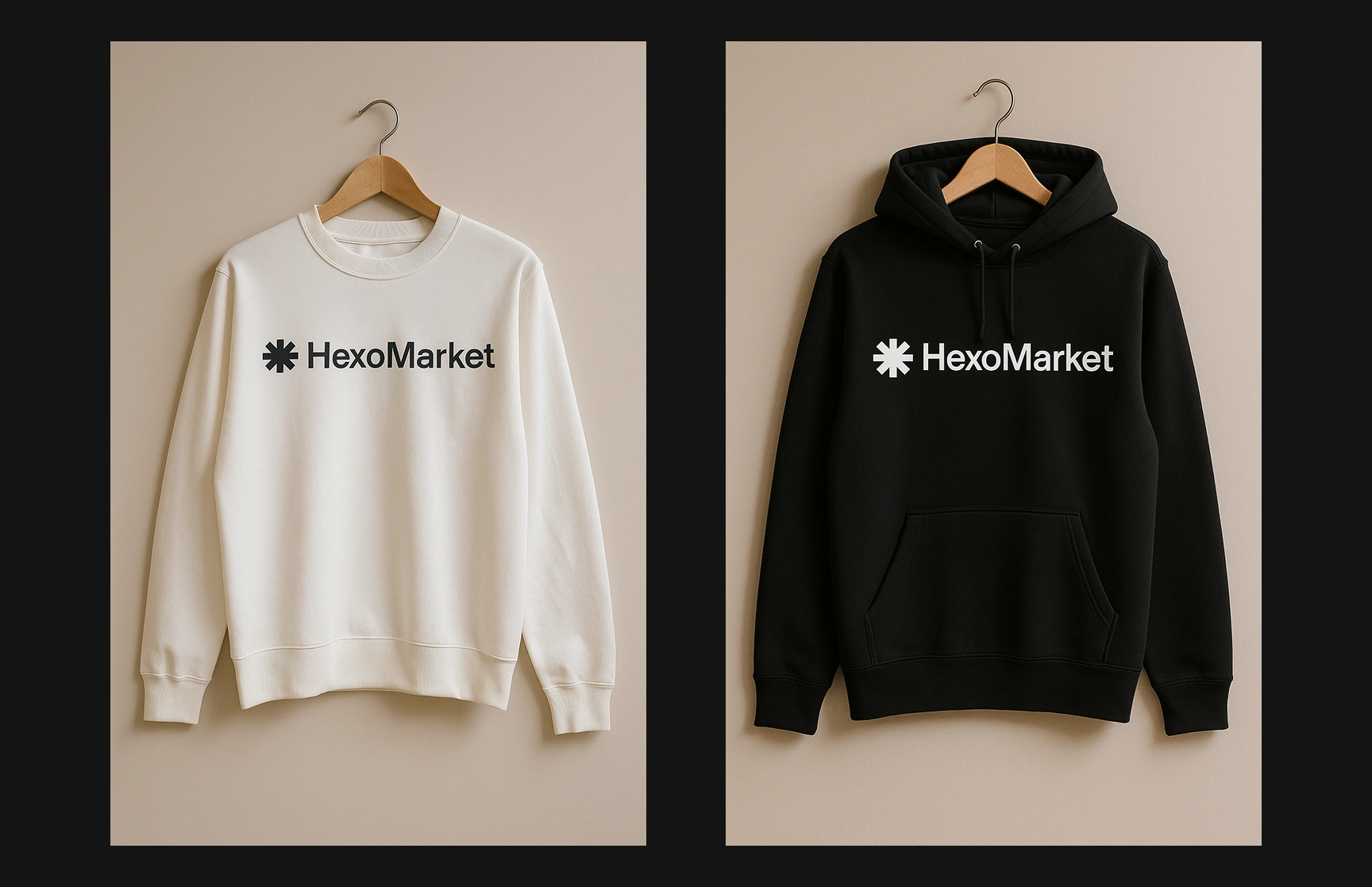
Mockup
Brand assets
📦 Final Project Deliverables
The HexoMarket branding project delivered a complete brand strategy, including positioning, audience research, tone of voice, and competitor insights. Visually, we developed a unique star-based logo system with variations, a refined color palette, a custom icon set, and consistent typography. Supporting assets included brand patterns, mockups, and creative direction through moodboards. All elements were compiled into a cohesive brand guidelines document and a polished case study presentation showcasing the full process and outcome.
Like this project
Posted Aug 3, 2025
A confident, minimalist brand identity crafted to help HexoMarket stand out as a bold, premium marketplace for modern, style-driven consumers.