Design of Lunar New Year Visuals for PPI
Zola So
Project overview
For Lunar New Year, PPI needed a festive email header and Red Banner (揮春)–style invitation visual to send to all advisors across Canada, reinforcing the brand as a culturally aware, advisor‑focused partner. The deliverable was a digital banner that could work in email, on web, and as a visual anchor for the event invitation.
Objectives and constraints
Celebrate Lunar New Year in a way that feels authentic to Chinese culture while remaining inclusive to a multicultural advisor base.
Integrate PPI’s corporate brand (logo, colours, positioning line “The Advisor’s Premier Partner for Insurance”) into a seasonal design without feeling like a generic corporate banner.
Ensure legibility of both English and Chinese messages on desktop and mobile email clients, with fast load time and simple layout for easy reuse in future campaigns.
Concept and visual rationale
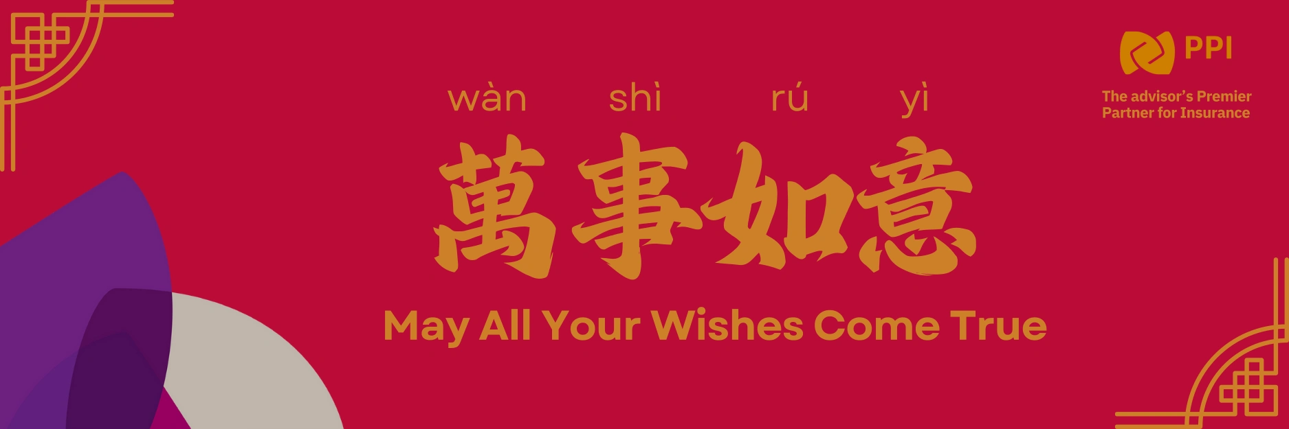
The key message chosen was 「萬事如意」(wàn shì rú yì) paired with the English line “May All Your Wishes Come True” to bridge Chinese and non‑Chinese audiences and emphasize prosperity and good fortune. The dominant red field and gold typography convey luck and celebration, while decorative corner elements reference traditional window lattice patterns and the rectangular proportions of red door banners. The abstract purple and beige shapes soften the design, introduce a modern layer, and connect back subtly to PPI’s broader brand palette so the piece still feels “on brand” rather than purely traditional.
Process and design decisions
Typography: A brush‑style Chinese display font was selected for 「萬事如意」 to echo handwritten calligraphy used on physical red banners, contrasted with a clean sans‑serif for the English line and pinyin to maintain clarity in digital environments.
Layout: The hierarchy places the Chinese phrase in the visual center as the hero, with pinyin above to help non‑native speakers pronounce it and the English blessing below for comprehension by the wider advisor audience. The PPI logo and descriptor sit in the top‑right, treating the greeting as primary and the brand as host rather than the other way around.
Technical choices: The design uses a wide but shallow aspect ratio optimized for common email header dimensions, with limited fine detail to avoid compression artifacts and ensure legibility across email clients and screen sizes. File size was kept light to reduce load times and avoid deliverability issues.
Outcomes, reflection, and next steps
The final graphic provides PPI with a culturally resonant, brand‑aligned greeting that can be reused in future Lunar New Year communications and adapted into print red banners, social posts, or event signage. Internally, it positioned the design function as a partner in inclusive marketing, not just production. If revisiting the piece, next steps could include creating a small system of variations (vertical red banners, social square, and animated version) and exploring additional language localizations (French, other Asian languages) while testing with advisors to validate readability and cultural nuance.
Like this project
Posted Dec 15, 2025
Designed a festive email header and Red Banner-style invitation visual for PPI's Lunar New Year celebration.