Designed a brand identity for
Muhammad Ahmad
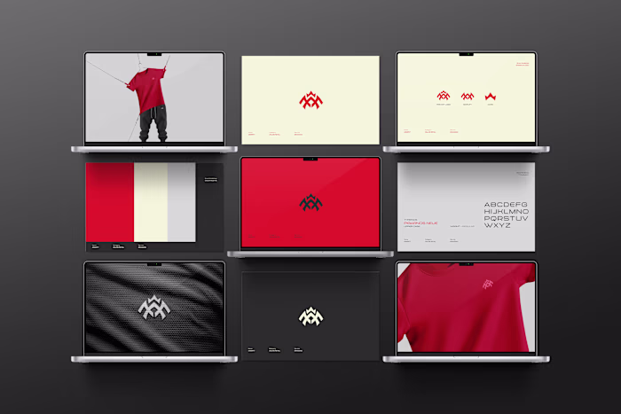
Designed a brand identity for a hot sauce brand — and the brief was simple: make it feel unhinged.
The mark hides a face inside the letterforms. The two O's become eyes. The liquid drip sits right in the middle — sauce running down, watering your eyes from the heat. Rough-style typography to match the chaos.
Red on white. Red on black. White on red. The logo holds everywhere.
This is what happens when concept and craft work together.
→ Brand Identity Design
→ Logo Design & Mark Development
→ Packaging Application (bottle label)
→ Typography System
Available for brand identity and packaging projects.
📁 behance.net/ahmadchaudhry3
📩 adesigns444@gmail.com
#BrandIdentity #LogoDesign #PackagingDesign #FoodBranding #BrandDesign #GraphicDesign #LogoDesigner #FreelanceDesigner #VisualIdentity #FoodAndBeverage #BrandingAgency #CreativeDirection #LogoMark #PackagingDesigner #FMCG #BrandStrategy #AdobeIllustrator #Figma #DesignInspiration #BrandingDesign
Like this project
Posted Jun 8, 2026
Designed a brand identity for a hot sauce brand — and the brief was simple: make it feel unhinged. The mark hides a face inside the letterforms. The two O's ...