NOIR/STUDIO — Crafting Bold & Premium Brand Identities
Framer Luxweb

Overview
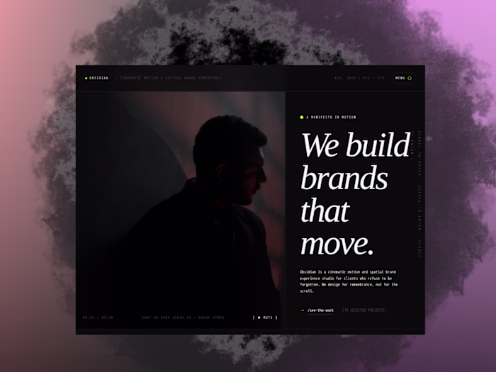
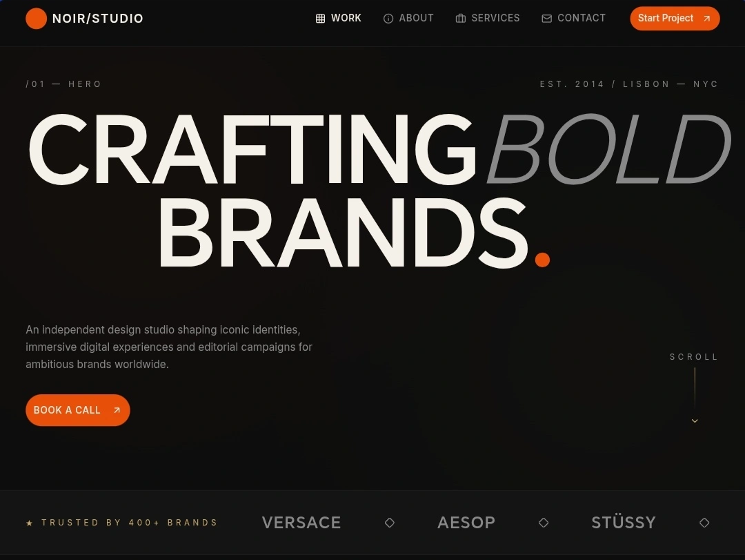
NOIR/STUDIO is a creative agency brand identity and website built to command attention. The goal was to create a digital presence that feels as premium as the work the studio produces: bold, refined, and unapologetically confident.
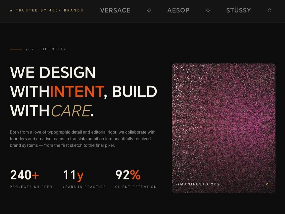
Identity
The Challenge
The client needed a brand identity and web experience that would position them as a top-tier creative studio. The existing presence didn't reflect the caliber of their work. They wanted something dark, cinematic, and instantly memorable.
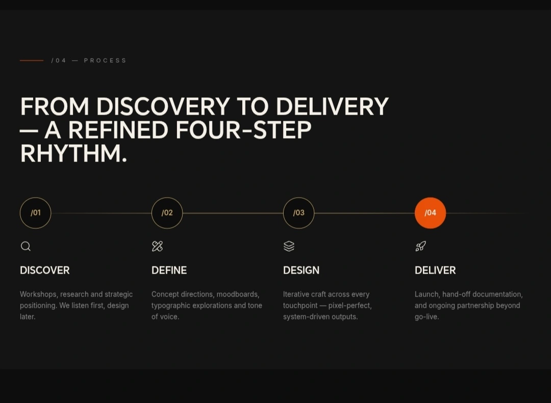
Process
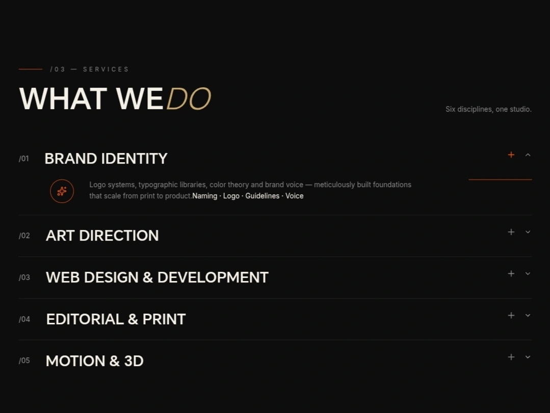
Services
My Approach
I started in Figma, exploring typography pairings, color systems, and layout structures that could carry the weight of a luxury creative brand. The visual direction leaned into high-contrast dark aesthetics with bold type and generous whitespace.
From there, I moved into Framer to bring the design to life. Every interaction was intentional: smooth scroll animations, hover states that reward curiosity, and transitions that feel cinematic without slowing the experience down.
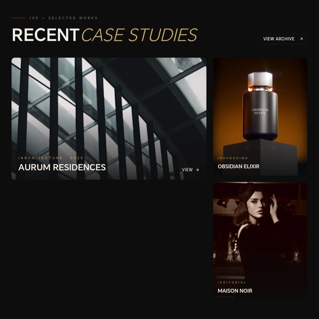
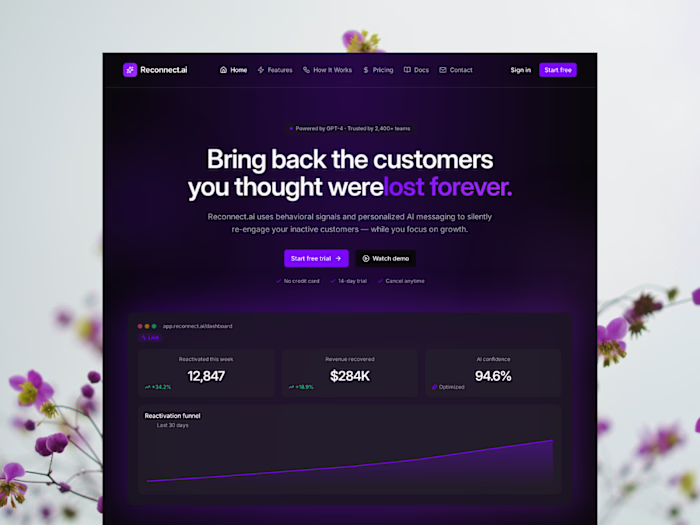
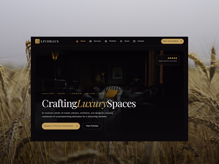
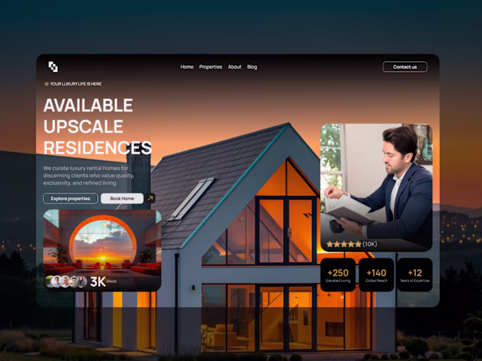
Selected works
Key Design Decisions
Dark-mode-first design to reinforce the premium, editorial tone
Bold typographic hierarchy that guides the eye and communicates confidence
Micro-interactions and scroll-based animations built natively in Framer
Responsive across all breakpoints, ensuring the experience holds up on mobile
Results
A digital identity that matches the studio's ambition. The site communicates credibility and creative authority from the first scroll, giving NOIR/STUDIO a platform that attracts the caliber of clients they want to work with.
Like this project
Posted May 8, 2026
Elevate your brand with NOIR/STUDIO. We craft bold, iconic identities and premium digital experiences for ambitious companies worldwide. (136 characters)
Likes
0
Views
6