logo design for a paint service provider
Radheyshyam Veerwal
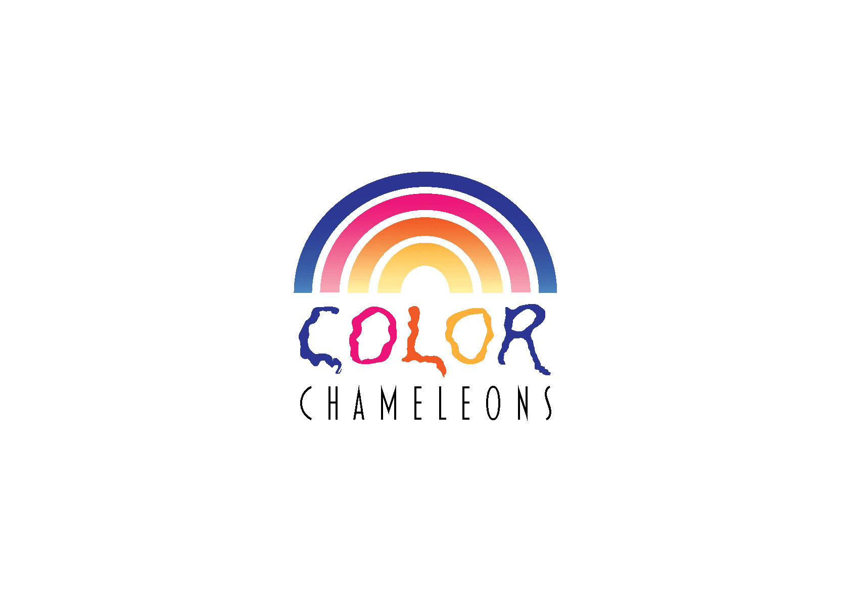
The logo presents a striking juxtaposition of the words "COLOR" and "CHAMELEONS" in a vibrant rainbow color scheme. This immediately suggests a paint service that offers a vast array of color options and the ability to seamlessly adapt to different color preferences
Color Palette: The use of a full rainbow spectrum conveys a sense of boundless creativity, energy, and a wide range of color possibilities. It aligns perfectly with the core service of a paint company.
Typography: The font I chose is modern and playful, reflecting a youthful and dynamic brand personality. The all-caps treatment of both words gives them equal prominence, emphasizing the core idea of the logo.
Composition: The simple, horizontal arrangement of the text creates a clean and memorable visual. There's a strong balance between the two words, making the logo easily recognizable.
Like this project
Posted Aug 12, 2024
I designed this logo for a paint service provider who wants a logo which conveys clear and strong message for their quality service and easily memorable.
Likes
0
Views
19