Ghar Tameer
Qasim Amin
Ghar Tameer
Project Overview
In the heart of a bustling city of Lahore, where architectural wonders rose to the sky and the pulse of construction echoed through the streets, a new company was born - "Ghar Tameer." They are not just builders; they are visionaries, committed to exceeding expectations for their clients and staff alike. As they embarked on their journey to offer a comprehensive, one-stop solution for construction, they recognized the need for a brand identity that would set them apart. That's where my role came into play.

The Concept
The idea behind the following project was to design in calligraphic and modern form together with the spirit of building and construction. By geometric and minimalistic form to connect and choose the right typographical and bold colors.
Conduction Research
My first step was to immerse myself in the world of Ghar Tameer. I conducted thorough research, getting to know their history, values, and aspirations. I spent time with their team, listening to their stories, and understanding the unique attitude that drove them to go above and beyond. I explored the construction industry landscape, identifying the trends and opportunities that could shape Ghar Tameer's brand.
Defining the Brand
With a wealth of knowledge at hand, I began the task of defining Ghar Tameer's brand identity. Their commitment to excellence and their one-roof solution for construction were at the core of their essence. Their spirit of innovation and their harmonious blend of calligraphy and modern design became the pillars upon which the brand would stand.
Creating The Design
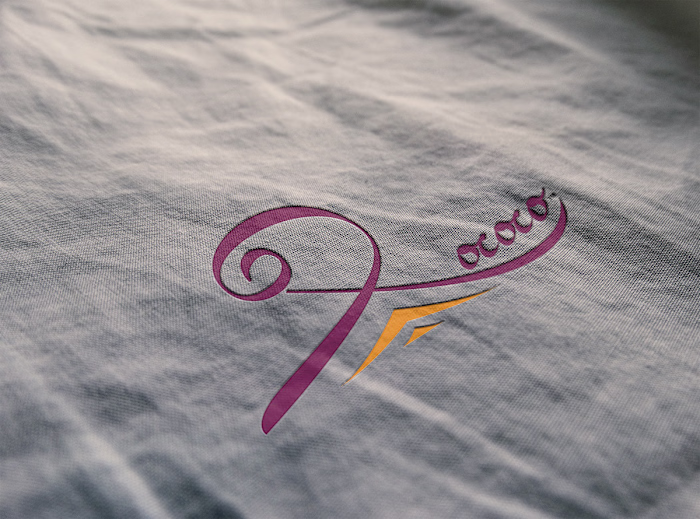
With a clear vision in mind, I ventured into the realm of design. The concept was to fuse calligraphy, representing artistry and tradition, with modern geometric and minimalistic forms that symbolized precision and innovation. I meticulously crafted a logo that encapsulated the spirit of building and construction. Each curve and line was carefully chosen to convey Ghar Tameer's commitment to perfection.
Selecting the Style
Typography played a vital role in conveying the brand's identity. I selected bold, strong fonts that projected reliability and confidence. The color palette was equally important. Earthy tones represented grounding, while bold and vibrant hues conveyed a sense of dynamism. It was a palette that would resonate with Ghar Tameer's values.
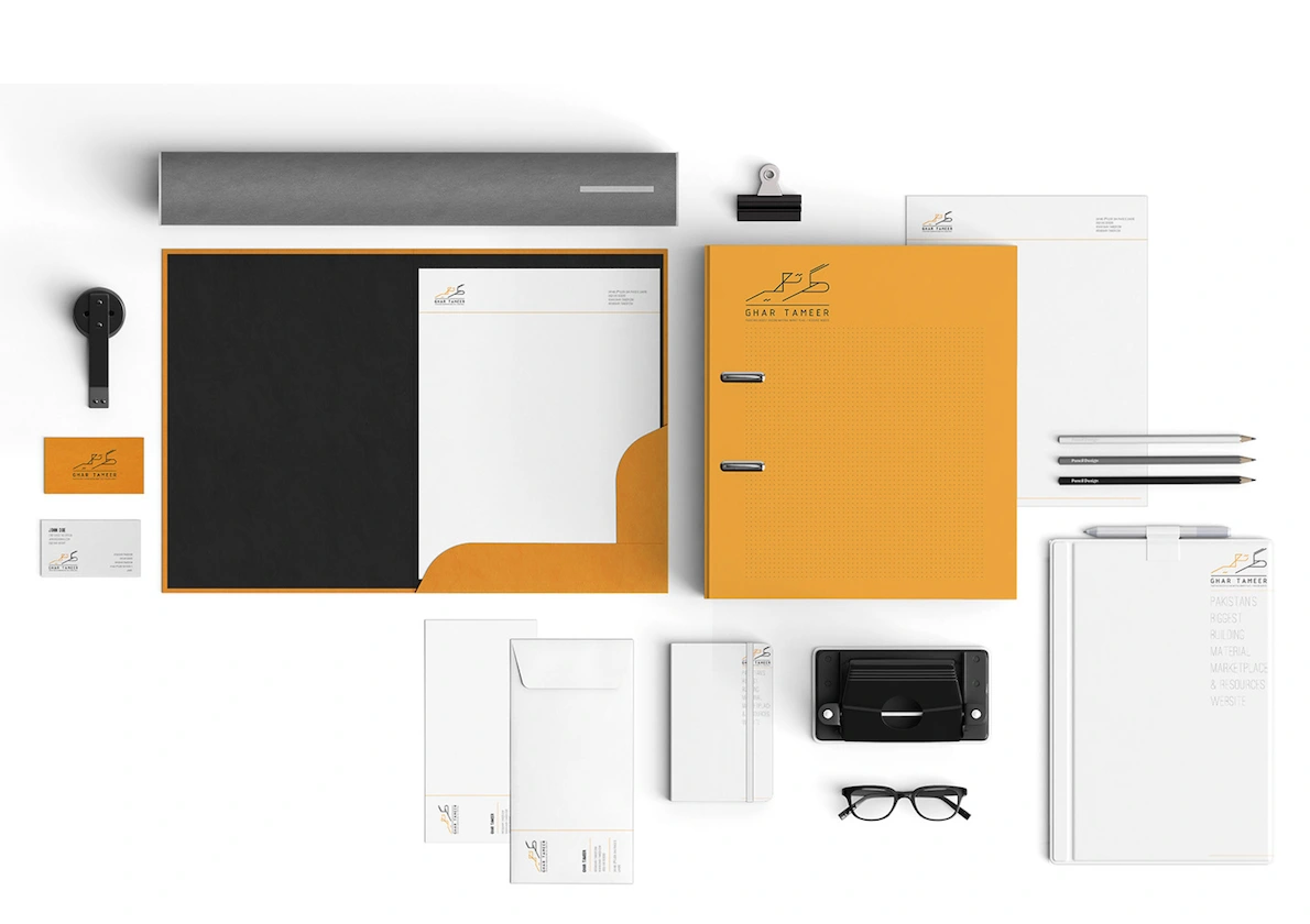
The Solution
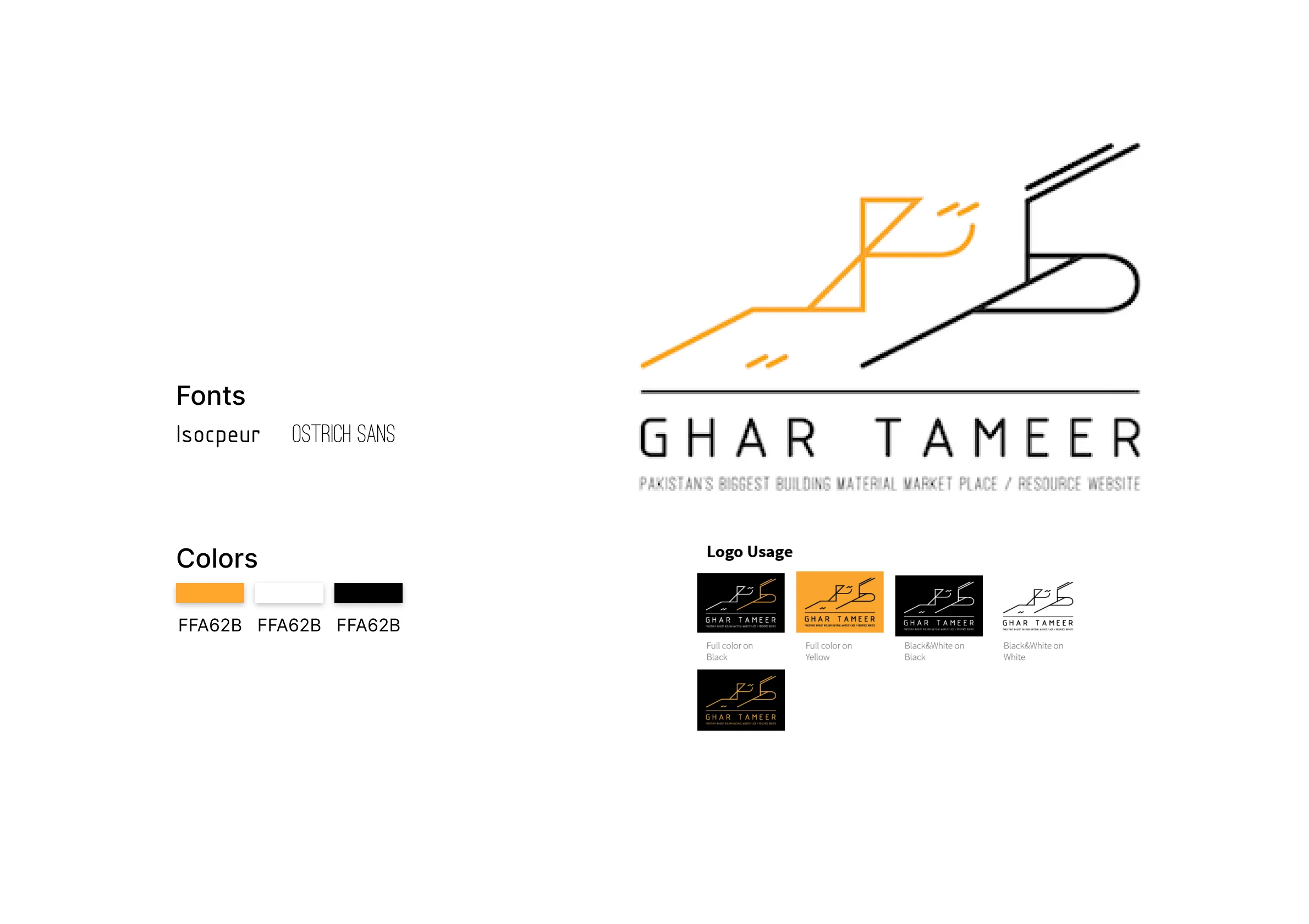
The logo I created was more than just an image; it was a symbol of Ghar Tameer's dedication to their craft. It seamlessly blended the calligraphic elegance of their heritage with the modernity of their approach. The final design was timeless and versatile, perfectly encapsulating the essence of Ghar Tameer.
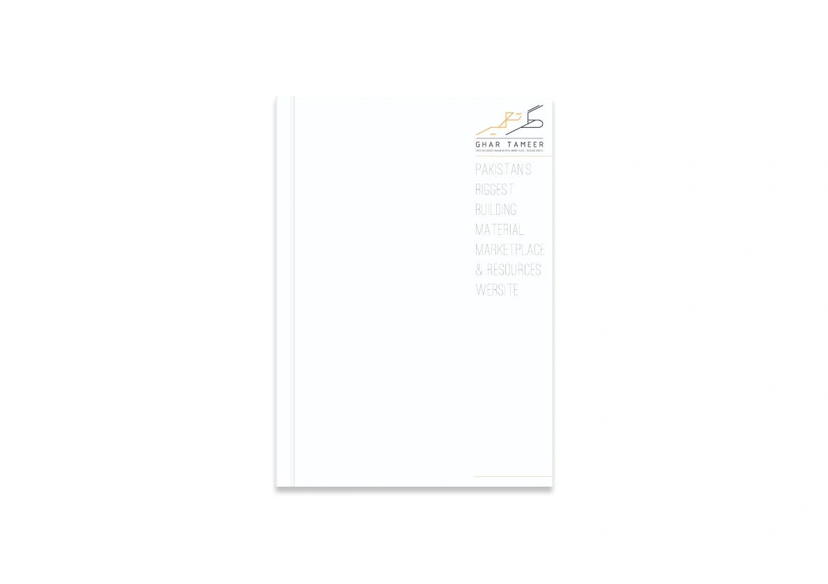
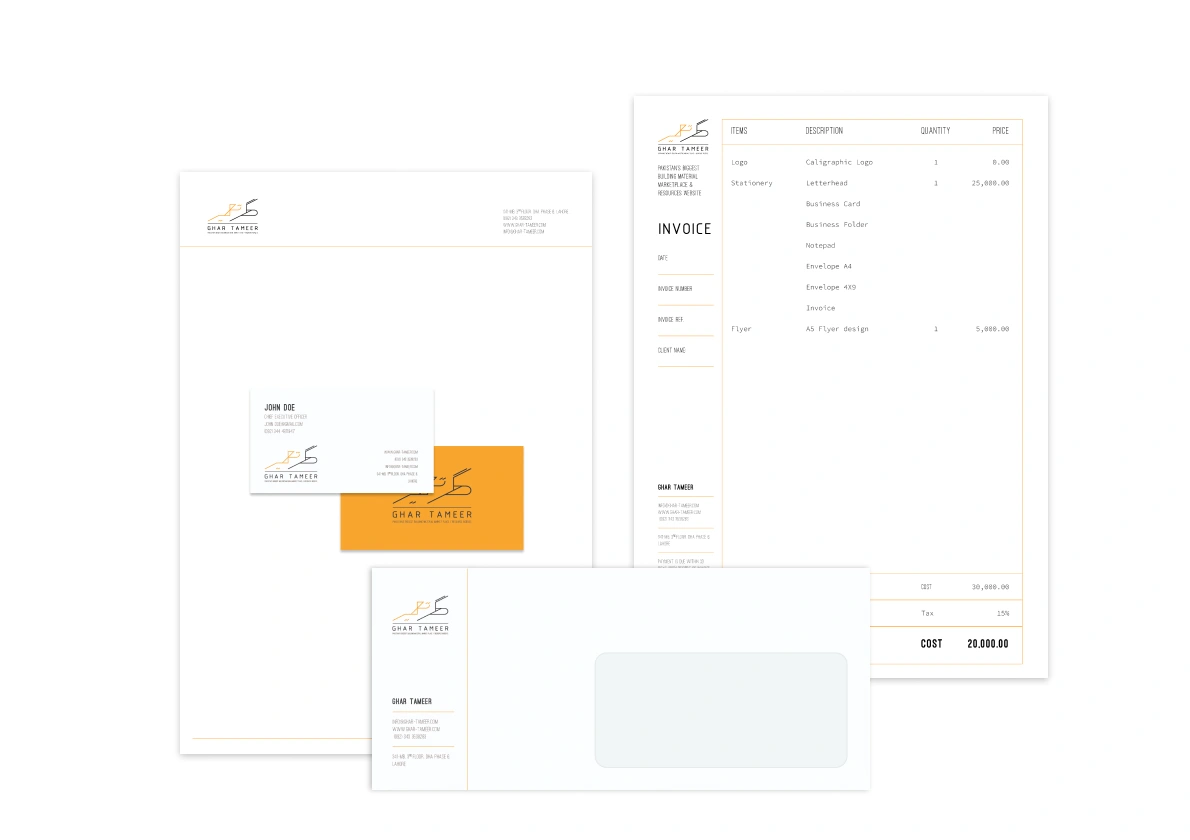
But the branding didn't stop at the logo. I extended the ideas and shapes from the logo to create a cohesive branding system. This system ensured that Ghar Tameer's identity remained consistent and adaptable across various environments and applications. Whether it was on construction site banners or business cards, their branding was always the perfect fit for its purpose.
In the end, my role in researching, defining, designing, and styling the logo for Ghar Tameer was a journey of discovery and creation. The unveiling of their new brand identity marked the beginning of a new era for the company, one where they would continue to build dreams and go above and beyond for their clients and staff under the banner of their distinctive logo.
Thankyou for watching
Like this project
Posted Jun 9, 2026
Likes
0
Views
6