Visibeat

Sukhpreet Singh

VISIBEAT / CASE STUDY
DASHBOARD · PRODUCT DESIGN (B2B) · UK POLICING
A command surface built for UK Police, with geofencing, hotspots and alerts.
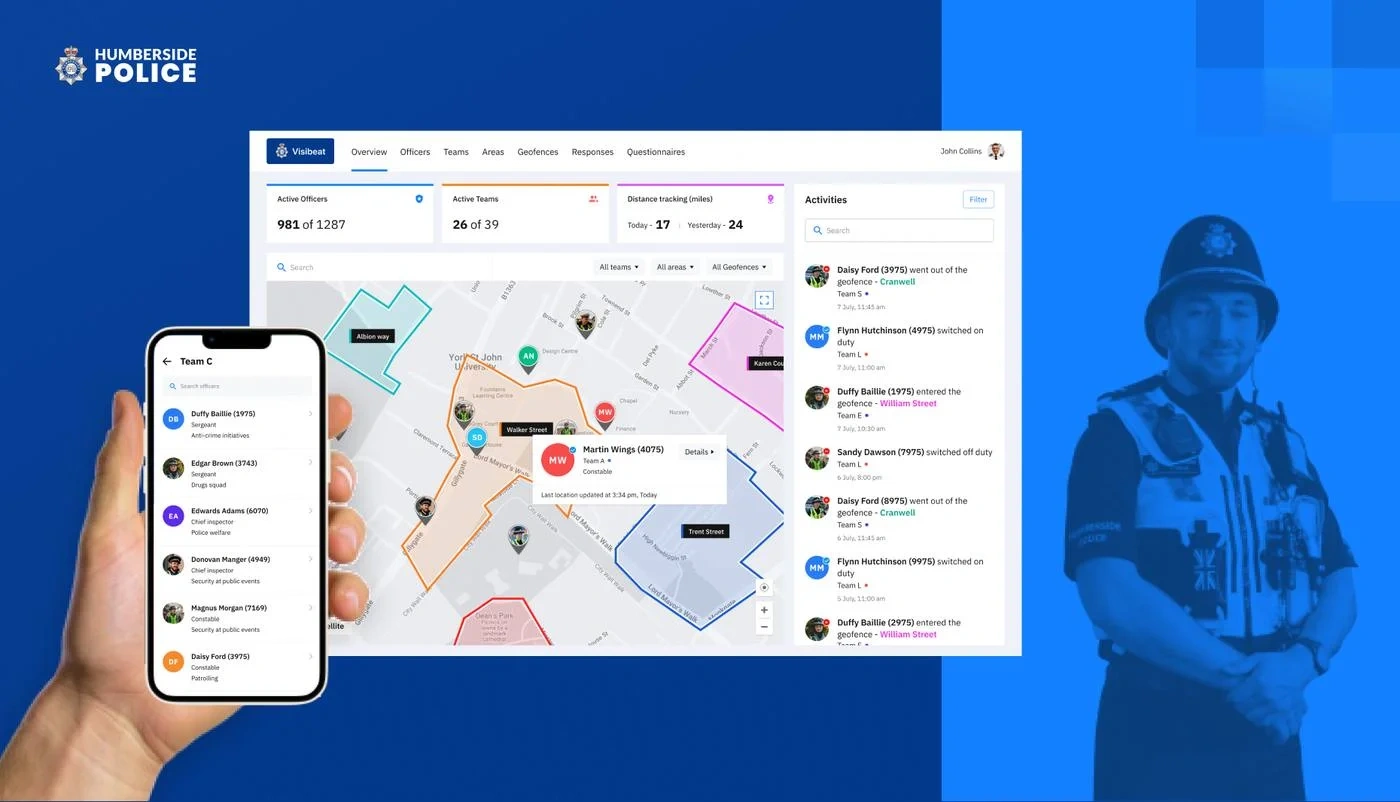
A white-label location intelligence platform for organisations that need to see the field in real time — adopted by Humberside Police as their command surface for patrol coordination.
CLIENT
Humberside Police
United Kingdom
AGENCY / ROLE
Thumbmunkeys
UI/UX Designer — sole designer on record
PLATFORM
Web dashboard + mobile
Desktop-first, iOS companion
DURATION
6 months
Discovery → shipped v1
DELIVERABLES
Product, IA, UI, System
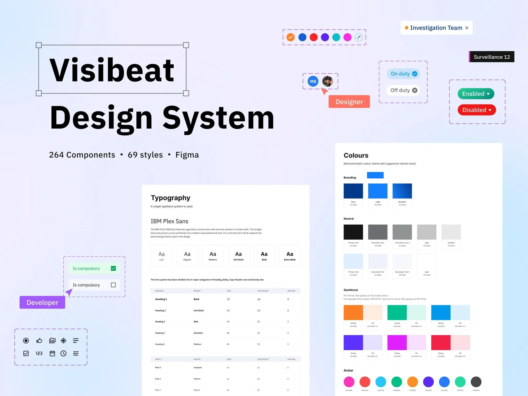
264 components · 69 styles
CONTEXT & PROBLEM
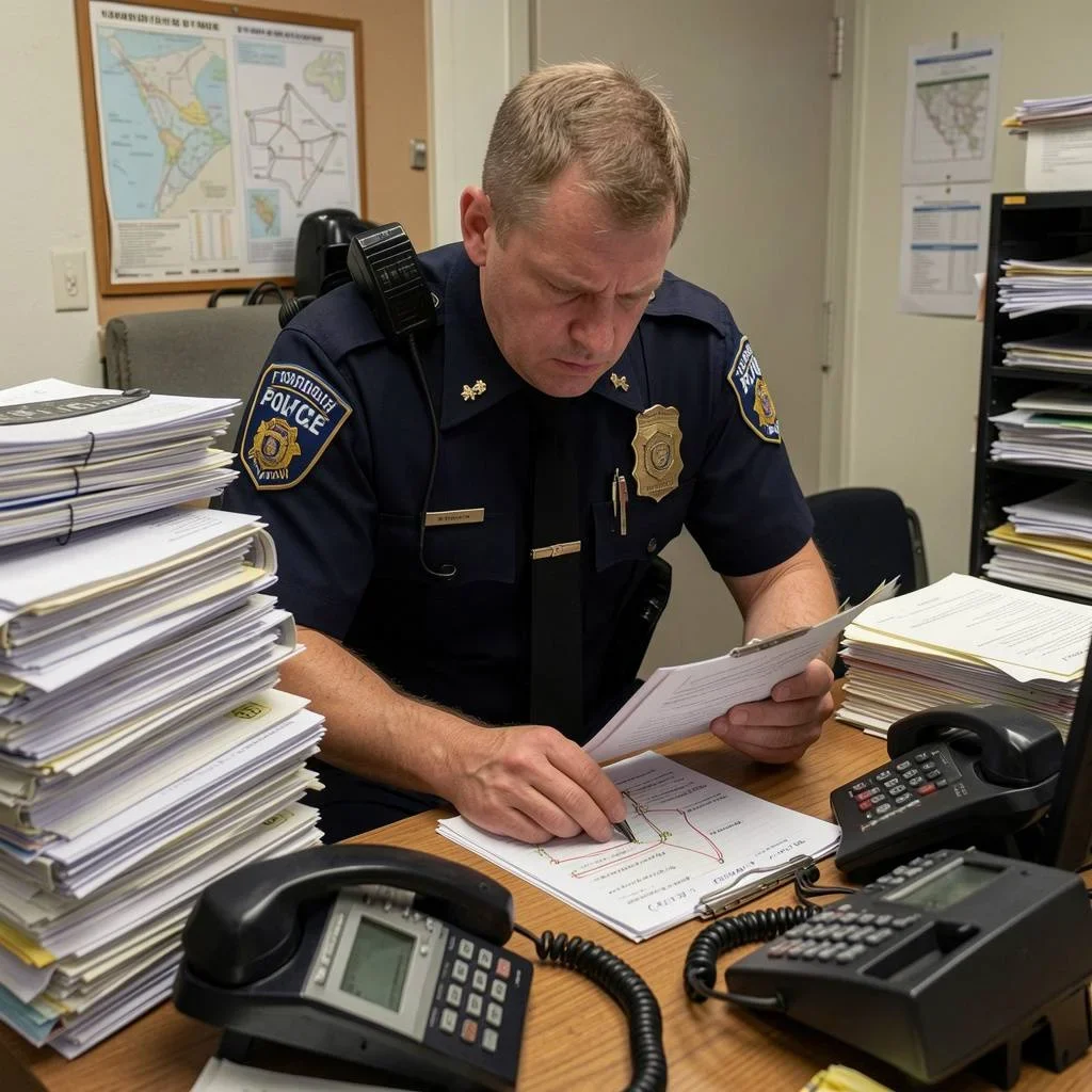
Before Visibeat: radio, paper, and a lot of guessing.
Humberside Police adopted Visibeat as their command surface for patrol coordination across Northern Lincolnshire, Hull and the East Riding.
Before it, supervisors couldn't answer basic questions fast — where's my team?, which hotspots are covered?, who finished their patrol? — without switching systems and calling officers on the ground.
The briefOne calm surface: instant answers, precise territory control, and a mobile companion built for gloved hands mid-shift.
OVERVIEW
One product, four roles, four surfaces.
USERS
Admins · Supervisors · Managers · Officers
MODES
Dispatch console + Field companion
DATA SURFACES
Directory · Map · Timeline · Analytics
DESIGN SYSTEM
Custom · white-label ready
PROCESS
Six months. Blank brief to shipping v1.
Sole designer — product framing, IA, UX, UI, design system and usability research.
01
Strategy — Product framing
A broad "track officers" brief, scoped into a defensible primary user and a white-label spine.
02
Research — Discovery & interviews
Sat with supervisors, dispatchers and beat officers to see how radio and paper logs actually got used, shift to shift.
03
IA — Information architecture
Four durable surfaces — Directory, Map, Timeline, Analytics — built to grow without breaking week-one habits.
04
UX/UI — Interaction & visual design
Every screen from officer directory to geofence editor: dense tables, calm maps, bulk-action drawers.
05
System — Design system
264 components, 69 styles. Brand as configuration — re-themeable for any force, no rebuild.
06
Testing — Usability & iteration
Task-based sessions with real dispatchers on the beta, fed straight back into the drawer and filter patterns.
DESIGN PRINCIPLES
Five rules the product had to obey.
P1 Read from 3 metres
Clarity under pressure
Legible during a bad shift. Colour never carries meaning you'd lose in glare.
P2 One screen, one system
Density without overload
Directory, map, activity feed and KPIs on one screen — each surface with one job.
P3 First screen = first question
Role-shaped workflows
Managers see coverage. Supervisors see live position. Officers see the next task.
P4 One colour = one thing
Map-data coherence
Team colours, geofence colours and pin colours are the same tokens, everywhere.
P5 Configurable, not hard-coded
Scalable by default
The next force and the tenth admin can adopt it without a redesign.
F/01 · OVERVIEW & SEARCH
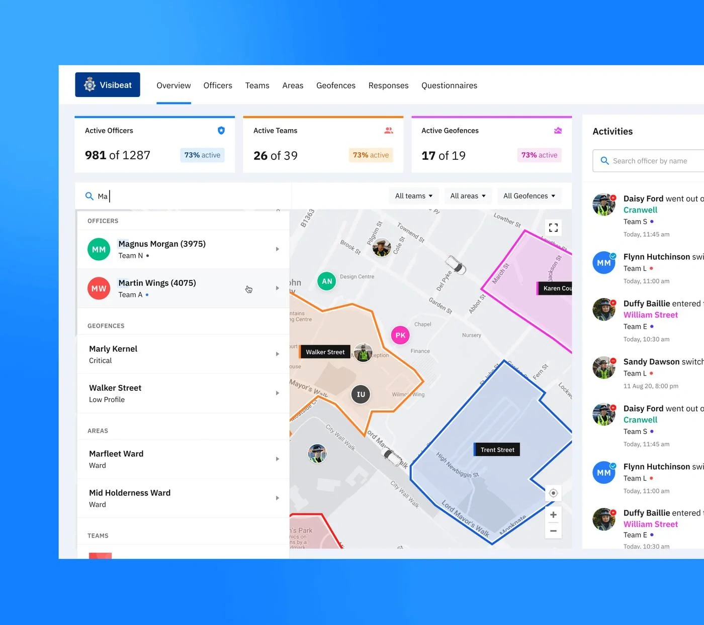
One screen, one search box, for everything
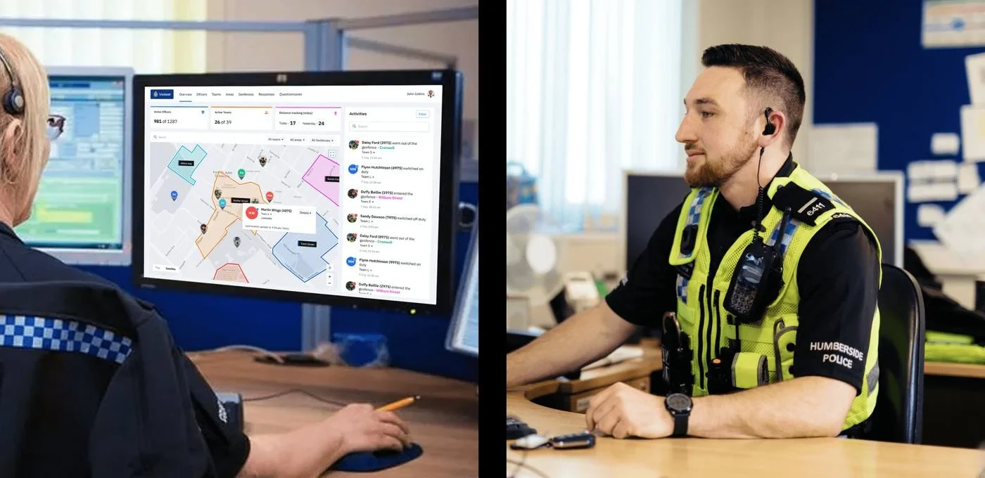
Active officers, active teams and distance covered at a glance, with a live activity feed alongside.
Live KPIs, not vanity metrics981 of 1,287 officers, 26 of 39 teams — the numbers a supervisor needs first.
Search drives the mapPick a result and the map recentres, the activity feed filters to match. One source of truth.
Grouped, ranked resultsOfficers, geofences and areas ranked by relevance in one dropdown.
F/02 · OFFICER DIRECTORY
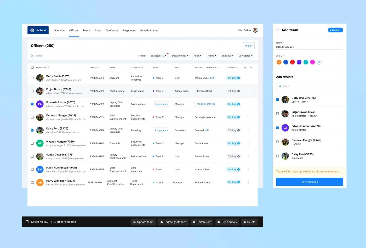
A directory built to stay usable at scale
Rank, department, team, role and assigned geofences, all visible in one row.
Five bulk verbs, 90% of the workflowUpdate team, geofences, role, survey, delete — reversible, confirmed before firing.
Team creation as a companion, not a pageOpens a drawer — the directory underneath never loses context.
F/03 · OFFICER DETAIL & LIVE TRACKING
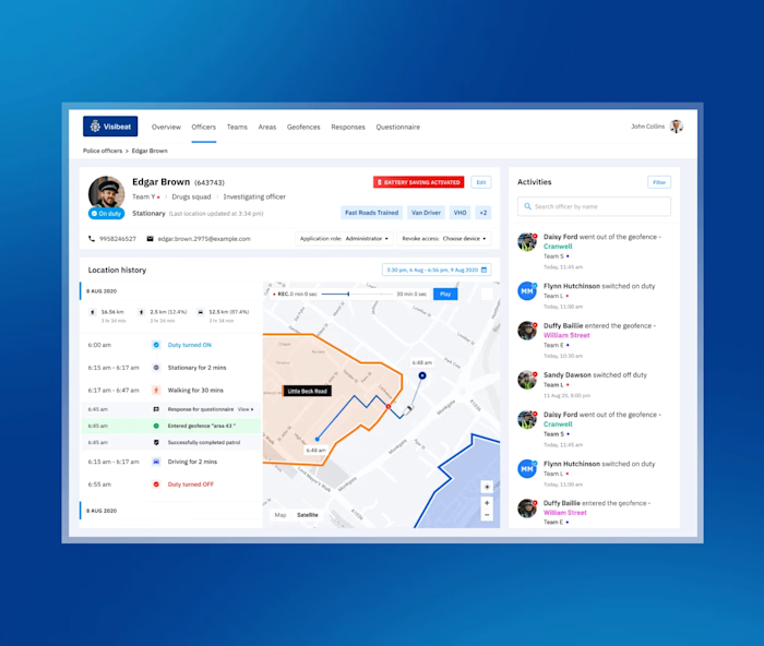
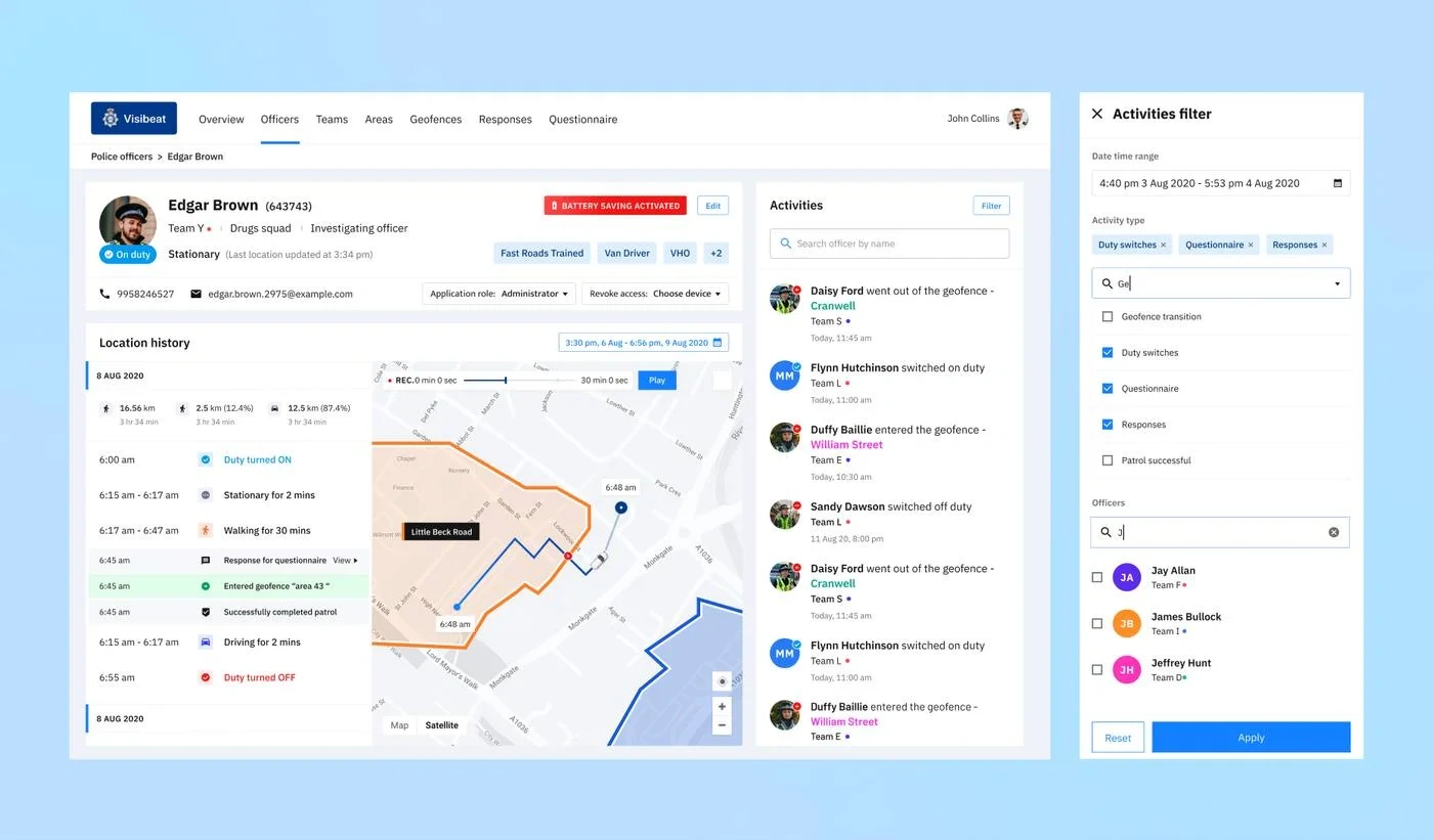
A shift, played back second by second
One profile per officer — photo, team, role, badge, device state — header collapses on scroll so the timeline stays visible.
Route drawn on assigned geofencesCoverage and deviation visible in the same glance, not a bare map.
Filters remembered per sessionDuty switches, questionnaires, responses — chip-style, stateful.
F/04 · TEAMS AT SCALE
Coordination across dozens of teams, not one
Each team carries its own colour, member count, active count and assigned ward.
One colour, one meaning, everywhereSame token on the roster, the map pins, and the officer's badge.
F/05 · HOTSPOTS & GEOFENCES
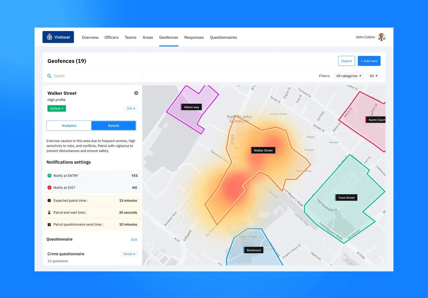
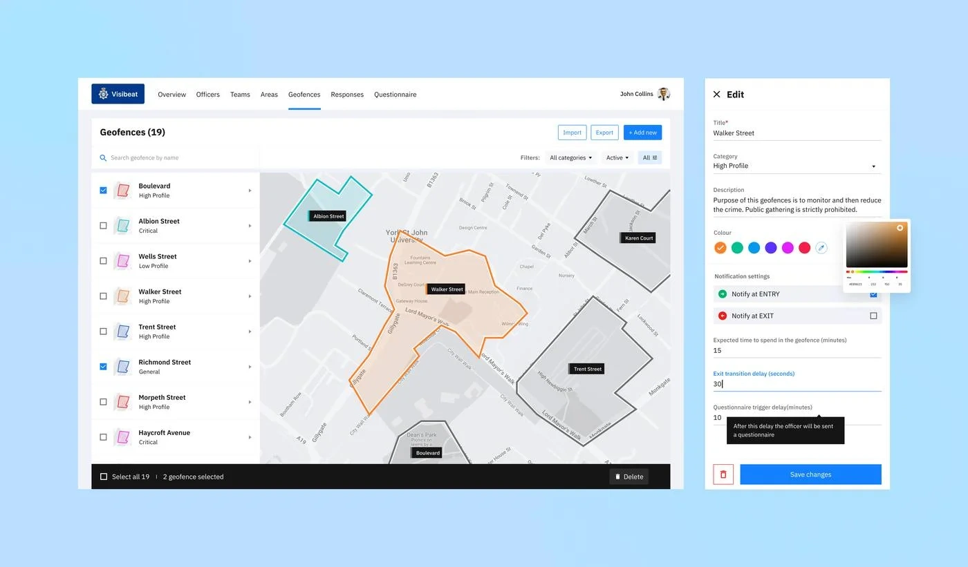
The coverage layer: territory, carved by hand
Drag pins to carve territory. Each geofence carries a profile — High, Critical, Low — a colour, a team, notification rules and an in-fence questionnaire. Every activity inside is tracked.
F/06 · FIELD COMPANION
A gloved-hand experience for the field
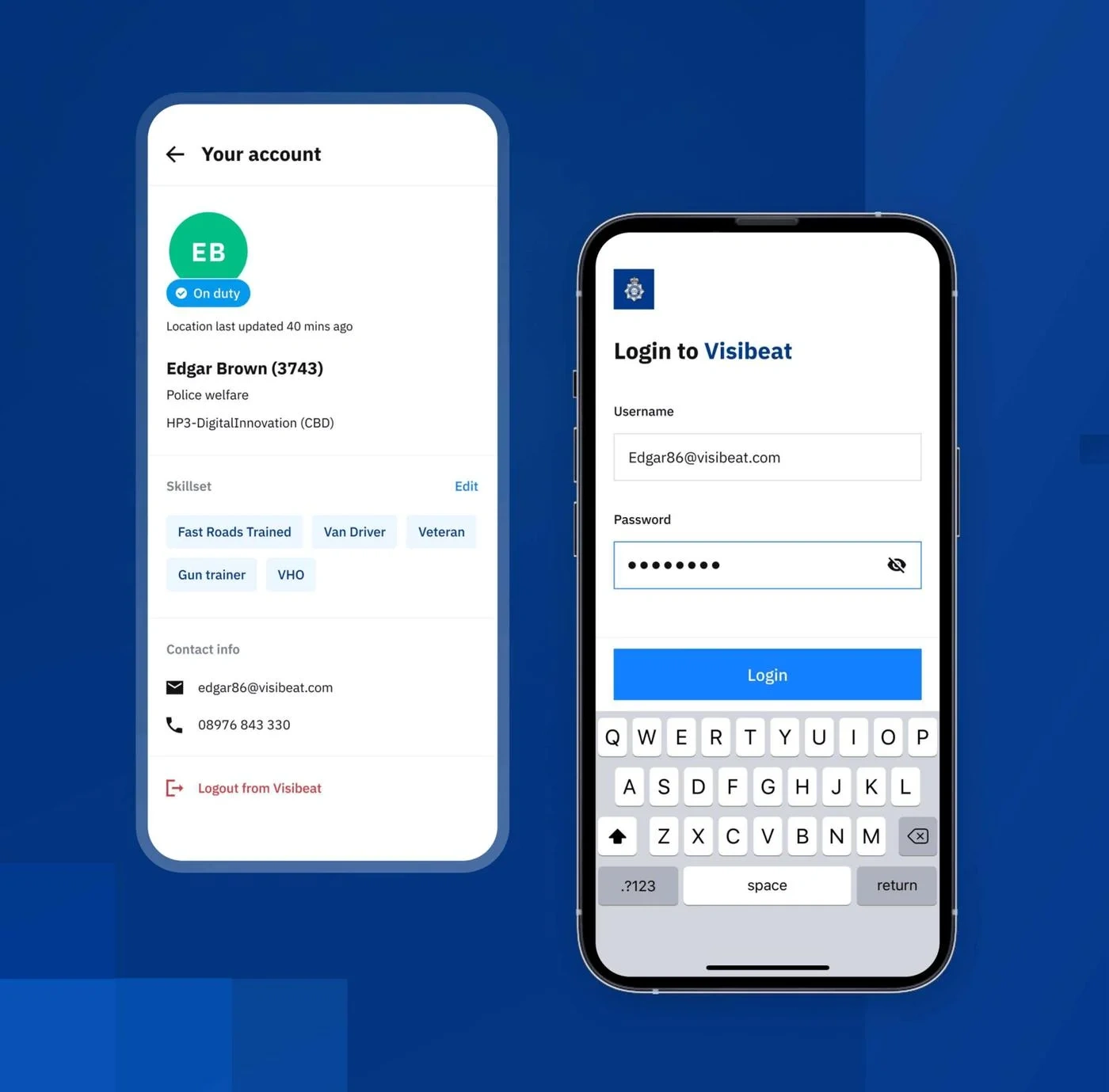
Task queue, surveillance zone briefings and one-tap navigation on the map. Skillset, contact info and login kept just as simple. Sized and paced for a phone on a lanyard, not a shrunk-down desktop.
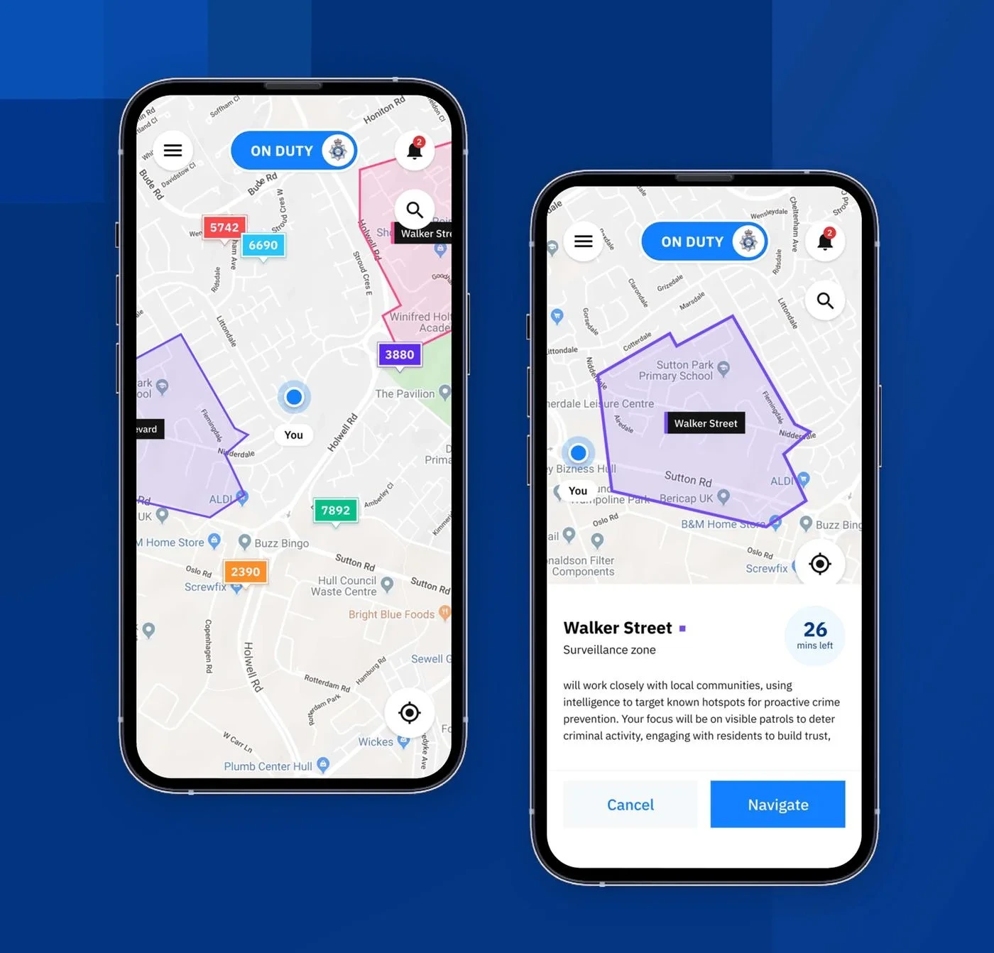
Zone briefings, not just a pinEach surveillance zone carries a description and a countdown, so the next task is never ambiguous.
Designed for glovesLarge hit areas, chunked inputs, no hover states, no dropdowns.
Offline-tolerantActions queue and sync on reconnect — never a mid-shift spinner.
F/07 · THE DESIGN SYSTEM BEHIND IT
Built once. Re-skinned in a few clicks.
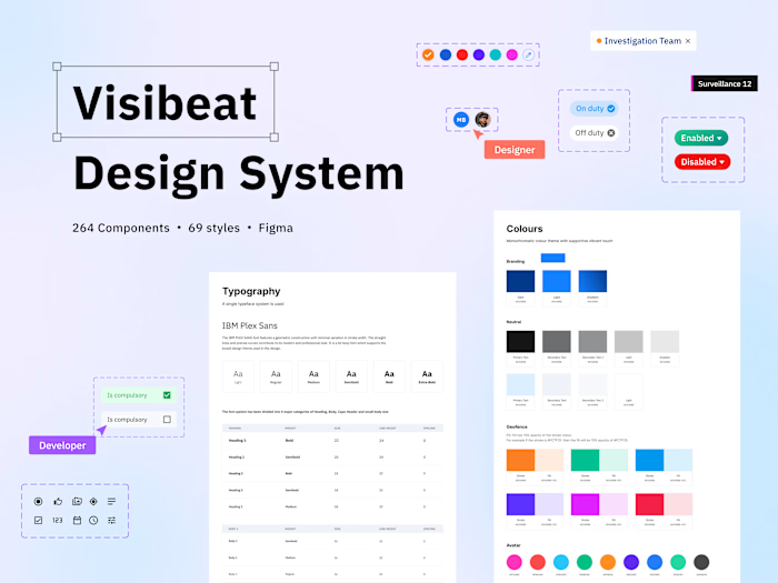
264 components and 69 styles in one Figma library — colour, logo, typography and map styling are all configuration, not hard-coded. The same system that powers Humberside Police can be relabelled for a different fleet without a rebuild.
FD
Fire & rescue departments
Swap badge, colour tokens and geofence categories (High/Critical/Low) for incident risk tiers — the tracking core stays identical.
SH
Shipping & fleet tracking
Officers become drivers, geofences become depots and delivery zones — the same directory, map and timeline surfaces carry over.
PD
Other police forces
A new force's crest, brand colour and ward names drop straight into the existing tokens — no redesign, just reconfiguration.
264 components
69 styles
1 typeface system
0 rebuilds needed per client
09 / OUTCOMES — WHAT SHIPPED, AND HOW IT LANDED
Safer streets, clearer command.
— Digital Innovation Manager, Humberside Police
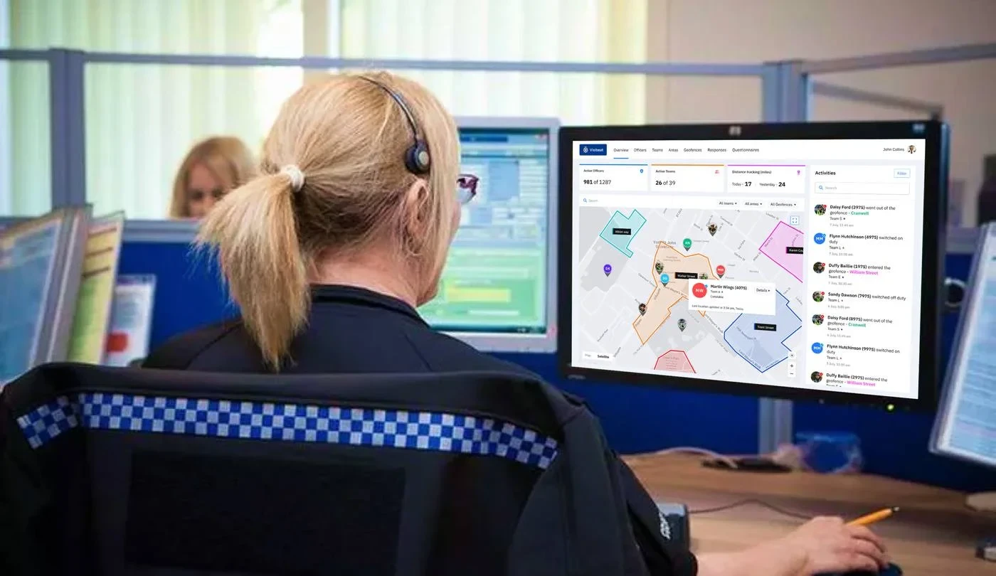
"The intuitive dashboard with clean UI allows the admin to manage all activities — from live location tracking to team management, hotspots and questionnaires — in one place."
ACTIVE OFFICERS
981 / 1,287
live at peak shift
ACTIVE TEAMS
26 / 39
teams active in a typical duty period
GEOFENCES
17 / 19
hotspots monitored across the region
DISTANCE TRACKED
17 mi
today · 24 mi yesterday
01
Operational transparency
From "where do we think they are" to a shared, live view of duty status and coverage.
02
Coordination at scale
981 officers, 39 teams, 19 geofences — run from one surface, bulk actions replacing phone-and-email.
03
Accountability, both ways
Every duty event timestamped and auditable — protecting officers as much as the public.
Available for freelance & contract design work
Sole designer, blank brief to shipped v1 — product framing, IA, UX, UI, design system and the usability research to validate it. Particularly drawn to domain-heavy B2B platforms and 0-to-1 builds.
View prototype Get in touch
Like this project
Posted Jul 26, 2026
Visibeat — a white‑label location intelligence command surface for Humberside Police with map, geofencing, hotspots, and a mobile field companion.
Likes
0
Views
5
Tags