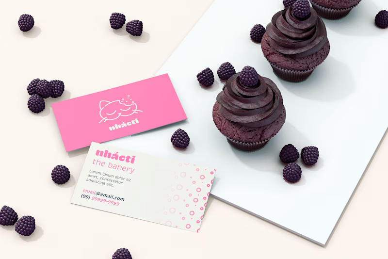
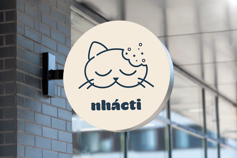
This is a personal project intended to practice branding. Therefore, the chosen concept was a cute, cozy, cat-themed bakery. The brand’s name, nhácti, it’s a Portuguese onomatopoeia for eating sounds, similar to what chomp would be in English.
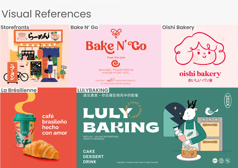
Color Palette
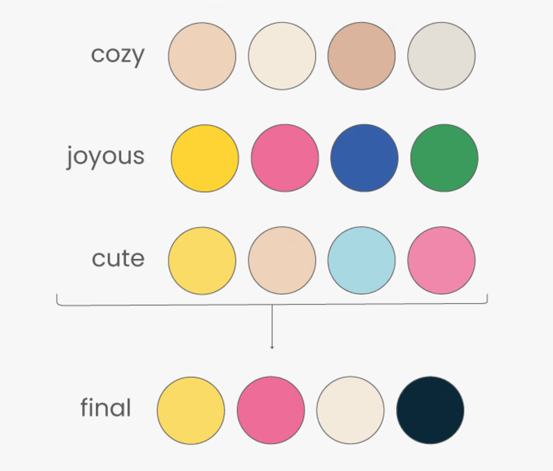
Thinking of a minimalist, yet colorful design with a cute aesthetic, the words cozy, joyous and cute were chosen to define the brand. With that said, four colors were assigned to each concept to then be refined to the final color palette.
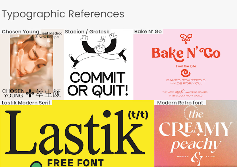
Typography
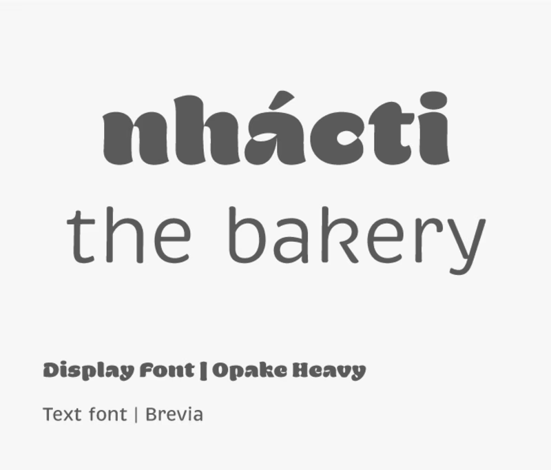
For typography, the idea was to keep the brand's concept without affecting the legibility. Therefore, two fonts were chosen for the brand: one for the titles and displays, and the other, for common text.
Logo Concept
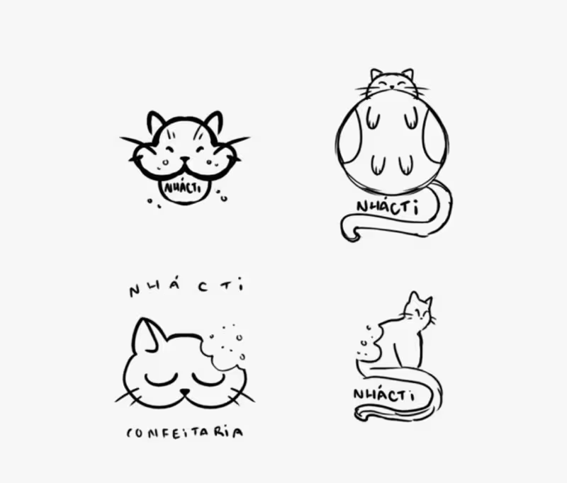
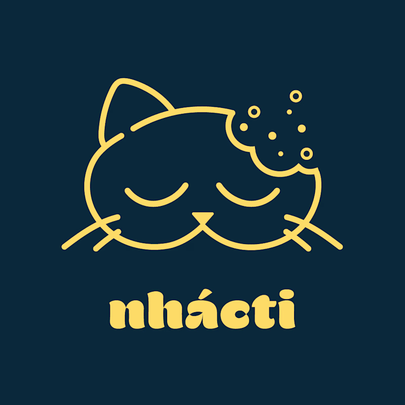
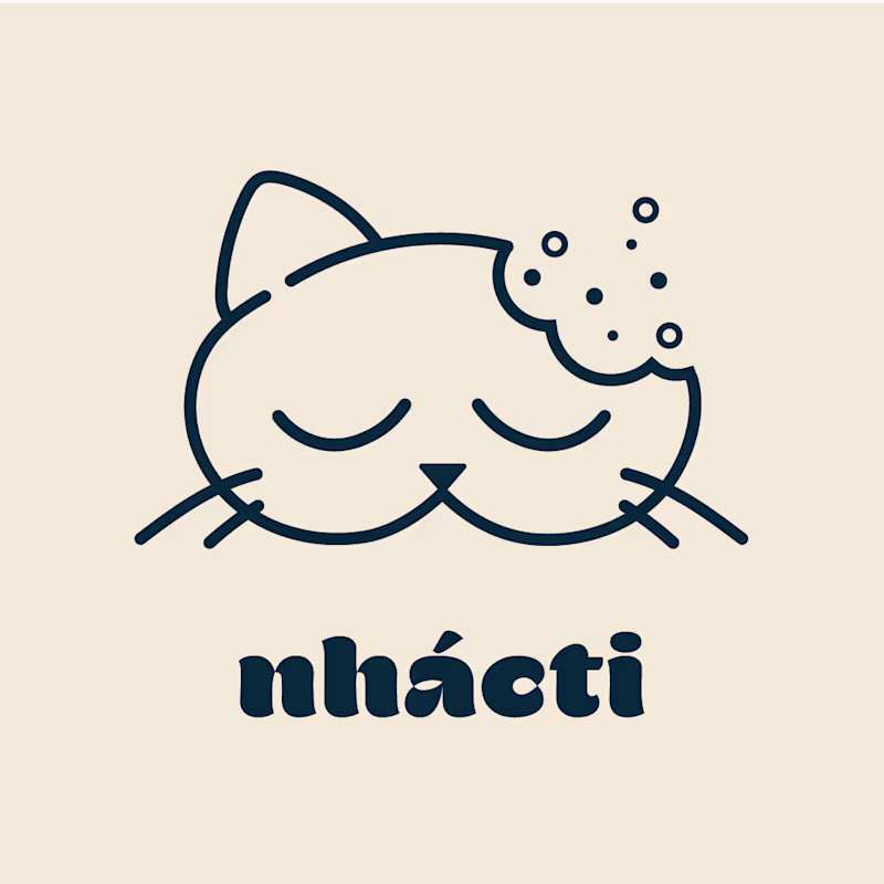
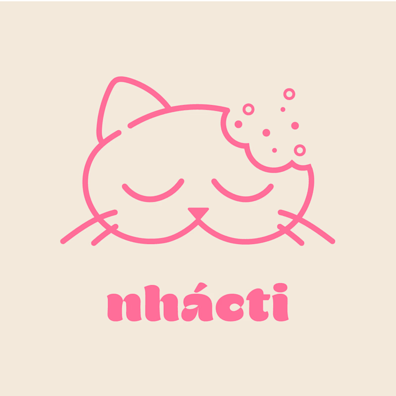
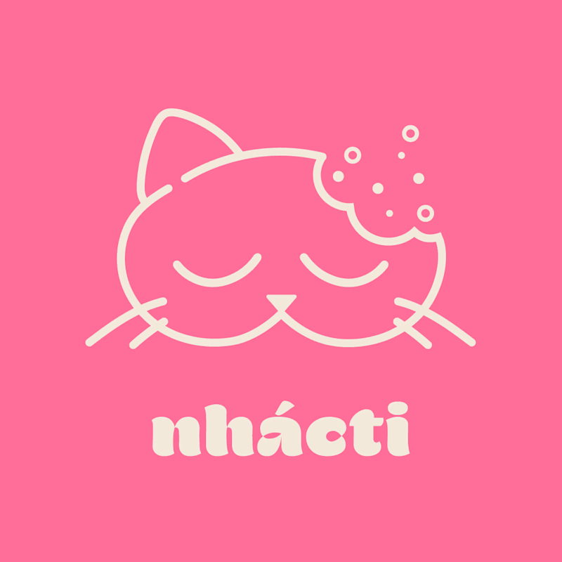
For the logo I first started doing some sketches. The idea was to clearly show the brand's aesthetic: a cute, cozy, cat-themed bakery. The conclusion I had was to bring the action "to eat" in the brand's logo. That way, the logo not only explicit the brand's services, but also brings the playfulness to it.
Color Applications
Mockups
