App Redesign, Feature Improvements
Seneca Mobile
Design Problem
The design problem would be discussed in terms of UI and UX
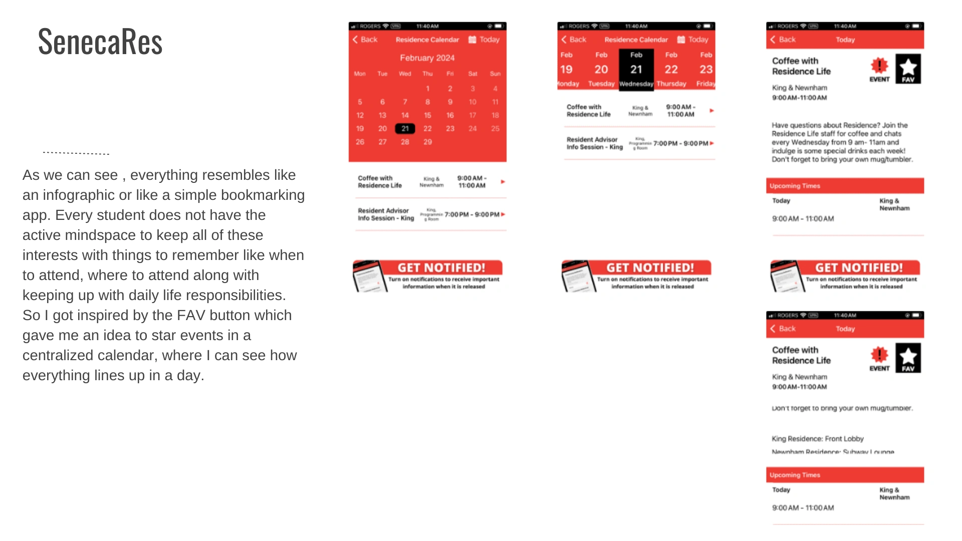
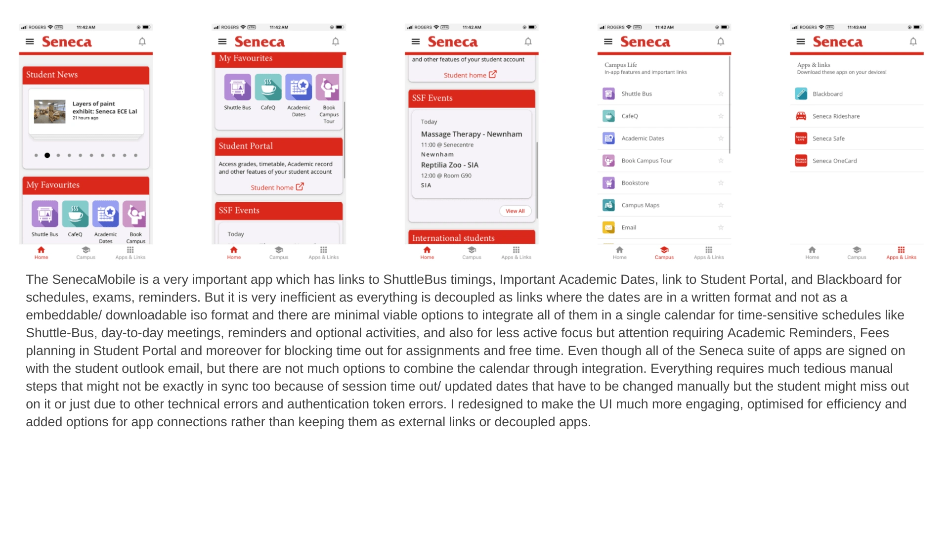
For the user interface, it does look good, but it resembles more like an interactive infographic for new students rather than an app busy students can use, mainly because of the user experience.
The links are clickable which takes the users to different sites, some of which must be logged into and if the student uses 2 factor authentication, then this would take the user to Microsoft authenticate which is very tedious to say the least. Over time through muscle memory, the user goes through this process every time, and this leads up to a build up of tabs in the mobile browser and this increases the chance of losing sight and track of very important open tabs for schoolwork or other aspects of student life like taxes, health related browser tabs etc.
Design Solution
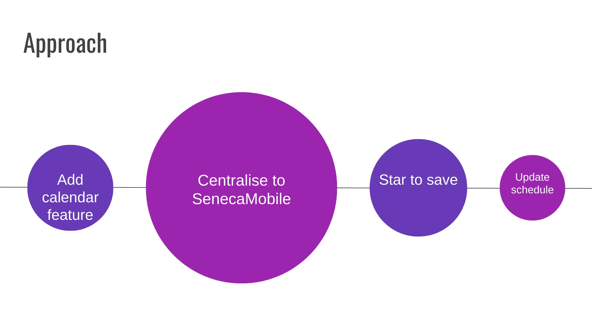
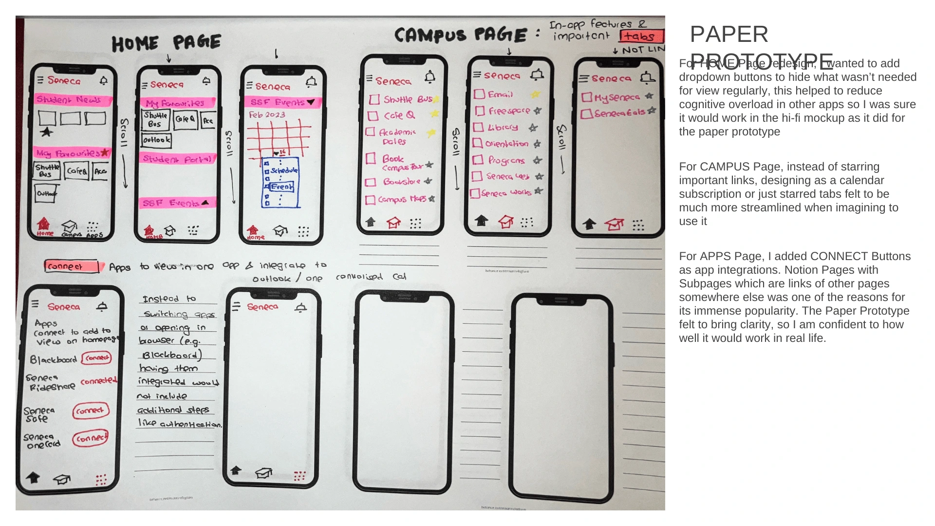
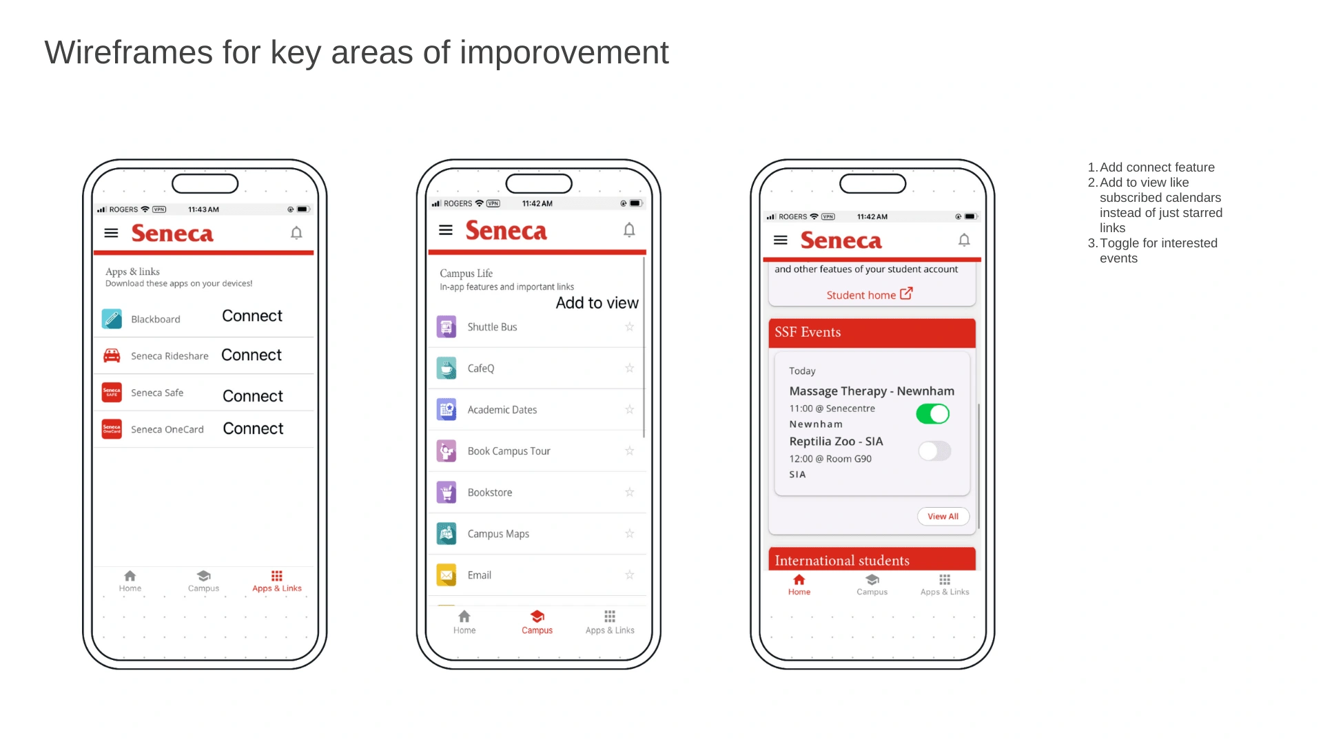
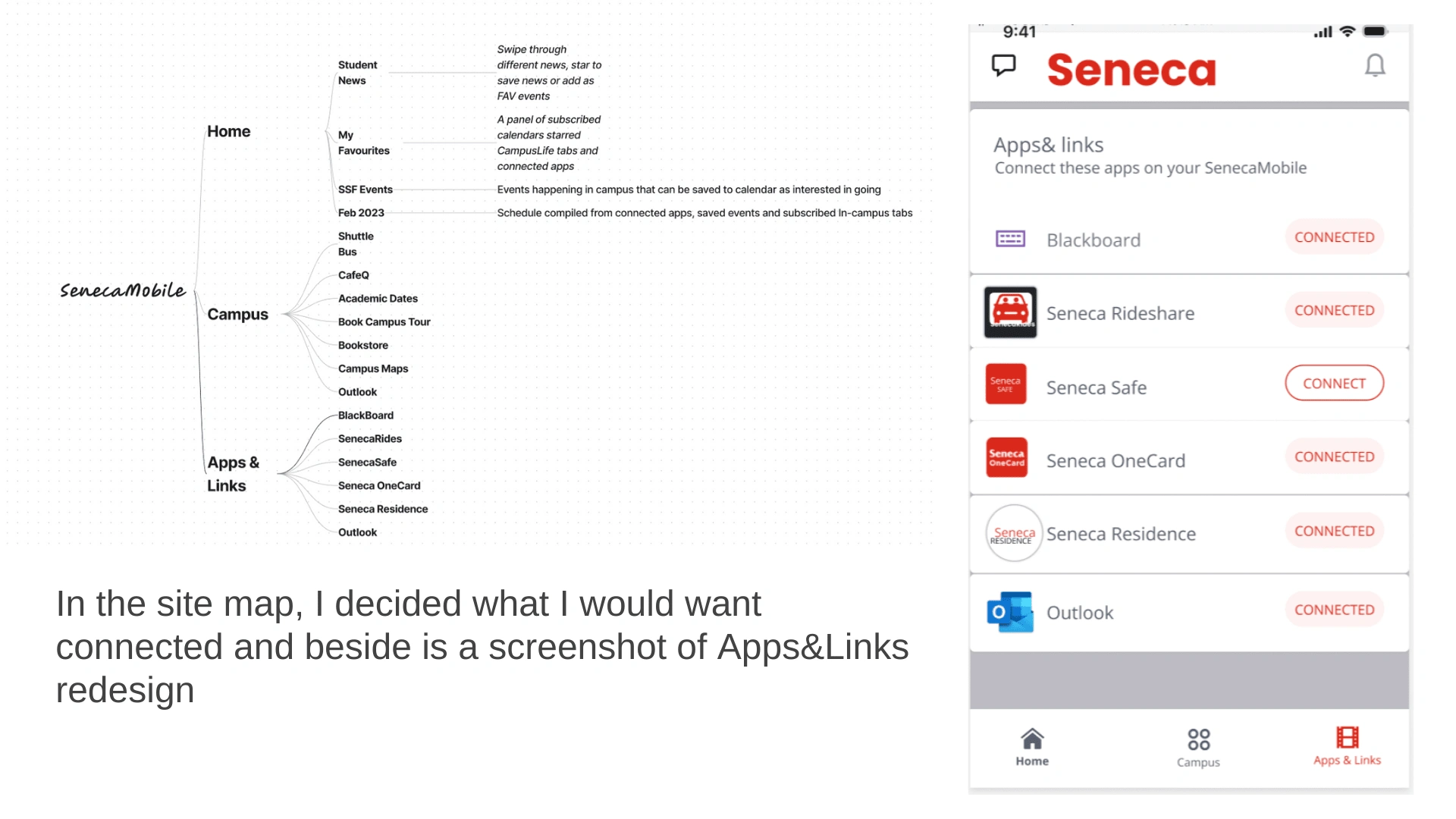
The design solution would be to centralize through the outlook email, integrate the outside links appropriately as in-app features and to add an option for connecting Blackboard, etc. so that the calendars can be fetched and turned on to be in sync.
Key areas of improvement
Key areas of improvement would be based on the quality of interactions.
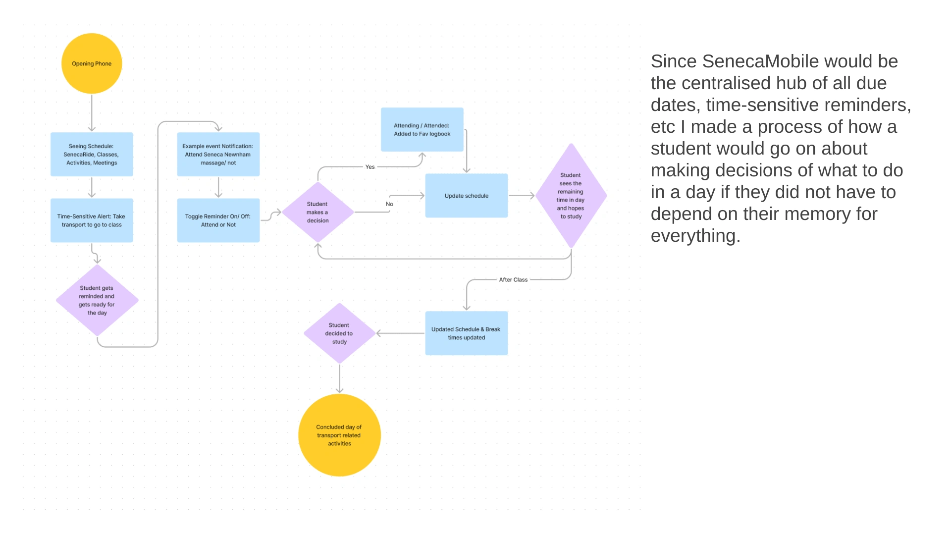
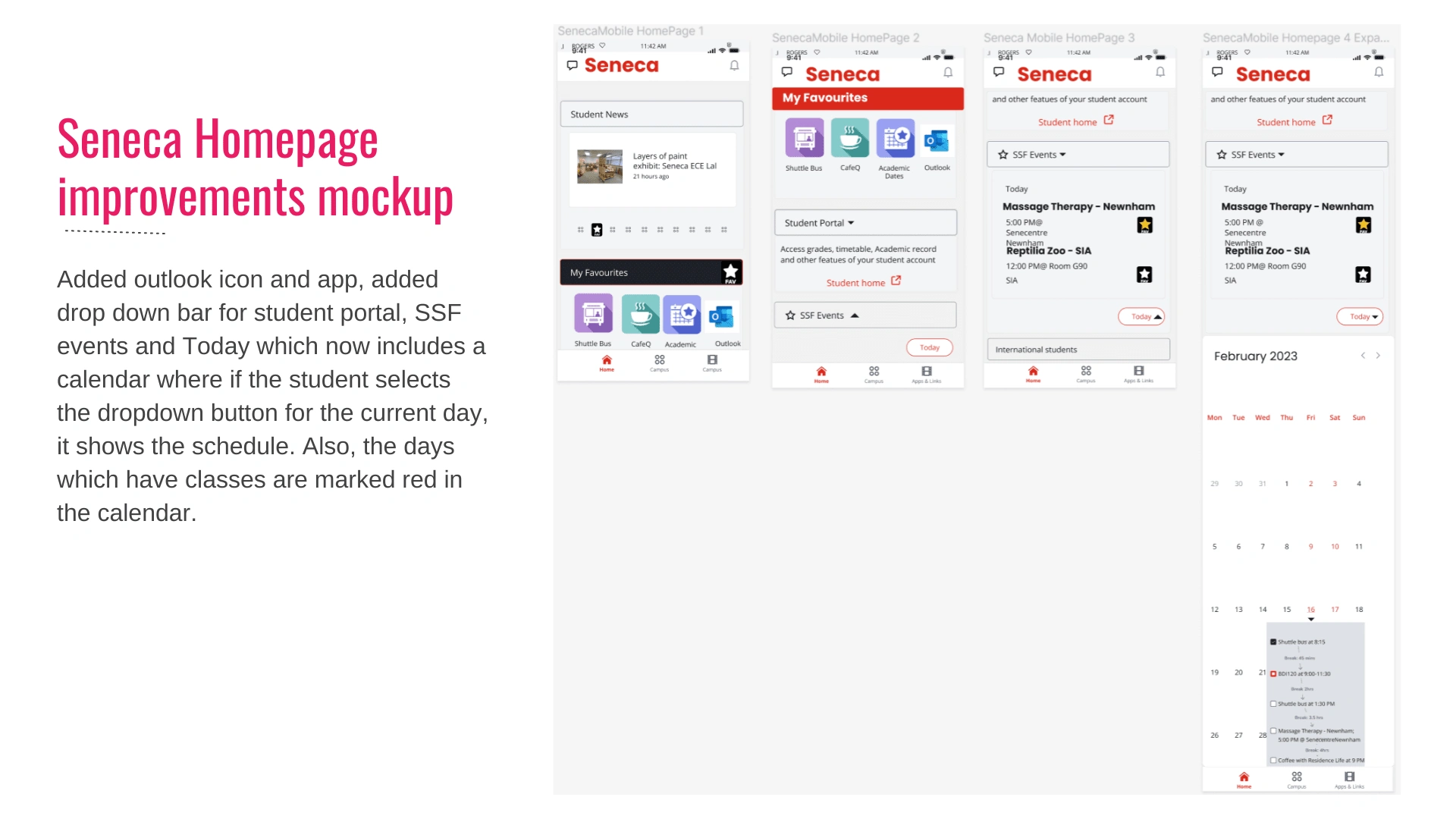
Key areas of improvement include making a centralized, dependency-based calendar, where fixed schedules like Shuttlebus and Class Timings carry priority over campus and residence activities. All optional activities should have a toggle bar in the big widget to turn off if needed.
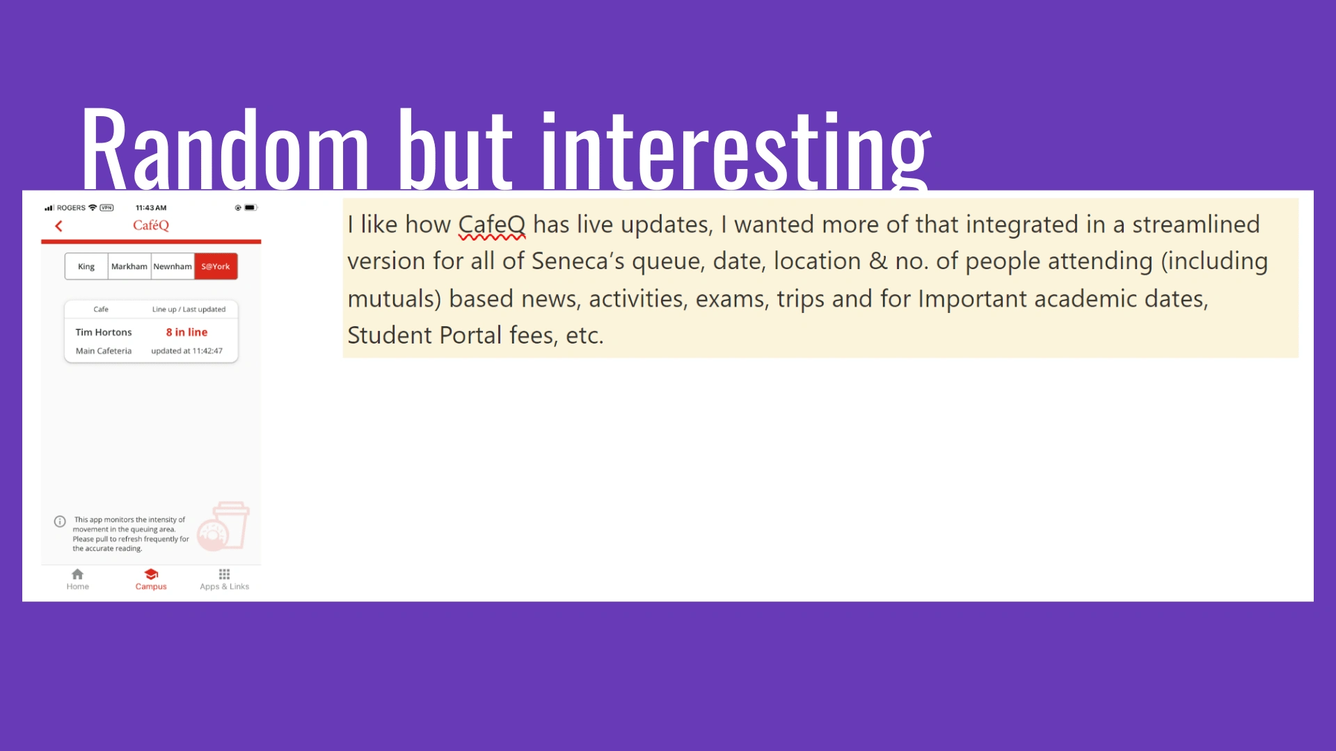
In this way, everything related to Seneca would be contained in one app that would increase efficiency, reduce cognitive overload due to minimization of clicking, loading, opening, signing in, loading, … until the user forgets what they intended to do in the first place.






Like this project
Posted Jul 28, 2024
App Redesign, Feature Improvements; UX Research, Wireframing and High Fidelity Mockups
Likes
0
Views
2


