NEON AGENCY Rebranding
Layers Studio
1 collaborator
NEON AGENCY Rebranding
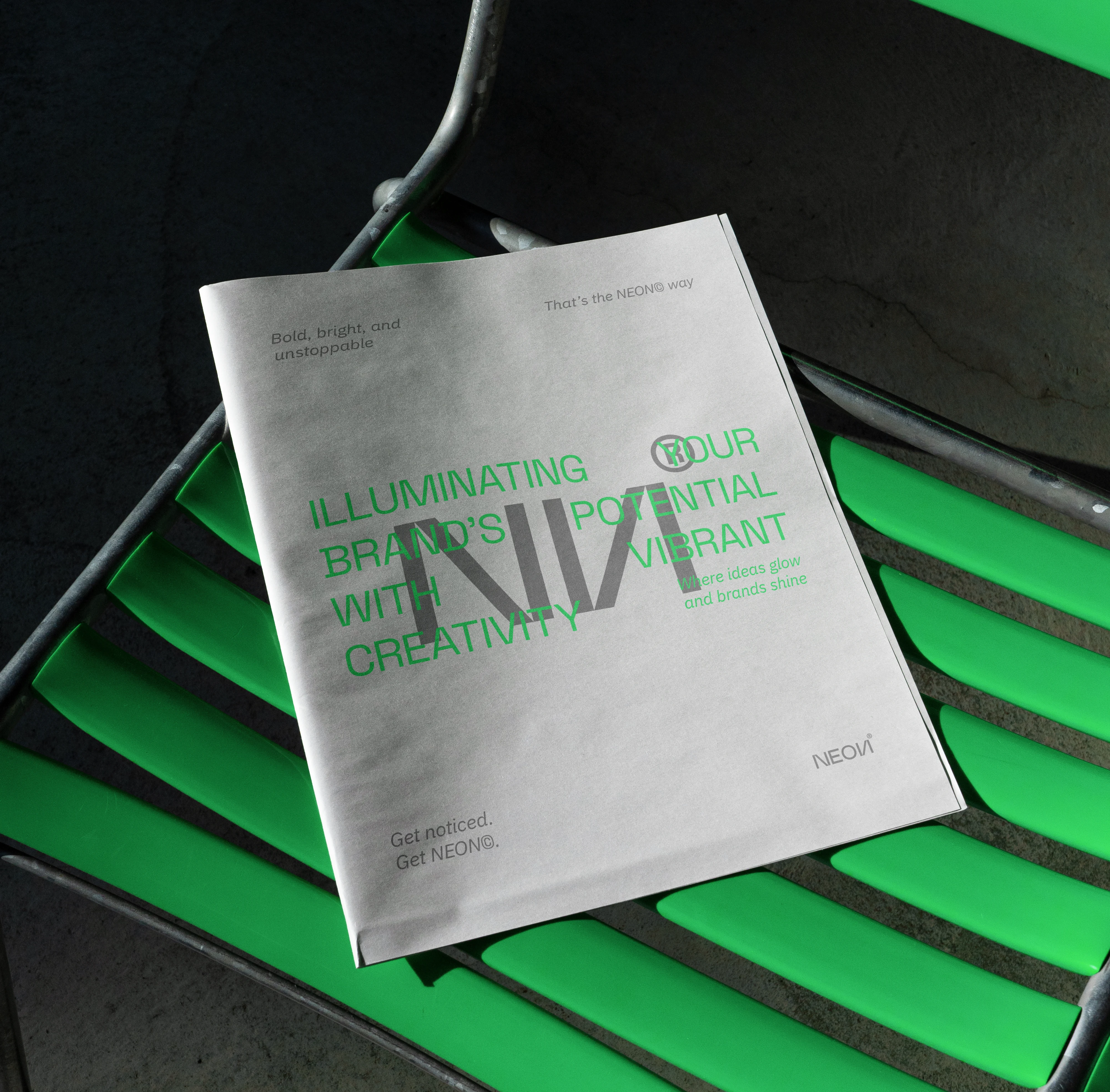
NEON© is a Baku-based creative agency seeking a visual identity that reflects its bold, energetic, and digitally driven nature. The goal of the rebranding was to create a cohesive system rooted in the concept of neon light — a symbol of visibility, movement, and innovation.
Concept & Logo Logic
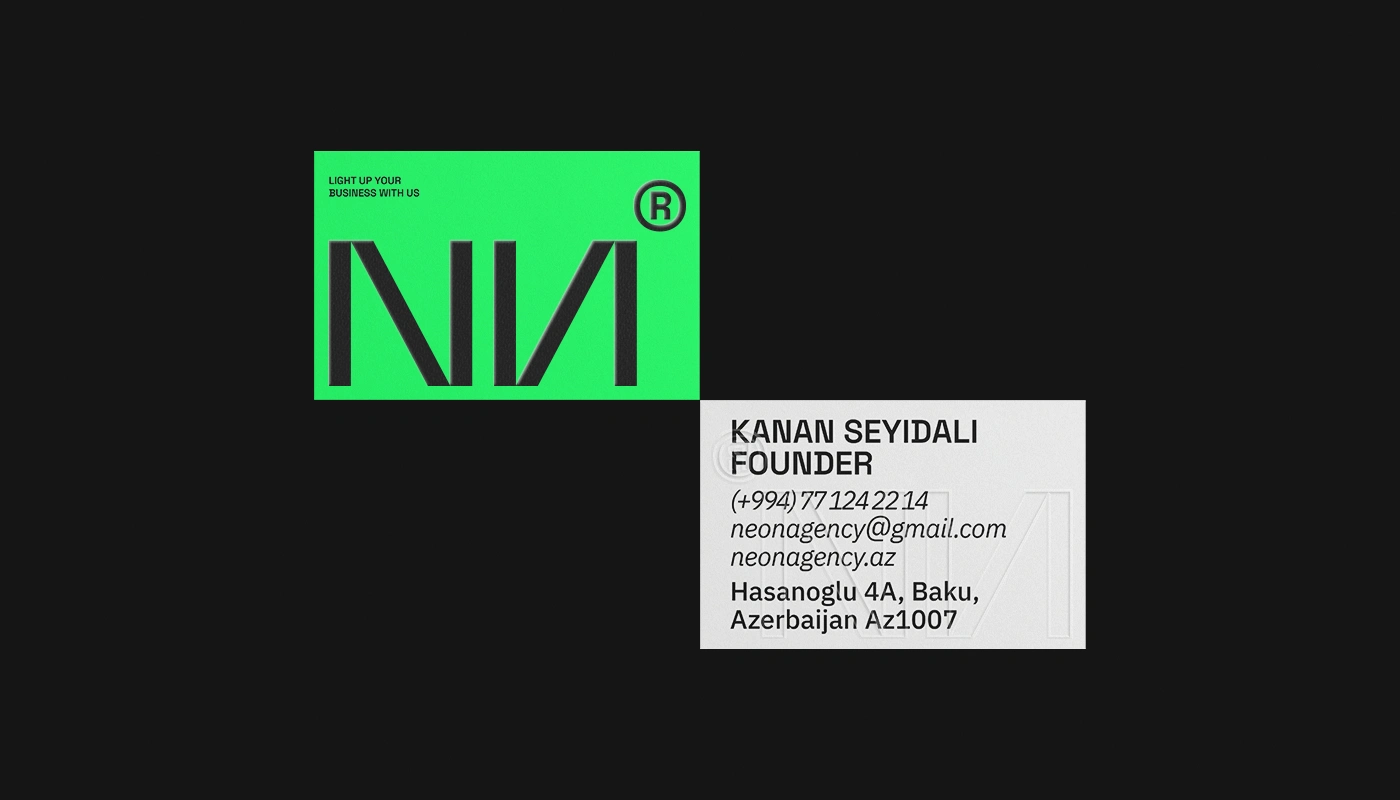
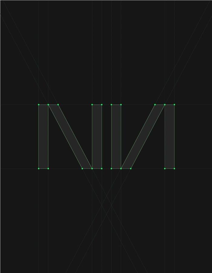
The word “neon” immediately evokes the structure of neon tubes. Inspired by their physical construction, I built the logo around the idea of two diodes — represented by the “N” letters at the beginning and end of the word.
The movement between these two points forms the letters “E” and “O,” symbolizing the flow of particles that generate neon light. This subtle conceptual foundation transforms the logo from a simple wordmark into a meaningful visual system.
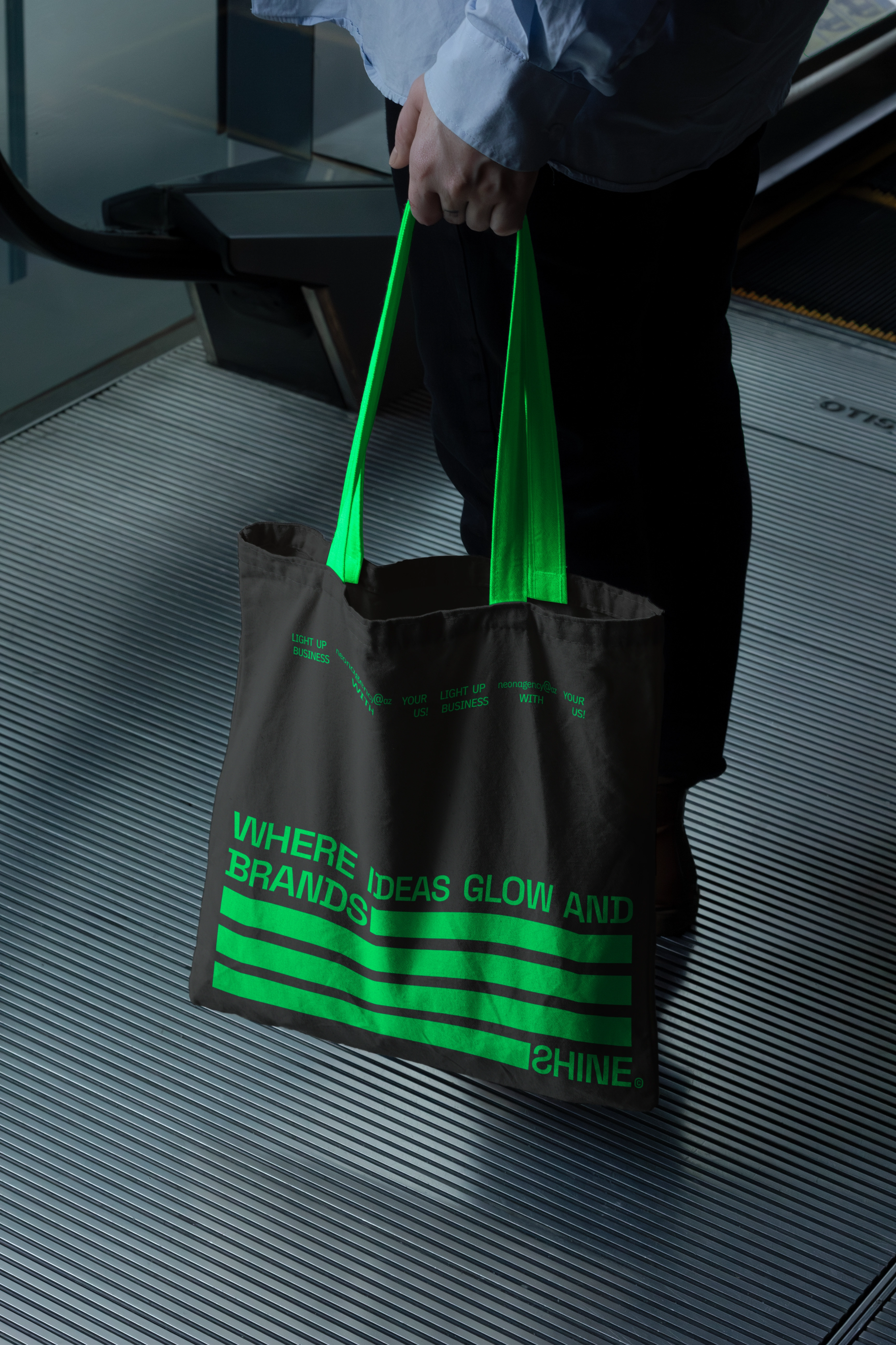
Visual Language & Pattern System
Neon tubes bend and expand when exposed to heat, allowing them to take dynamic shapes. Drawing from this characteristic, I developed a flexible pattern system inspired by the bending structure of neon pipes.
This pattern became a core identity element, reinforcing:
Flexibility
Creative movement
Dynamic transformation
It supports the logo across various touchpoints and ensures strong brand consistency across print and digital materials.
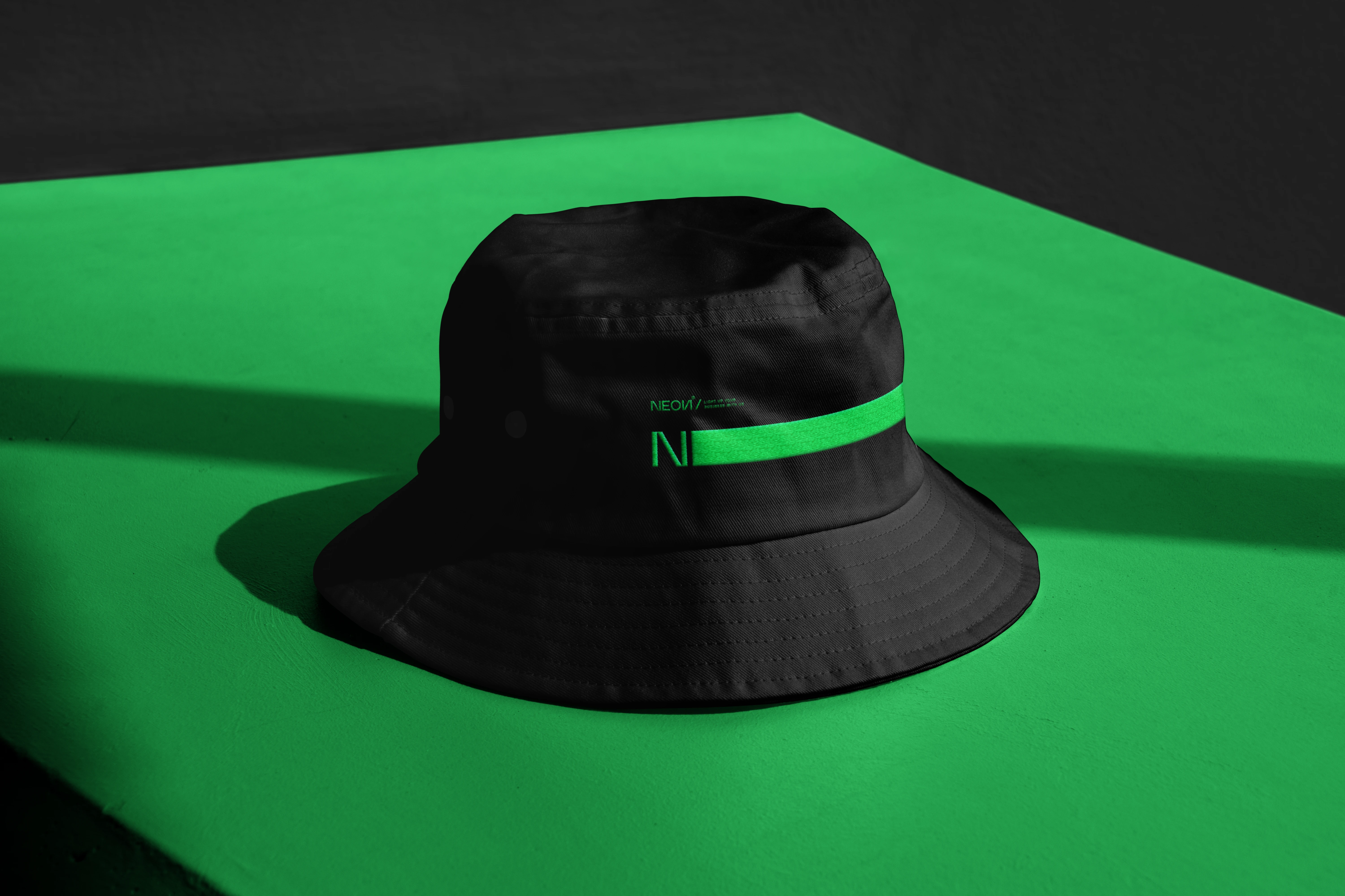
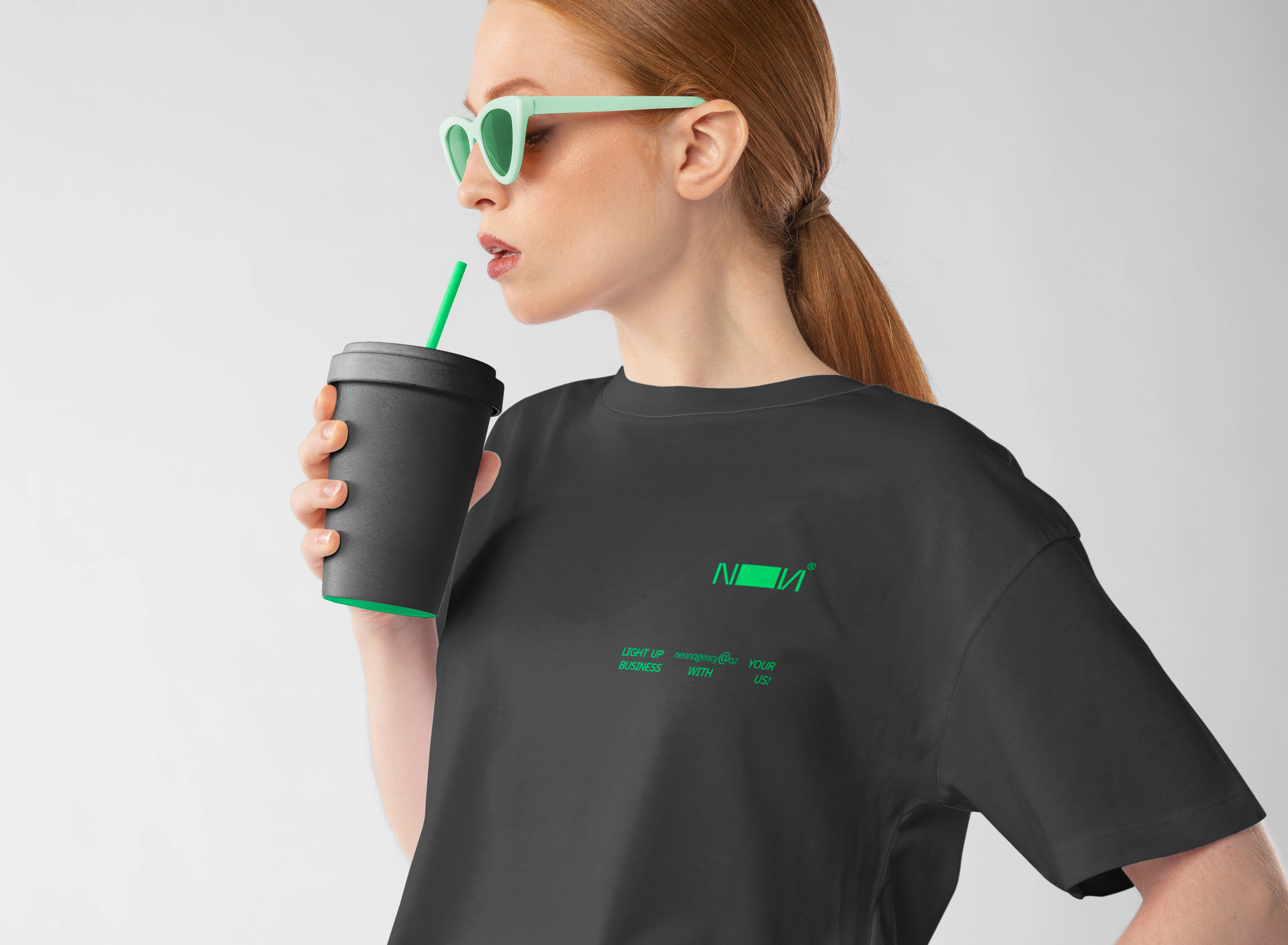
Color Strategy
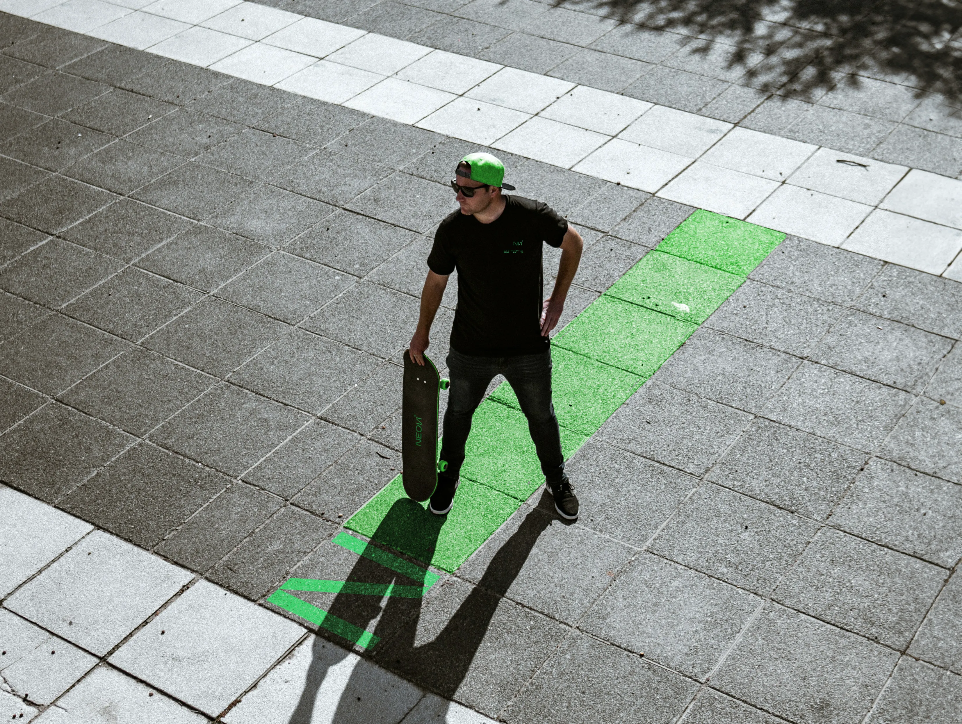
The primary palette consists of neon green and black.
Neon green represents the glow and vibrancy of illuminated tubes.
Black symbolizes the darkness that enhances the visibility of light.
This high-contrast pairing creates a bold and memorable visual presence.
To add depth and avoid monotony, deep blue and dark purple tones were introduced as secondary colors, enhancing sophistication while maintaining the futuristic feel.
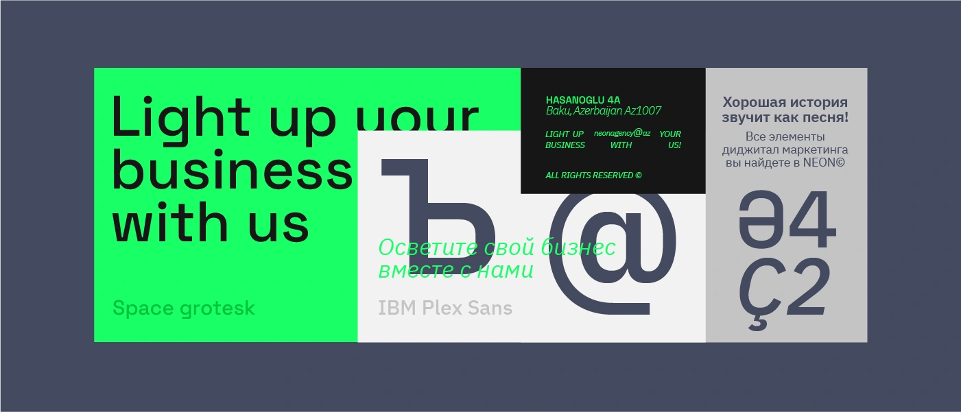
Typography
Selecting the right typography required balancing aesthetics and functionality.
The chosen typefaces:
Support Azerbaijani, Russian, and English
Maintain clarity across digital platforms
Reflect modernity and technological innovation
The result is a clean, multilingual typographic system aligned with NEON’s digital positioning.
THANK YOU FOR ATTENTION!
Art direction: Yahya Heydarli
Motion&3D: Yahya Heydarli
Graphic designer: Yahya Heydarli
Illustrator (Stickers): Malika Khojanazarova
OTHER PROJECTS ON BEHANCE
FOLLOW US ON INSTAGRAM
Like this project
Posted Feb 10, 2026
Rebranded NEON Agency with a neon-inspired visual system, logo logic, dynamic patterns, and a bold color strategy.
Likes
3
Views
18
Collaborators