Gurbani App
The Problem
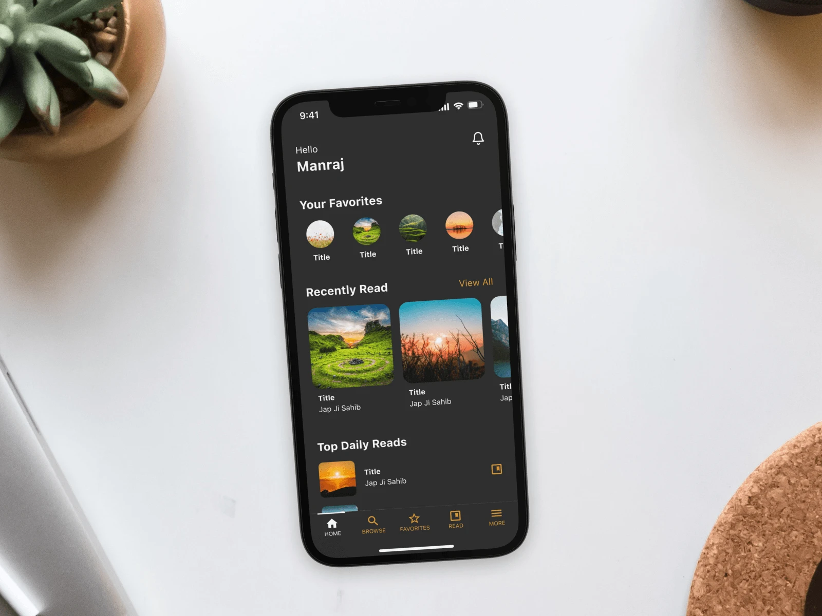
Upon encountering an app that had languished in the grip of obsolescence, our client sought a transformation that would breathe new life into the user experience, all while adhering to the distinctive allure of a dark theme aesthetic.
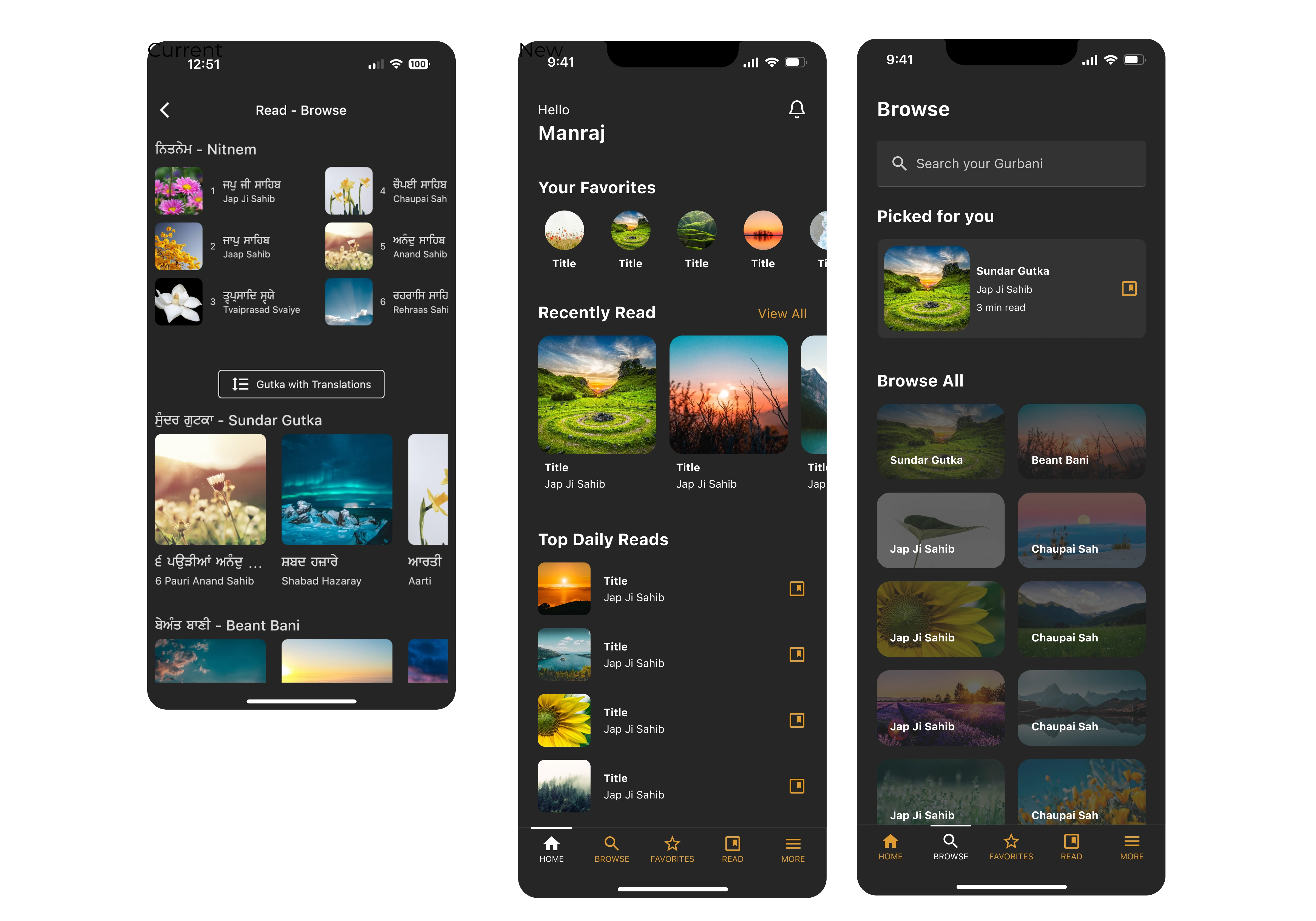
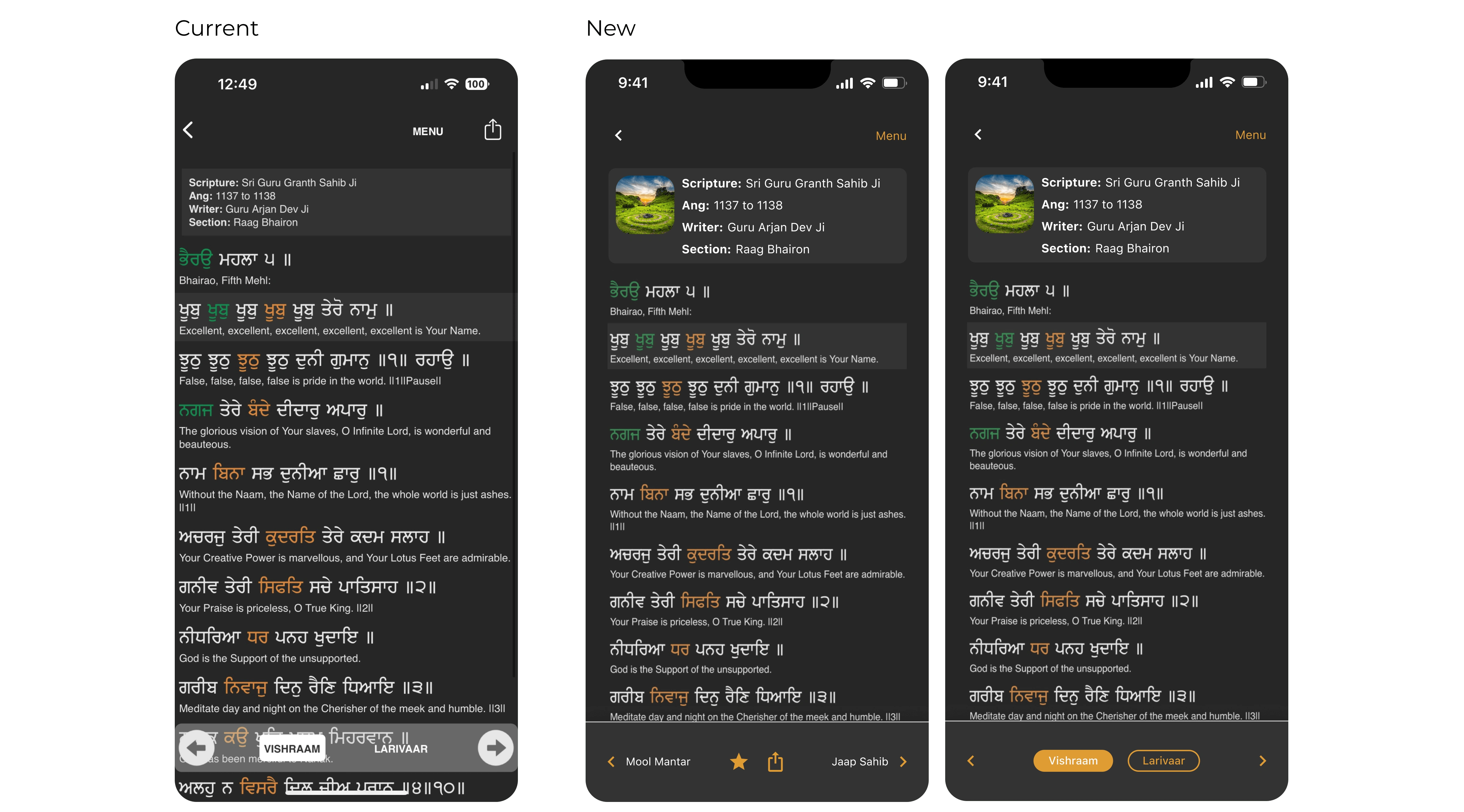
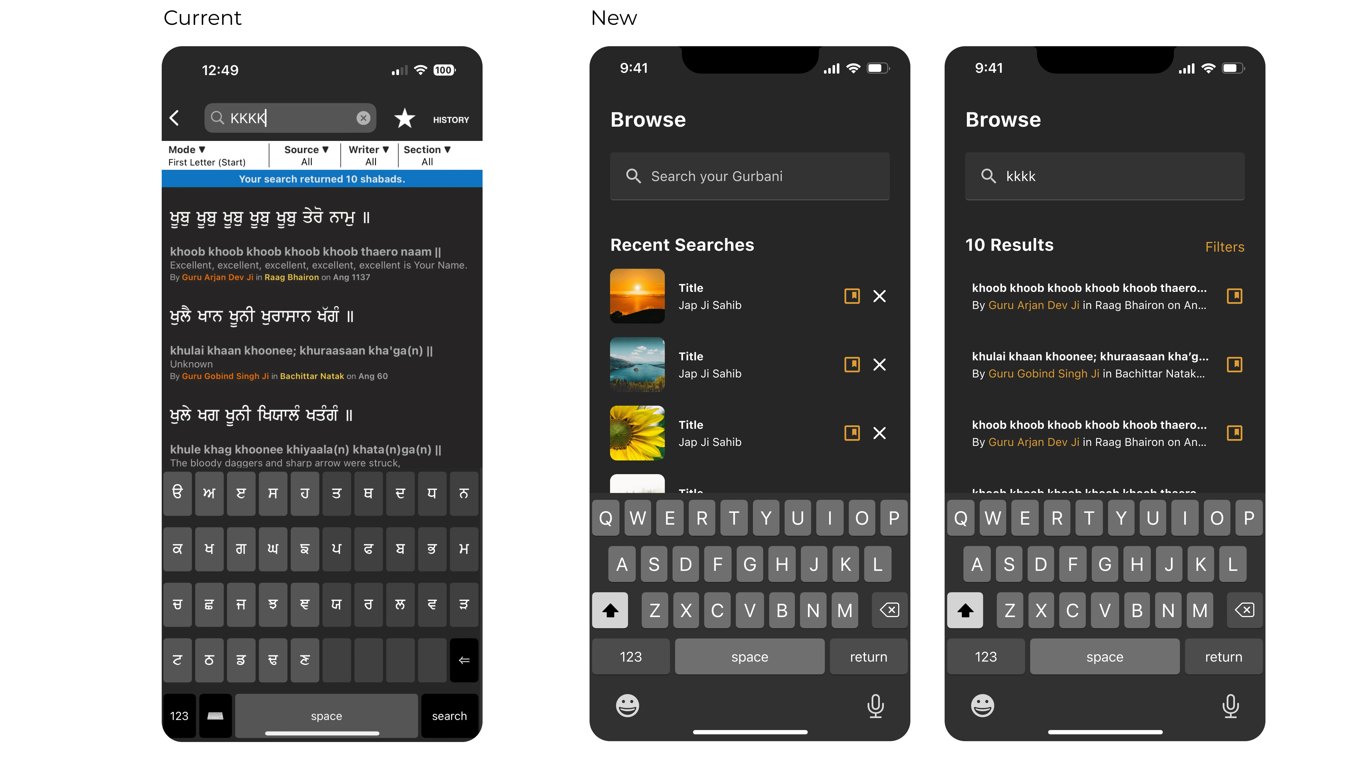
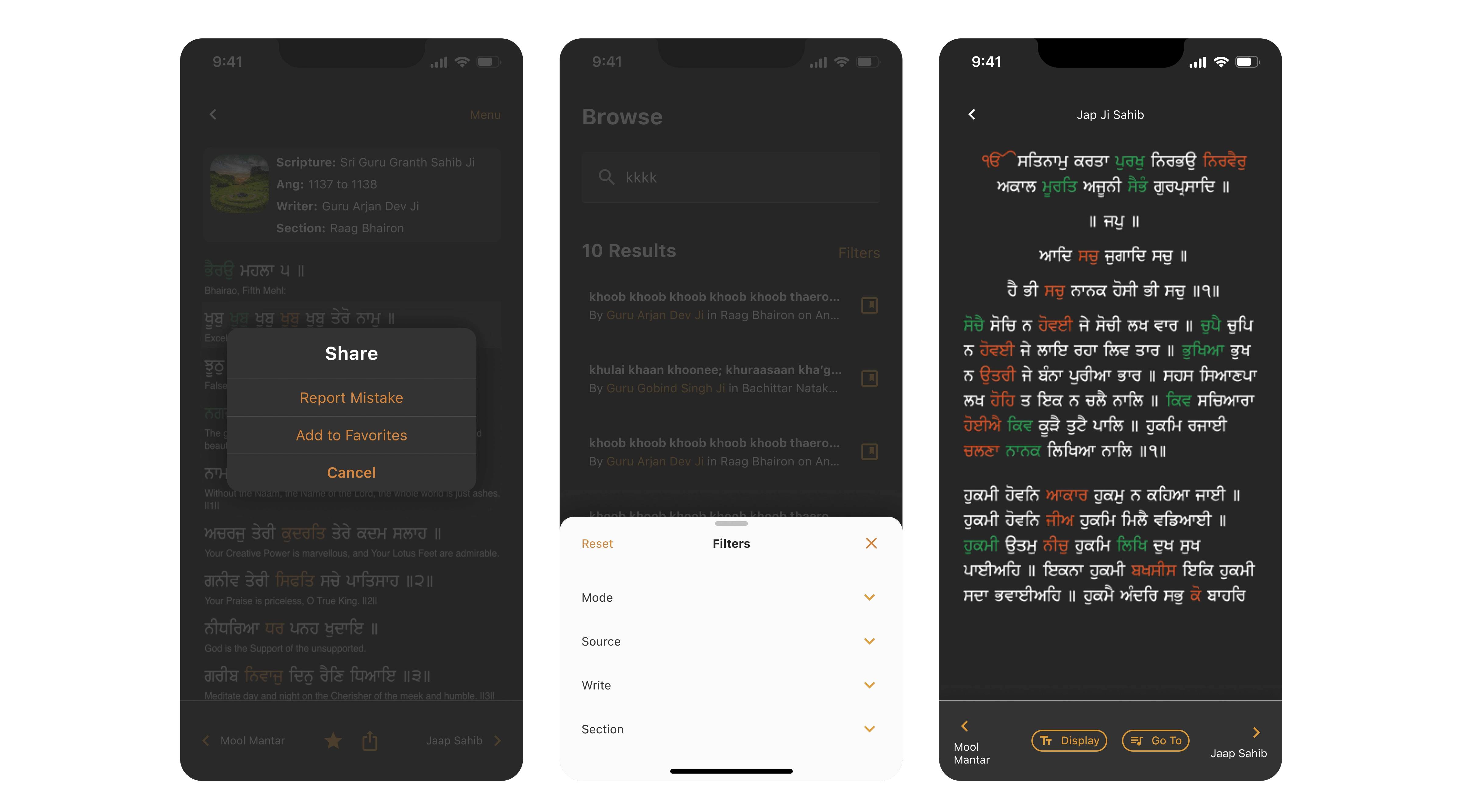
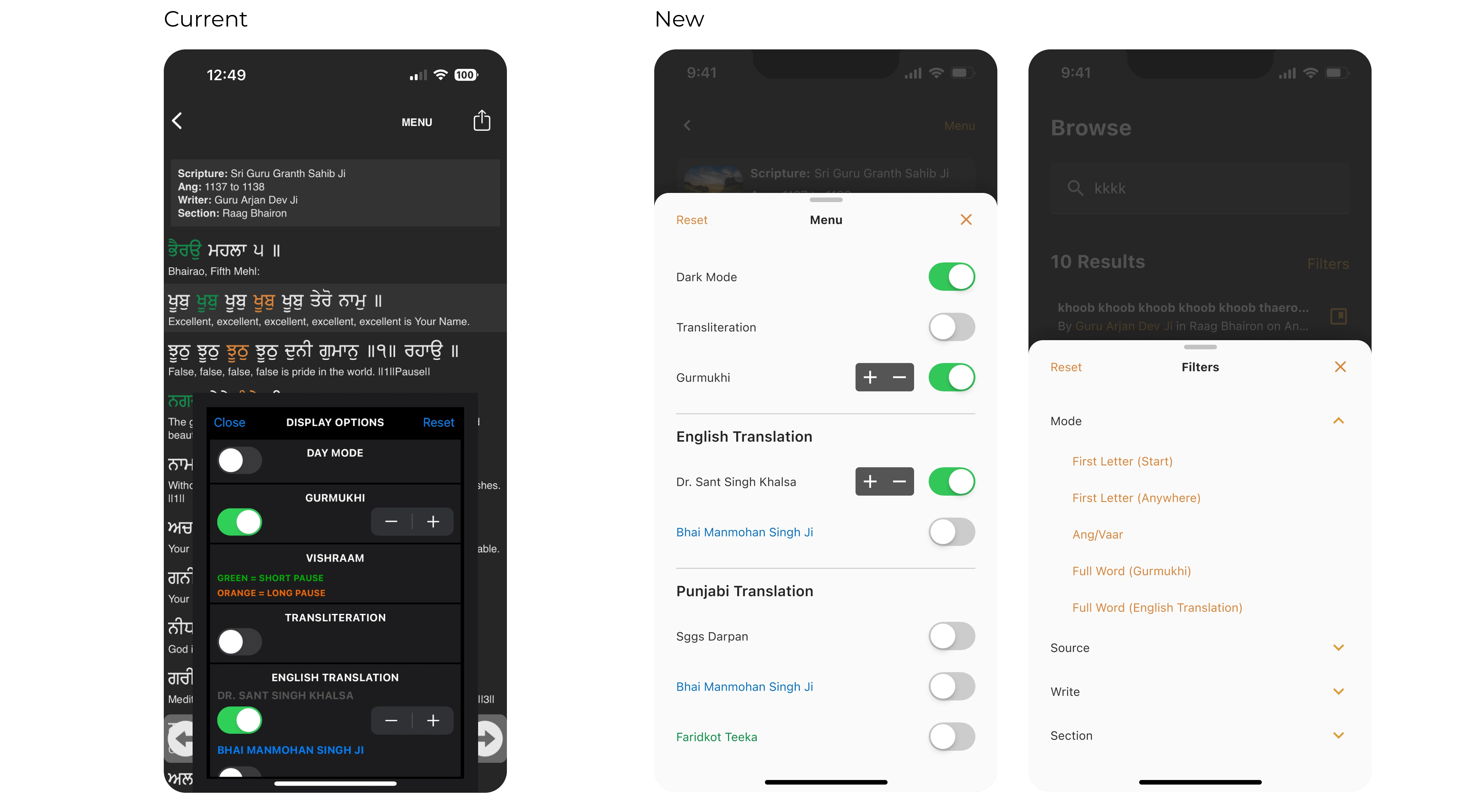
Our journey encompassed a comprehensive overhaul, reimagining every facet of the app's functionality. Rooted in user-centricity, we retained the quintessential search, read, and save features while infusing them with a renewed sense of efficiency and elegance.
Yet, our ambition extended beyond the familiar. The inception of novel features such as 'Picked for You' unveiled a curated dimension to the user journey, tailored to individual preferences. The canvas of the Home screen was reborn, an emblem of seamless navigation and curated content that captures the essence of modernity.
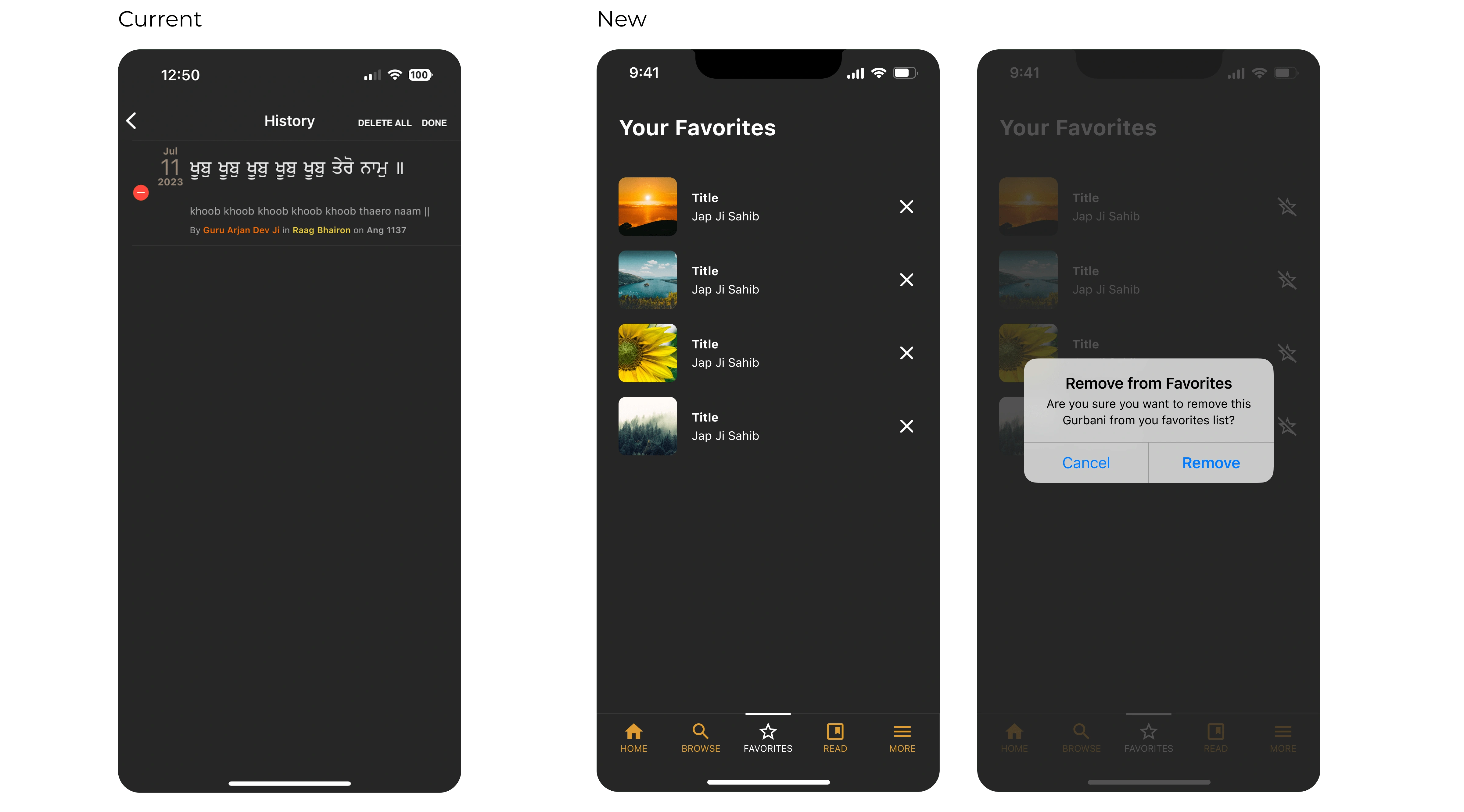
Moreover, we unveiled the 'Favorites' list—a symphony of convenience—granting users an elegant repository for their cherished selections. The culmination of our endeavours, expertly laced with the familiarity of the dark theme, is an app reborn—ushering its users into a realm of newfound fluidity, innovation, and elegance.
Tool
Figma
Like this project
Posted Sep 12, 2023
A powerful gurbani search engine that allows you to search for Sikh scriptures

