AI Training Landing Page Design

Stephen Kolawole


One of my favorite things about funnel design is seeing an idea go from a static design to something users can actually interact with 🚀
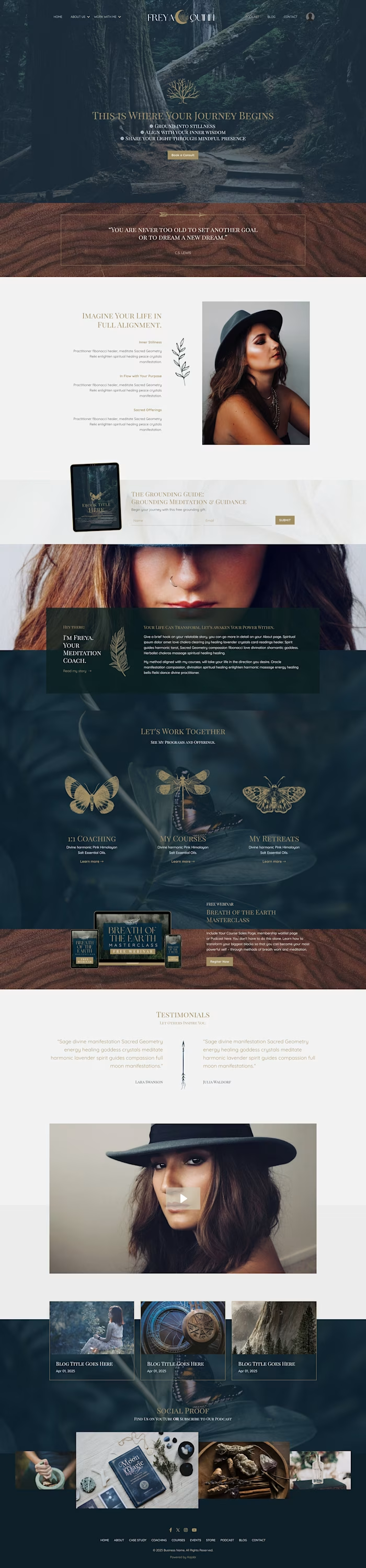
For this project, I started with a Figma design and initially built it in ClickFunnels 1.0. Midway through the process, we made a strategic shift, moving the entire build to GoHighLevel (GHL) to better support automation, flexibility, and future scaling.
The goal?
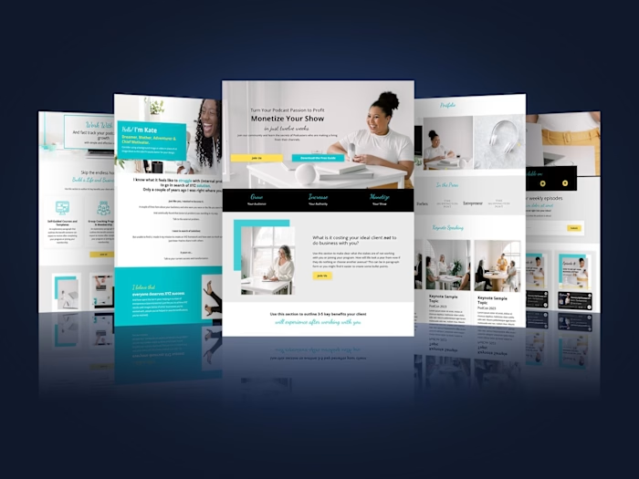
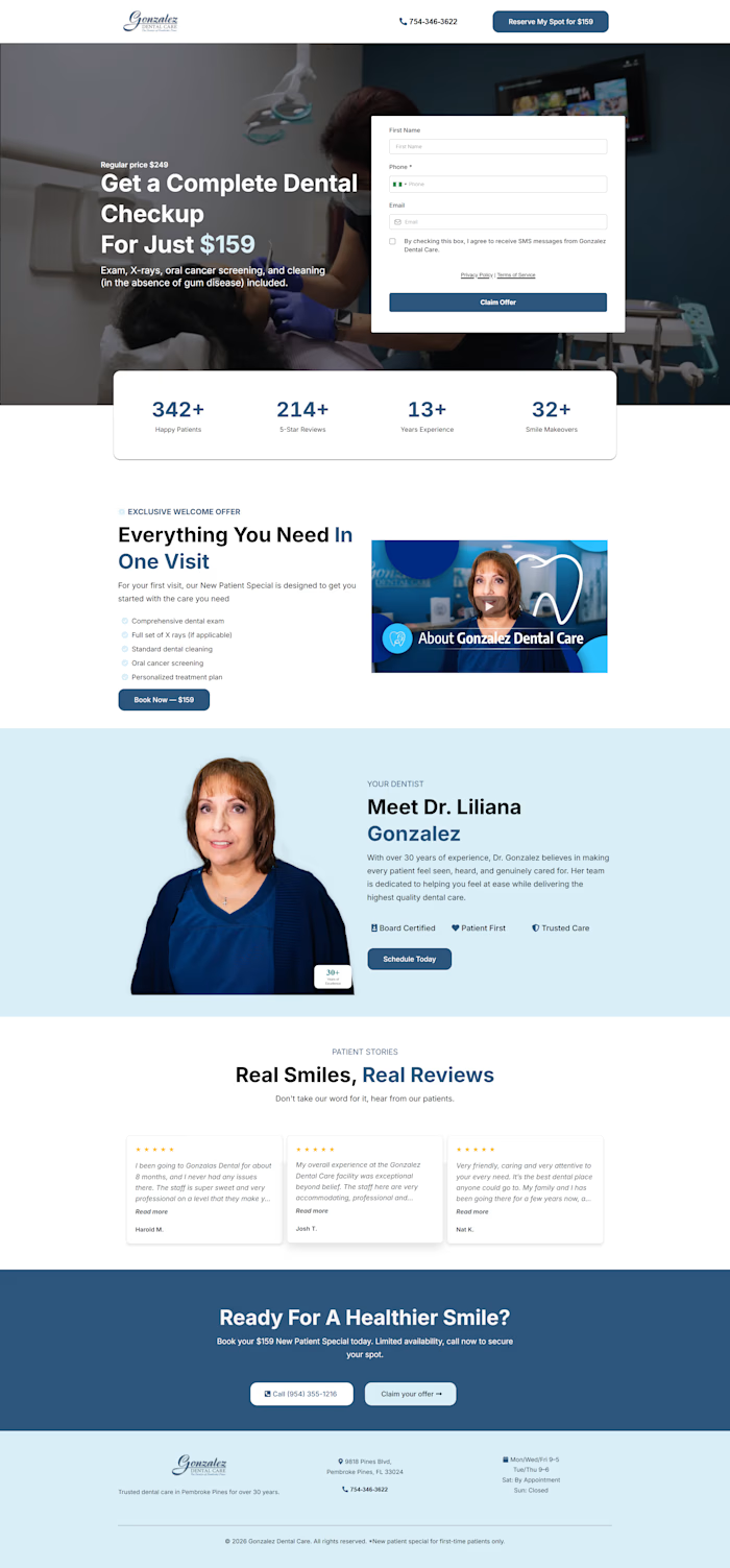
Create a high-converting, mobile-first landing page for an AI training offer that instantly grabs attention, keeps visitors engaged, and drives action.
A few things I focused on:
✅ Clean, bold visual hierarchy to stop the scroll
✅ Mobile-first responsiveness (because most traffic lives there)
✅ Strong headline positioning for clarity + curiosity
✅ Conversion-focused structure built to keep attention and improve opt-ins
One thing I’ve learned: sometimes the platform changes, but the strategy behind conversion doesn’t.
Designing in Figma is one thing. Translating it into a smooth, responsive, conversion-focused experience inside a funnel builder is where the real work happens.
Curious, when building funnels, do you prioritize design aesthetics or conversion strategy first? 👀
#GoHighLevel #SalesFunnels #FunnelDesign #ClickFunnels #LandingPageDesign #ConversionDesign #WebDesign #AI #DigitalMarketing

Like this project
Posted May 28, 2026
Started in Figma, built in ClickFunnels, then migrated to GoHighLevel mid-project. The final result: a mobile-first landing page for an AI training offer, structured around bold hierarchy and opt-in conversion.
Likes
1
Views
12