Plant-Based, Melanin-Laced.

Keanu Broughton
Brand Designer
Graphic Designer
Visual Designer
Adobe Illustrator
Figma
Procreate
About the Client
Plant-Based, Melanin-Laced, is a Black-owned, lifestyle brand striving for a healthier, more sustainable future for marginalized communities.
The Goal
A complete brand refresh to enthuse and familiarize the target audience with the business, increase brand recognition, and brand outreach.
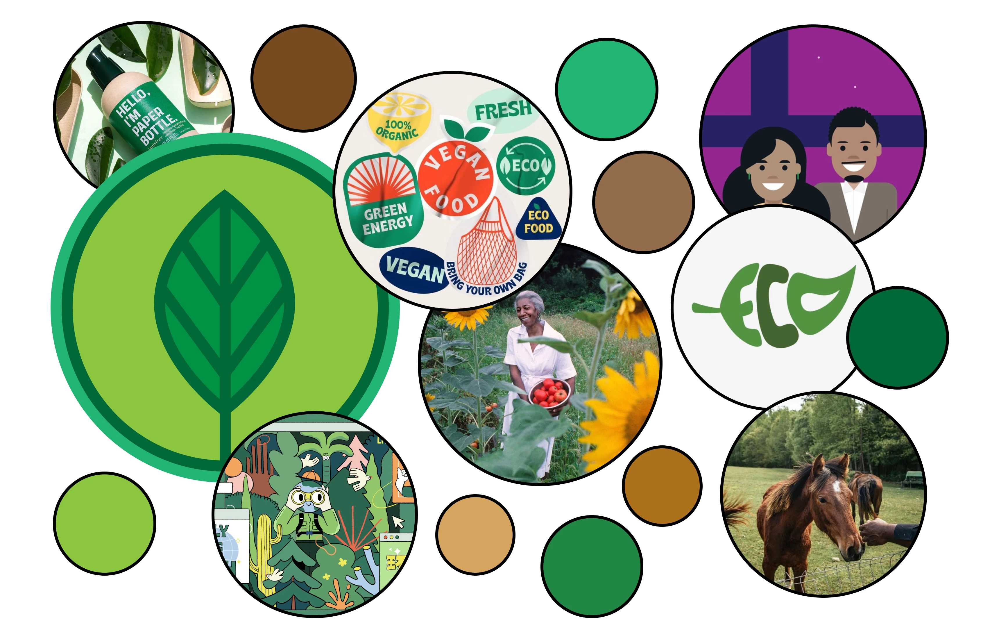
Brand Refresh Moodboard
Conceptualizing the Brand
Wanting stark contrast from the original branding, the creative direction adopted a bold, and more vibrant approach.
Plant-Based, Melanin-Laced is about the health, vitality, and wellness. It was important to invoke this liveliness into the branding.
Creating the Logo
With the goal to increase customer reach and brand recognition, we shortened the logo into an acronym; using that as a springboard for further design choices.
The design process was intentional in every way. I made the decision to construct the logo out of simple shapes - rectangles and circles.
A multi-colored logo, not only incorporated every aspect of the brand identity, but also emphasizes the melanin portion of the brand name.

Official, acronym-style logo for Plant-Based, Melanin Laced
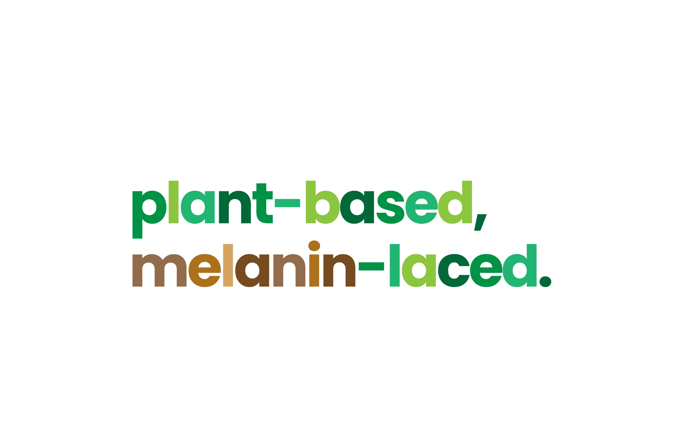
Text Logo Alternate - Plant-Based, Melanin-Laced

Submark - Plant-Based, Melanin-Laced
Palette & Typography Choices
Strength in unity and diversity, are tenets of the brand's ethos. I wanted to invoke that in the the color scheme.
I continued the circular theme when choosing the typography, opting for an orbular type.
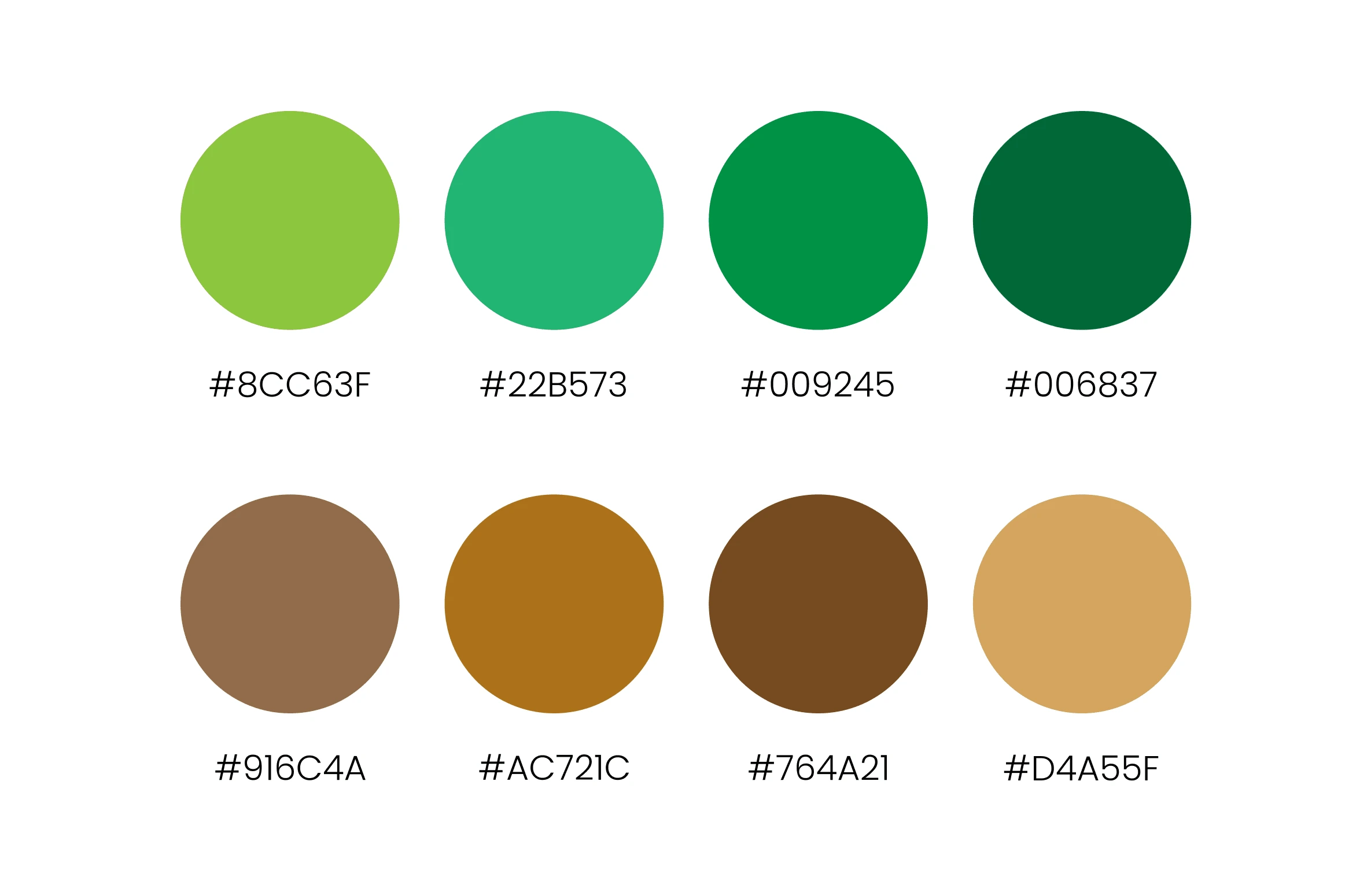
Color Palette - Plant-Based, Melanin-Laced
I continued the circular theme when choosing the typography, opting for a type with a rounded form.
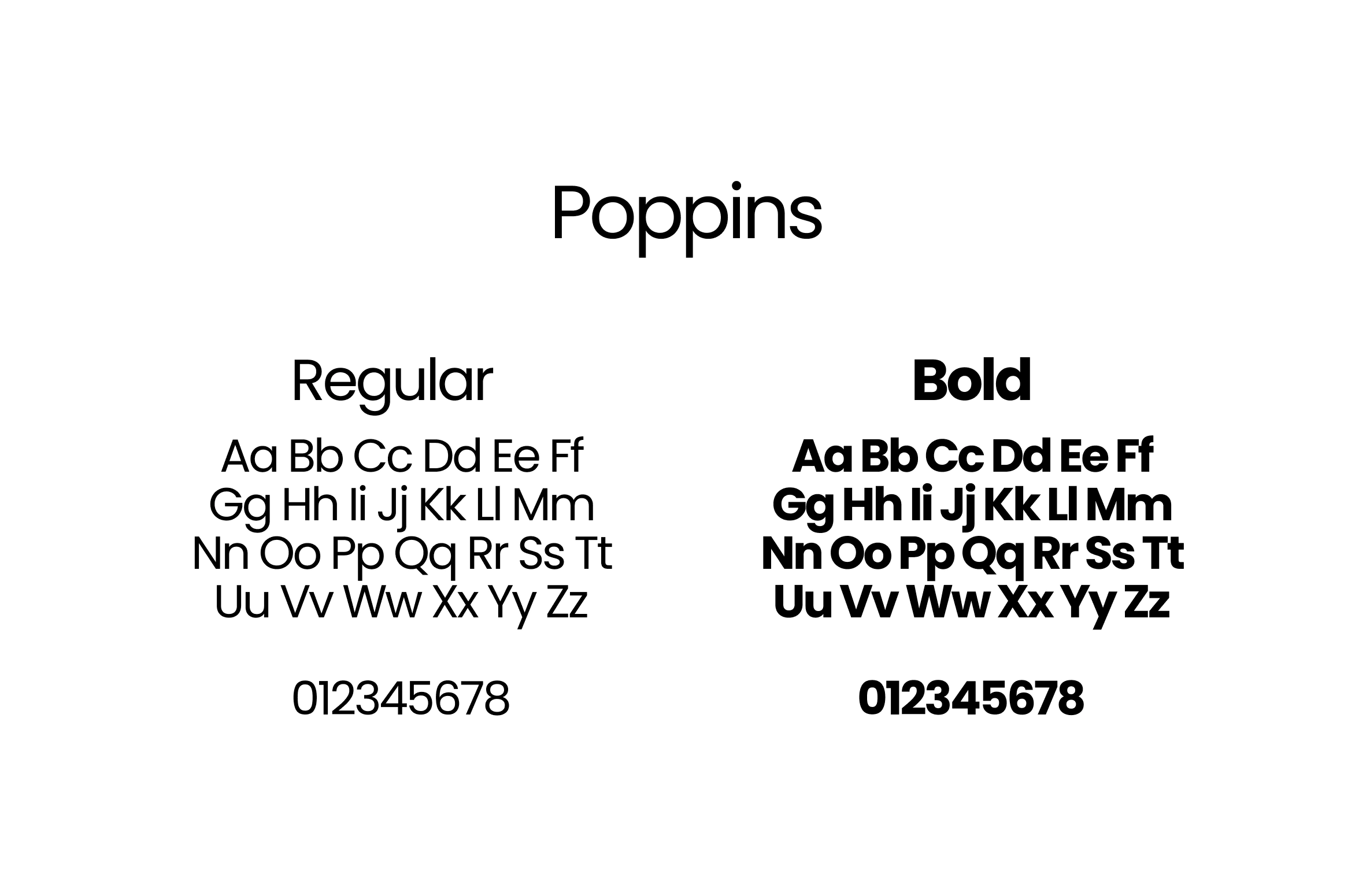
Typography - Plant-Based, Melanin-Laced
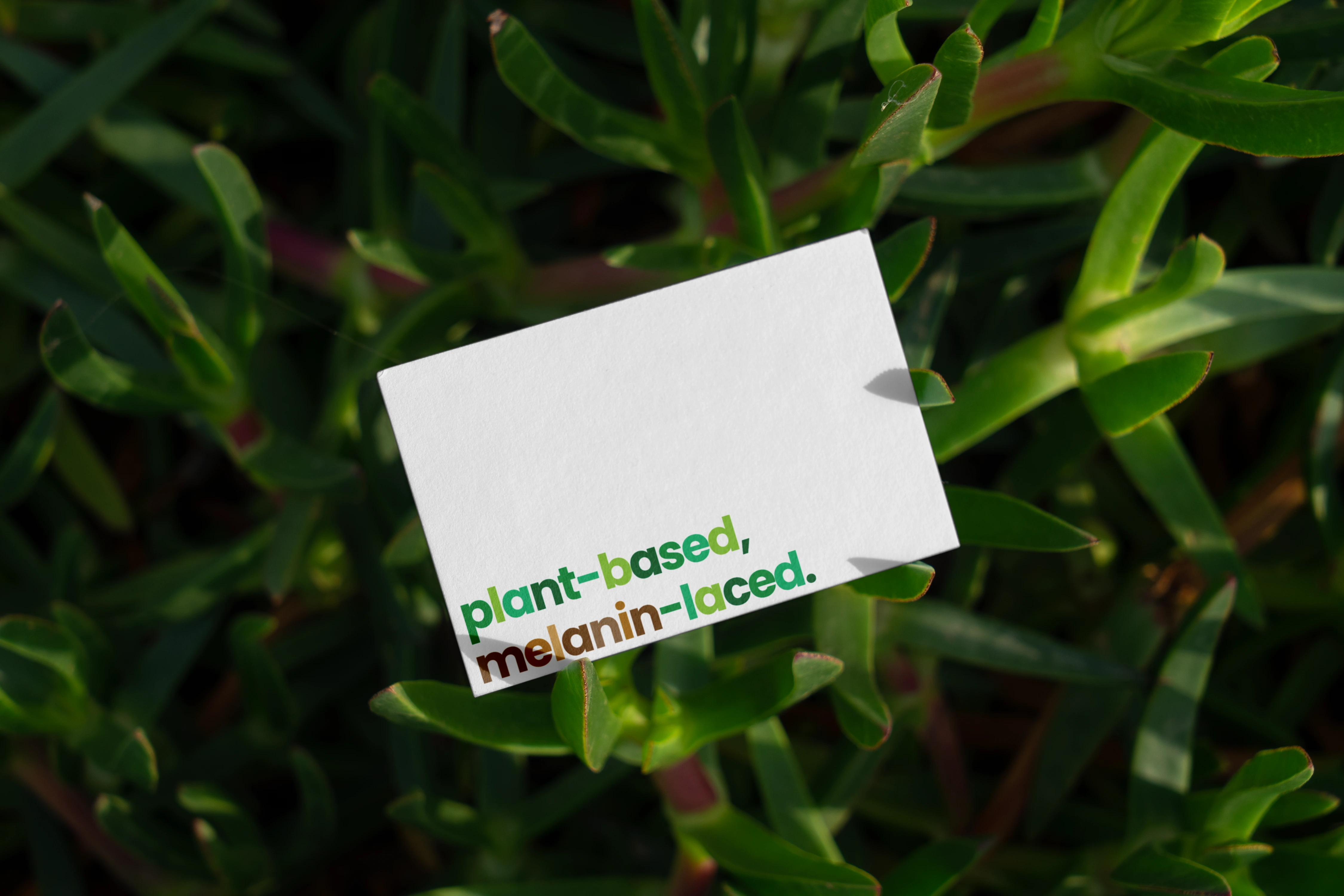
PBML Business Card
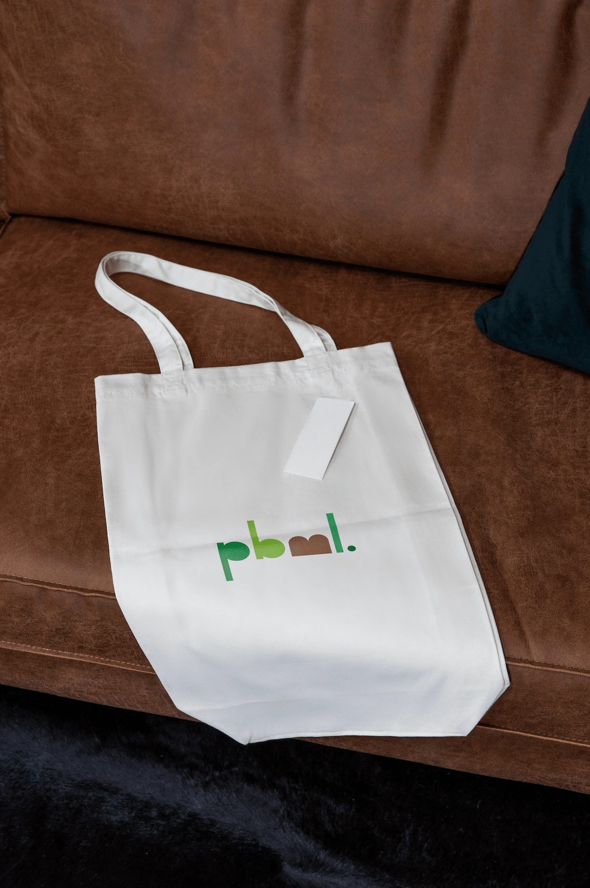
PBML Tote Bag


