Duolingo Method Video
TL;DR
Our mission: Reinvent how we convey Duolingo's learning methods during the Onboarding experience. Debunk common learner misconceptions with an educational video. Increase overall retention rate of new users.
My role: I collaborated with Design Studio, Product Design, Product, and Learning Science to develop a strategy and script for a short onboarding experience video that would build Duolingo’s credibility for new learners.
Building a content strategy
UXR insights told me that: our learners wanted more prescriptive lessons, transparent efficacy claims, and trustworthy teaching methods.
To build Duolingo’s credibility, I needed to develop content that would prime new users to trust our app’s learning methods by strategically re-framing and debunking common learner misconceptions.
Pondering important questions
I had lots of convos with the team around what the deliverable should be, what format would be most compelling for the user, and how we should incorporate it into the Onboarding experience.
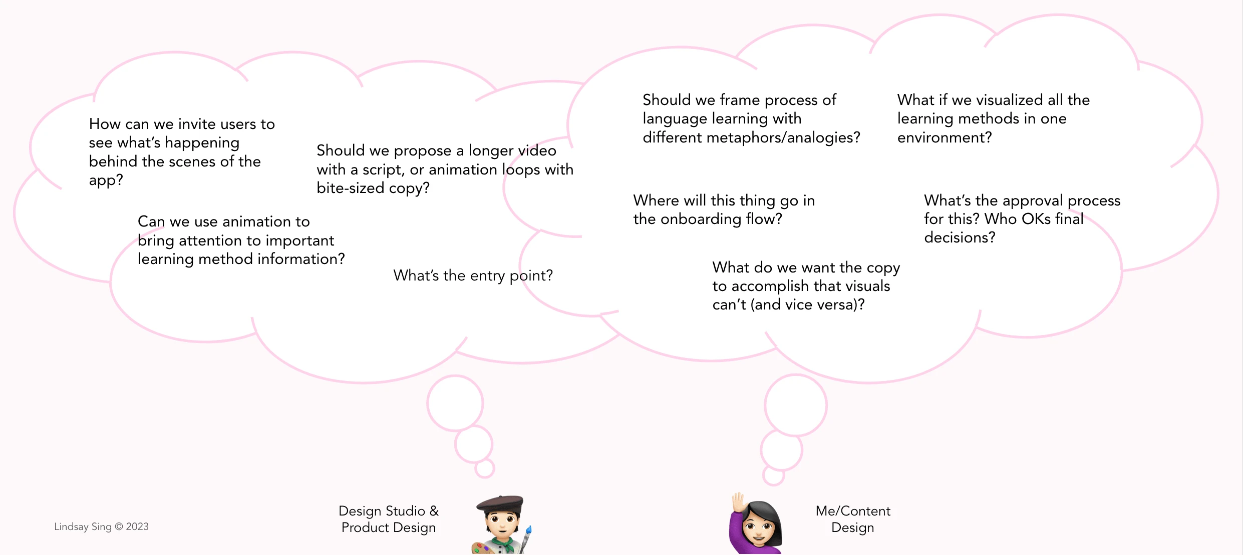
Initially, with such a cross functional team - we had a lot of discussions regarding "cart before the horse" or "horse before the cart." Between Design Studio, Product Design, and Content Design, we eventually decided that content strategy would initially lead this effort.
Bringing the content strategy to life
I started drafting different types of positioning for the top priority Duolingo learning methods we wanted to clarify for users.
This was my first time truly writing a "script" from scratch in the UX Writing world, so I embraced the challenge by throwing out ideas to get the ball rolling and see what would stick.
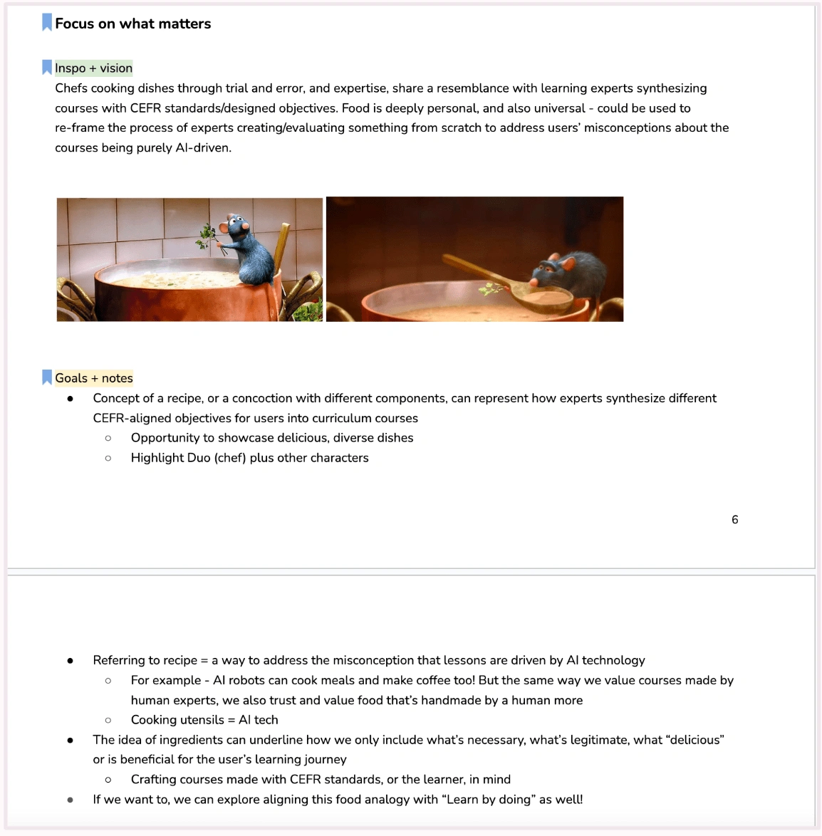
Yes, one of the many wild ideas that popped into my head drew inspo from Ratatoutille to drive home the concept of Duolingo crafting AI-powered lessons with science-backed methods. Fortunately, fleshing out concepts was Design Studio's job!
Design Studio took my rough initial ideas/copy and ironed them out into their own (and much better!) concepts for potential animation and illustration.
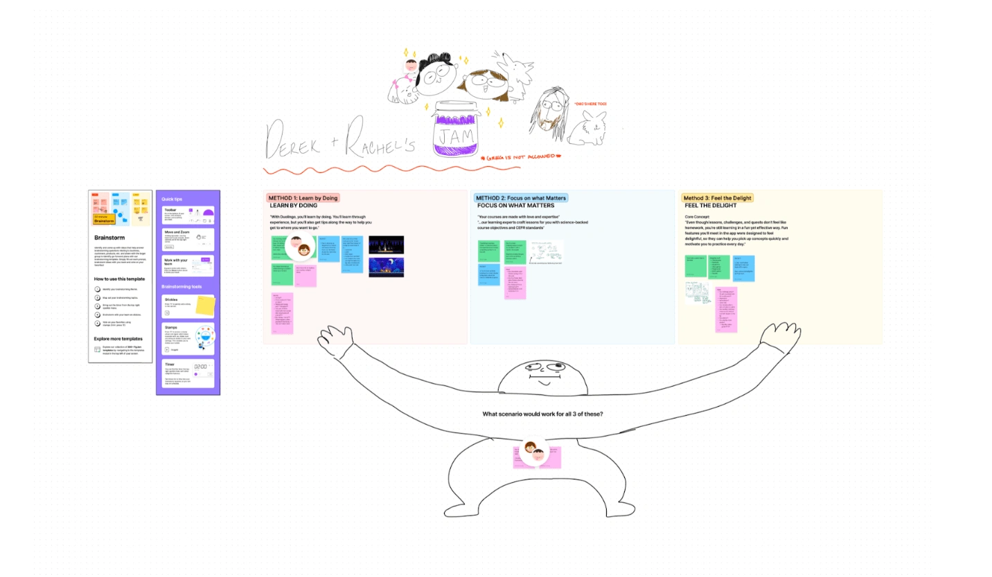
Design Studio used initial copy drafts to guide their brainstorming process.
Putting pen to paper
Drawing from all the collaborative brainstorming with partners, I went off into the wilderness on my own and started drafting several versions of messaging (the ideas we wanted to convey) for the video.
The idea was to quickly communicate and capture each pillar, or Duolingo Method of language learning: Learn by doing, Focus on what matters, Feel the delight.
I worked with Learning Science to sift through detailed research written about each pillar, and distill them into concise one-liners that Design Studio would use as a compass for illustrations.
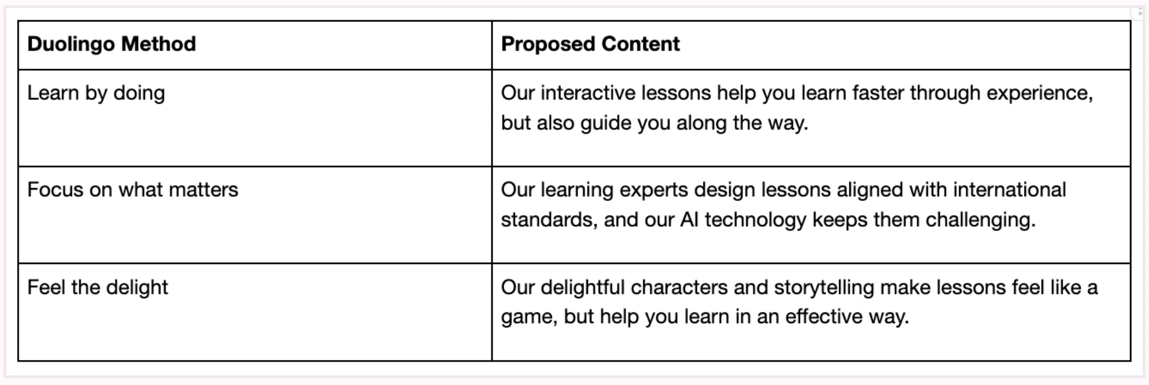
After distilling Duolingo Method pillars into concise messaging, I worked with Design Studio to brainstorm different script directions and themes.
To help drive alignment, I created a template for collaborative use that tracked both copy changes and rationale behind each proposal.
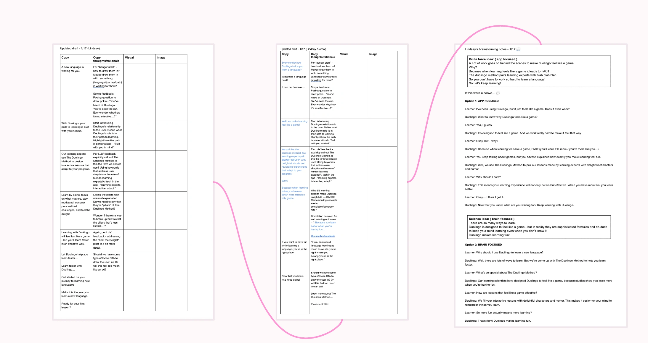
Designing the experience
Once we gained momentum on the script, Product Design and Design Studio led explorations for how we’d embed the video into the onboarding experience.
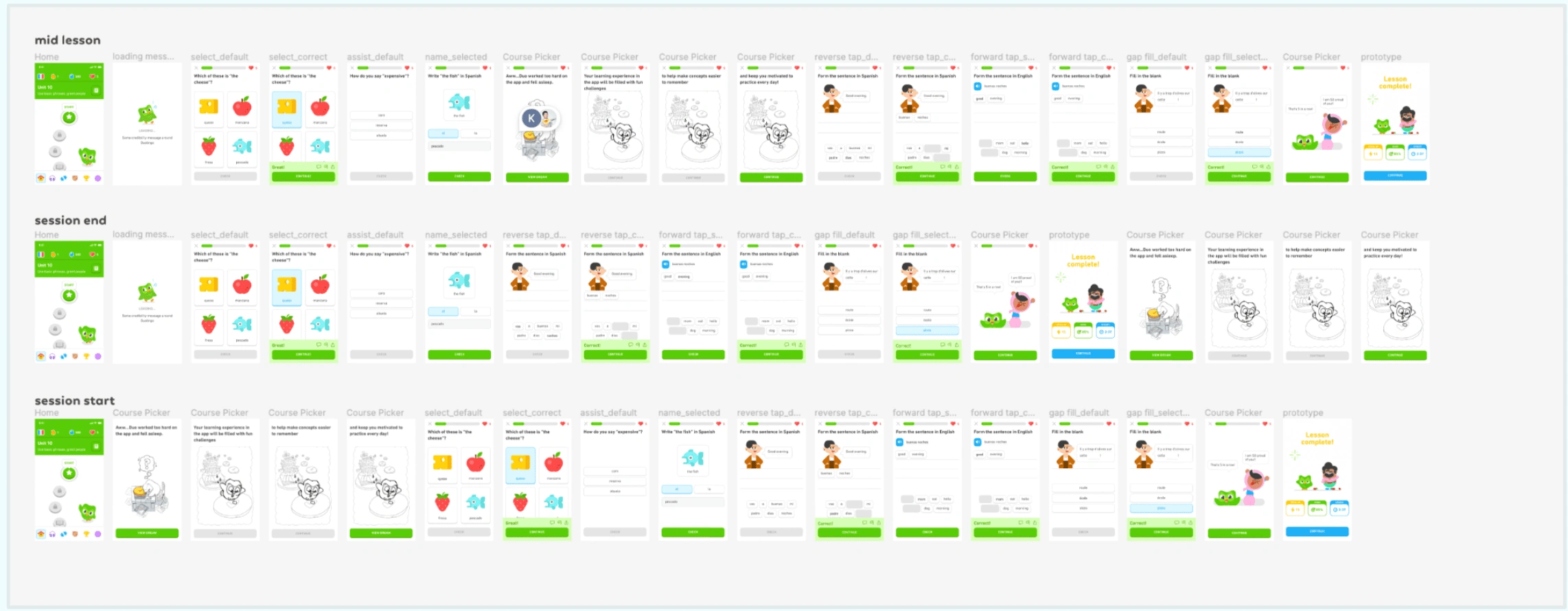
Product Design identified all the use cases we needed to consider.
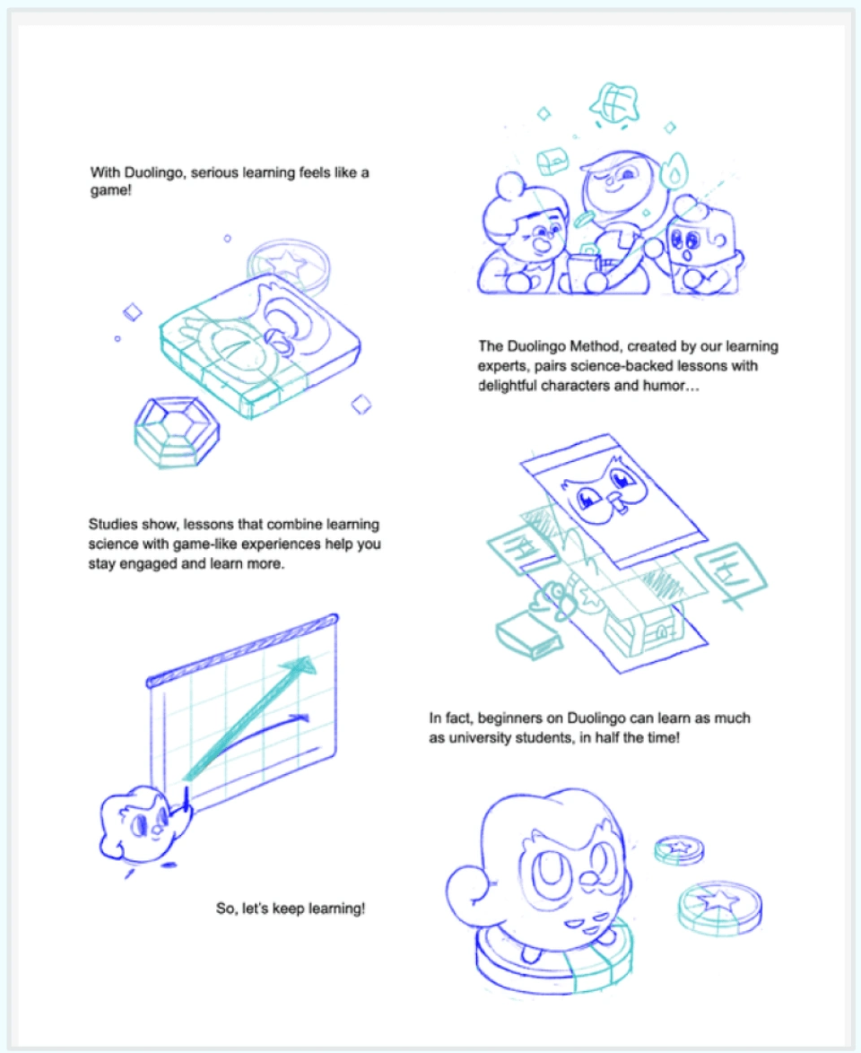
Another question Design Studio explored: How can we visualize (illustrate and animate) the words we're saying?
Shipping it
With competing leadership feedback, we knew we had to lean on UXR. Our team got insights from ~80 US-based, non-Duolingo users.
Based on the most compelling version that resonated with them, this is what we landed on…
The result
→ neutral results for overall retention and rate of Daily Active Users (DAU)
→ ~3%increase in Total Subscription Bookings (for Super Duolingo)
Going forward, the team is continuing to redesign other core app feature experiences to improve our guardrail metrics.
Like this project
Posted Apr 10, 2024
Crafted content strategy and script that drove Product Design and Design Studio concepts throughout Duolingo Method Video project.


