Black Bee Honey packaging and logo creation
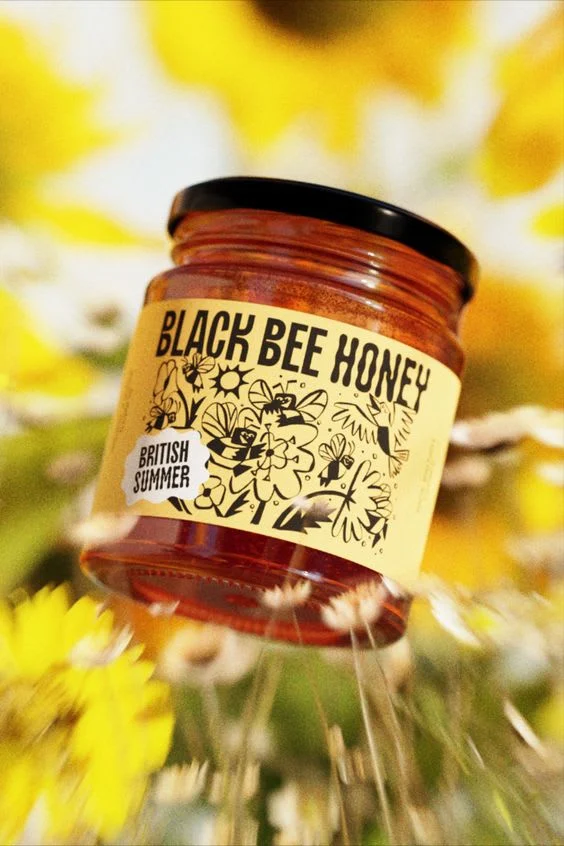
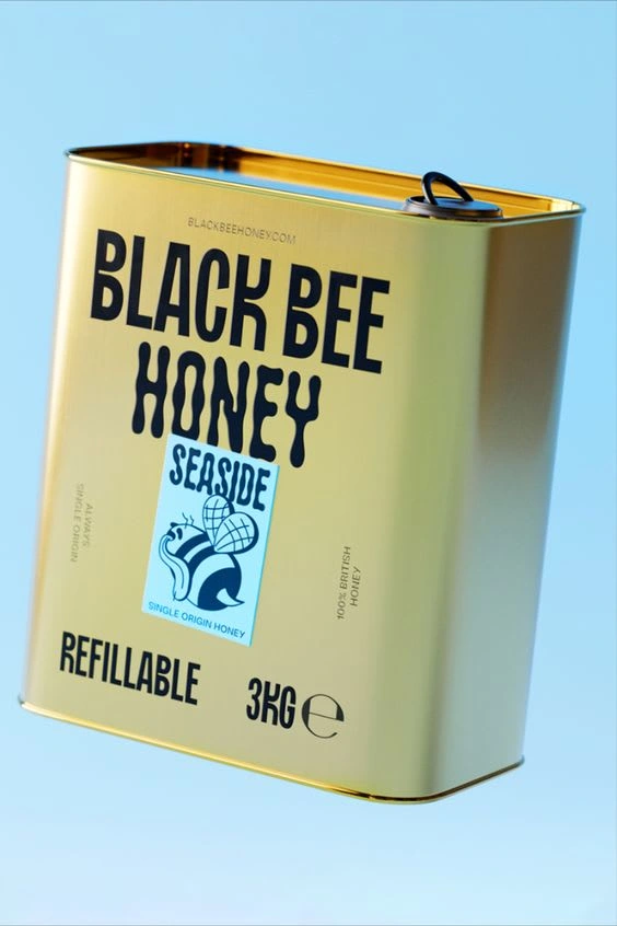
As the designer behind the Black Bee Honey
Brand identity, my inspiration was drawn from the natural environments where our bees thrive. I aimed to reflect the uniqueness of each honey variant through the design elements and color schemes used. The robust and industrial look of the "Seaside" tin signifies strength and longevity, much like the coastal cliffs where our bees face the ocean winds. In contrast, the "British Summer" jar is adorned with a kaleidoscope of wildflowers, representing the diversity and vibrancy of British meadows during the warmest months.
Each product in our range tells a story, not only of the honey within but also of the place and the bees that have worked together to create something extraordinary. As a consumer, you're not just purchasing honey; you're supporting a narrative of ecological harmony, sustainable practices, and a celebration of the British landscape.
Savor the essence of nature with Black Bee Honey, where every product is a piece of art, crafted with intention, and delivered with care for the environment and our communities.
Like this project
Posted Jan 16, 2024
Logo and packaging creation for Black Bee Honey. Here are some mock ups.
Likes
0
Views
10

