Passion Design Project: Cuppccino
Antonette Reginio
Cuppccino is a creative project based on a coffee-mug online business. They have subscription boxes for customers who want something monthly, or a online store for more individual purchasing.
Spreading the love of Canadian coffee and the wonders of a good mug.
From branding to packaging, Cuppccino was formulated by the idea of combining coffee and eCommerce into one.
Process
The first step is to create an awesome logo. I look for unconventional ways to portray the meaning behind the brand to keep it interesting and fun.
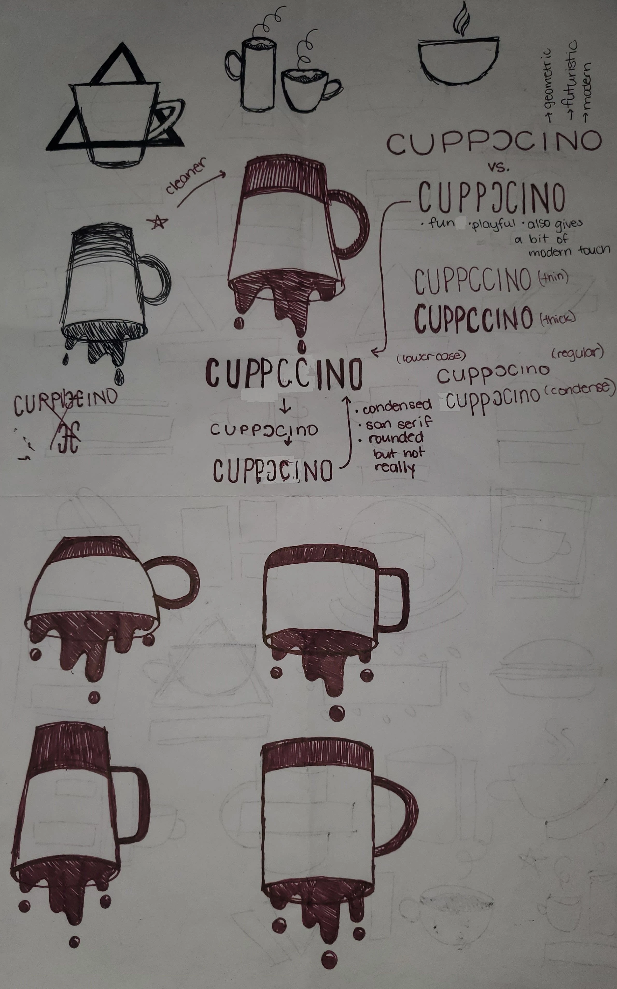
The idea of an upside down mug, dripping
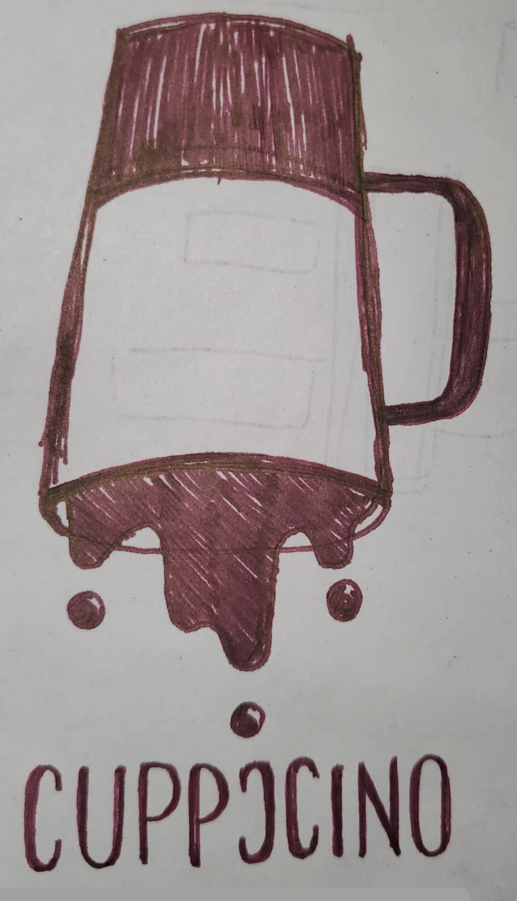
Final approved design sketch
Digital Rough to Final Logo
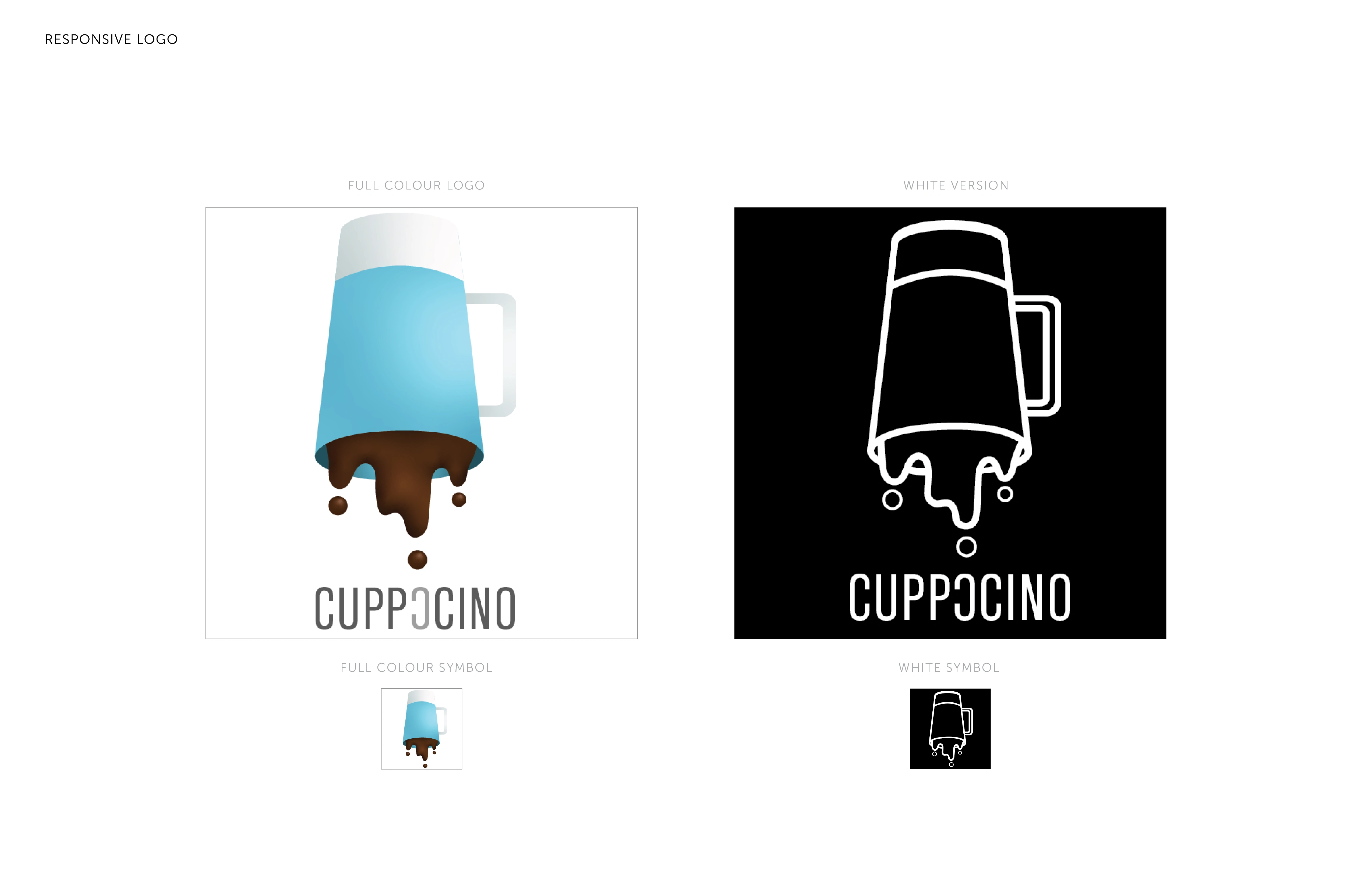
Main Logo with Alternative Contrast Logo
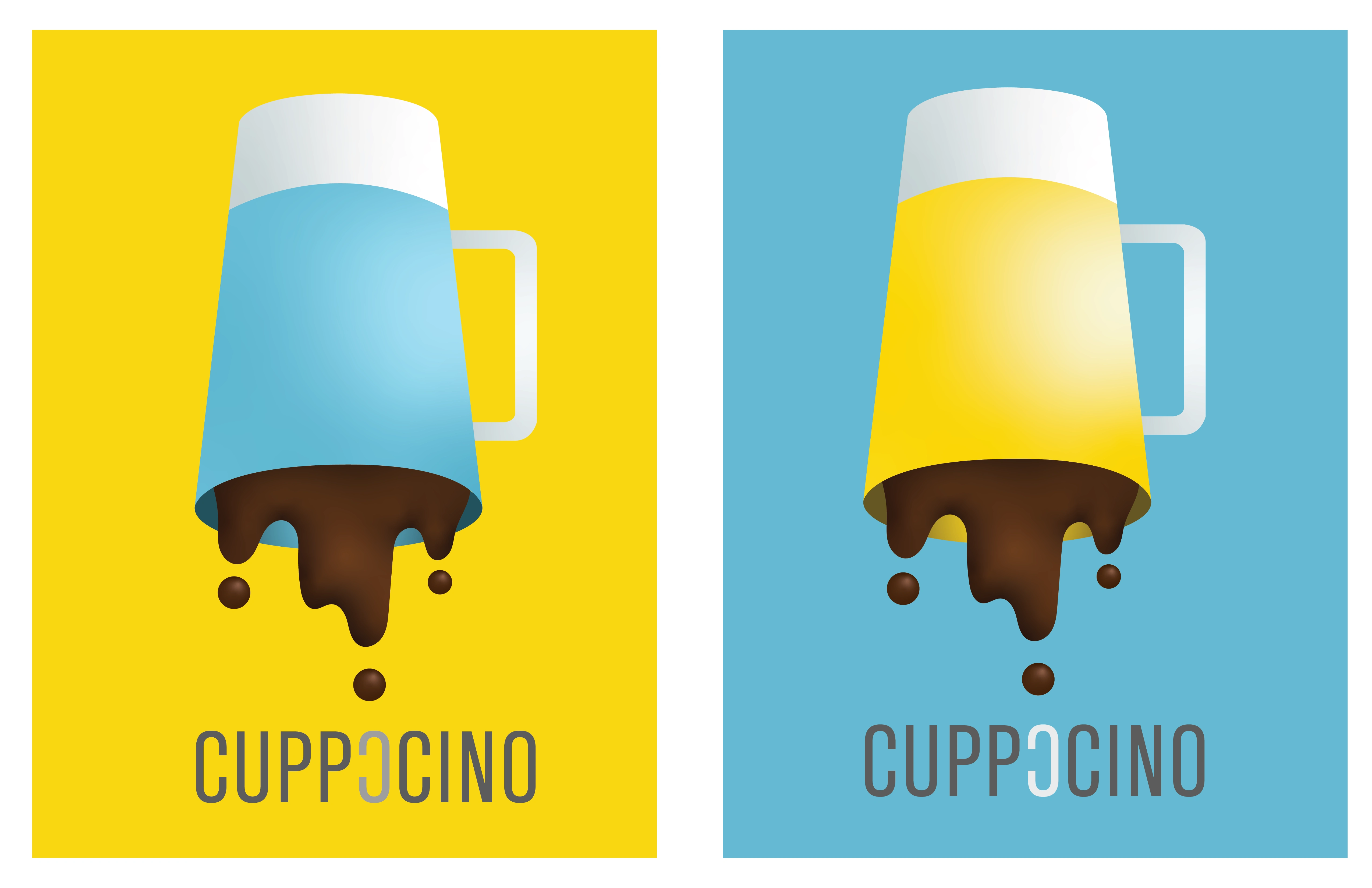
Main logo with Colour Contrasting Logo
Final Results
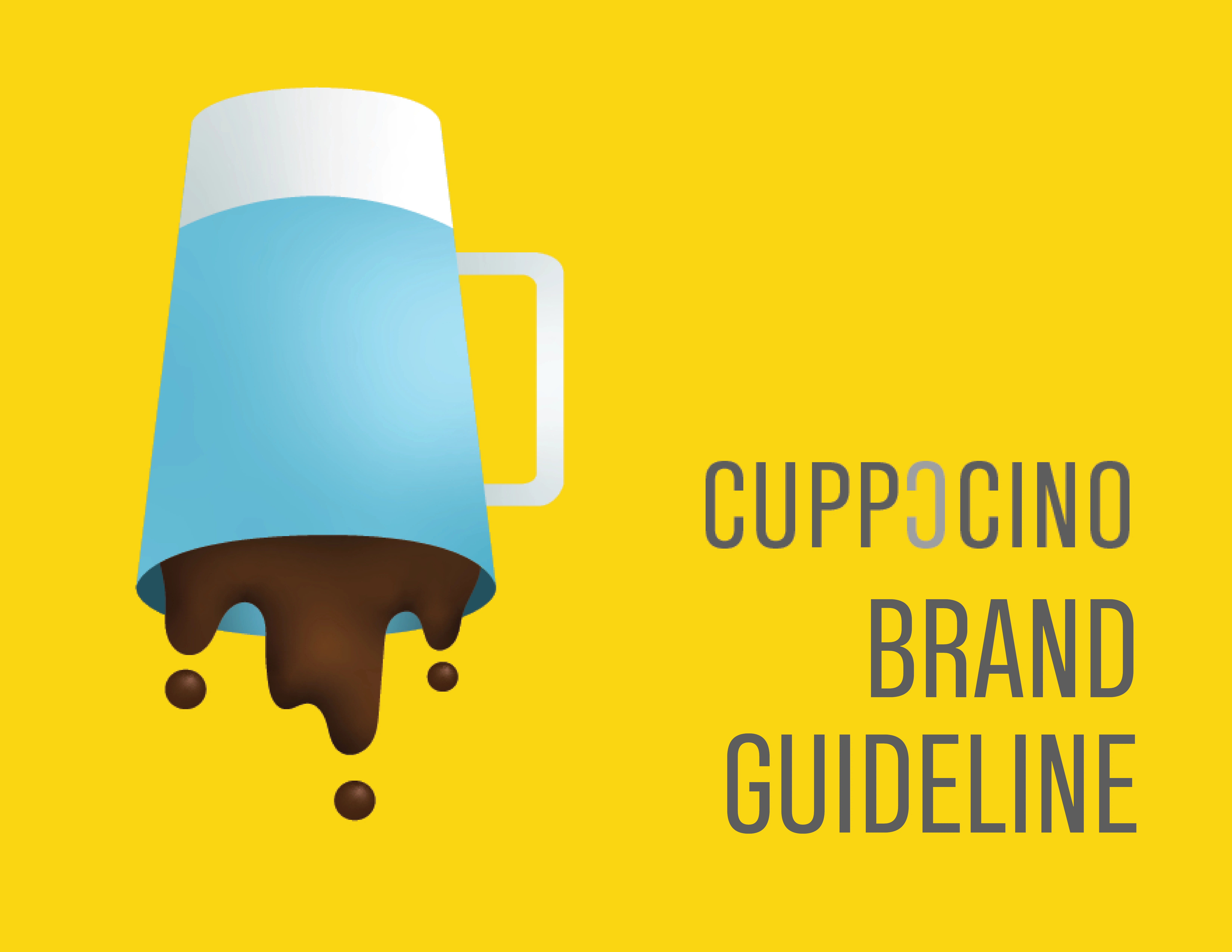
Creating the Ultimate Brand Guideline
It starts as an idea and now we curate the brand to make sure the brand can be followed through the business.
Find the full Brand Guideline! https://antonettemarie.com/cuppccino-brand-guideline
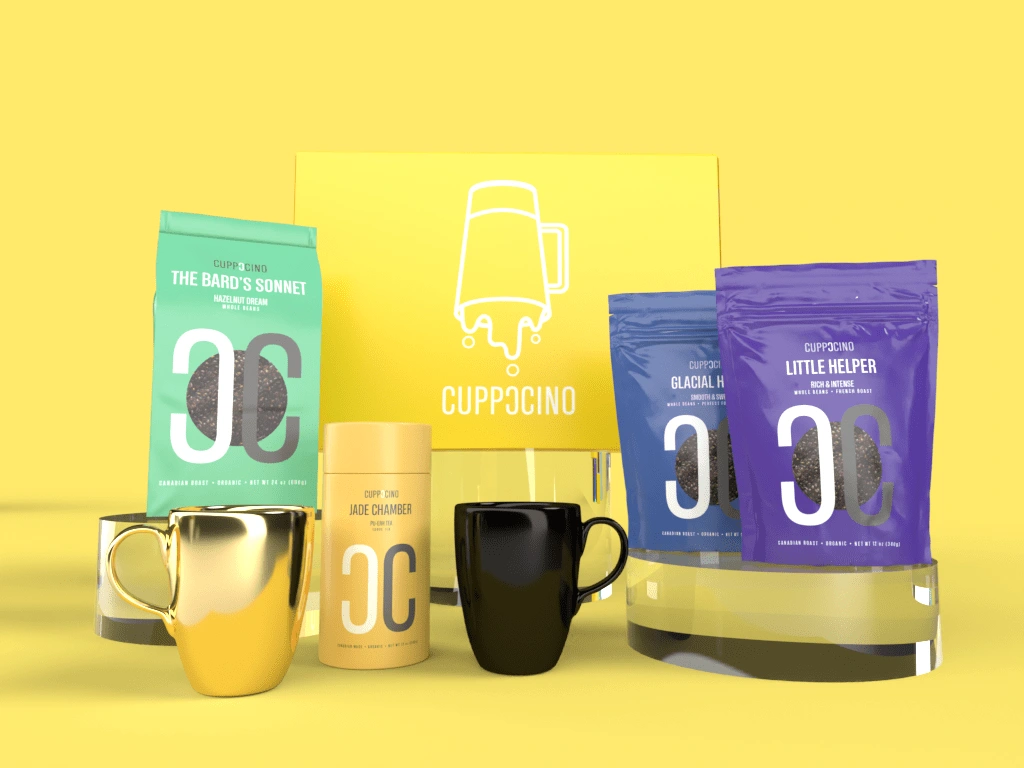
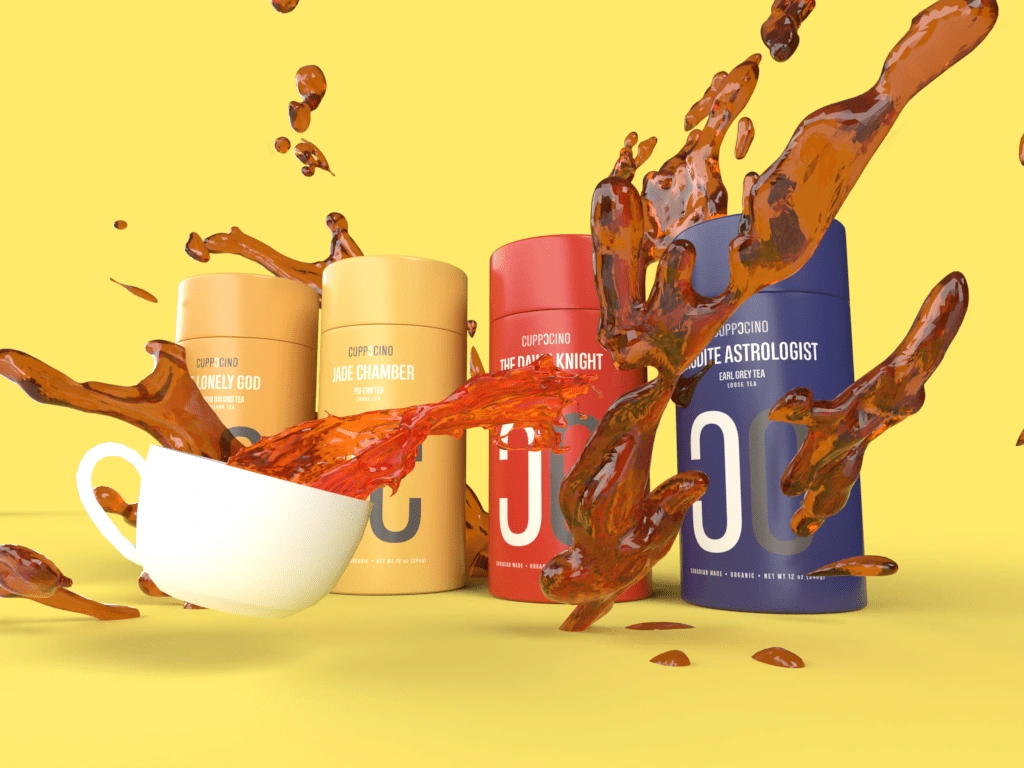
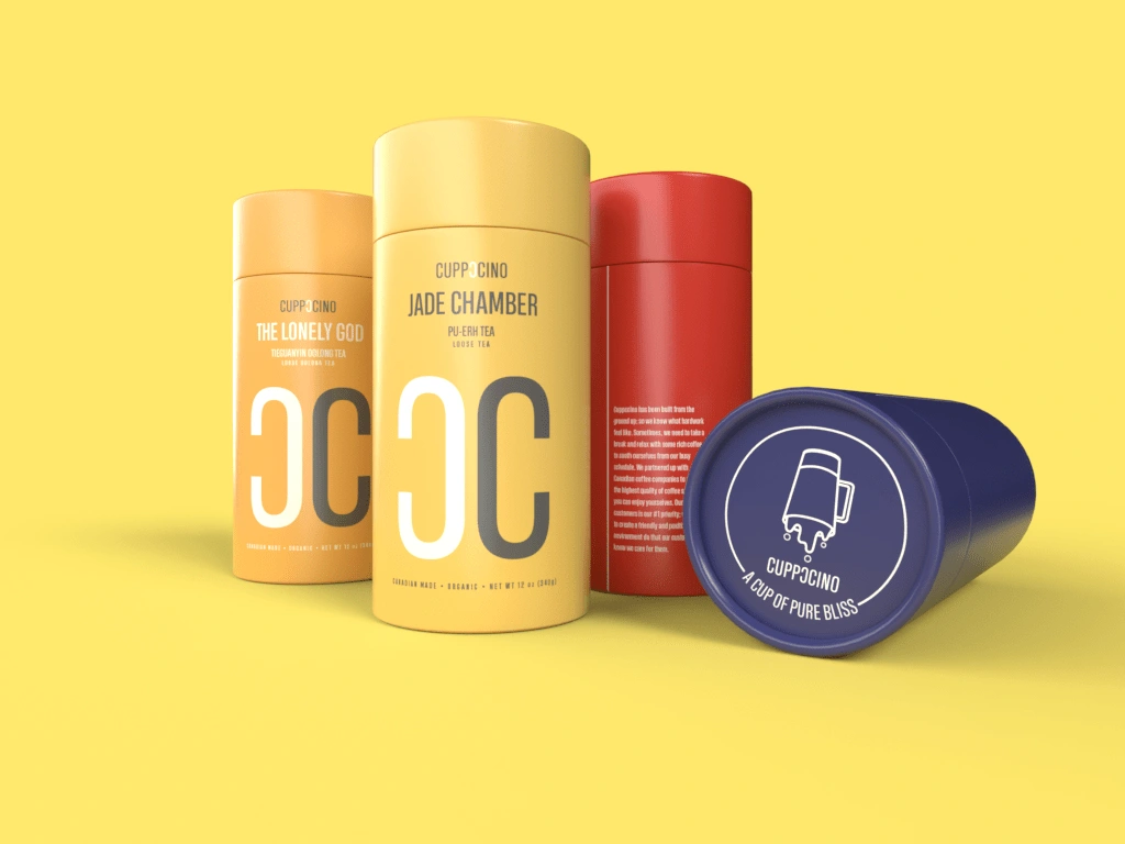
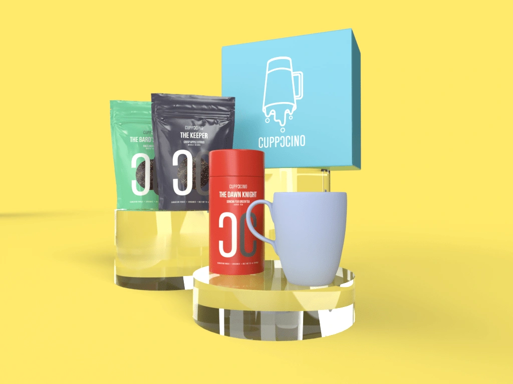
Designing Cool Packaging
One of the overlooked parts of the design process is colour. Although monochromes and neutral colours are a high trend in a lot of modern day packaging, they tend to become bland and blend into everything else. With this idea in mind, I decided to challenge myself and create a colour line that is colourful but simple.
In order to be unified into the brand, the layout and Logo are the same in all packaging.
Used Adobe Dimension to create 3D Renders of the products in action.
Checkout the full Product Packaging Line: https://antonettemarie.com/cuppccino-packaging-design
Reflection
It was a fascinating project to work on as it gave me some insight of creating a brand from scratch. One of my goals is to create design with a colourful look without compromising the modern day design trends.
Like this project
Posted Oct 15, 2021
A passion design project
Likes
0
Views
12