Logo Design Collection'25

Mohammad Osama

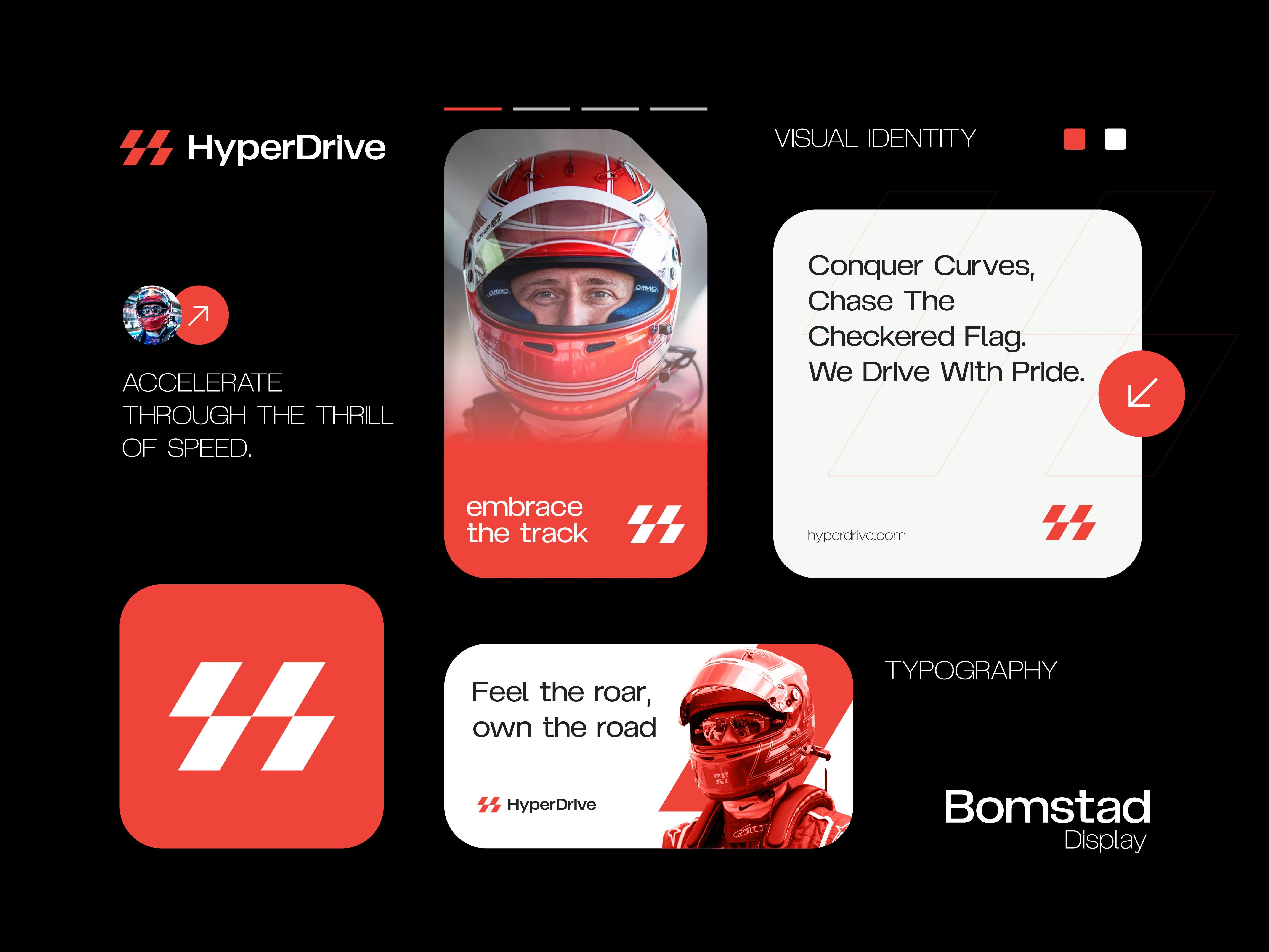
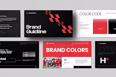
HyperDrive - Logo Design
Overview:
HyperDrive is a cutting-edge technology company focused on innovation, speed, and performance. I designed a logo that reflects these values while creating a bold and memorable visual identity.
Project Scope:
The objective of this project was to craft a logo that symbolizes HyperDrive’s futuristic vision and technological expertise. The design needed to be versatile for use across digital platforms, print materials, and product branding.
Key Elements:
Sleek, modern logomark inspired by motion and acceleration
Strong typography emphasizing stability and innovation
Bold color palette with high contrast for visibility and impact
Scalable design adaptable for both small icons and large signage
Mockups applied to digital interfaces, stationery, and product packaging
Goals:
Represent HyperDrive’s focus on speed, technology, and performance
Create a distinctive mark that stands out in the tech industry
Ensure adaptability across all brand touchpoints
Build a foundation for a larger identity system and brand guidelines
Design Style:
Futuristic, bold, and dynamic with sharp lines and energetic visual cues. The logo conveys momentum and innovation, positioning HyperDrive as a forward-thinking leader in tech.
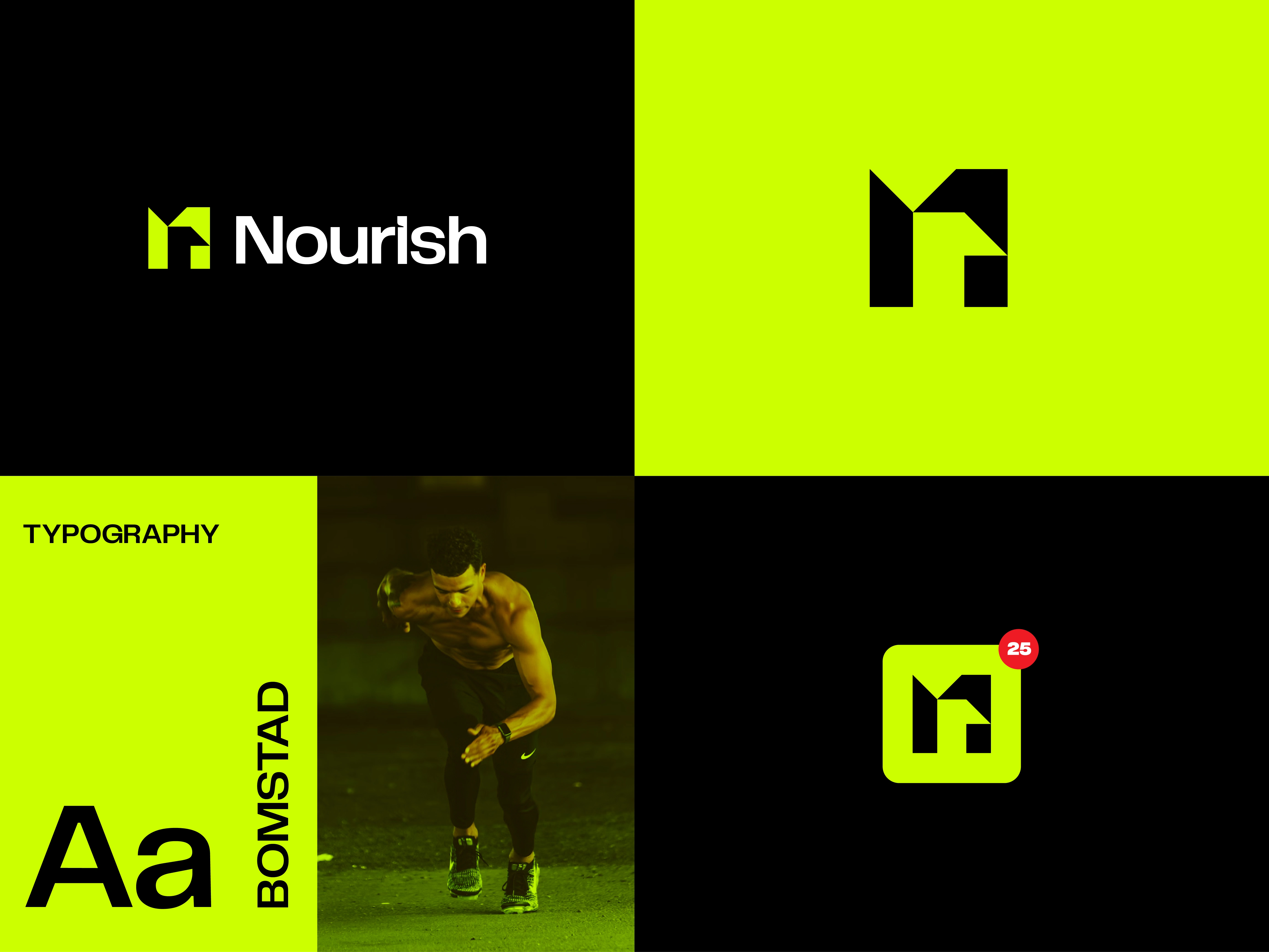
Nourish - Logo Design
Overview:
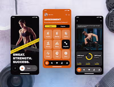
Nourish is a fitness and wellness app designed to support users in building healthier habits through workouts, nutrition, and mindfulness. I created a logo that embodies vitality, balance, and growth while staying simple and memorable.
Project Scope:
The goal of this project was to design a versatile logo that reflects Nourish’s focus on holistic fitness. The mark needed to work across the app interface, social media, and marketing assets while maintaining clarity at all sizes.
Key Elements:
Minimal logomark inspired by balance and nourishment
Clean, modern typography for accessibility and professionalism
Fresh color palette symbolizing health, energy, and vitality
Scalable design adaptable for app icons, web, and print
Mockups applied to the mobile app, merchandise, and digital campaigns
Goals:
Capture the app’s focus on holistic wellness (fitness + nutrition + mindfulness)
Create a simple, memorable logo for wide recognition
Ensure adaptability across digital and physical platforms
Build a foundation for future brand identity expansion
Design Style:
Clean, uplifting, and modern with soft edges and vibrant accents. The logo conveys energy and growth, positioning Nourish as a trusted fitness and wellness companion.
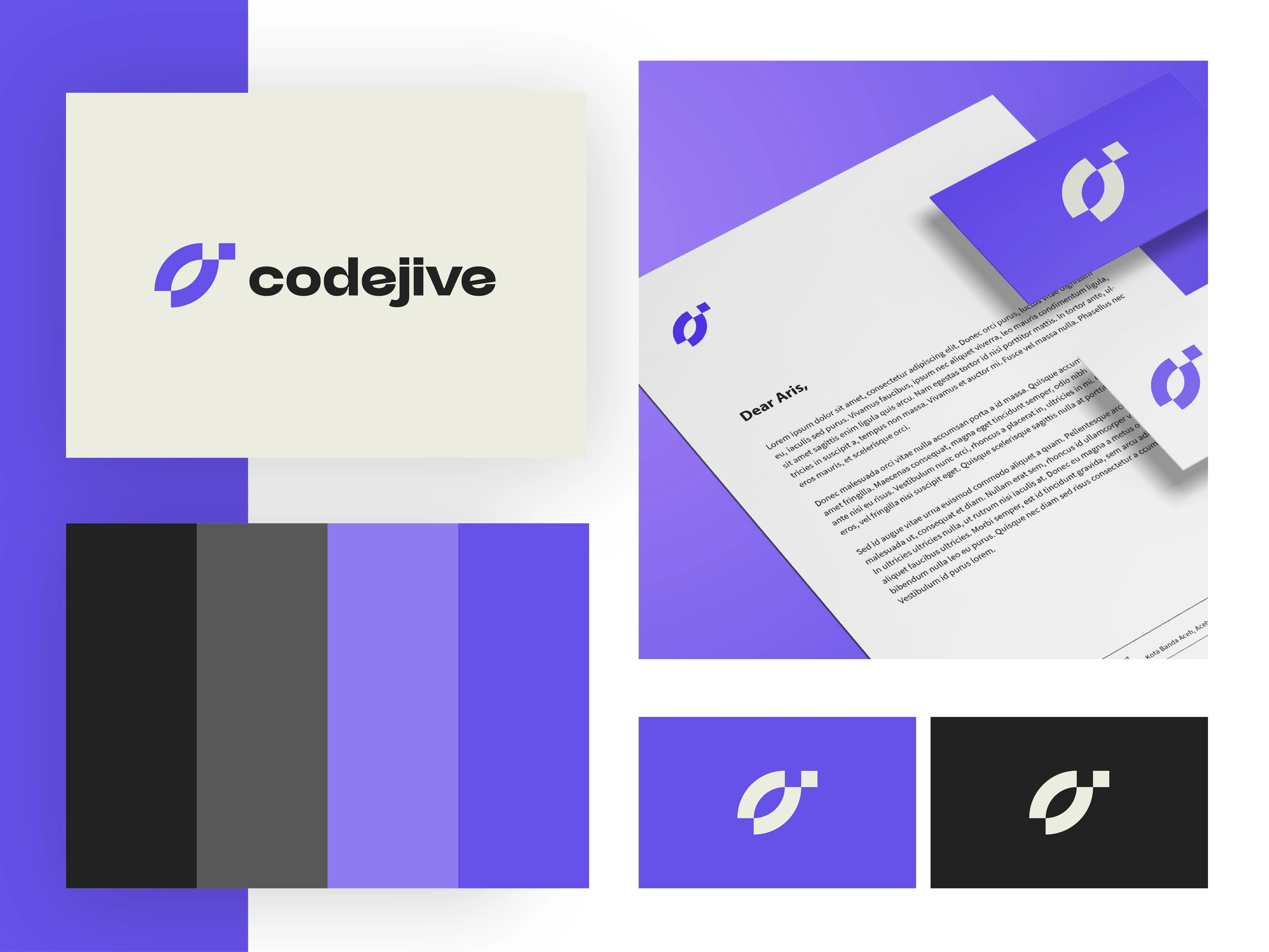
CodeJive - Logo Design
Overview:
CodeJive is a modern software development company that blends technical expertise with creativity and collaboration. I designed a logo that reflects innovation, rhythm, and a forward-thinking spirit.
Project Scope:
The aim of this project was to create a versatile and memorable logo that communicates CodeJive’s tech-driven identity while highlighting its dynamic, creative culture. The design needed to function seamlessly across digital platforms, developer tools, and branding materials.
Key Elements:
Contemporary logomark inspired by rhythm, flow, and coding structure
Bold, approachable typography for clarity and professionalism
Vibrant color palette balancing tech precision with creative energy
Scalable design adaptable for app icons, websites, and print assets
Mockups applied to stationery, digital interfaces, and merchandise
Goals:
Represent CodeJive’s balance of technology and creativity
Create a distinctive mark that resonates with both corporate clients and developer communities
Ensure adaptability across multiple platforms and formats
Establish a strong foundation for broader brand identity development
Design Style:
Modern, vibrant, and tech-inspired with geometric elements and fluid lines. The logo captures both innovation and rhythm, making CodeJive feel dynamic, approachable, and future-ready.
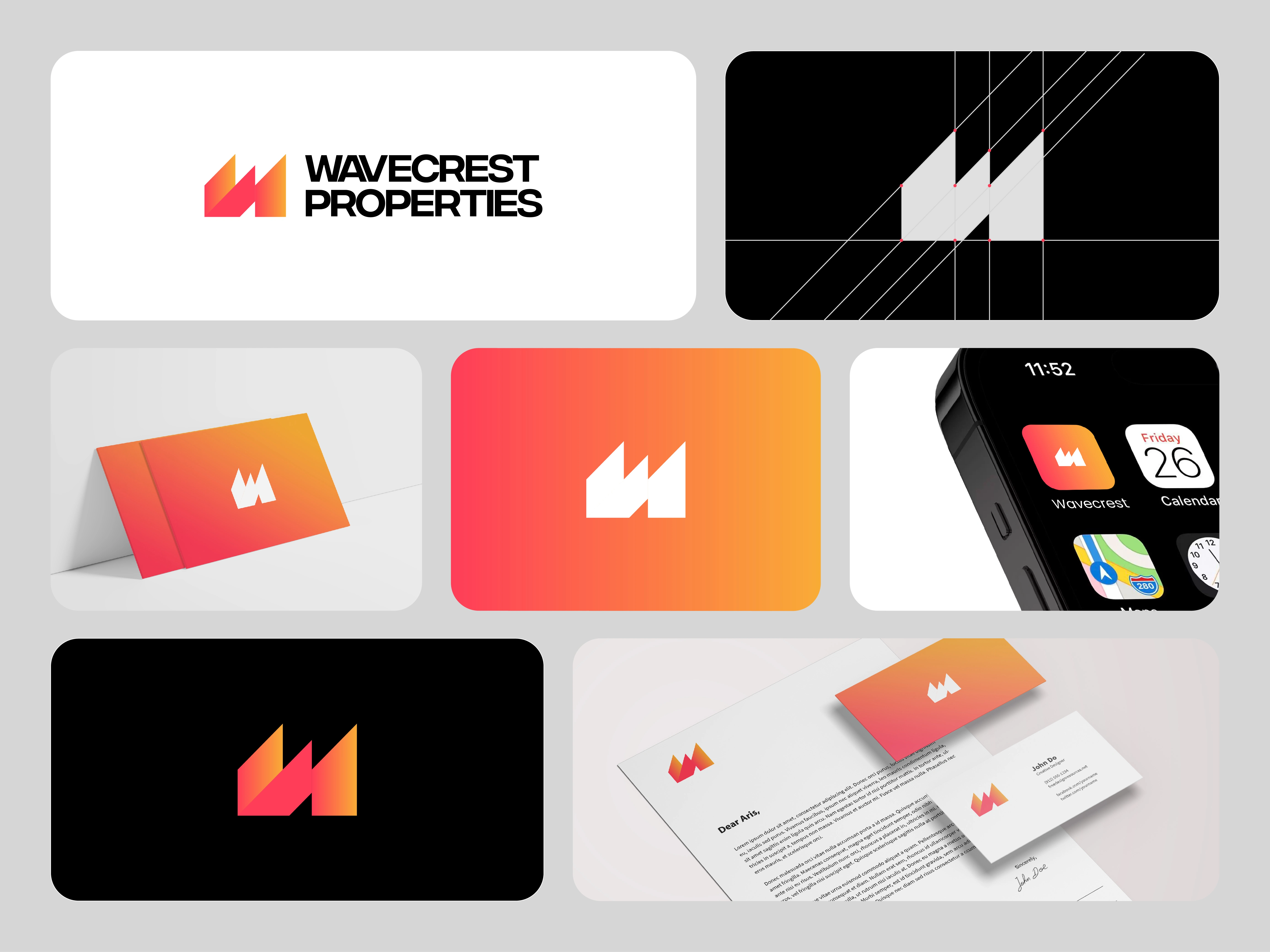
Wavecrest Properties - Logo Design
Overview:
Wavecrest Properties is a real estate company specializing in premium coastal and urban properties. I designed a logo that reflects stability, trust, and the elegance of modern living while drawing inspiration from waves and architecture.
Project Scope:
The goal of this project was to create a distinctive, versatile logo that communicates both professionalism and approachability. The design needed to appeal to property buyers and investors while working seamlessly across signage, digital platforms, and marketing materials.
Key Elements:
Elegant logomark inspired by wave forms and structural lines
Clean, modern typography to convey stability and professionalism
Refined color palette with coastal blues and neutral tones
Scalable design adaptable for signage, print, and web use
Mockups applied to business cards, property boards, and digital platforms
Goals:
Establish Wavecrest Properties as a trusted, premium real estate brand
Create a logo that symbolizes both coastal inspiration and architectural strength
Ensure versatility across both digital and physical branding applications
Lay the groundwork for a complete brand identity system
Design Style:
Sophisticated and modern with fluid yet structured elements. The logo emphasizes balance between movement and stability, positioning Wavecrest Properties as a reliable and aspirational name in real estate.
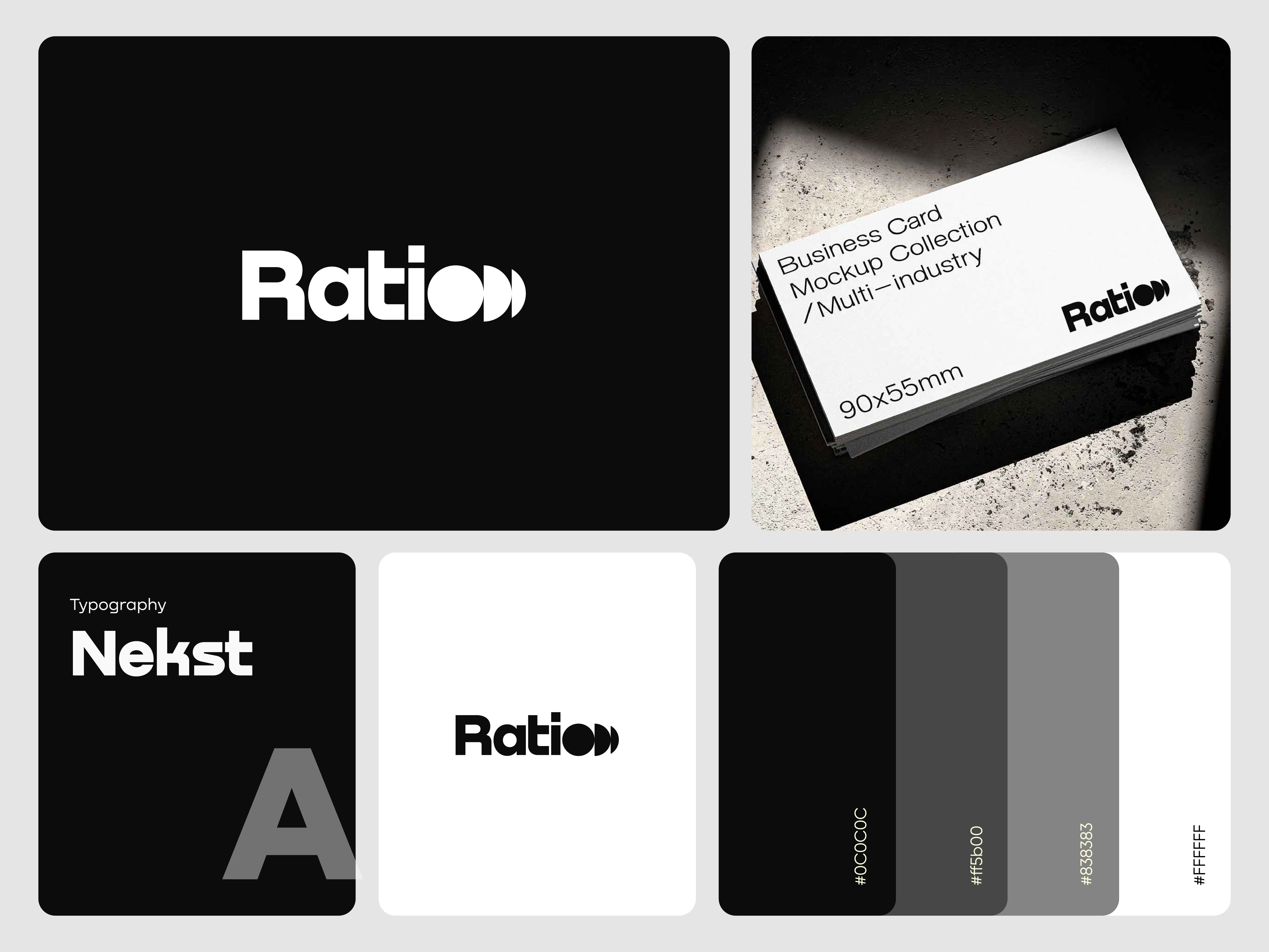
Ratio - Logo Design
Overview:
Ratio is a modern consultancy company focused on strategy, balance, and growth. I designed a logo that reflects precision, clarity, and professionalism while embodying the brand’s commitment to smart, well-measured solutions.
Project Scope:
The objective of this project was to create a clean, versatile logo that communicates Ratio’s focus on logic and balance. The design needed to be strong enough to stand alone yet flexible across print, digital platforms, and corporate materials.
Key Elements:
Minimal logomark inspired by balance and proportional harmony
Strong, geometric typography symbolizing stability and precision
Neutral yet professional color palette with subtle accent tones
Scalable design adaptable for stationery, presentations, and digital media
Mockups applied to business cards, website headers, and marketing collateral
Goals:
Represent Ratio’s focus on balance, clarity, and strategic growth
Create a distinctive, professional logo that resonates with corporate audiences
Ensure adaptability across various mediums and formats
Establish a strong visual foundation for future brand identity expansion
Design Style:
Minimal, modern, and geometric with clean lines and proportional structure. The logo conveys balance, logic, and professionalism, positioning Ratio as a trusted and forward-thinking consultancy.
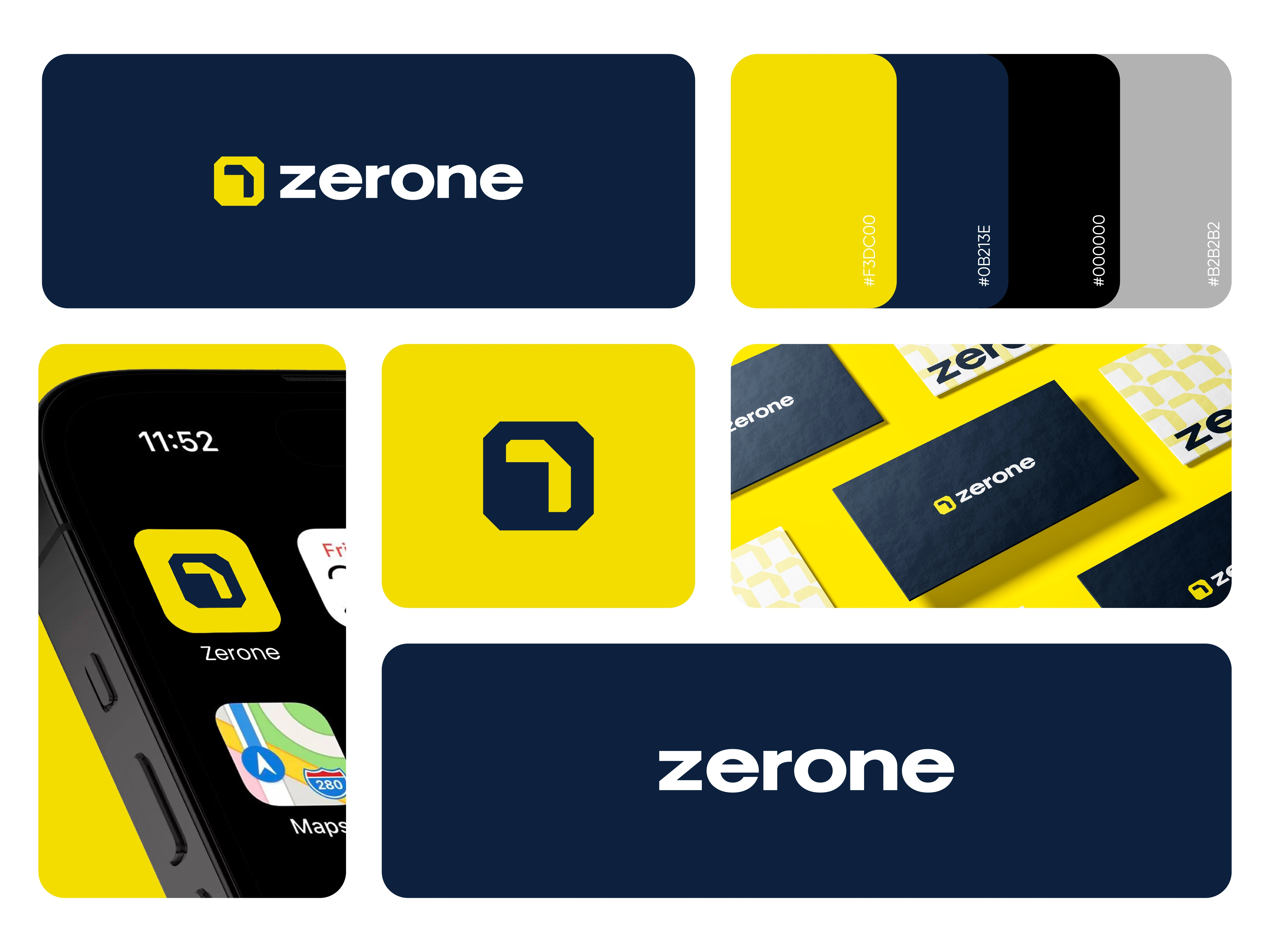
Zerone - Logo Design
Overview:
Zerone is a futuristic app designed to merge innovation with simplicity, bridging the digital world through data, connectivity, and smart solutions. I created a logo that symbolizes technology, minimalism, and forward-thinking design.
Project Scope:
The goal of this project was to design a modern, versatile app logo that works seamlessly as an icon while also supporting a broader identity system. The logo needed to reflect the binary inspiration of the name Zerone (0 and 1) while staying sleek, scalable, and instantly recognizable.
Key Elements:
Minimal logomark inspired by binary code and digital flow
Clean, futuristic typography for a modern tech appeal
Bold, contrasting color palette with tech-inspired tones
Scalable design optimized for app icons, interfaces, and marketing
Mockups applied to mobile UI, app store listings, and promotional materials
Goals:
Represent Zerone’s connection to technology and innovation
Ensure clarity and recognition at small app icon sizes
Build a distinctive, modern mark that stands out in the digital product space
Create a foundation for a cohesive brand identity system
Design Style:
Futuristic and minimal with sharp edges and high-contrast color schemes. The logo conveys innovation, simplicity, and precision, making Zerone feel like a next-generation digital product.
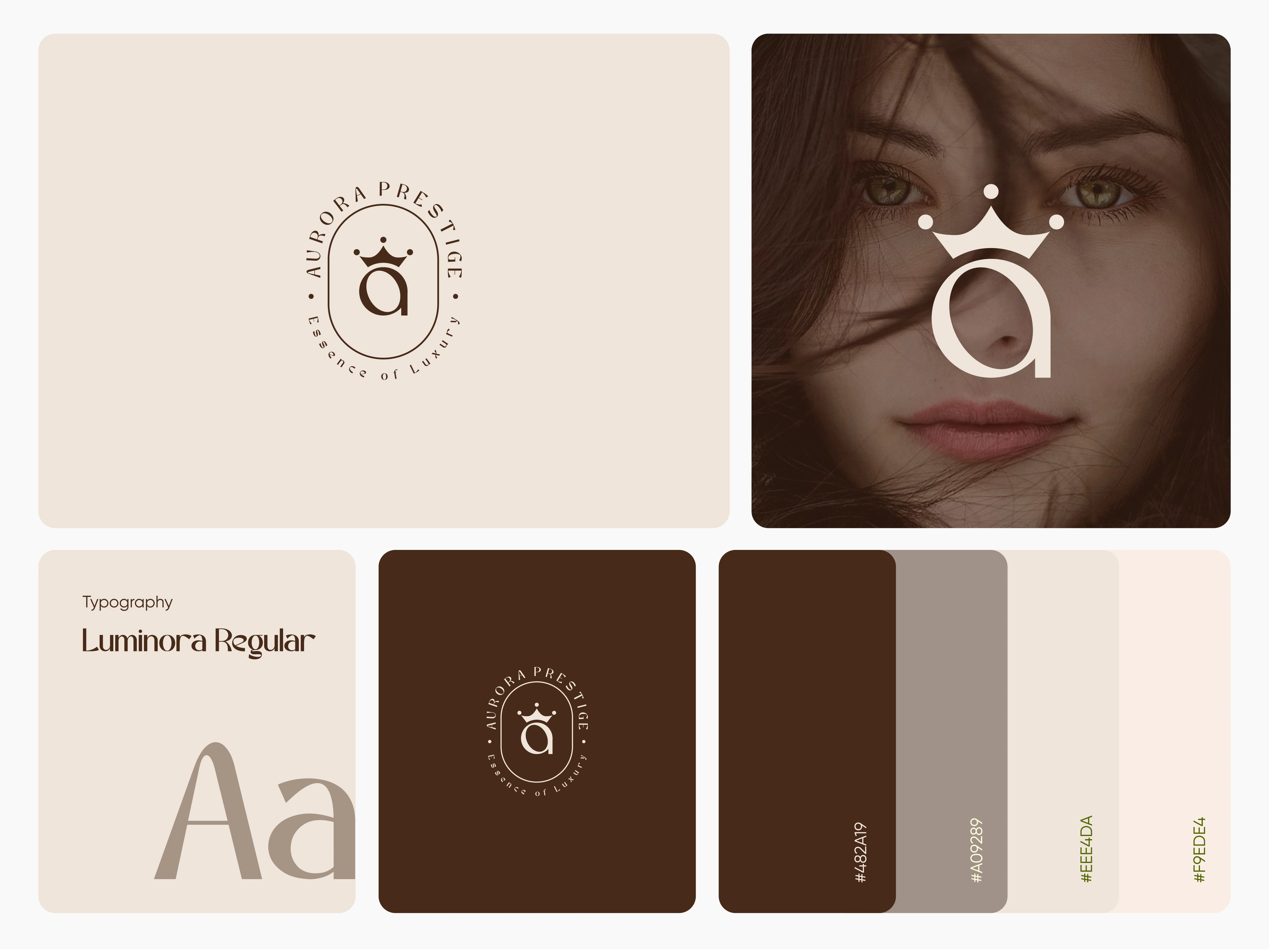
Aurora Prestige - Logo Design
Overview:
Aurora Prestige is a luxury fashion brand that represents elegance, exclusivity, and modern sophistication. I designed a logo that captures the brand’s high-end essence while remaining versatile and timeless.
Project Scope:
The goal of this project was to craft a distinctive and refined logo that reflects Aurora Prestige’s place in the luxury fashion market. The design needed to embody exclusivity and glamour while working seamlessly across digital platforms, print campaigns, and packaging.
Key Elements:
Elegant logomark inspired by light and prestige symbolism
Sophisticated typography emphasizing refinement and class
Luxurious color palette with gold, deep neutrals, and subtle gradients
Scalable design adaptable for packaging, signage, and digital platforms
Mockups applied to fashion labels, storefronts, and marketing collateral
Goals:
Position Aurora Prestige as a recognizable, aspirational fashion brand
Create a timeless logo that resonates with high-end audiences
Ensure adaptability across luxury touchpoints, from runway to retail
Lay the foundation for a cohesive brand identity system
Design Style:
Luxurious, refined, and modern with elegant typography and subtle details. The logo conveys exclusivity and sophistication, establishing Aurora Prestige as a premium name in the fashion industry.
Like this project
Posted Sep 16, 2025
Designing impactful logos that capture brand essence with clarity, creativity, and versatility, building marks that stand the test of time.
Likes
0
Views
6