Soooup- Food Recipe application
Origin of my design:
When I was doing my internship, I ran into several problem statements, so we conducted many research processes to come up with some solutions, which helped me in this project.
At the end of the internship I wanted to write a new case study to improve my skills so I asked my friends about any problems they had encountered and many of my friends told me that cooking food was very difficult for me especially when I was alone from the family.
There are many distractions when I am supposed to cook food for myself or my friends, I find it difficult to cook food.
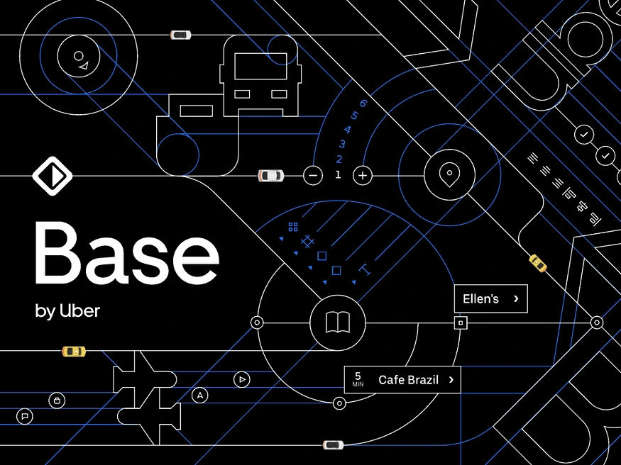
Then I got a problem statement for my next case study, So I was researching for it like any design patterns or guidelines like that. At one stage I was inspired by the Base (Uber design system), Which I felt was very minimalistic and simple in terms of User Interface and didn’t hold many distractions in the visual hierarchy so I confirmed that I needed to design a food recipe application as much as Uber.
The Process: 👉Full process: Figjam
What do I need to design?
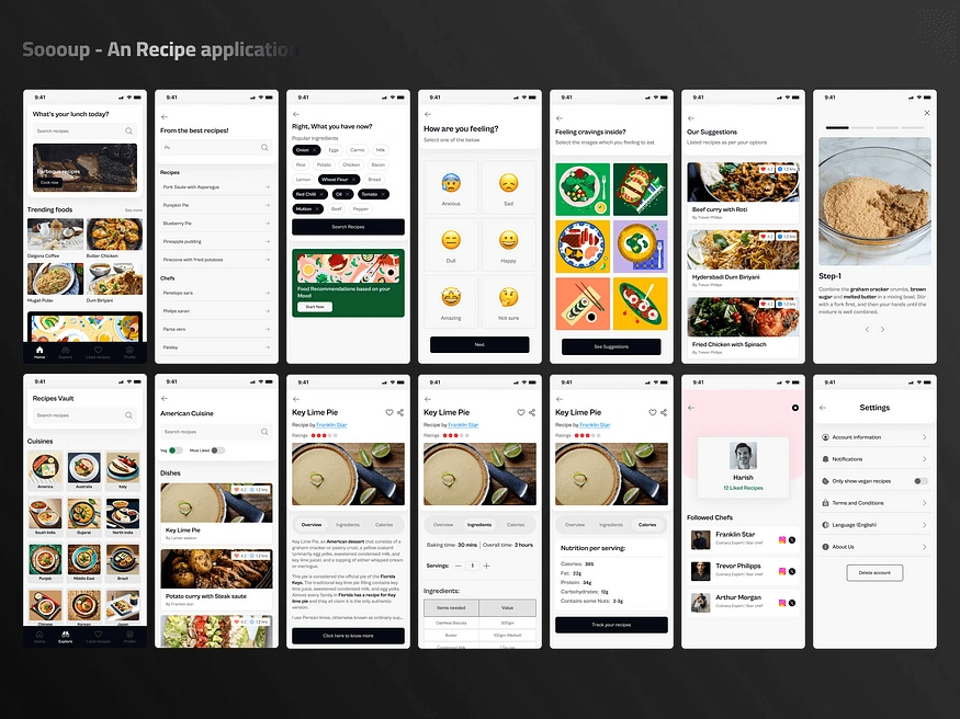
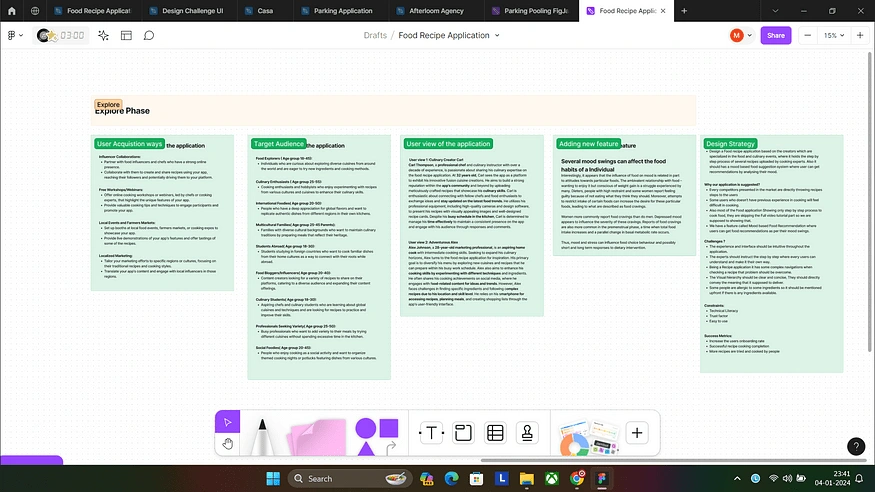
Design a Food recipe application based on the creators which are specialized in food and culinary events, where it holds the step-by-step process of several recipes uploaded by cooking experts. Also, it should have a mood-based food suggestion system where user can get recommendations by analysing their mood.
Why our application is suggested?
Every competitor presented in the market is directly throwing recipe steps to the users who don’t have previous experience in cooking and will find it difficult to cook. Also, most of the Food applications Show only the step-by-step process of cooking food, they are skipping the Full video tutorial part so we are supposed to show that. We have a feature called Mood-based Food Recommendation where users can get food recommendations as per their mood swings.
Challenges?
The experience and interface should be intuitive throughout the application. The experts should instruct them step by step so that every user can understand and make it their own way. Being a Recipe application it has some complex navigations when checking a recipe that problem should be overcome. The Visual hierarchy should be clear and concise, They should directly convey the meaning that it is supposed to deliver. Some people are allergic to some ingredients so it should be mentioned upfront if there are any ingredients available.
Questions I selected for the User Interview:
Can you tell me a bit about your cooking background and how often you cook at home?
Are there specific types of recipes or cuisines you usually search for on the app?
Do you use the app for meal planning, cooking inspiration, or both?
Can you describe any specific challenges you face when using the app or cooking in general?
Would you be interested in challenges, contests, or cooking events hosted by the app to engage with other users?
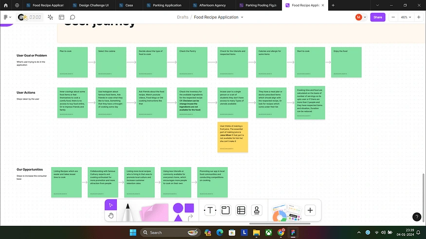
I conducted interviews with my family and friends, Specifically those who are living Abroad to learn about the challenges and pain points.
Researching the New feature- Mood-based Food recommendations:
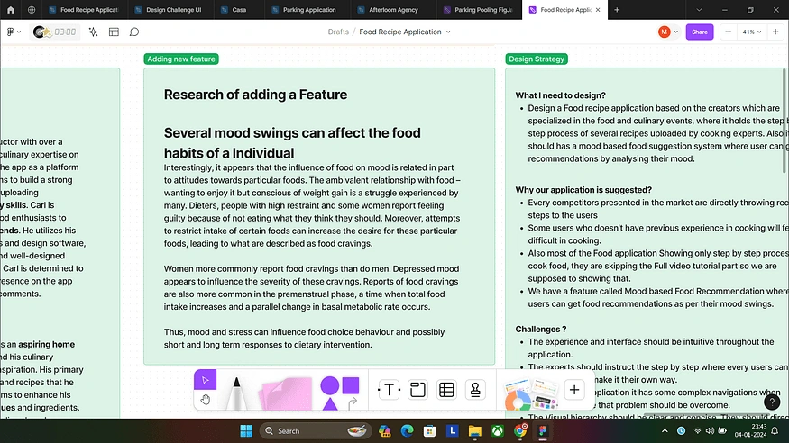
Factors that influence our Food recommendations: Interestingly, it appears that the influence of food on mood is related in part to attitudes towards particular foods.
The ambivalent relationship with food — wanting to enjoy it but being conscious of weight gain is a struggle experienced by many. Dieters, people with high restraint and some women report feeling guilty because of not eating what they think they should.
Moreover, attempts to restrict the intake of certain foods can increase the desire for these particular foods, leading to what are described as food cravings.
Women more commonly report food cravings than do men. The depressed mood appears to influence the severity of these cravings.
Reports of food cravings are also more common in the premenstrual phase, a time when total food intake increases and a parallel change in basal metabolic rate occurs.
Thus, mood and stress can influence food choice behaviour and possibly short and long-term responses to dietary intervention.
Check the article below to learn about what I explained above.
Competitor Research for a new feature:
I have conducted market research on the food industry and the list of culinary experts who are experts in cooking and how they influence people with their skills.
The food recipe application market has experienced significant growth, with a compound annual growth rate (CAGR) of approximately 15% over the past five years. As of 2023, the market is valued at USD XX billion and is projected to continue expanding at a robust rate.
Prominent players in the food recipe application space include Kitchen Stories, Cookfood, Tasty, and Slurrp. These applications offer a wide range of recipes, cooking tips, and interactive features to engage users.
In recent times, Artificial Intelligence’s domination in every industry has increased. Every player in the market is supposed to introduce AI in some way that will act as an add-on point to use their application, So I also Introduced the Mood-based food recommendation feature which is common in every food delivery app but I failed to find one in the recipe applications.
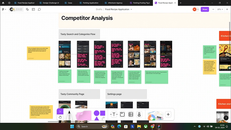
Brainstorming:
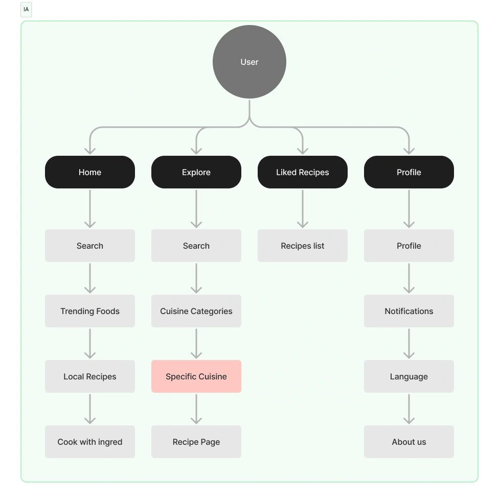
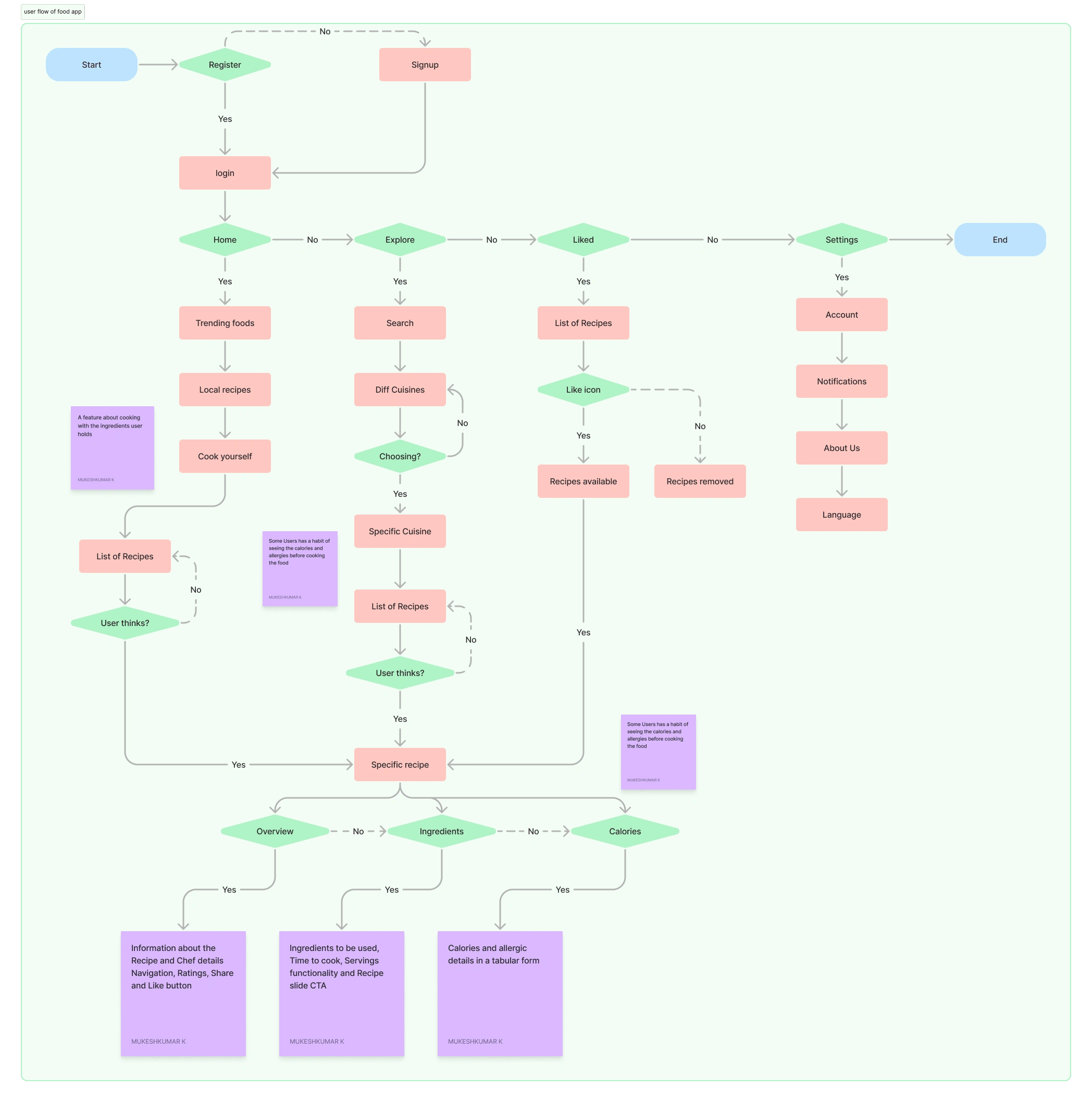
After the competitor analysis, I collected some insights and basic criteria of the food recipes and created the User flow and Information Architecture of the application.
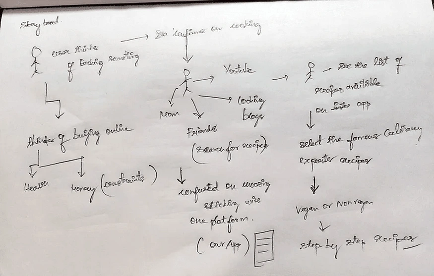
Storyboard of the application:
The thing that I found during this app design is that whenever we start designing a product we need to build an assumption of how users get to know about our product with the available opportunities, Will really help us to build the Information architecture of the product and helps to understand user Pain-points, Challenges.
🤩I created a Storyboard of the overall application.
Want to know my detailed research Check my FigJam
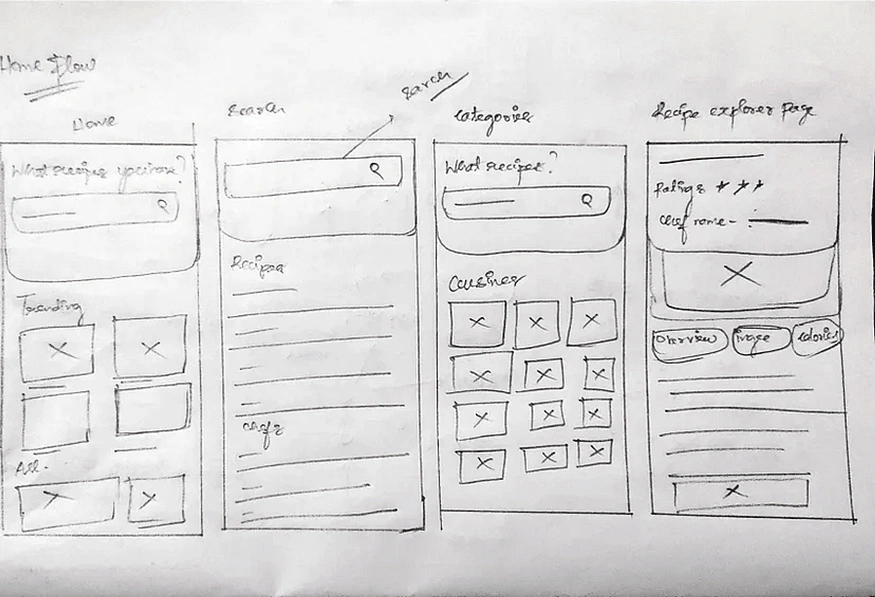
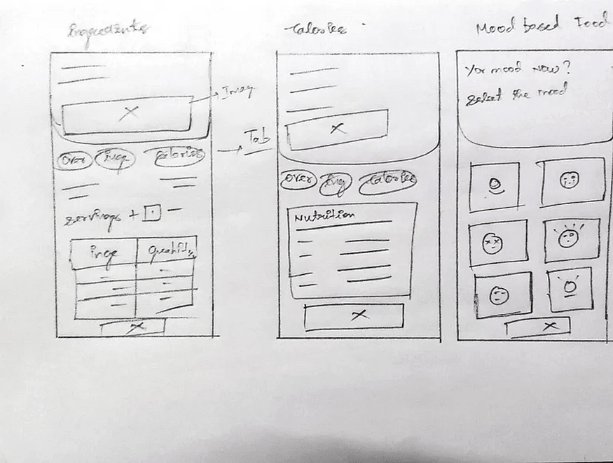
Initial Sketches and Wireframing:
I excluded the part about making low-fed design so I directly jumped from the pencil sketches and high fidelity design.
High-fidelity design:
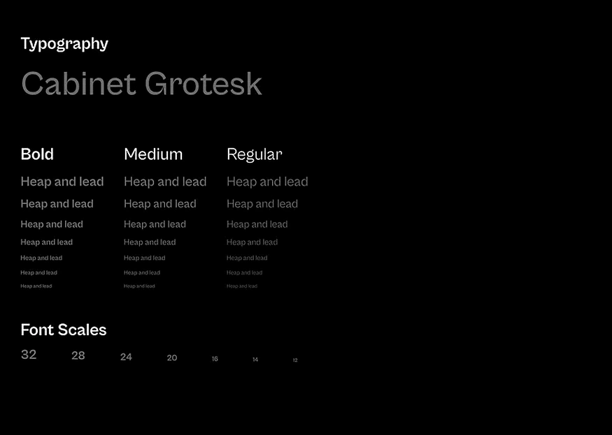
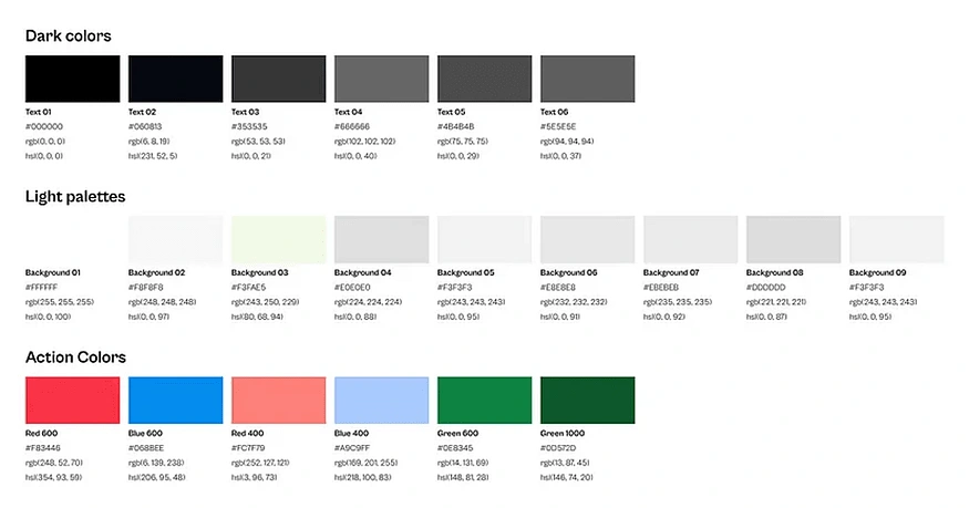
I chose the Typography as Cabinet Grotesk and the Colors are from the Uber design System (Base) P.C: It’s Inspired by Uber🚀
Overview of my screens:
🗒️Key Takeaways:
We need to prioritize the tasks based on the time we have available.
Ensuring consistency in the app’s design patterns.
When considering the app, it is important to think about different use cases, scenarios, contexts, and user interactions.
To solve the problem, analyze competitors and consider the context within the timeframe.
📌Future scope:
01. User Testing: Conducting user testing on the implemented solutions can provide valuable insights into how well the new features are received and any areas that might need further improvement.
02. Accessibility:** Make sure the search page is easy to use for people with disabilities by following accessibility rules and good methods.
03. Continuous Improvement: As user preferences and technology evolve, it is important to revisit the design and make necessary updates.
🌐Connecting time:
If you have any doubts or feedback on the process feel free to mail me: at mukeshdan20@gmail.com.
Like this project
Posted Jan 24, 2024
I designed a food recipe application as an Open source project. The application has a mood-based recipe recommendation AI.
Likes
0
Views
4
Clients

Open Source


