Bedding Packaging Design | Paakhi Home
Soveet Gupta
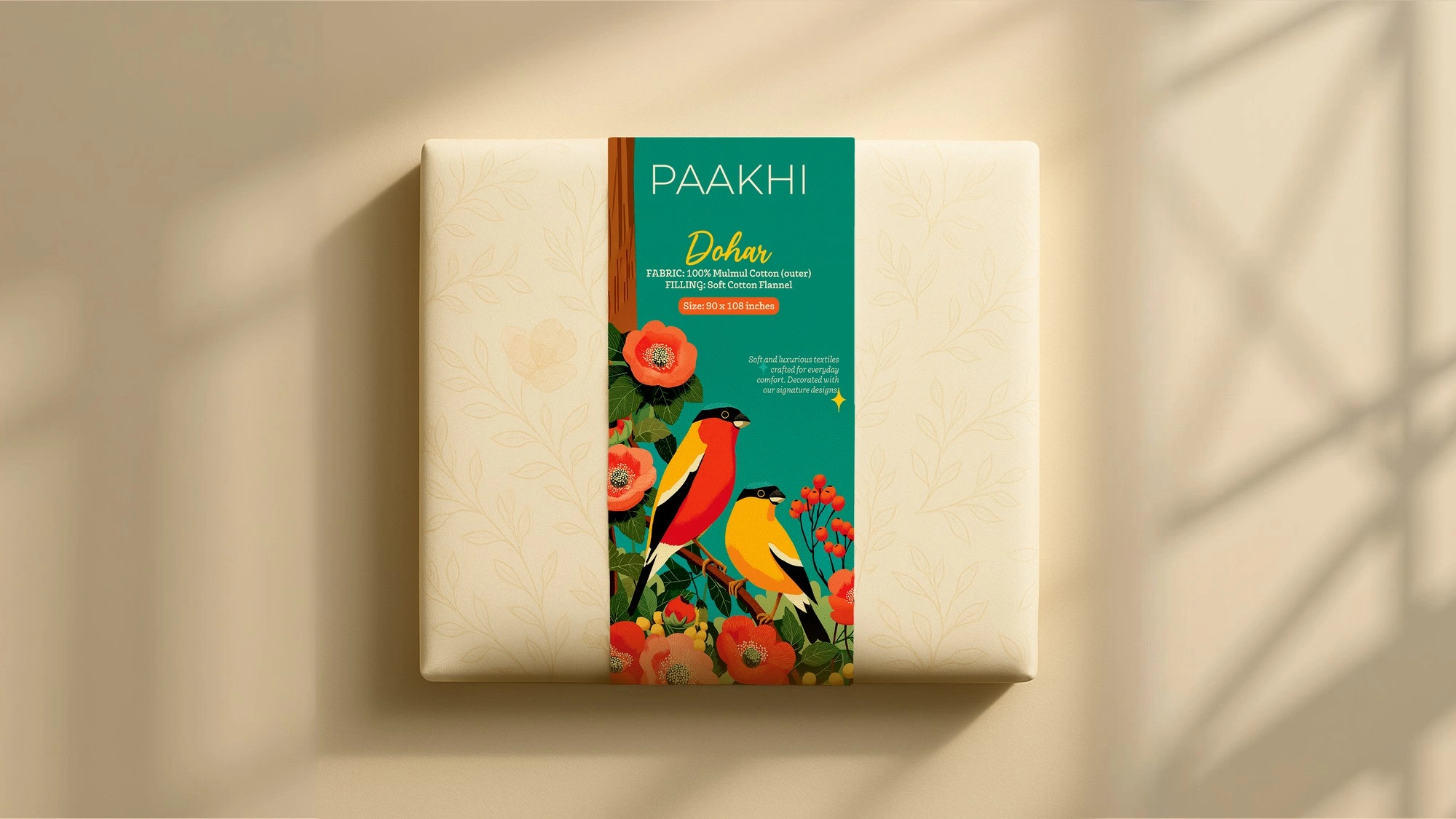
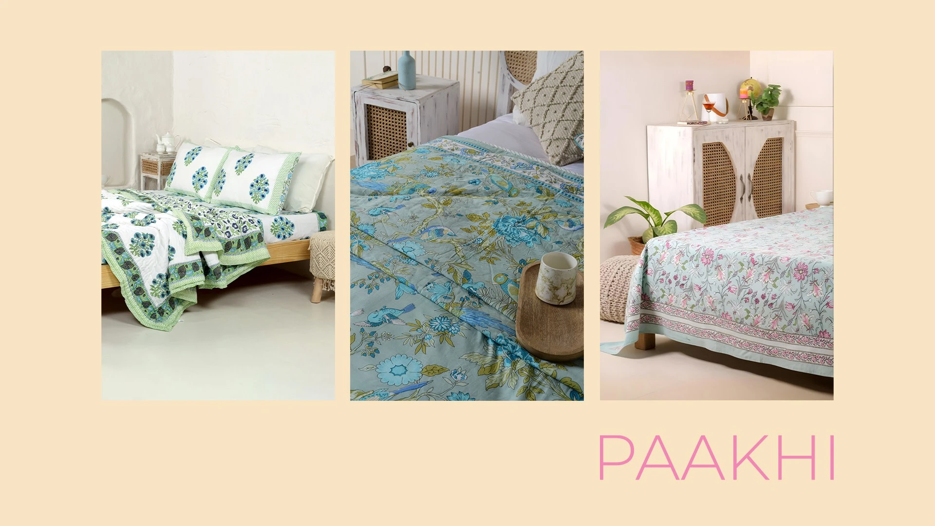
Paakhi - A Bedding Sheet Company

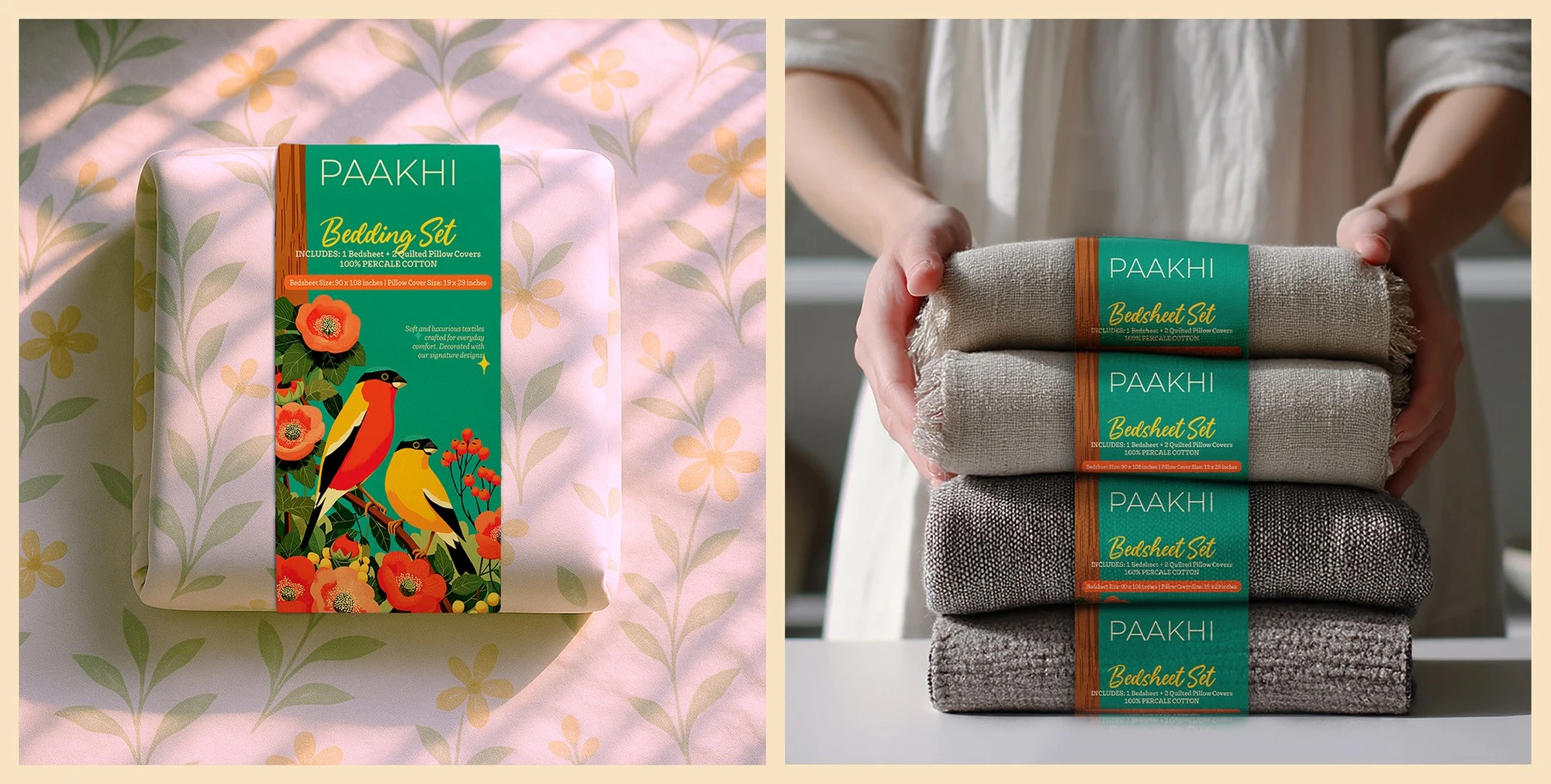
Paakhi offers beautiful bedsheets with a refreshing, vacation-like vibe.
We wanted the packaging to reflect that same light, breezy, and calming feel - so we designed it to feel like a mini escape from the very first glance.
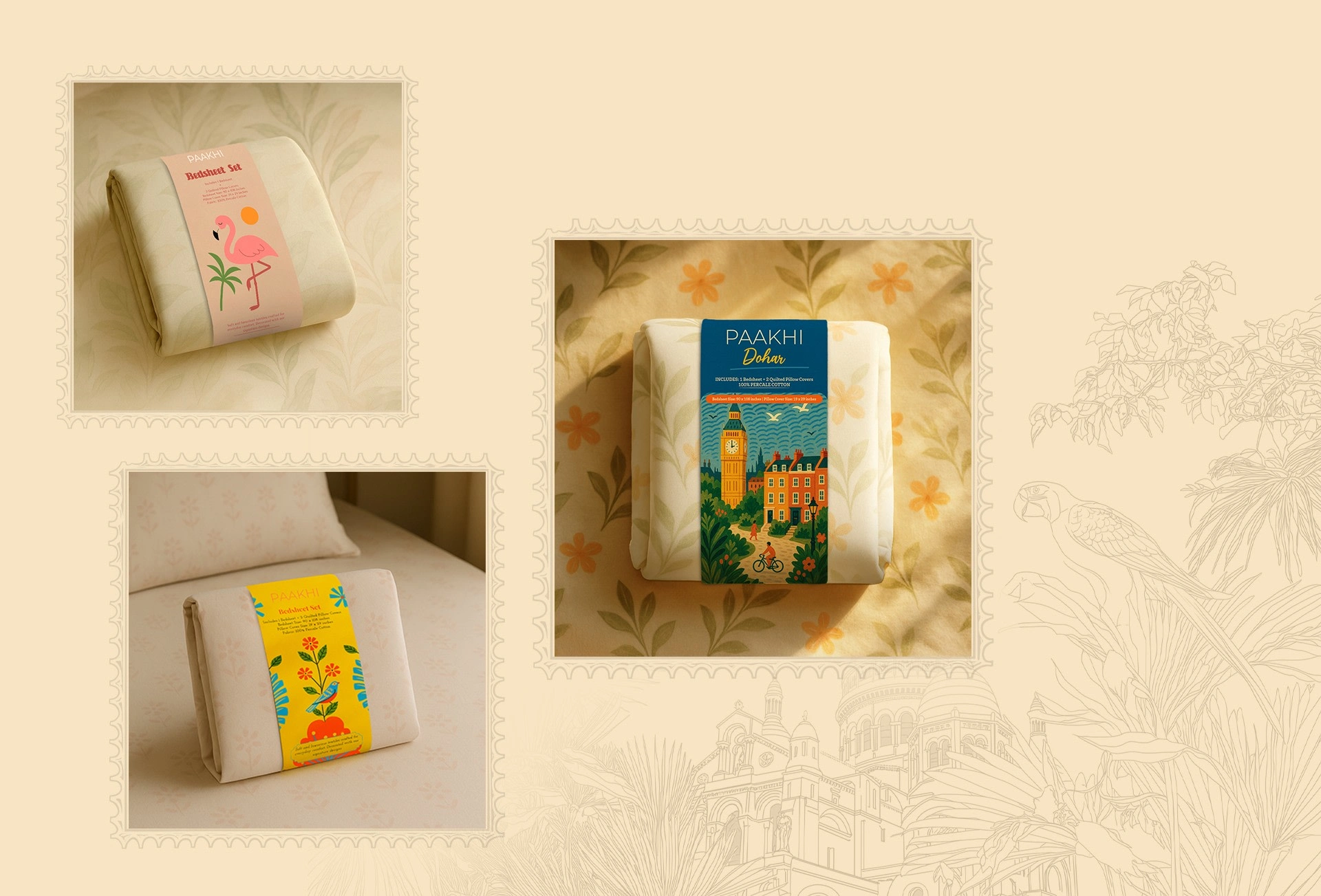
A clean packaging always catches the eye!
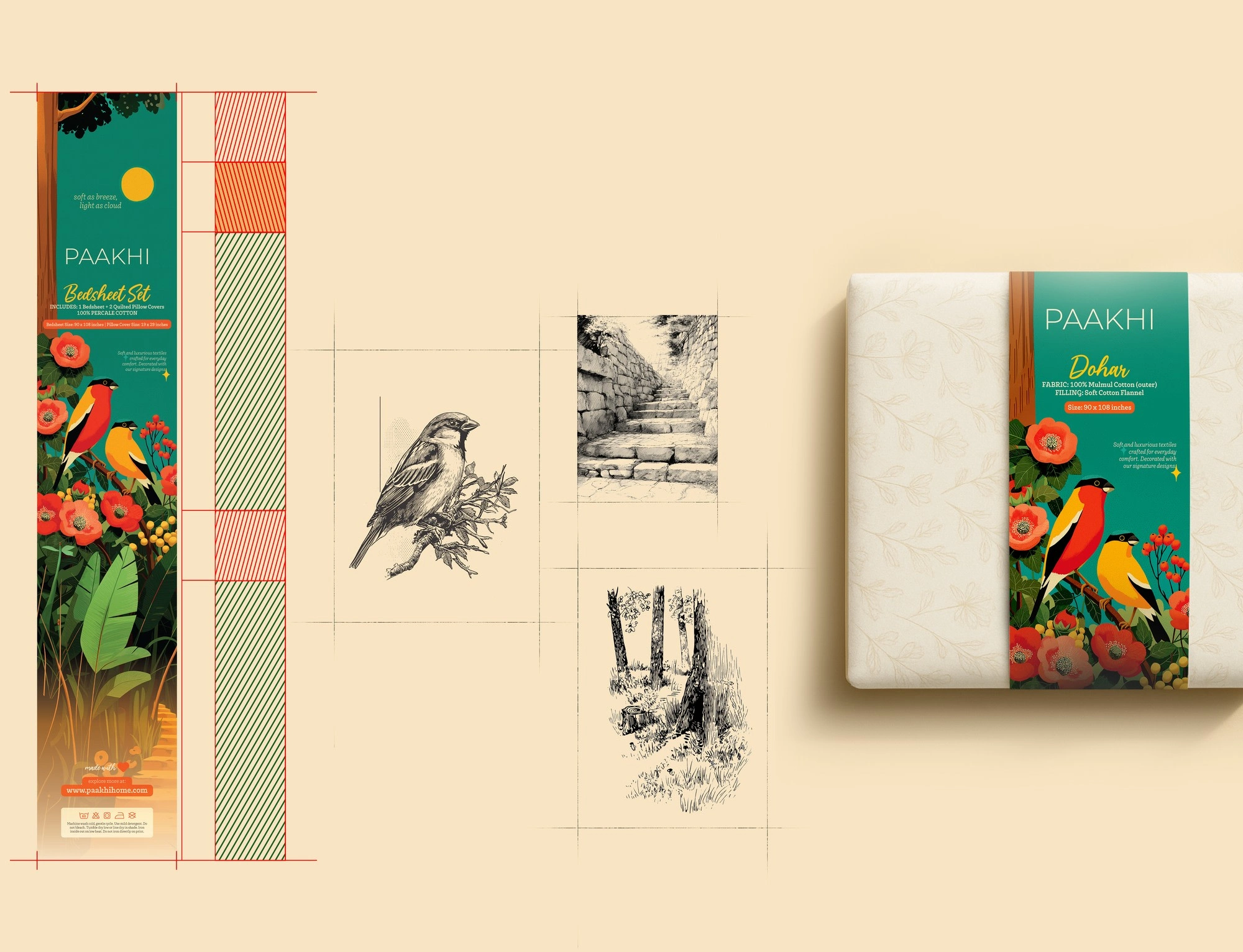
Paakhi means “bird” - a symbol of grace and lightness, which we wanted the packaging to reflect.
In the end, it came together beautifully.
Problem:
Paakhi’s bedding and furnishings packaging was generic, lacking brand identity and failing to build customer recall. In-store competition made it difficult for the brand to stand out and drive repeat purchases.
Solution:
We developed a unique packaging design system with distinctive brand visuals and storytelling. The result is elevated shelf presence, better recognition, and greater consumer trust for Paakhi’s bedding and furnishings range.
Like this project
Posted Aug 6, 2025
Created a unique packaging system for Paakhi, a bedsheet Co. blending brand visuals and storytelling - boosting shelf presence, recognition, and consumer trust.