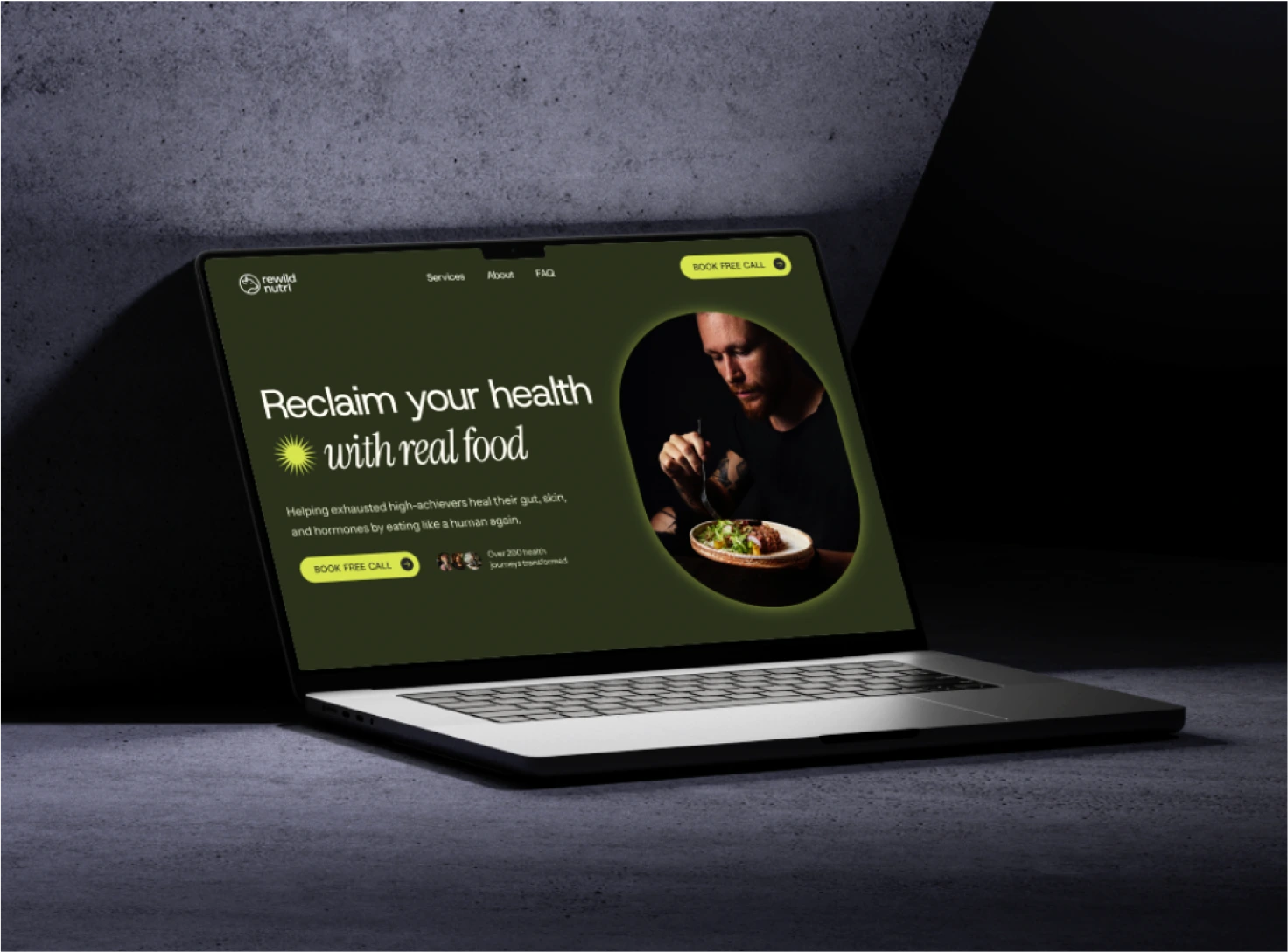
Nutrition Coach Website
Kristina Balciunaite
The Strategy
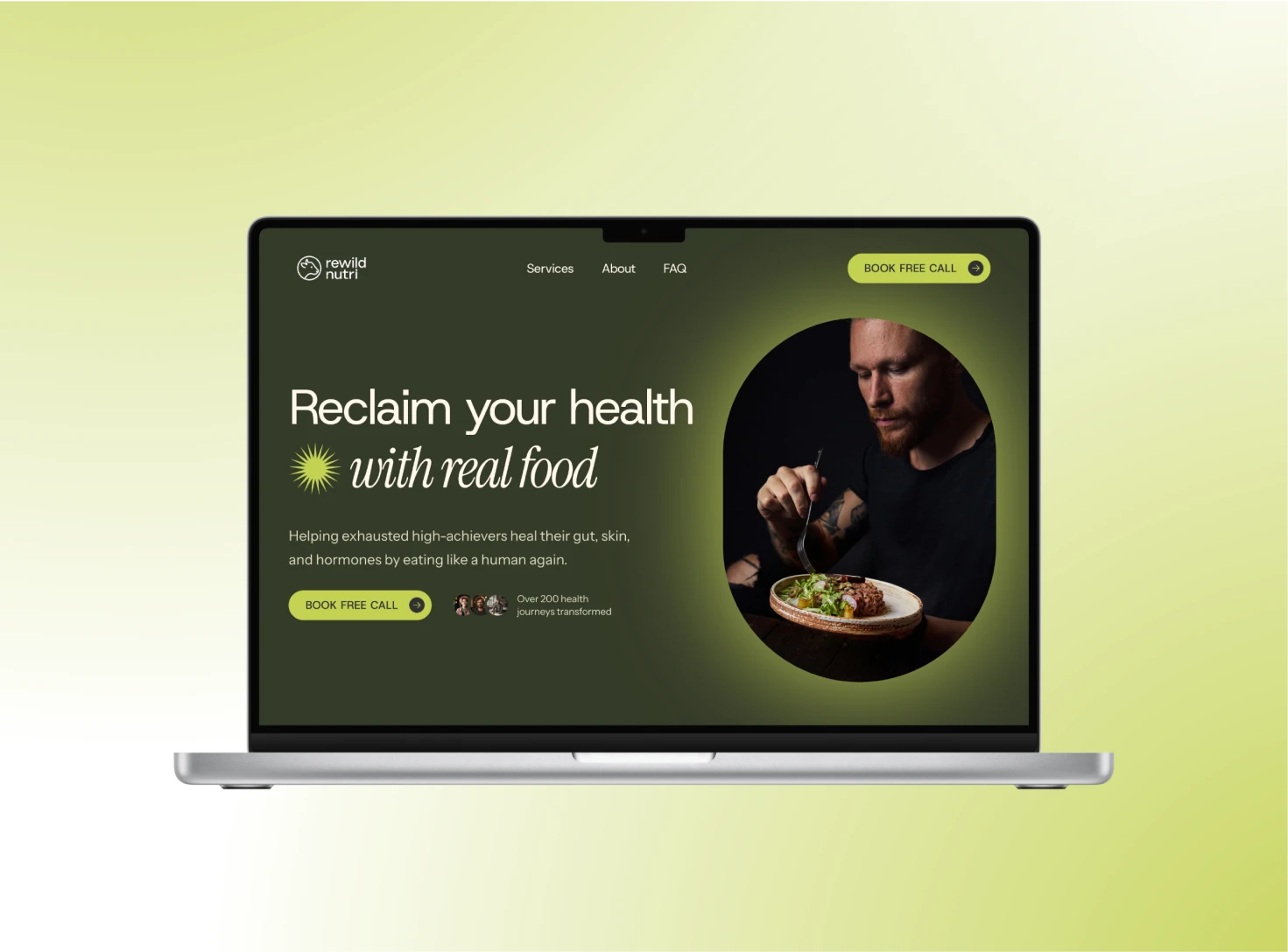
Rewild Nutri was designed to prove that a nutrition website can be both strategic and have character. The goal was to create a digital presence that’s:
→ Clear and conversion-focused
→ Rooted in real outcomes, not trends
→ Professional without feeling sterile
→ Bold without being chaotic
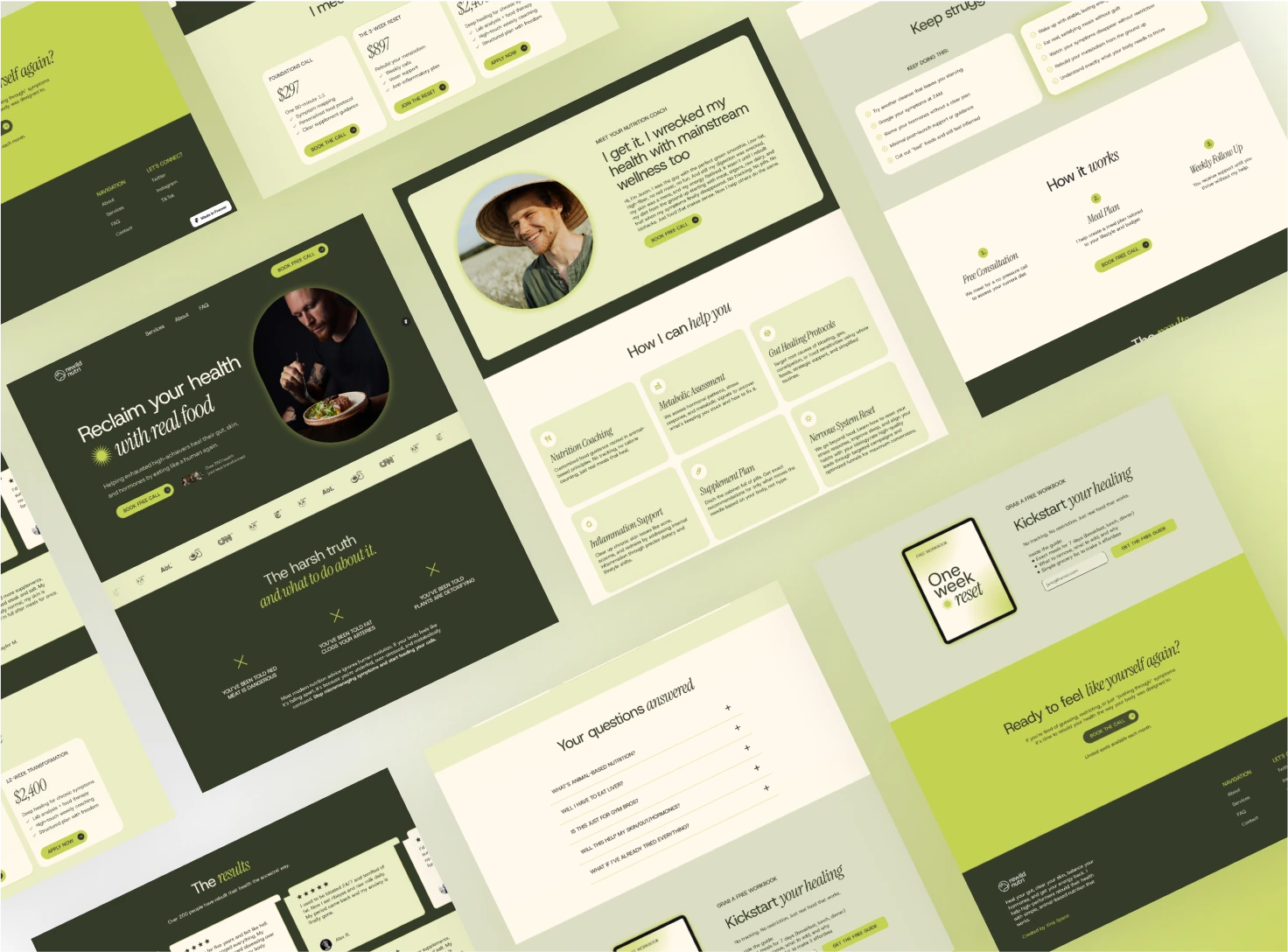
The Approach
Messaging:
The copy speaks directly to the kind of client who is tired of fad diets and surface level fixes. It is punchy, clear, and honest. Every section moves the user toward trust and action.
Visual System:
The palette combines earthy greens with a subtle acidic pop, grounding but memorable. It reflects the primal yet refreshing tone of the brand: real food, real healing, real results.
Typography:
A mix of sharp serifs and soft sans creates contrast and hierarchy while maintaining legibility and polish.
Layout:
Each section was designed to reduce cognitive load. Clear headers, visual breathing room, and minimal distractions keep the user moving while building trust with every section.
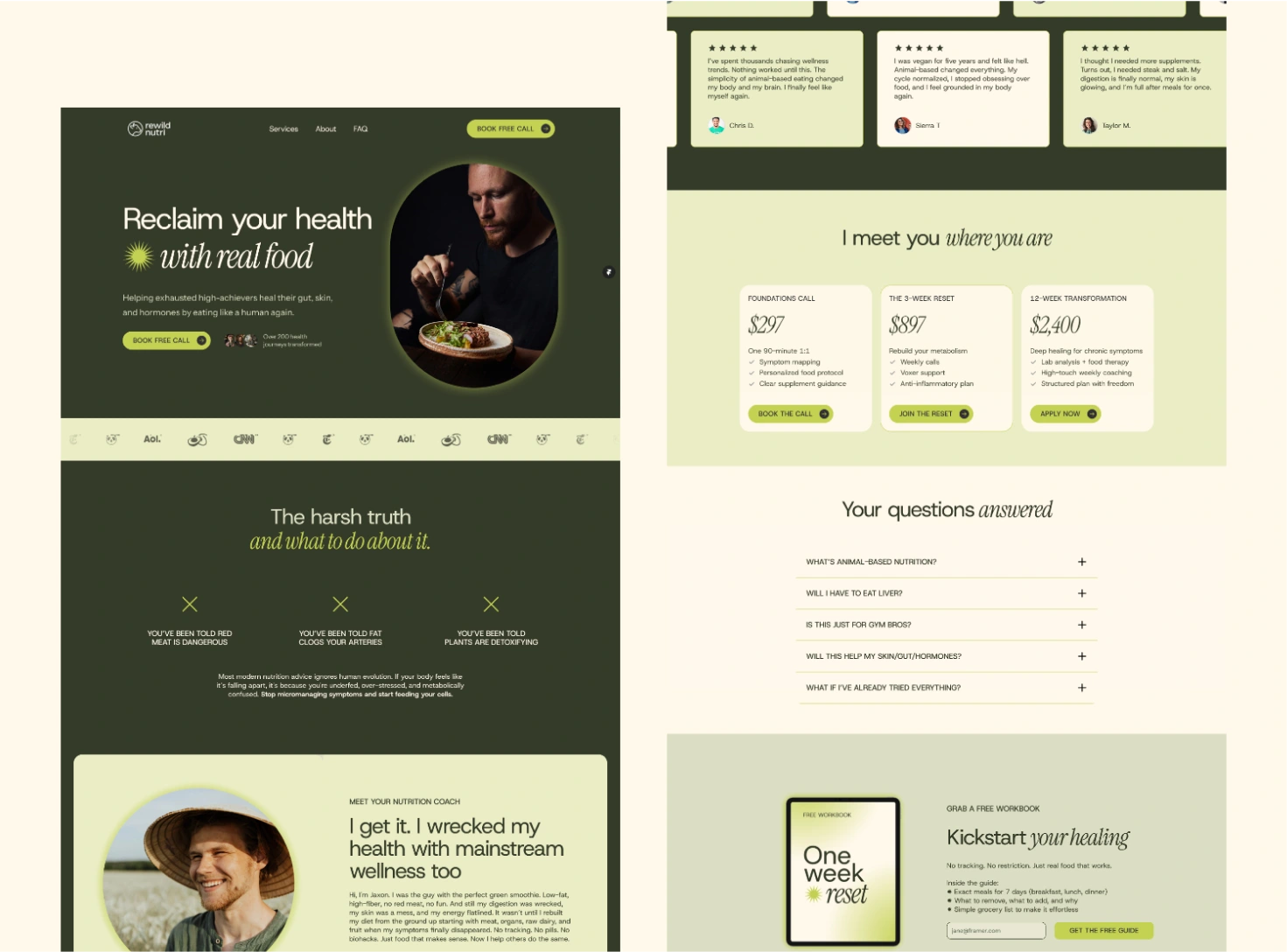
Why it works
This site does not look like every other wellness brand, and that is the point. It is confident. It is clean. And it converts.
→ It educates without overwhelming
→ It builds credibility without being clinical
→ It reflects a clear philosophy, making the right people lean in and the wrong ones opt out
Like this project
Posted Jul 15, 2025
A website for a nutrition coach, who teaches methods built on ancestral principles and real food healing.
Likes
0
Views
13