Visual Voices: A Gallery of Brand Identities

Chris Luniewicz
Brand Designer
Graphic Designer
Adobe Illustrator
Hi there — welcome to my portfolio of brand identities!
These are some of the identities I’ve developed over the years, each one carefully crafted to capture the essence of its unique story. My approach to design is rooted in minimalism, focusing on clarity and purpose, but always with the goal of creating marks that are not only visually striking but also deeply effective. Every logo and brand element is designed to be memorable, flexible, and impactful, reflecting both simplicity and intention.
Arya Roofing
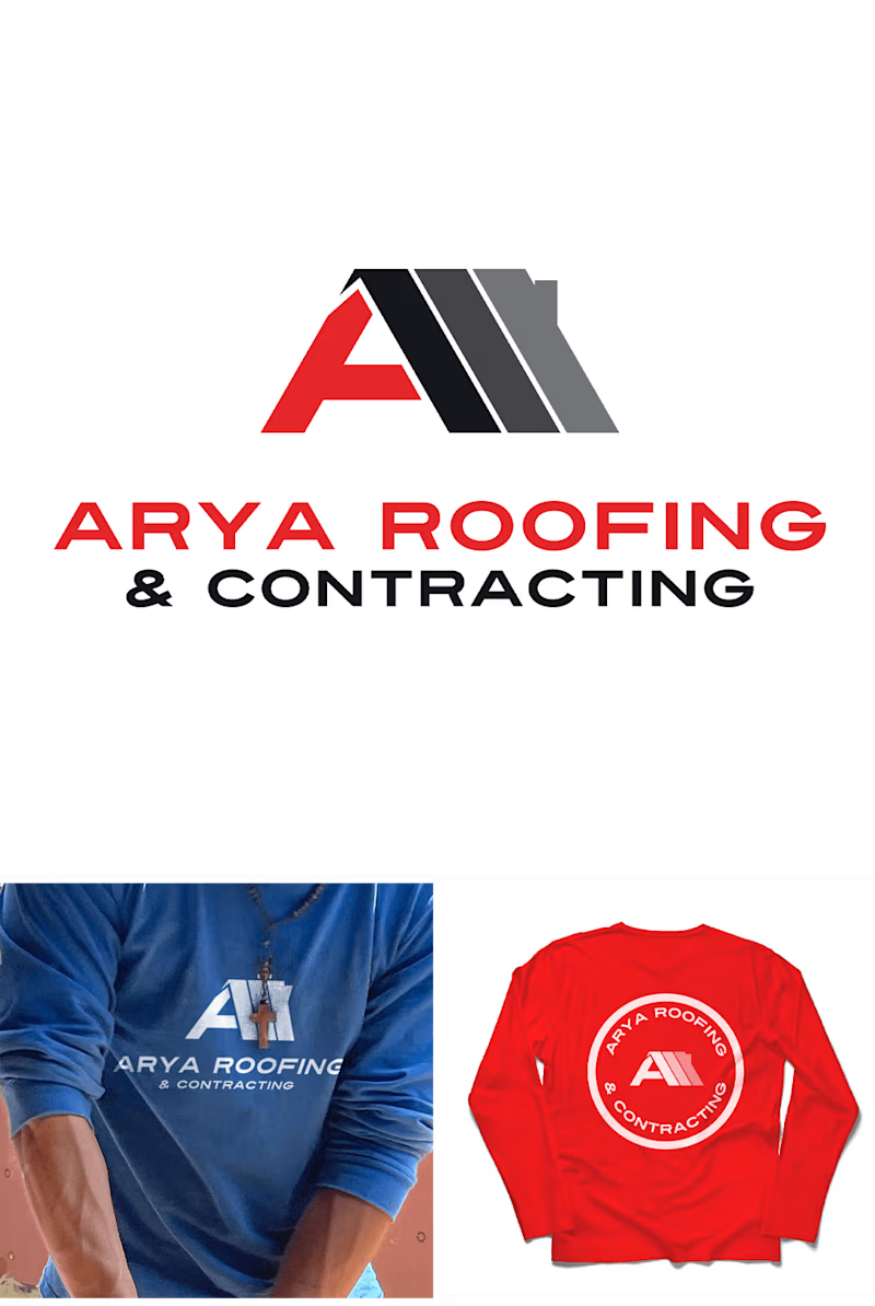
Arya Roofing
The Client 📝
Arya Roofing is a premier company specializing in residential and commercial roofing, siding and custom gutter and decking services.
Project Overview 🔍
This project was brought to through word-of-mouth. As a growing business Ten (the founder) needed a logo and brand that better represented his company and appealed to his clientele.
Project Goal ✅
My goal for his identity was to give him an elevated look. Being active on social media I knew I waned to give his something that worked well as an icon first and foremost. I opted for a wide modern font for "A" that incorporated well with the roofline.
873 Café & Smith Hill Tavern
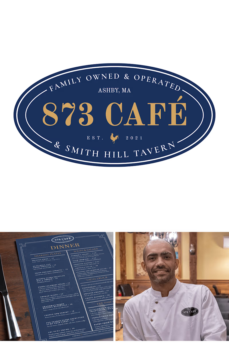
873 Café & Smith Hill Tavern
The Client 📝
873 Café is a local restaurant owned by a close personal friend. They offer a variety of homemade comfort foods, and take pride in using fresh, locally sourced ingredients from area farms and businesses whenever possible.
Project Overview 🔍
Chef Sean Smith bought 873 Café in 2021. He was in need of a logo and visual look for his restaurant.
Project Goal ✅
The goal for this project was to give a nod to the previous logo while also givnig him something new. The "873 Café" is done in the in the same font as the original logo from the previous owners of the location. We then paired that with Cormorant Garamond font that helps give the logo a touch of class and tradition.
The Hop Knot
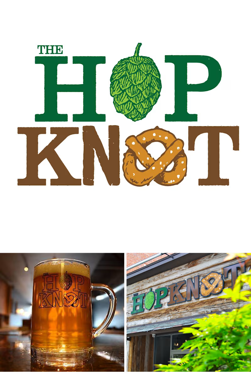
The Hop Knot
The Client 📝
The Hop Knot was Connecticut's first premier craft beer and gourmet pretzel bar. They featured a variety of beers on tap, craft cocktails, board games, and pretzel sandwiches.
Project Overview 🔍
I was approached by Mike Boney (the founder) to help him develop a logo for this new restaurant he was opening and in the process of franchising. He wanted something that "funky" and incorporated a pretzel and beer hop.
Project Goal ✅
Based on Mike's noted I went searching for a "funky" font that I felt fit his vision. I came across this font that varied between serif & sans-serif fonts that also incorporated texture and varied base lines.
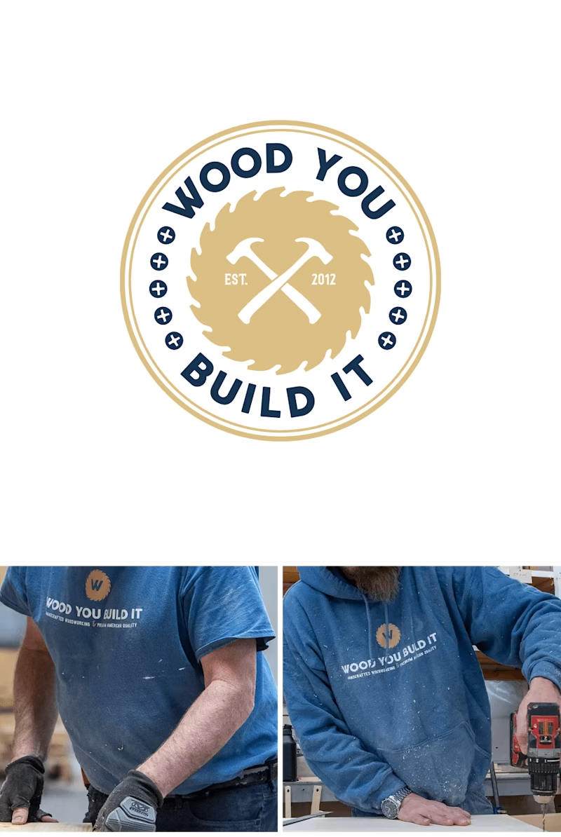
Wood You Build It
Wood You Build It
The Client 📝
Wood You Build It is a local specialty shop that specializes in building custom kitchen islands and handcrafted furniture.
Project Overview 🔍
With a growing business that was no longer based in his basement and as one of Etsy's top rated sellers of handcrafted furniture Justin was in need of a more professional logo and brand identity.
Project Goal ✅
The goal for this was to give him something that could adapt to his different use cases including web, social and print. I wanted a typeface that reflected his woodworking style. I chose this one for the rounded corners that reminded me of the rounded edges on his countertops and the unique "W" reminded me of joints coming together. After numerous color combinations we chose a strong navy blue and gold combination.
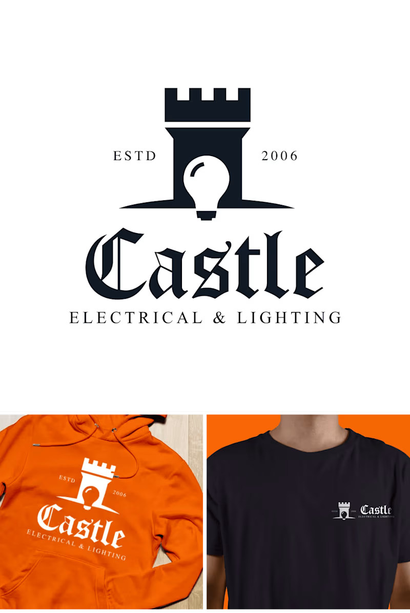
Castle Electrical & Lighting
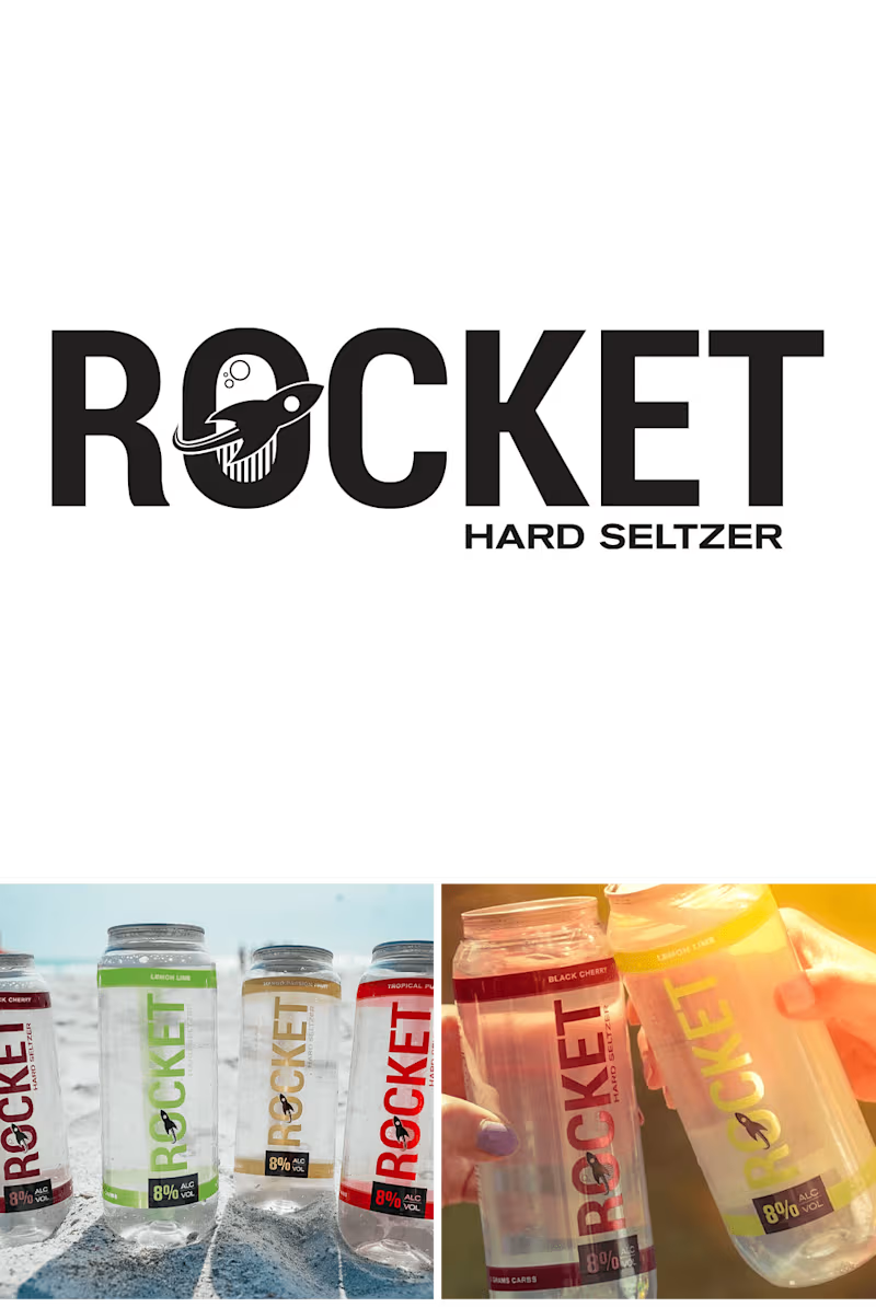
Rocket Hard Seltzer


