Reynir Remodeling: Logo and Business Card Design

This project involved the design of a logo and business cards for Reynir Remodeling, a general contractor and fine home remodeling company. The company's name, 'Reynir,' comes from the Old Norse word for the rowan tree (or mountain ash).
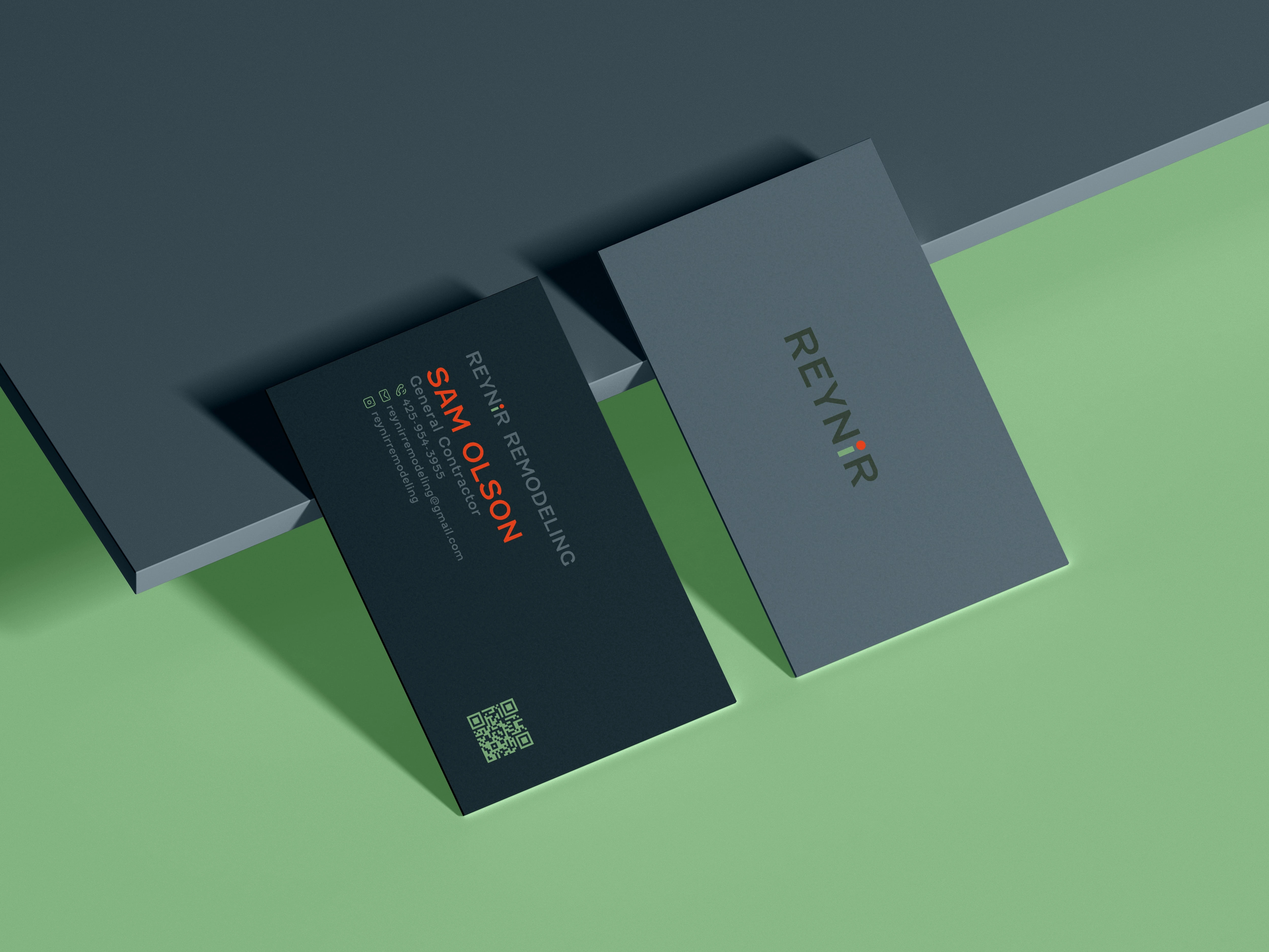
The logo design is centered around this concept, with the logotype incorporating a visual representation of a green sprig of the rowan tree. This is achieved by evoking a green sprig of the rowan tree with its characteristic orange-red berry in the letter "i". This subtle yet meaningful detail connects the brand to its name's origin and conveys a sense of natural growth, strength, and reliability.
The business cards were designed to complement the logo, utilizing a clean and professional layout that reinforces the company's brand identity. The overall design aims to communicate the company's expertise in fine home remodeling while also establishing a memorable and distinctive visual presence.

Like this project
Posted Mar 16, 2025
Reynir Remodeling visual identity. Design incorporates rowan tree imagery, reflecting the company's Old Norse name.


