UI/UX redesign for the Meezan Bank app
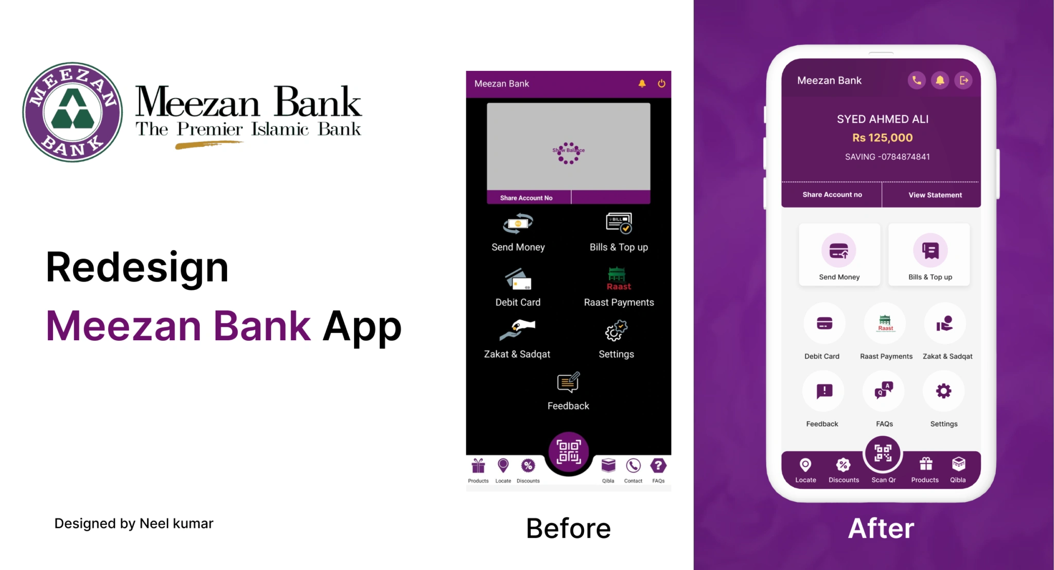
meezan bank app
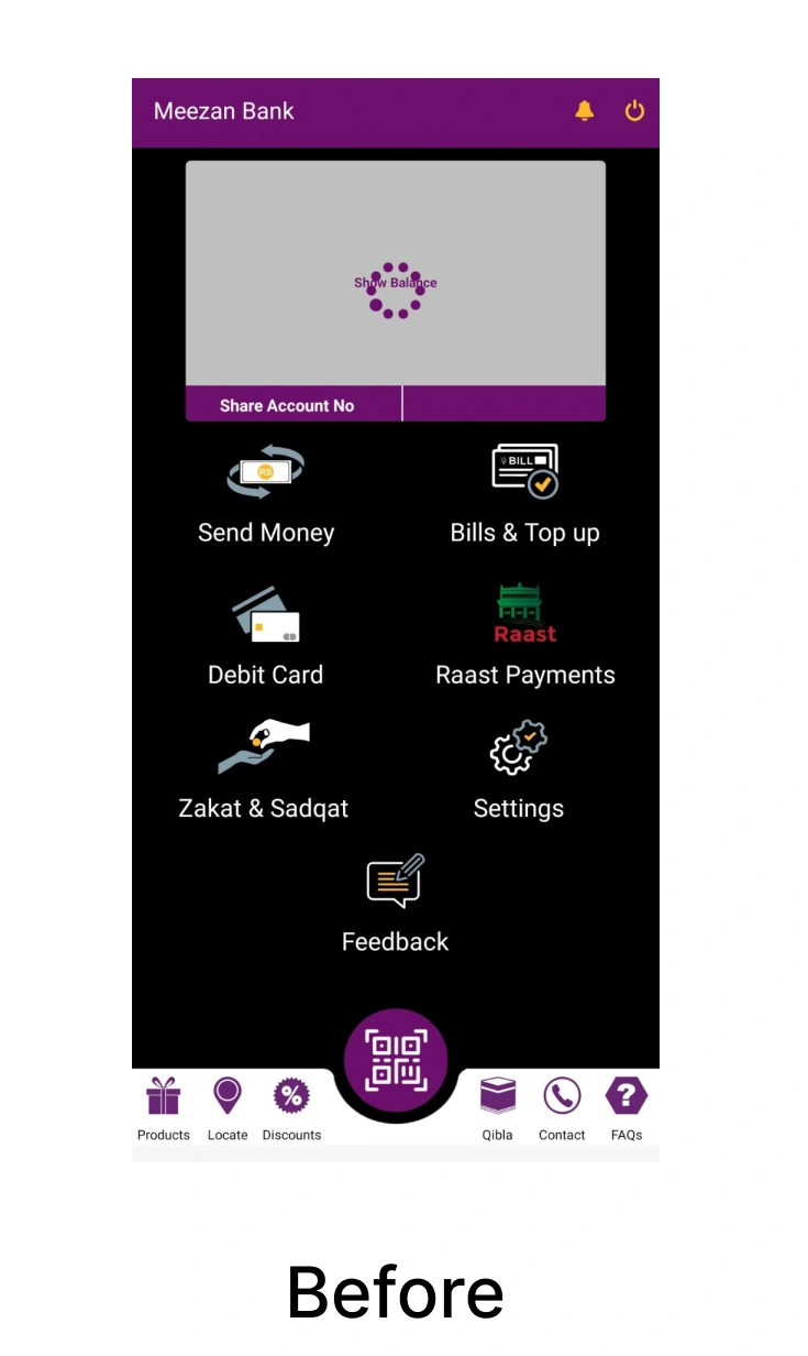
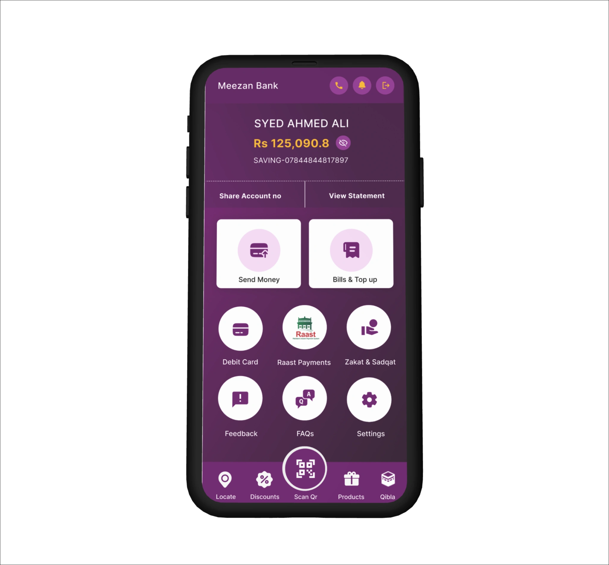
Before:
Overall Design:
Header:
Main Screen:
Bottom Navigation:
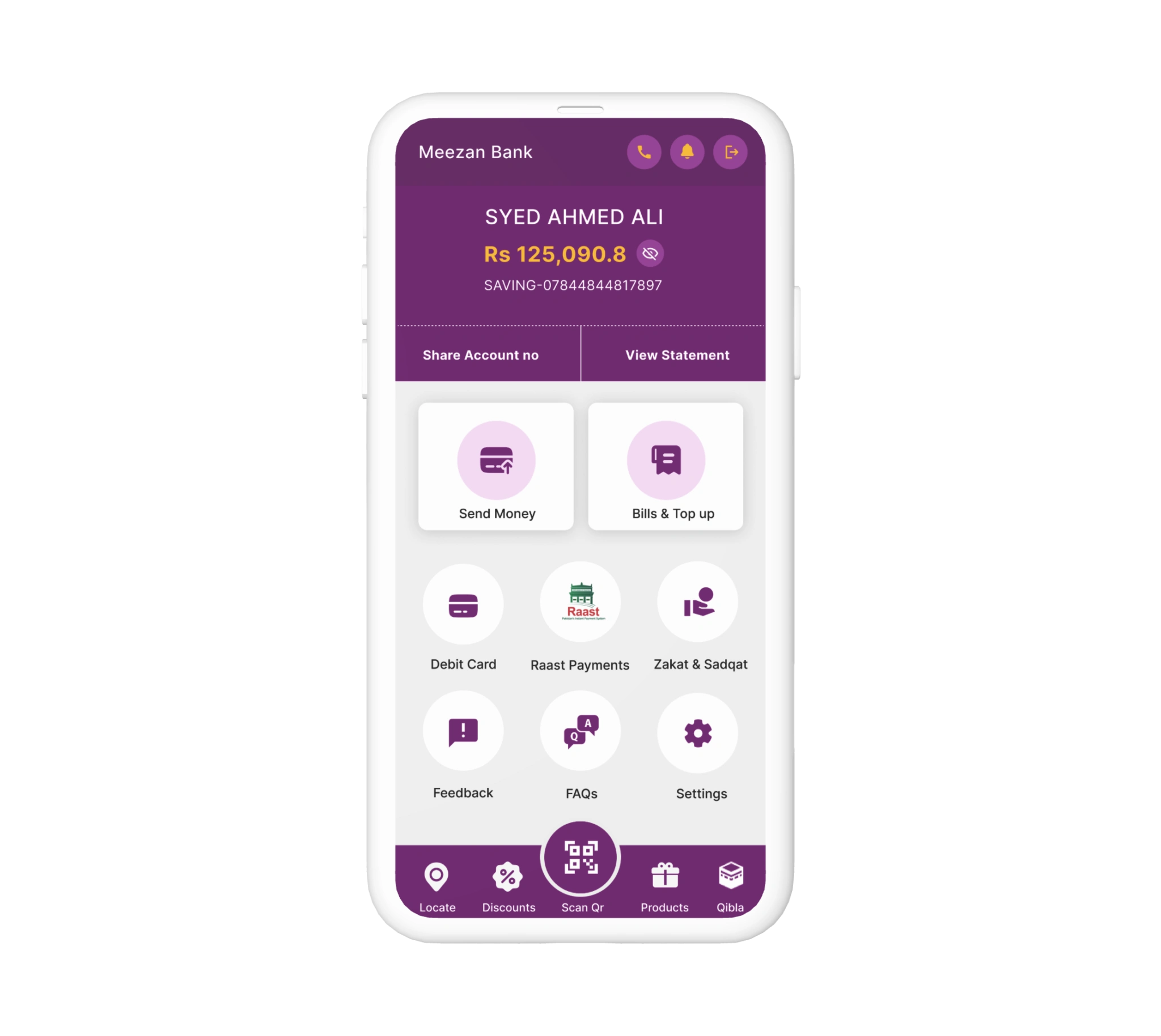
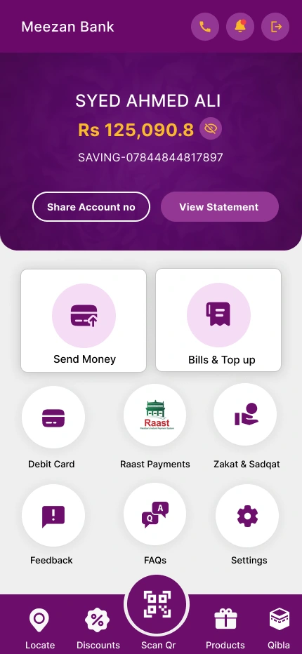
After:
Overall Design:
Header:
Main Screen:
Bottom Navigation:
Concept 2
Summary:
The redesign focuses on improving usability and aesthetics. The new design uses a light theme with consistent color use, larger and more intuitive icons, and better organization of functions. This enhances the overall user experience by making navigation easier and providing a visually pleasing interface. The redesign also highlights important user information at the top and groups similar functions together for better accessibility.
Like this project
Posted Aug 10, 2024
ui ux design for meezan bank app improved design with good user experience by neel kumar
Likes
0
Views
61
Tags


