WeWeb: Build user interfaces on top of databases
0
Product Designer

Figma
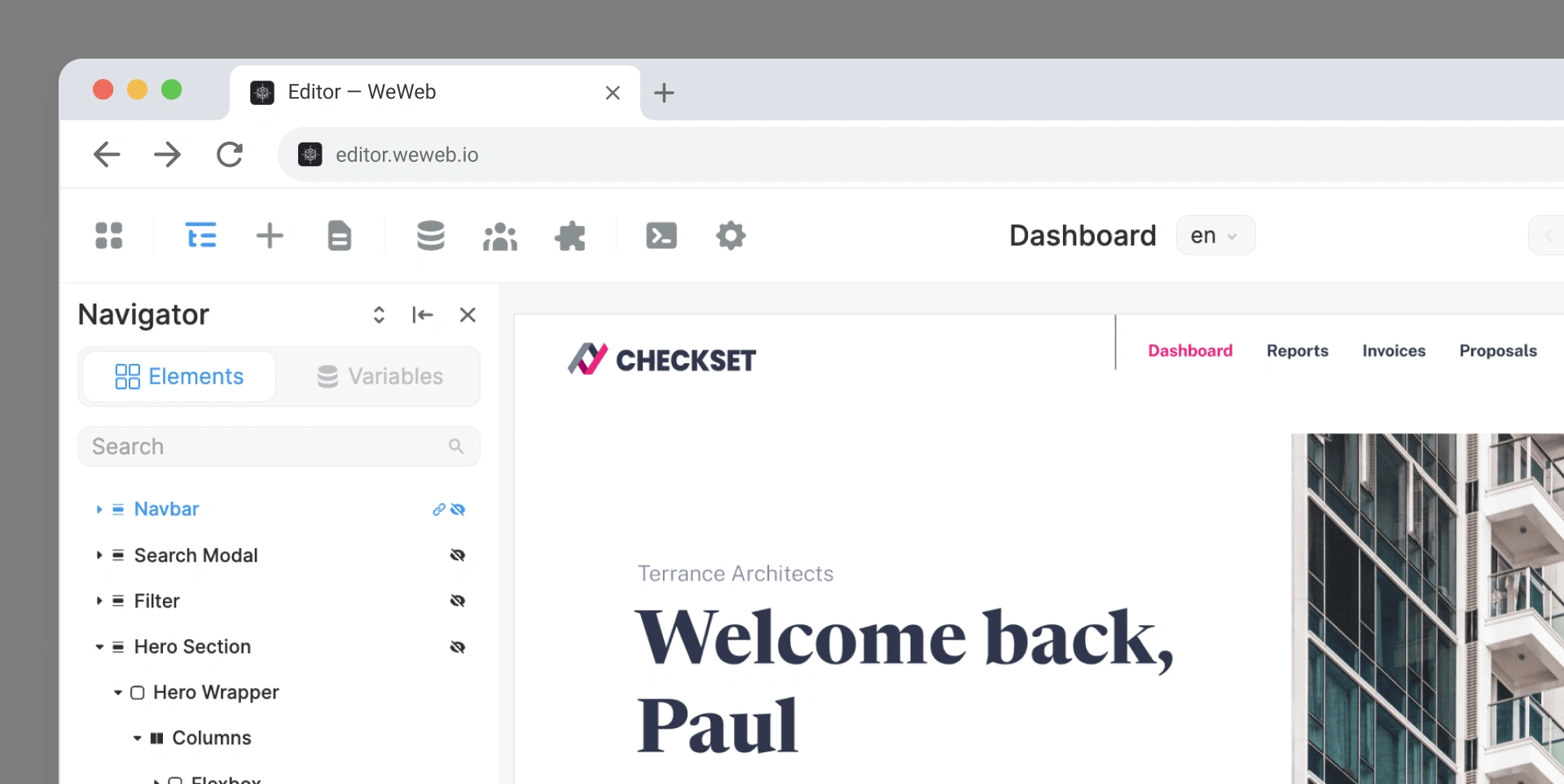
Build user interfaces on top of databases
WeWeb is visual app-development platform where you can build user interfaces on top of your databases. I’ve started working with the WeWeb team in May of 2022 as their first dedicated designer and my job in the editor was to polish design, think and create new features and challenge the core principles of the software.
Outside of the editor we wanted to improve our visibility on social media and achieve growth with the marketing website.
Components
Ever since WeWeb came to existence in current version, the most requested feature was classes. For a long time the only reason for not implementing this was complexity and development time.
Over time, the team has become less convinced that classes would be the best solution. While they may seem like a natural and clean way to handle styles without code, the process of naming classes and planning styles can become tedious.
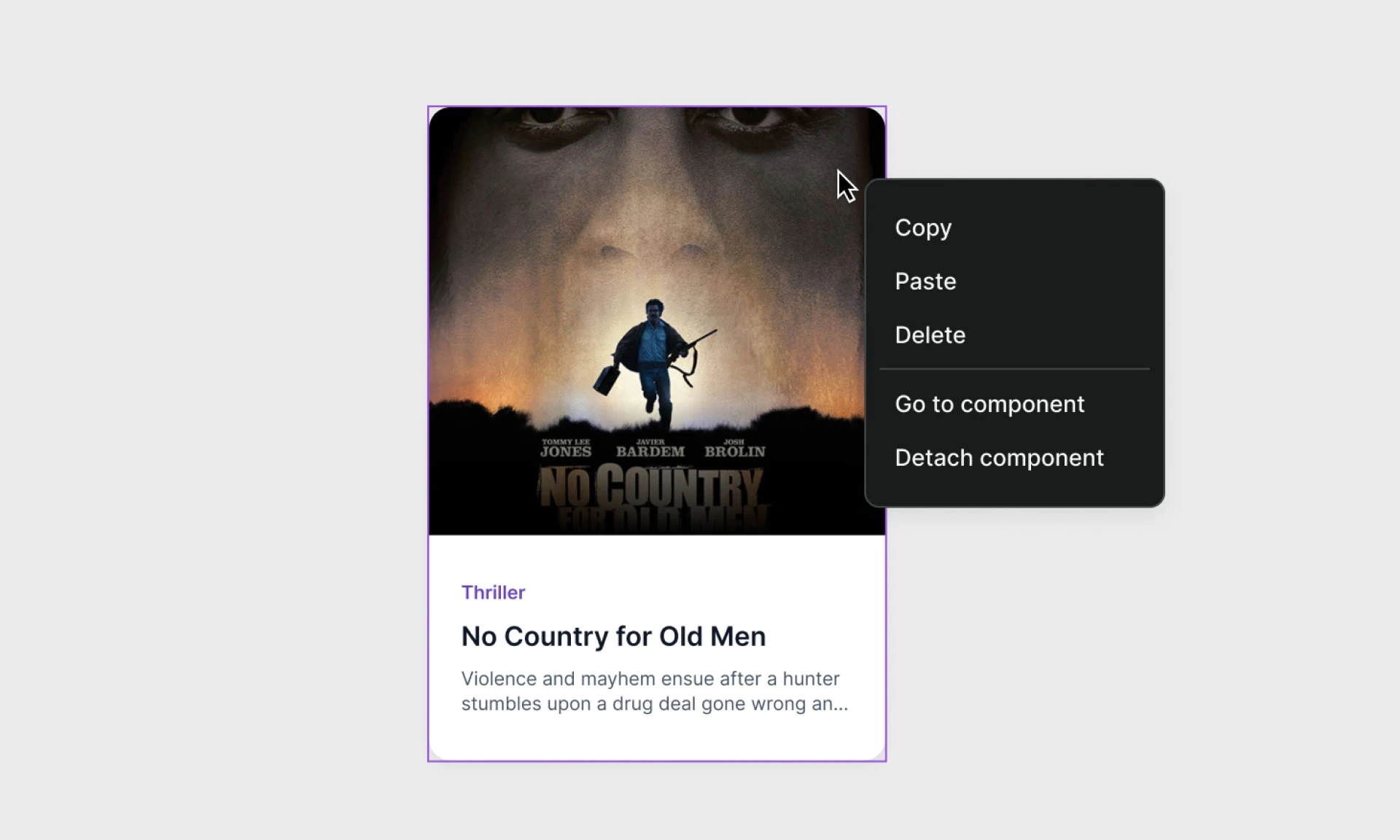
So we thought about something a bit different - implementing components as seen in Figma and Framer.
Components are reusable blocks in their simplest form, but you can go very far with them. WeWeb tries to be as close to the code as possible and this is why our components have properties, internal variables and triggers alike the ones in popular frameworks.
In exploration, we went a step further and played with something called Page components. With Page components you could quickly add alert system to all of your pages or change the top navigation to a side menu.
Workflow editor
Add reactivity and complex logic
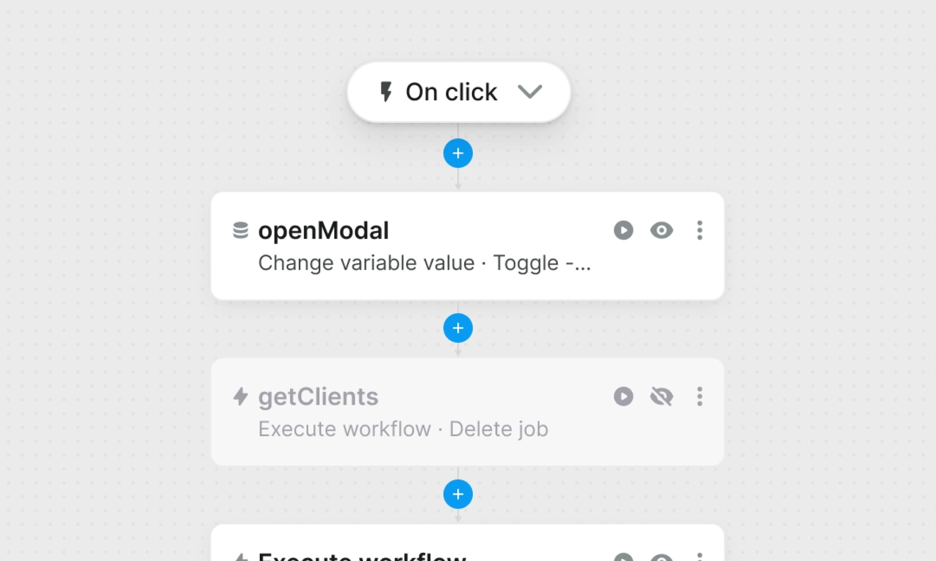
Workflows are action flows that describe reaction to triggers which can be simple clicks on an element in the interface or more complex like page load completion. Once that trigger is activated, the app executes actions that are defined. They are synonymous with functions in code. In code however, you have access to logic statements and loops which was not possible in WeWeb. This was possible in a panel with actions displayed vertically in order of execution. Logic statements have one or multiple actions that are executed depending on any condition and are effectively at the same order of execution.
Knowing this, we’ve moved to a canvas-like editor where you can visually see the logic and the flow of the workflow once it’s started.
When creating your workflow actions, you can choose from a comprehensive list of prebuilt actions like changing variable value, fetching a collection, applying a time delay and more. Included are already mentioned logic statements, but also custom code for advanced users.
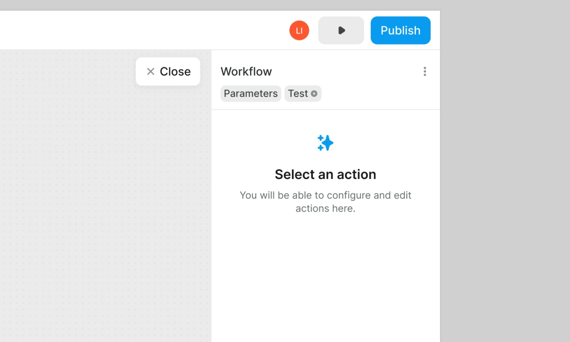
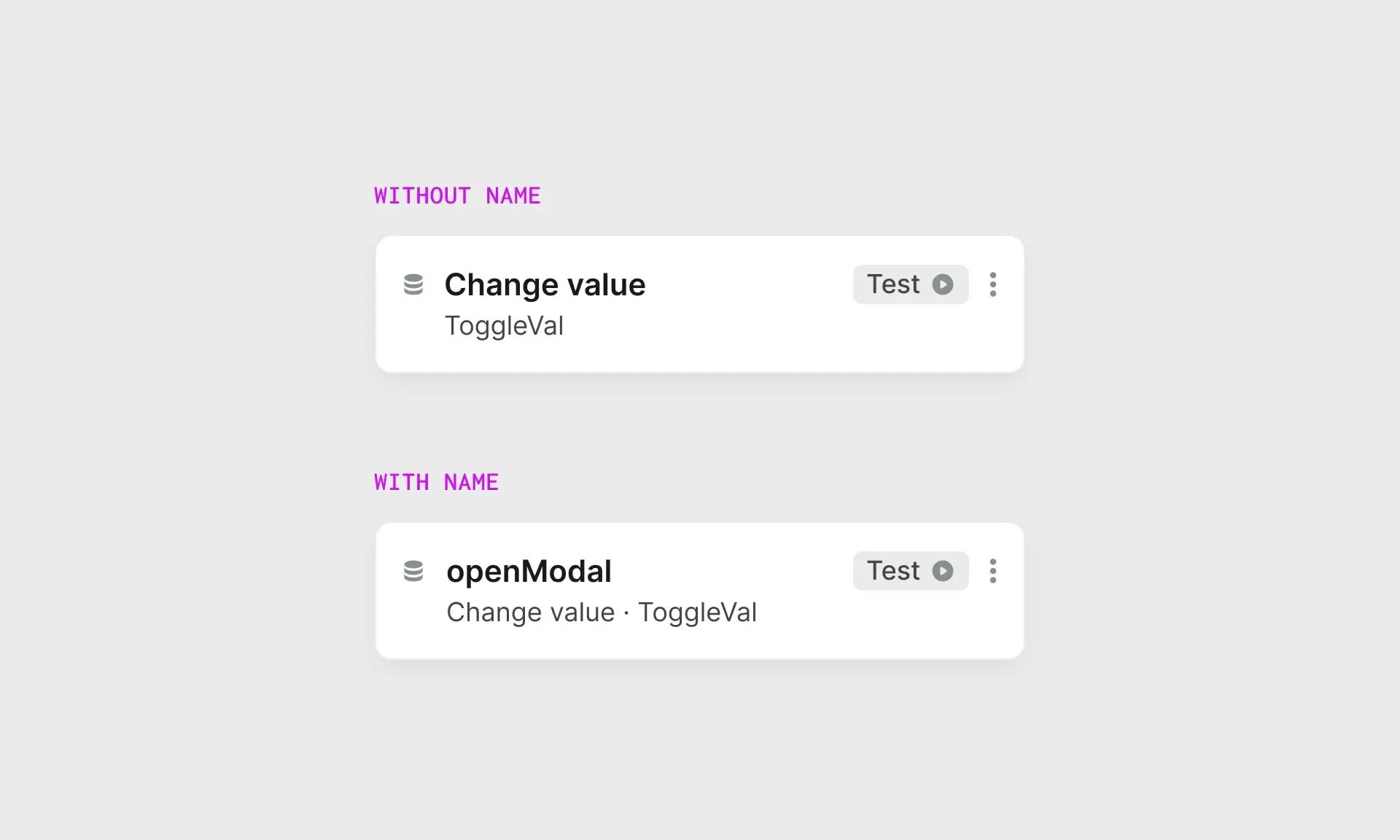
Previously we gave names to every action created: ‘Action 1.1’ for the first one, ‘Action 1.2’ for the next, ‘Action 1.3’ the one after and so on. With the new editor an action no longer requires a name. In that case, we display the action type. If it does, we display the action type along the contextual information in the second line.
Website
In August of 2022, we began the process of redesigning and rebuilding our website. We released a first version of the site the same month, but it had not turned out to our expectations. In retrospect, the biggest mistake we made was to not take a direction with the identity. The result was that the website felt generic.
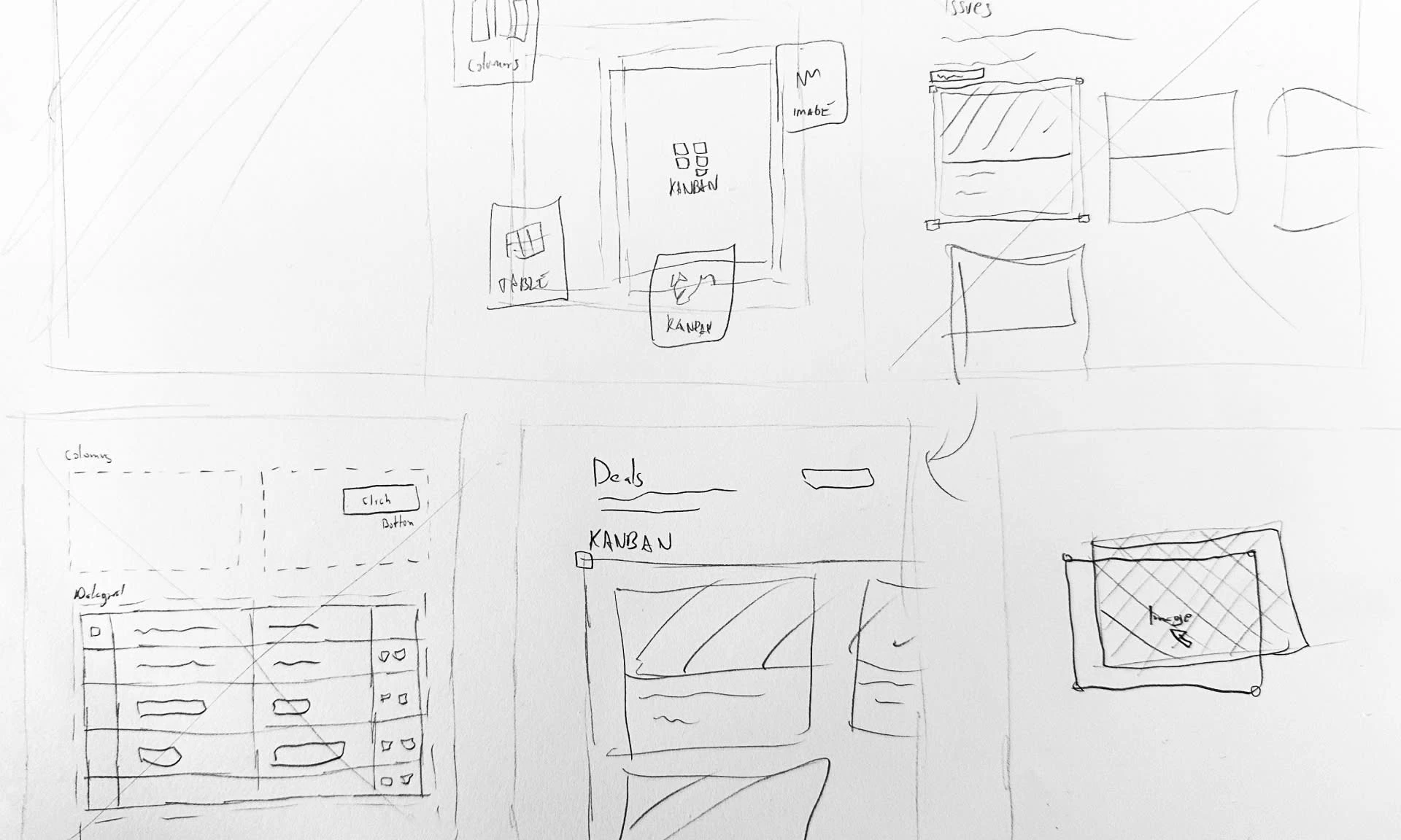
A month later, we made significant improvements by cutting pages that did not meet our quality standards and redesigning the home page. Tracking conversions closely, we made additional changes to the design and content of the site, leading to an increase in conversions.
However, we continued to strive for improvement and conducted another redesign of the home page. The new version of the website was finally released in January 2023 and we believe it now meets the standards of a good marketing website.
Typography
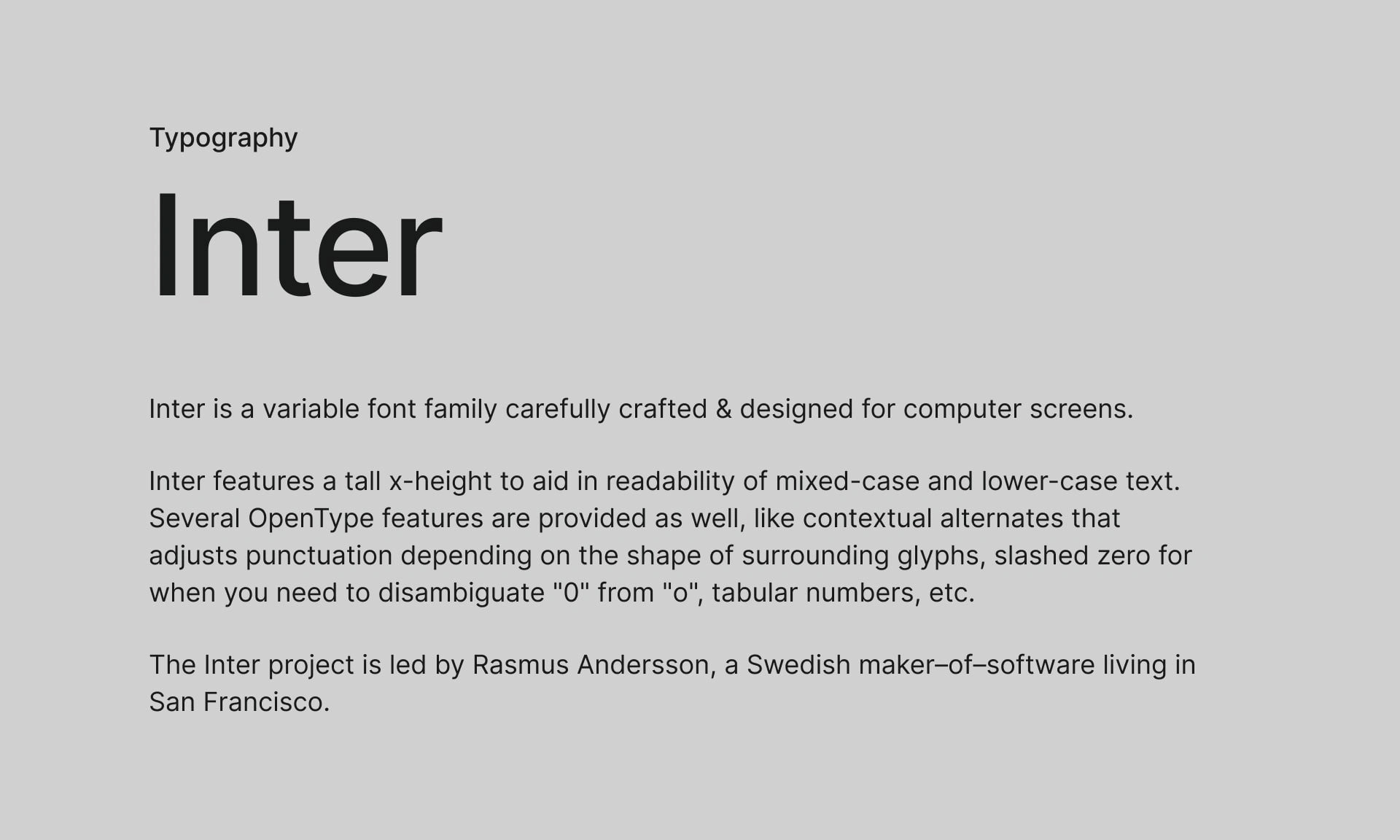
One of the main trends that we observed at WeWeb is that our identity appeared fun and playful. However, as the company's focus shifted towards developing web applications and attracting a wider range of clients, including enterprises, we wanted to update our image to be more modern and functional. As a result, we decided to use Inter as our typography, which is a popular choice for the web today.
In the future, our goal is to incorporate elements of our original identity through the use of typography, while still maintaining a professional image.
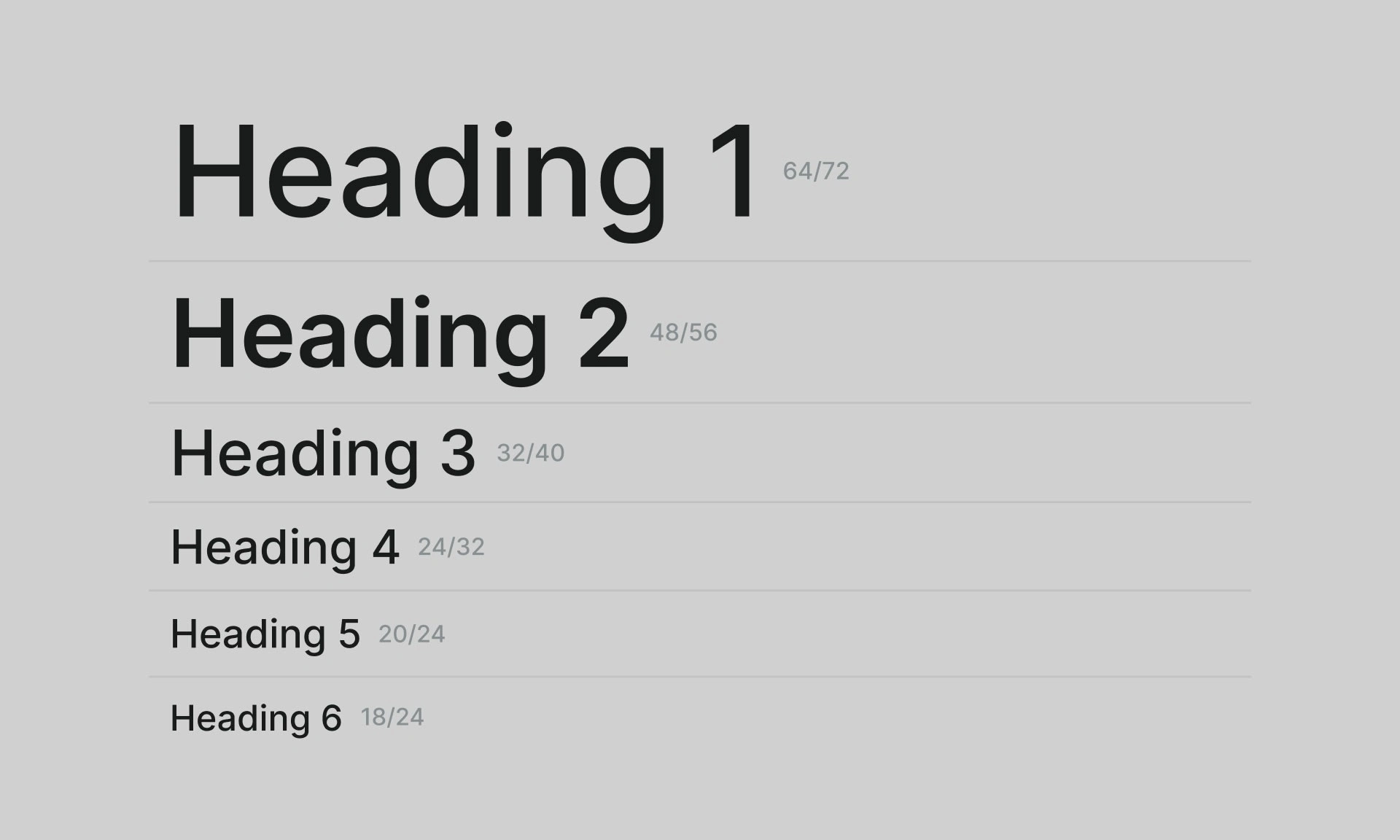
The styles in our design follow a simple scale, with headings ranging from one to six on an almost linear scale.
For most of the user interface, we use four sizes (10, 12, 14, and 16 pixels) in regular and medium weight.
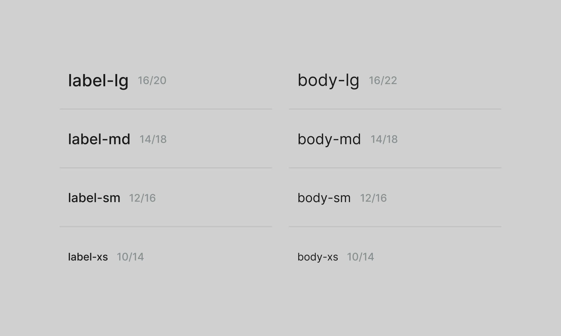
One factor to consider when comparing Figma and the final product is that Figma uses a custom rendering engine that includes font smoothing, which is similar to anti-aliasing on the web. In our current implementation, we do not use this smoothing, which can result in a slight difference in appearance compared to the designs. However, anti-aliased fonts tend to appear slimmer, so it is necessary to adjust and use the different weights accordingly.
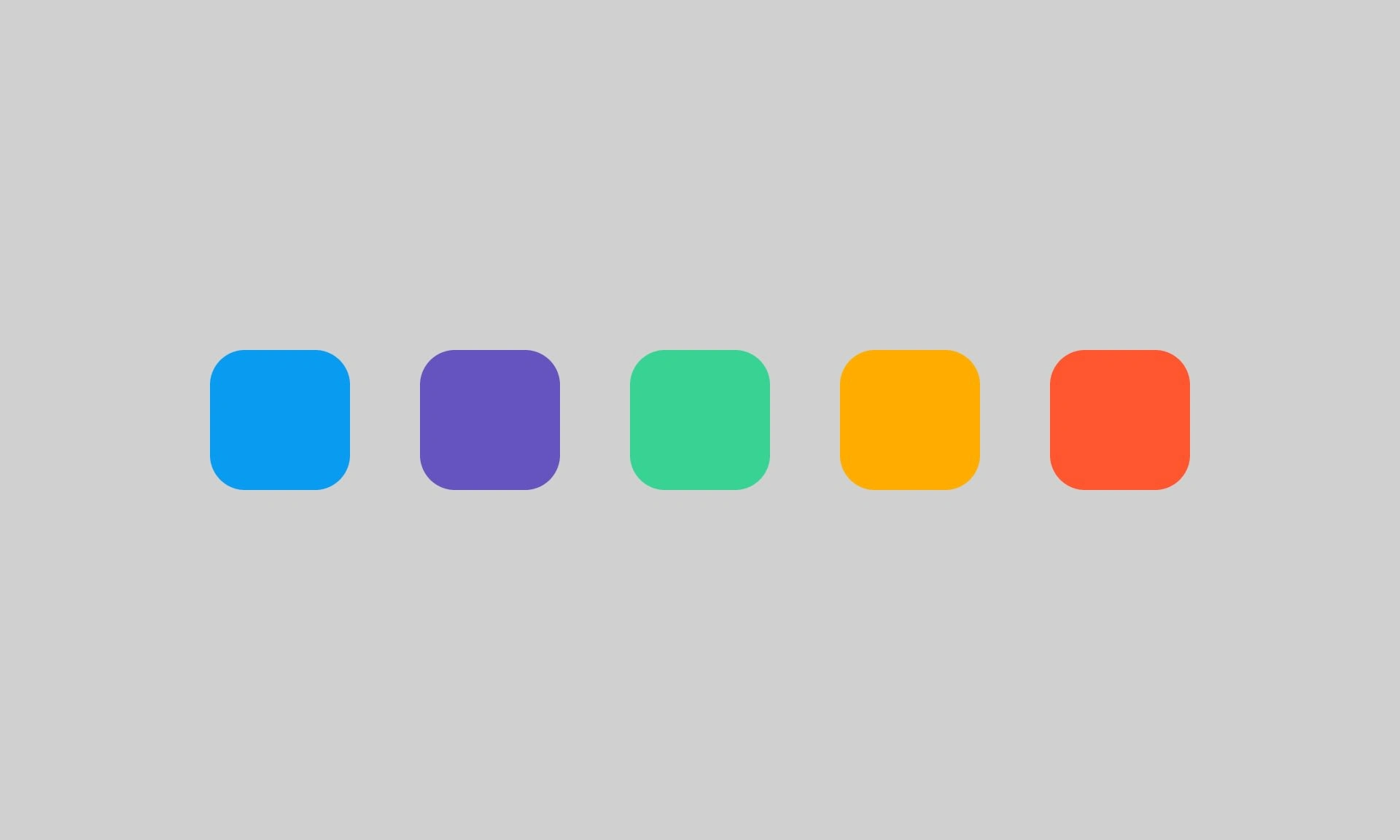
Refreshing the colors
With a color refresh due, we’ve decided to make some quick improvements until we have the time to this properly. The result is improved contrast and a darker and cleaner dark mode.
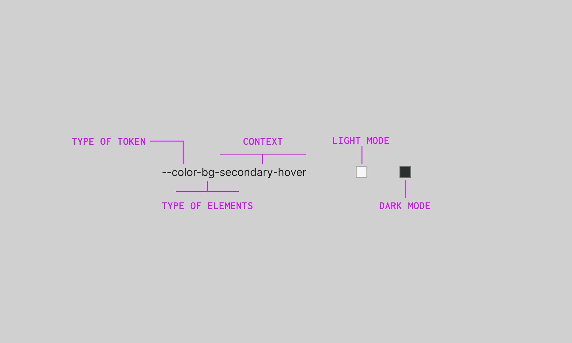
WeWeb has a built-in dark mode feature that inverts the color ramps. While this is an easy solution, it can sometimes result in low contrast issues with certain elements. Additionally, using color ramps can lead to design debt, as the colors do not have semantic value.
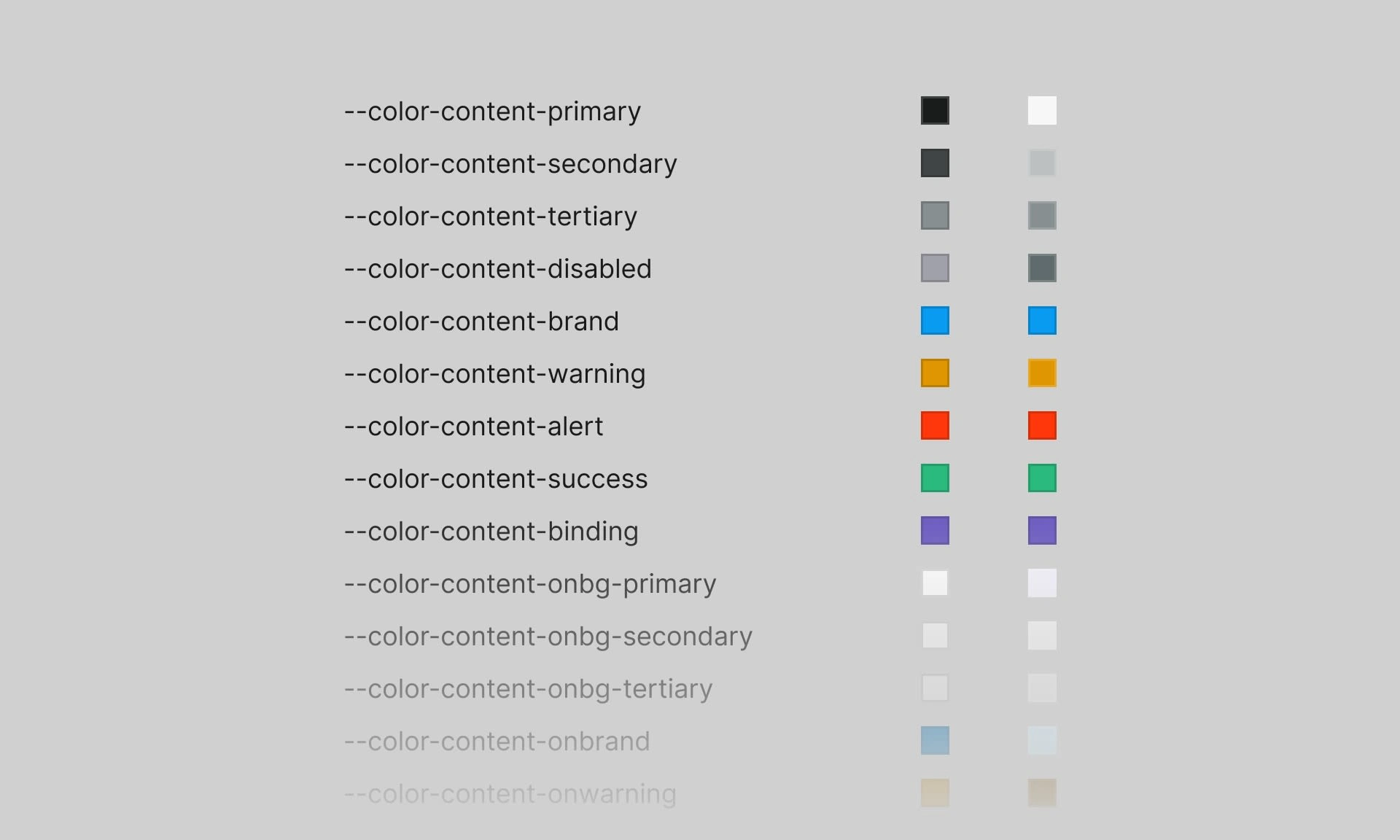
To address these issues, we are implementing color tokens. Derived from the ramps, these tokens are named based on their function, allowing for more customization and control. For example, you can customize text, background, or other colors in any color mode without affecting other tokens with the same value.
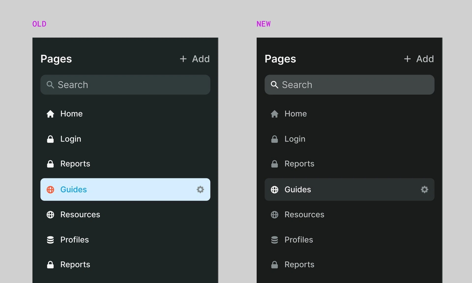
This approach is inspired by the way Figma handles their colors, as described in this talk.
Icons
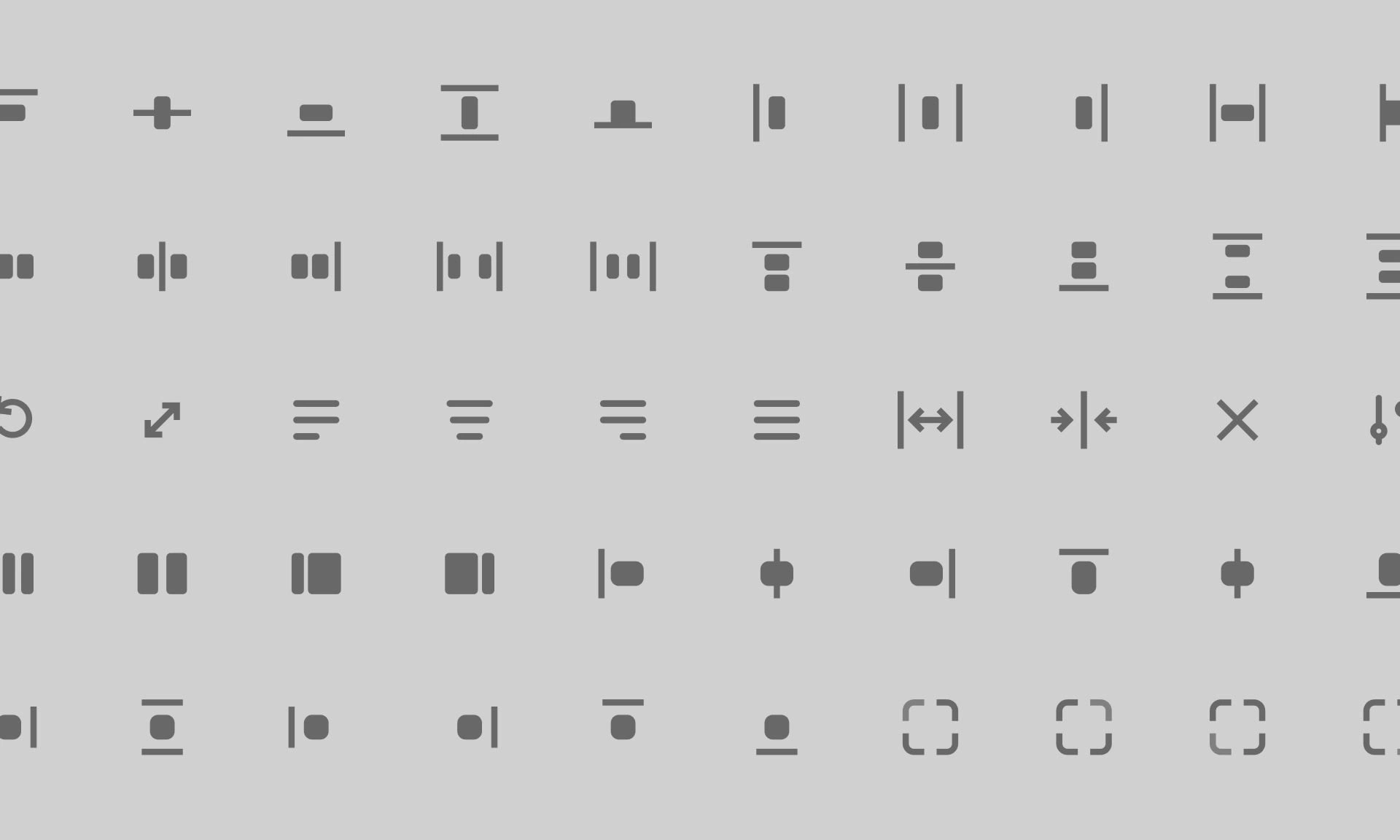
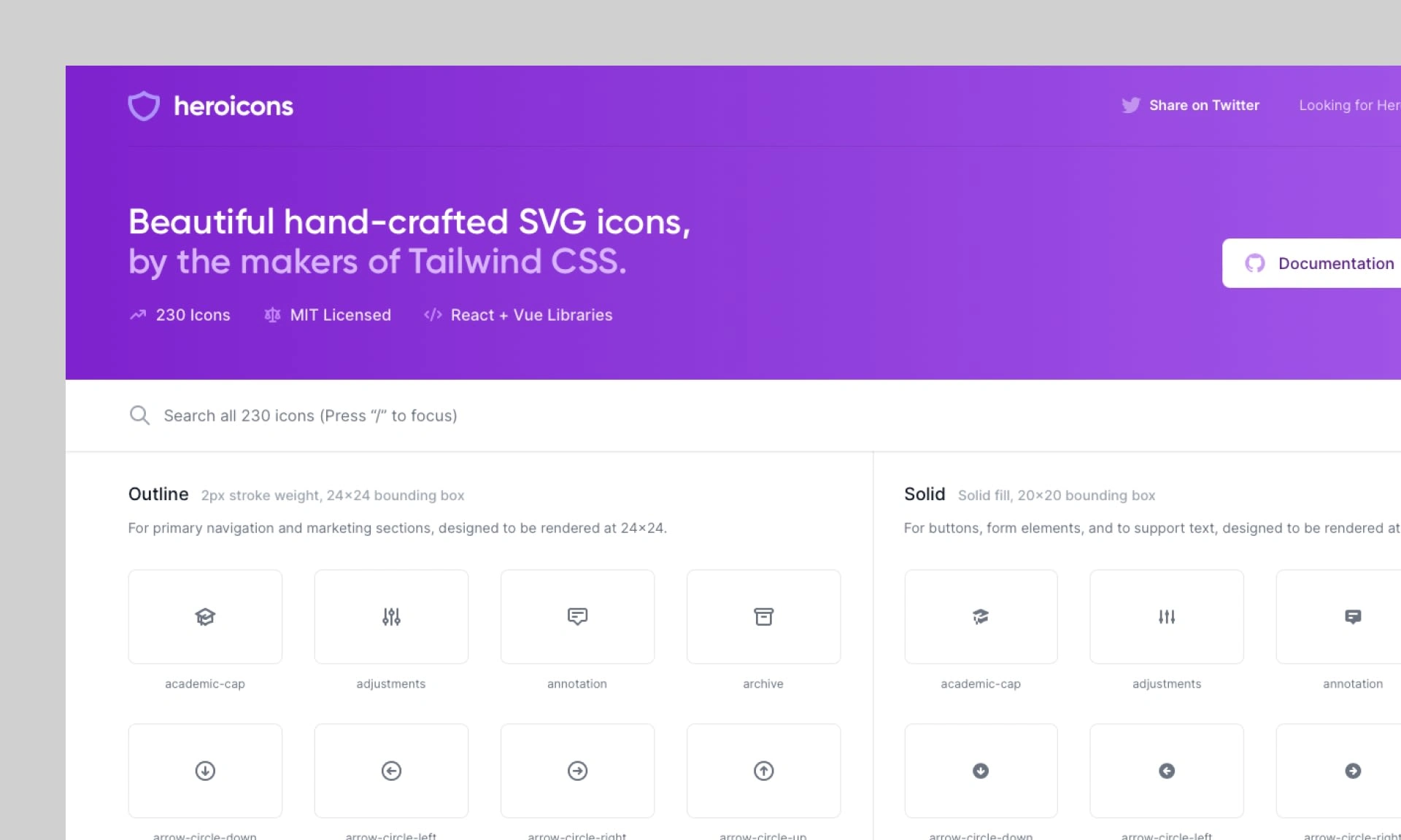
With previously using FA icons, we were looking for something more modern and polished. After a lot of time looking at different sets, we've landed on heroicons.
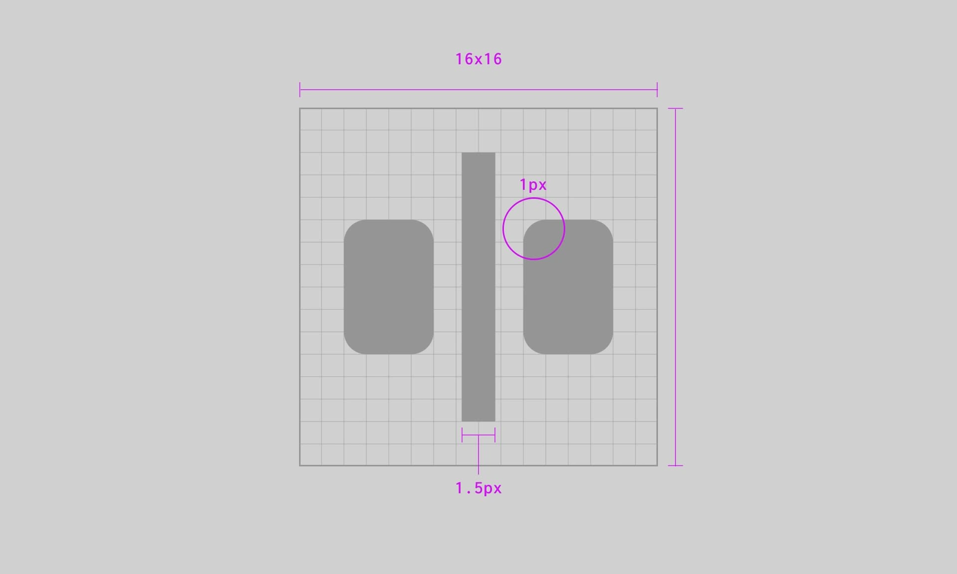
However, we wanted more control over icons on the core parts of the interface like the styling sidebar which is why I spent a lot of time creating custom icons for these sections. Using 1.5px stroke on 20px size achieves perfect balance of visibility and elegance.
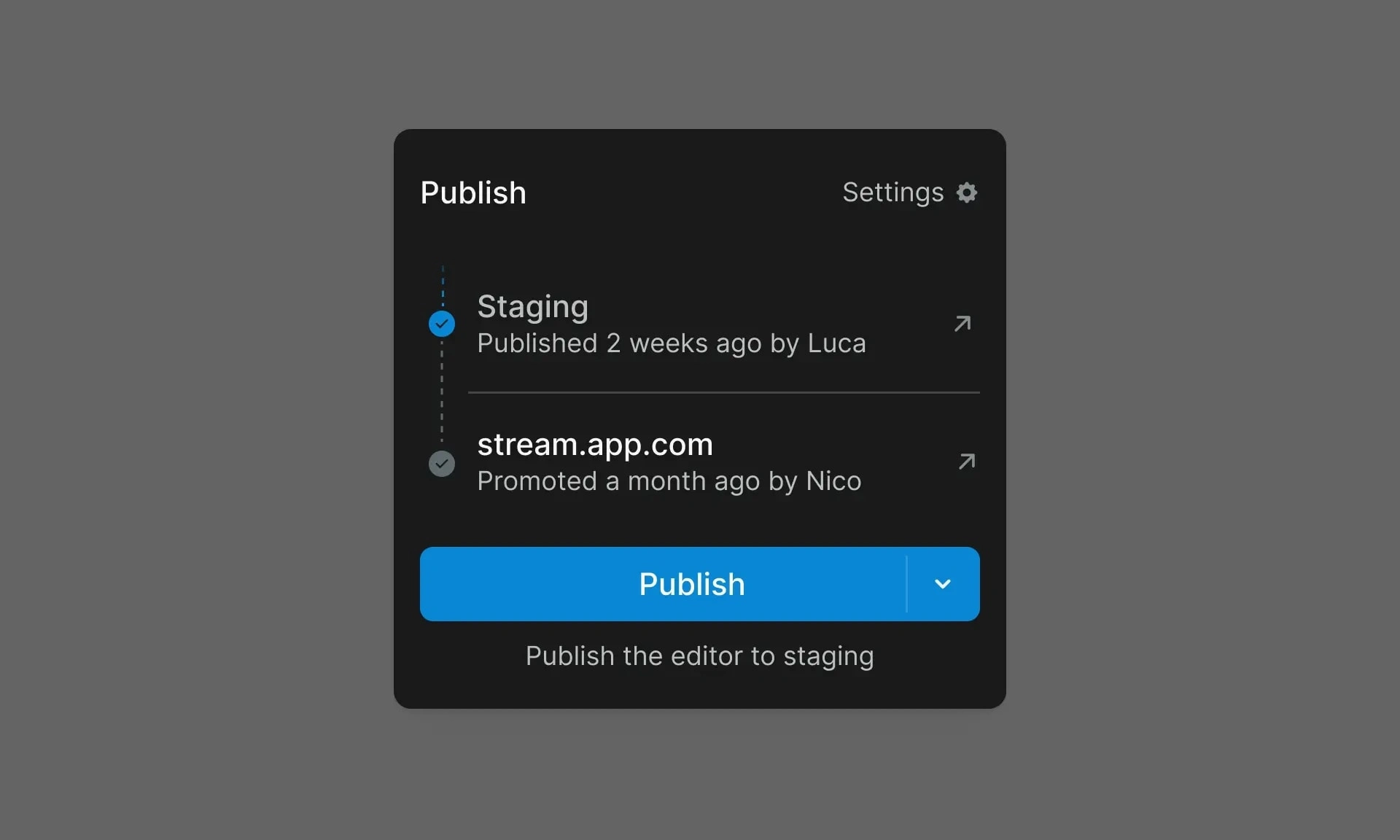
Staging environment
Like this project
0
Posted Jan 31, 2023
Enjoy the simplicity of visual programming without compromising on the design, security, or scalability of your web apps.
Likes
0
Views
19
Tags
Product Designer

Figma


