Building Investor Trust for a Stem Cell Therapy Pioneer

Ina Dimitrova


Brief
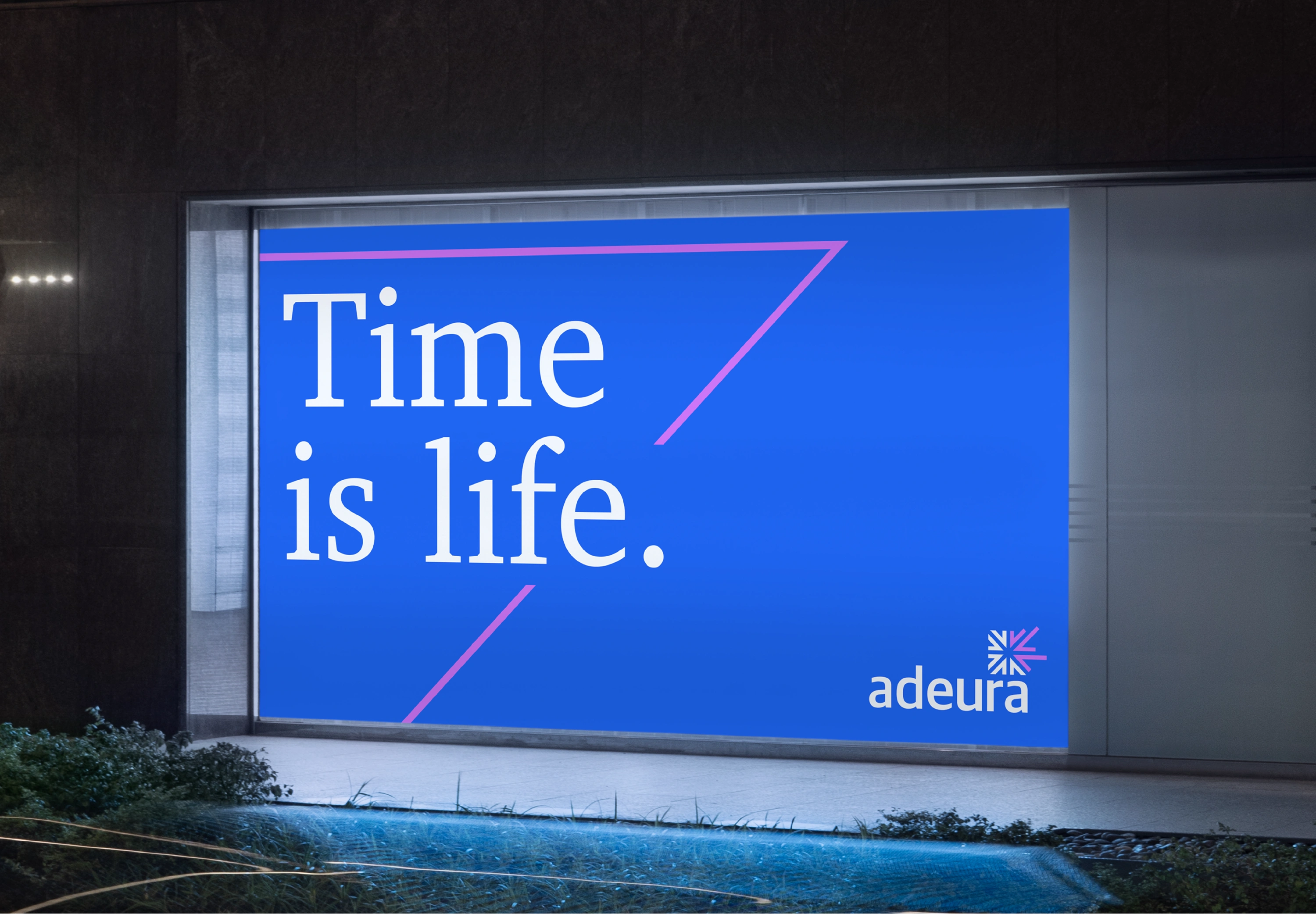
A stem cell therapy company was raising an investor round and needed a rebrand to strengthen its position. I was asked to build a brand identity that could carry more weight in the room.
The problem
The company had strong science, but strong science doesn't fund itself. Investors needed to know this team would still be standing when the trial ended. That's a harder, higher-stakes ask than a standard identity refresh: get it wrong, and the round won't close.
The insight
A rebrand doesn’t fix a fundraising problem. It fixes a belief problem.
Investors weren’t evaluating the science alone. They were deciding whether to trust the company behind it. That reframed the brief from “look more credible” to “feel inevitable.”
The strategic move
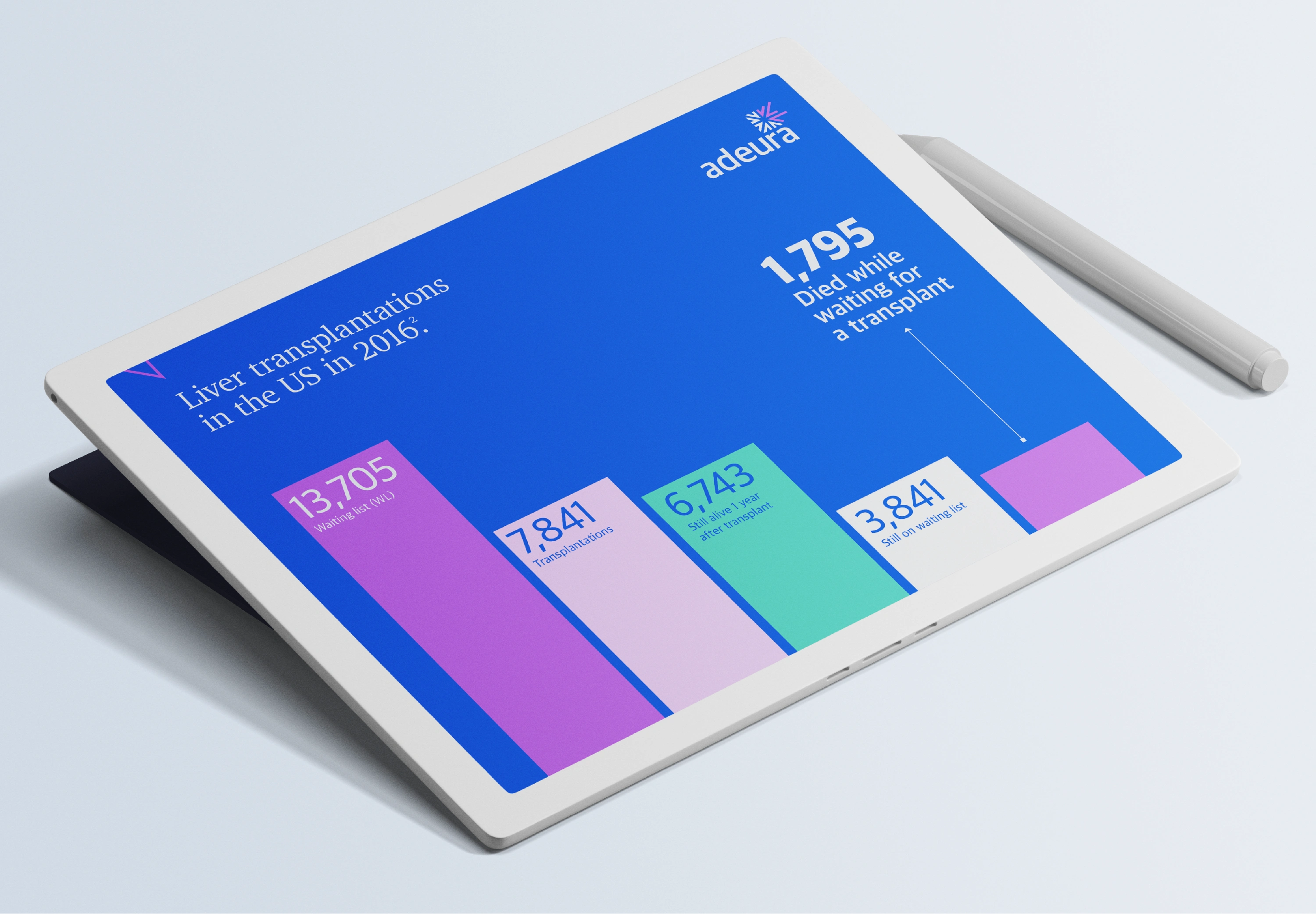
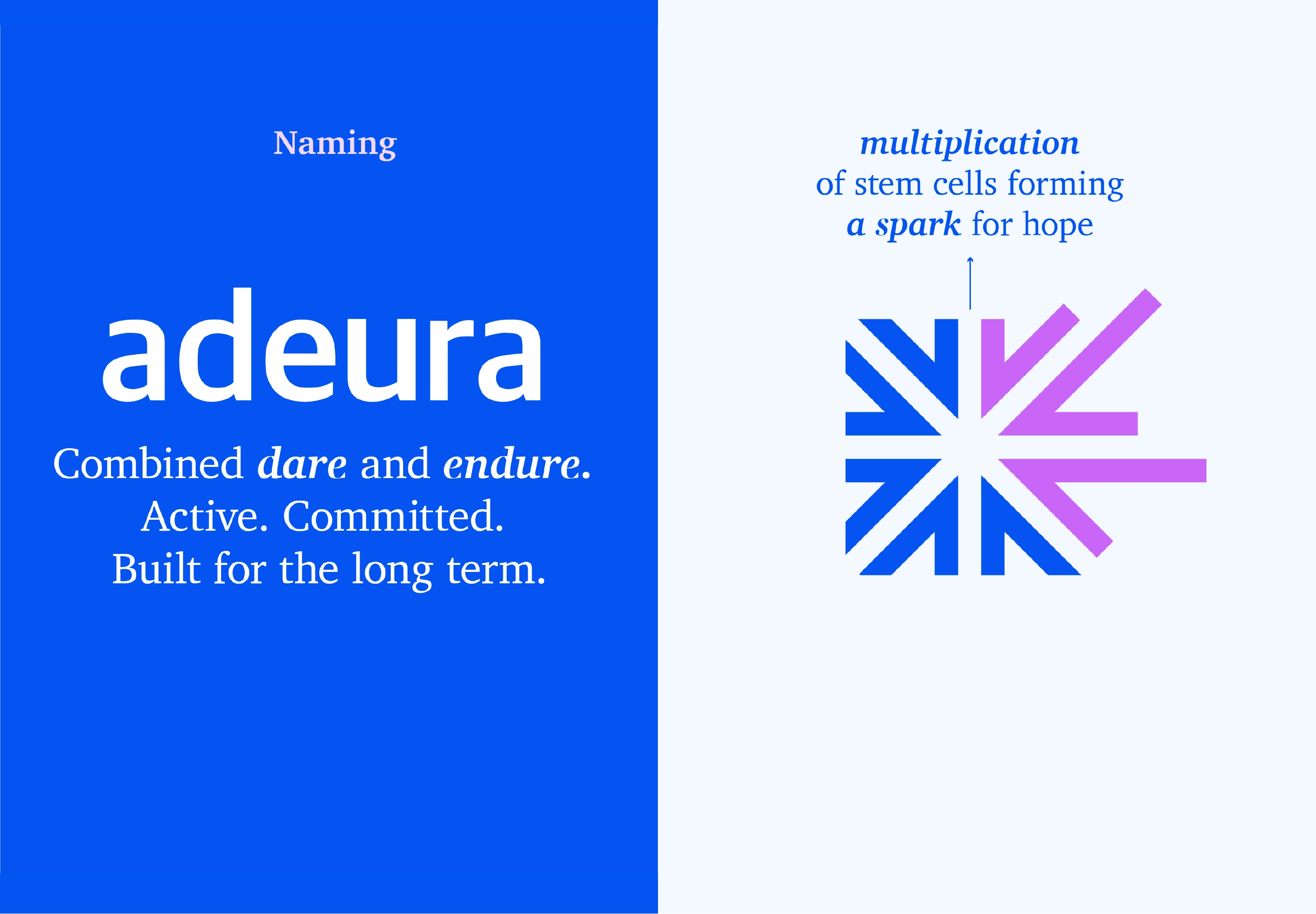
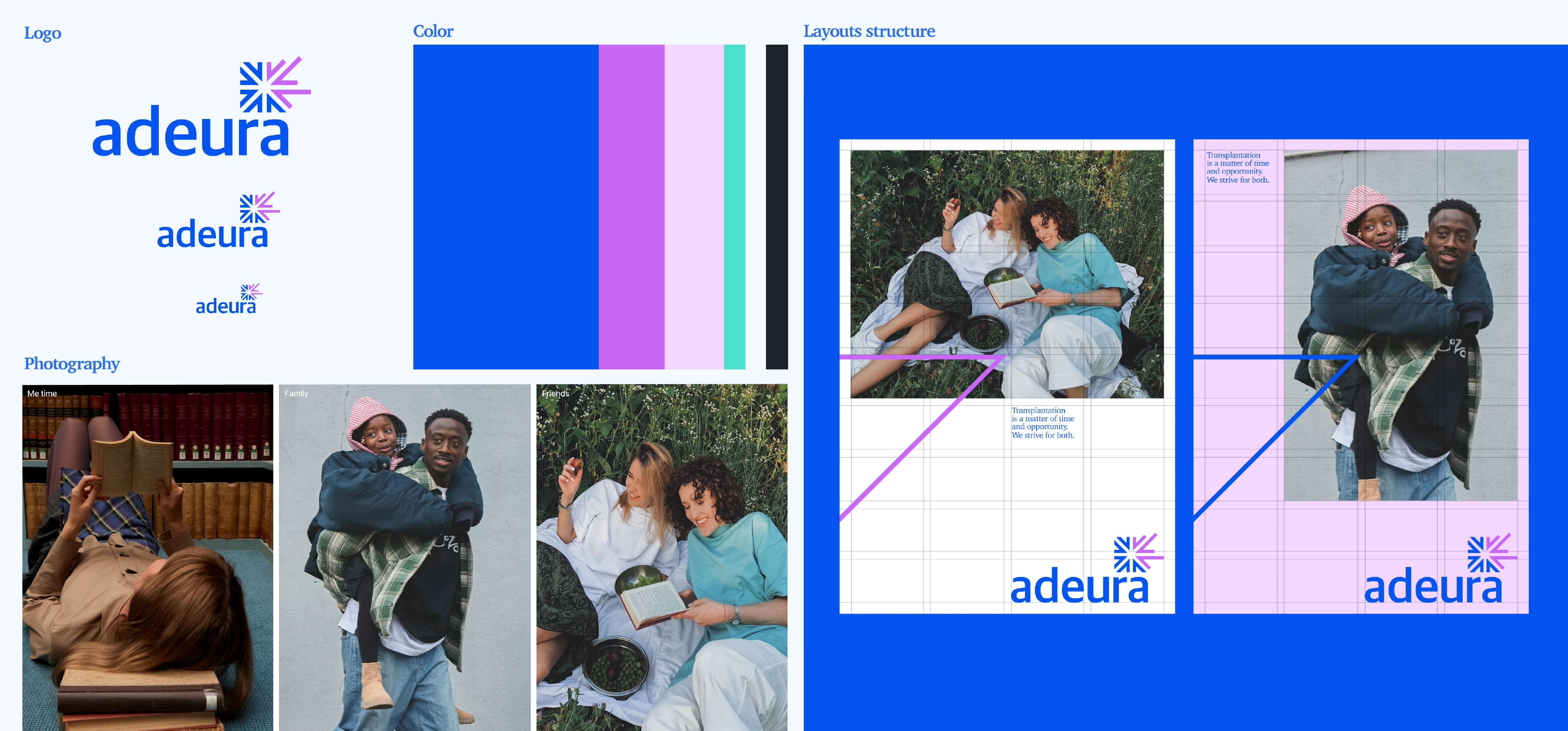
I moved the identity away from clinical, sterile healthcare cues and toward certainty and warmth: a blue that conveys stability, real photography in place of staged lab imagery, and a new name that tells a story of differentiation.
The creative work
I created the positioning, naming, visual identity system, and guidelines.

My contribution
I led brand strategy end-to-end: rallied the cross-functional team, shaped the naming and positioning, and crafted the pitch that won the client’s confidence.
Outcome
The pitch won the client’s excitement. The work led to further branding engagements through that relationship.
Client: Woven Health Collective
Year: 2022
Role: Brand Strategist & Creative Lead
Team: Internal creative team, with Marketing Directors, Account Managers, and New Business Growth Managers.
Tools: Adobe Suite, Figma, PPT, Word, Mural
Like this project
Posted Aug 19, 2026
Built the positioning, identity, investor pitch, and guidelines for a stem cell therapy company raising its next round.
Likes
0
Views
0