Achievement Unlocked
Callum Hepburn
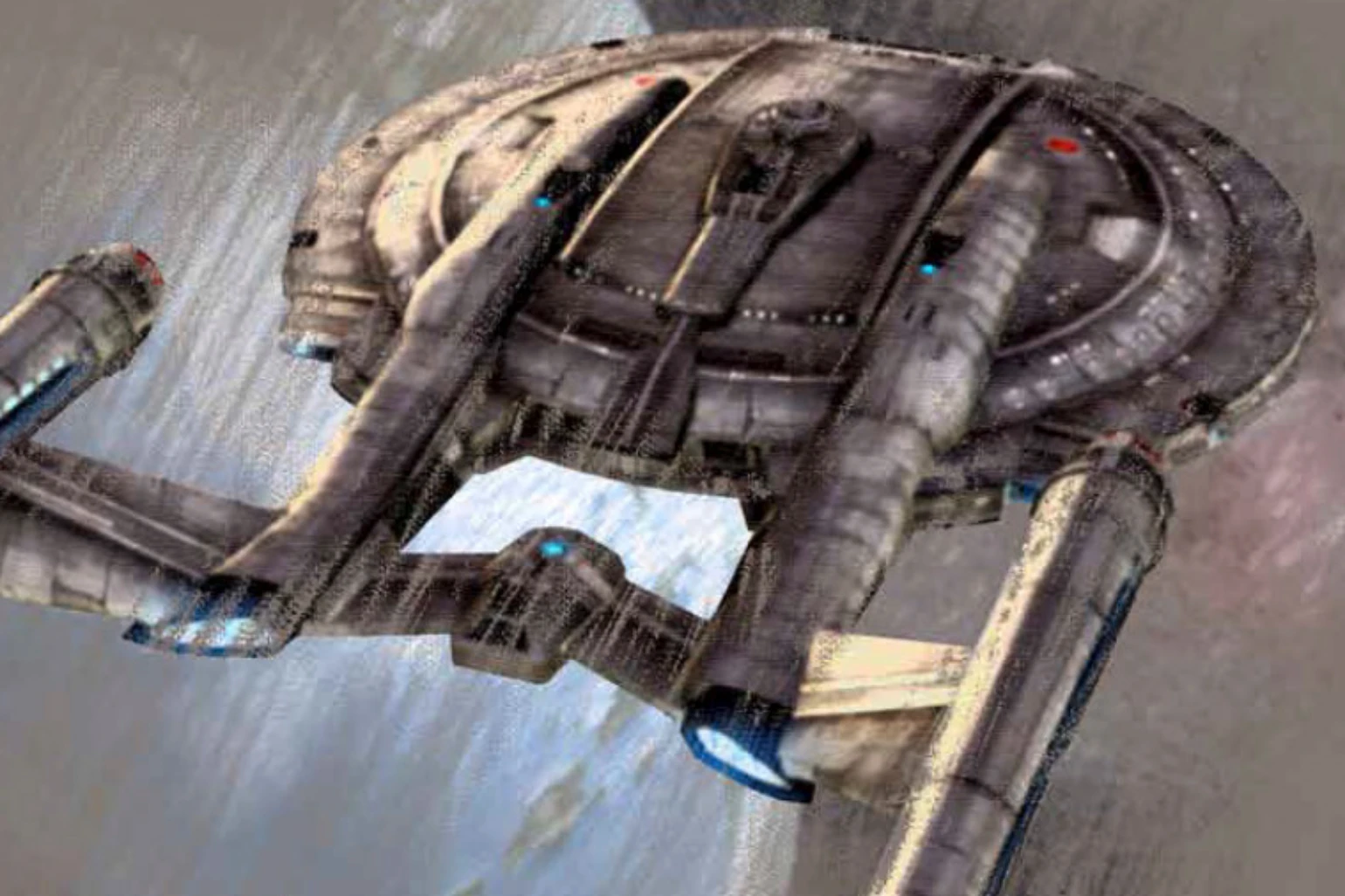
After completing my commission for the Federation Herald earlier in the year, I was approached by a client to provide the same editorial design service for himself and his gaming community magazine.
It was my biggest job yet with the page count and scope of the project much larger than anything previously – this included a branding redesign of the magazine as well as desktop publishing and layout due to a Cease & Desist letter of the previous brand.
As such it was conceived and built from the ground up as a re-launch of the magazine into a new re-incarnation. The branding symbolised it’s Star Trek origins in typography and the shape of the letters AU – almost like a combadge.
Like this project
Posted Jan 27, 2021
Likes
0
Views
12
Tags