Zechub Dashboard Redesign
Pelumi Adebayo
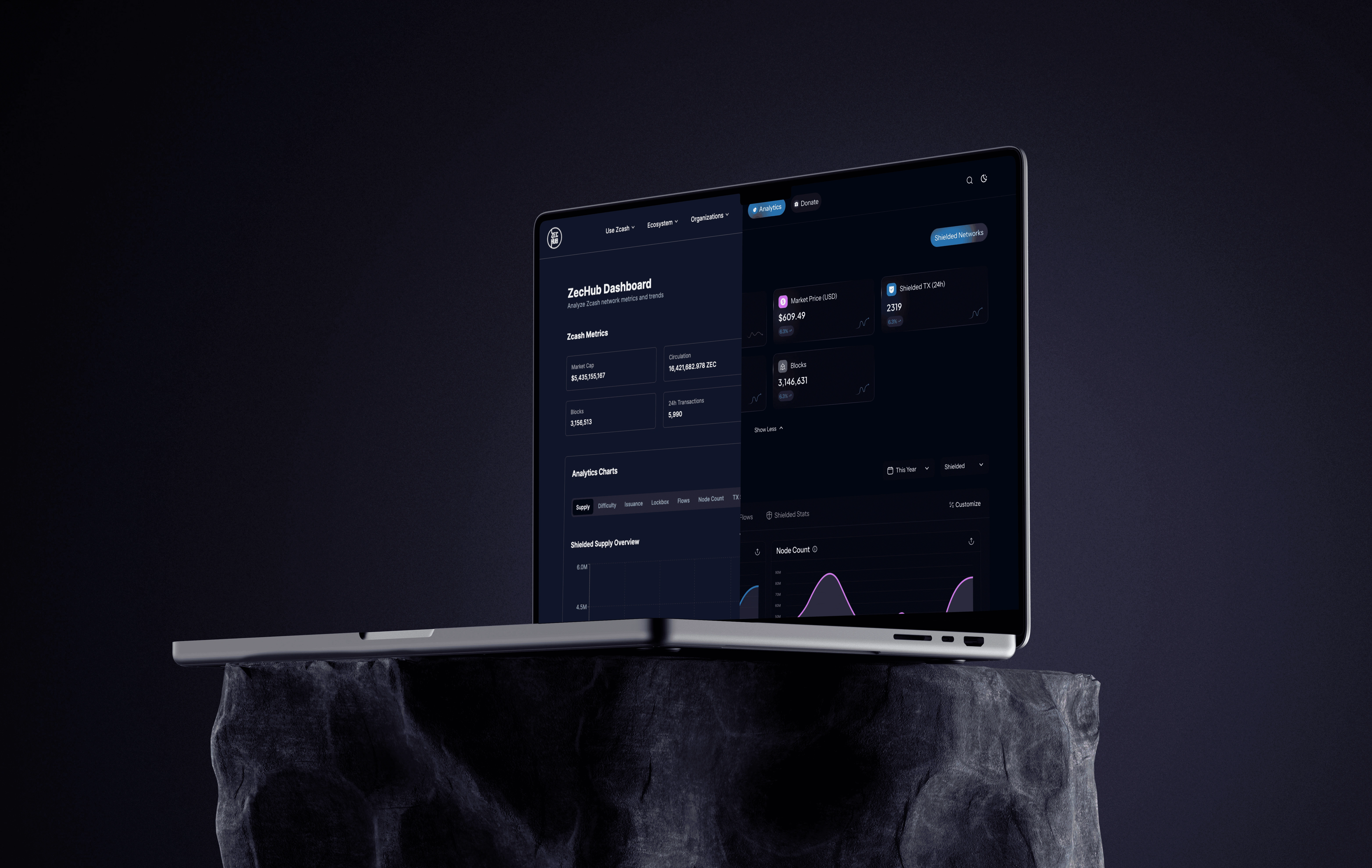
ZECHUB
Redesigning Zechub's Web3 Dashboard
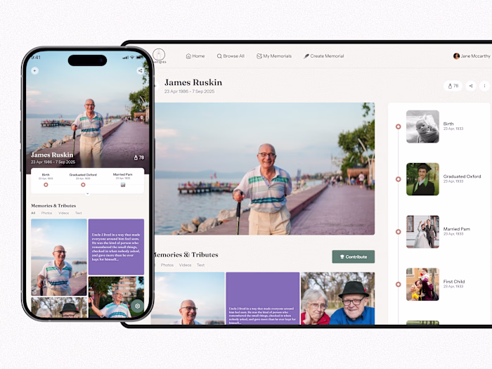
The Past Lives project was about building a sanctuary, a digital archive of someone’s entire existence, created by people who are grieving, remembering, healing, or celebrating a life well lived.
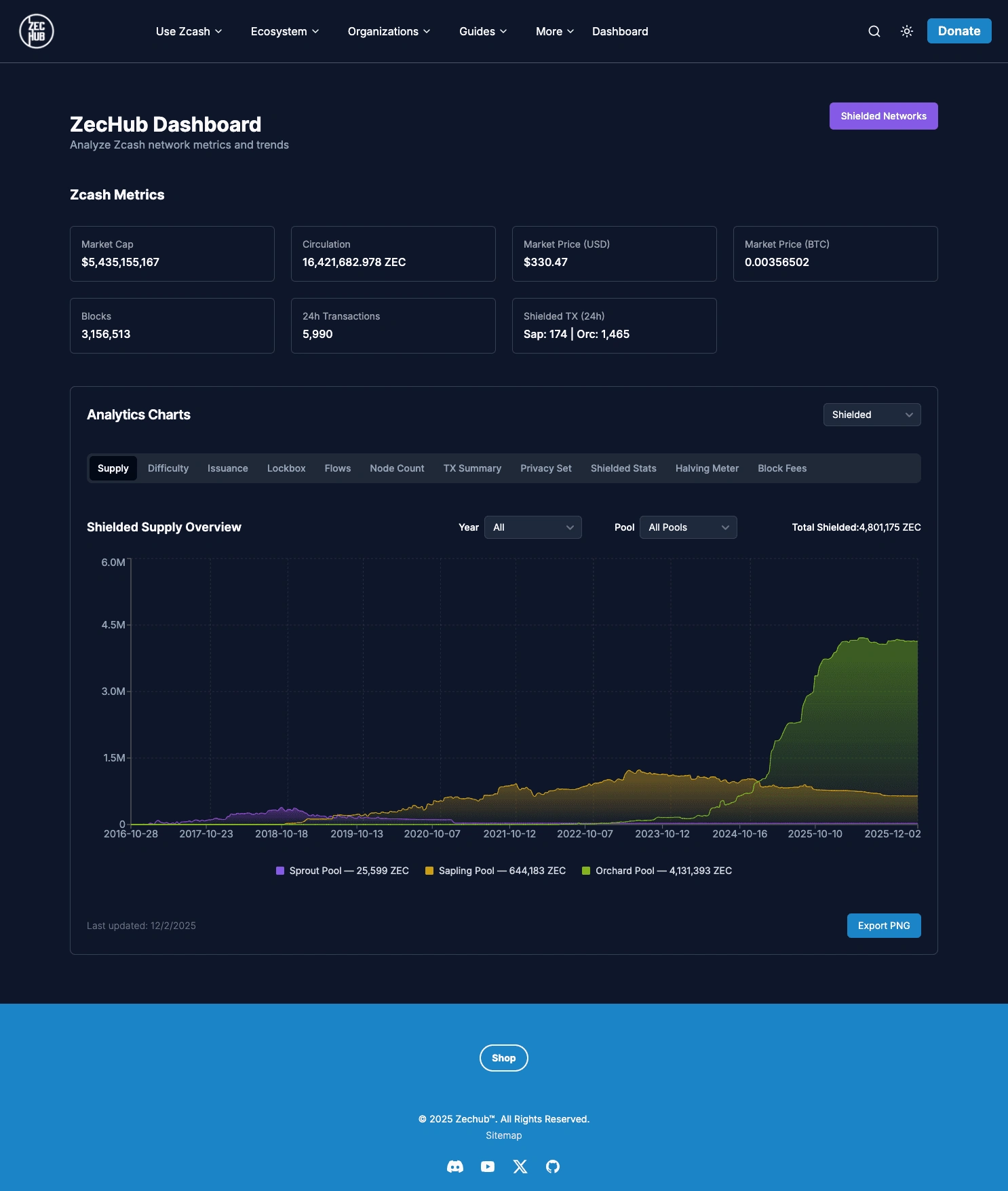
The ZecHub Dashboard serves as the central information hub for the Zcash community, connecting users to network health, governance, and ecosystem activity. The existing dashboard suffered from information overload and an outdated presentation, hindering its effectiveness in supporting ZecHub's mission of building community, education, and investment tracking.
To redesign and re-architect the ZecHub Dashboard, transforming it from a static data dump into a modern, action-driven, and customizable intelligence center.
The legacy ZecHub Dashboard suffered from low discoverability and high cognitive load, resulting in a poor user experience.
Specifically:
Everything was presented in a flat, unhierarchical tab-style data dump; it was hard to tell important information from secondary details.
Users were struggling to find key information quickly.
It looked outdated, not what you would expect from a cutting-edge financial privacy tool.
GOALS AND SUCCESS CRITERIA
To put it simply, all we wanted to do was:
“Put the user in the driver’s seat.”
Efficiency: Decrease the time to find critical information
Usability: Achieve a reasonable level of usability validated by positive qualitative feedback
Engagement: Increase weekly user engagement
Modernization: Establish a modern, credible Z Modern visual design identity
Research and Insights
The design process began by challenging assumptions about how the Zcash community interacts with metrics.
Methods Used:
Heuristic Evaluation: Identified severe usability issues related to consistency, error prevention, and recognition over recall.
Competitive Analysis: Analyzed two major data dashboards - Dune Analytics (for data density) and TradingView (for charting flexibility).
Light user feedback from the Zcash community
Pivotal Design Insights
The most defining insight was that while the data was complex, the user needs were simple and varied:
Users wanted the most important information first, followed by the flexibility to explore deeper.
This insight led to two big design decisions:
Prioritize: Collapse and restructure summary metrics
Customize: Let users build the dashboard in a way that matches their workflow
The new IA moved from a product-focused organization to a user action-driven framework.
Navigation Before (Product Centric)
Rationale:
Reduced cognitive load by focusing the primary navigation on the three core user actions, significantly simplifying the header.
Also renamed "dashboard" into "analytics".
UI & UX Decisions
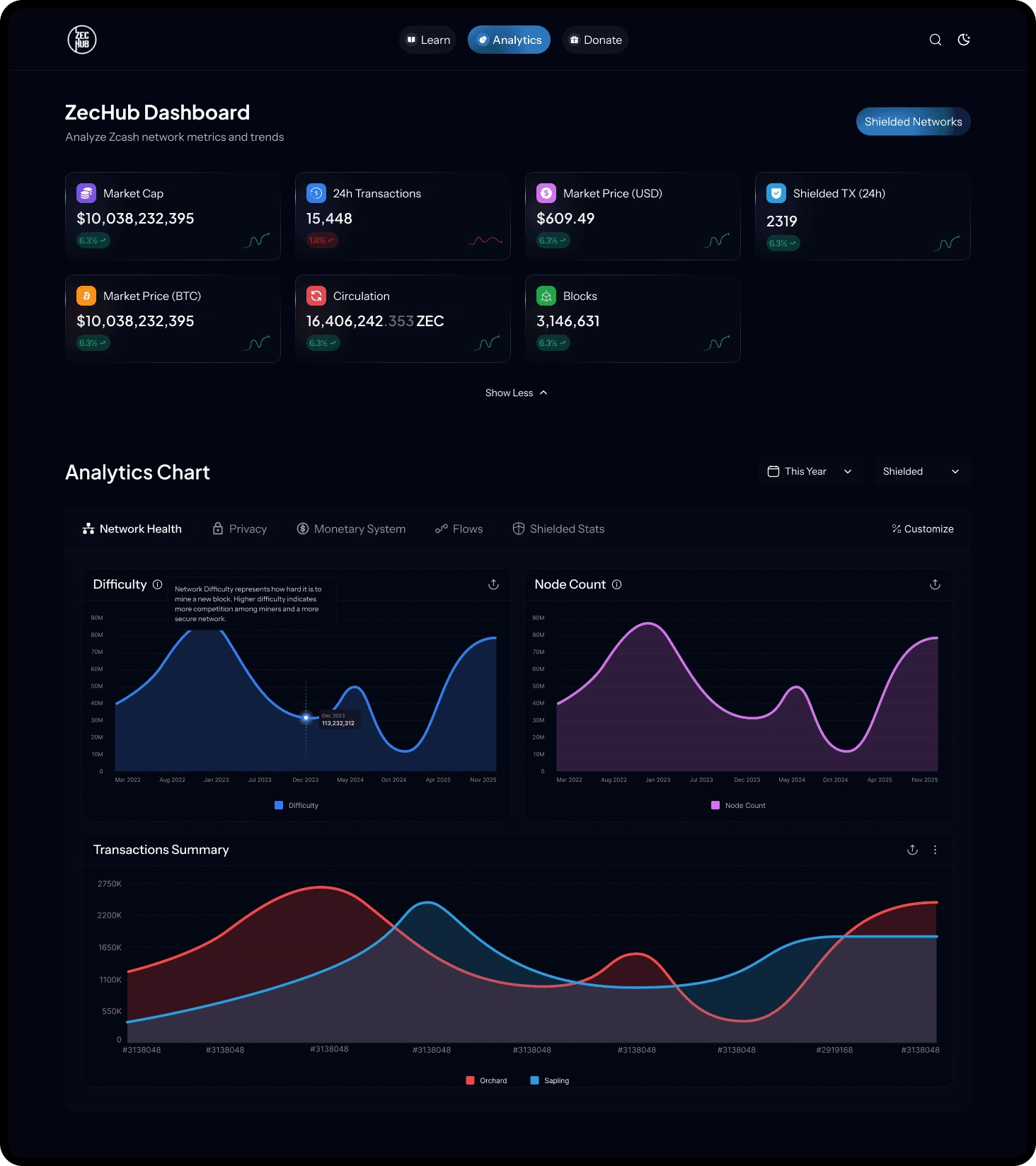
The primary challenge was displaying tons of required data intuitively. The solution was to make the display of this data a feature, not a fixed constraint.
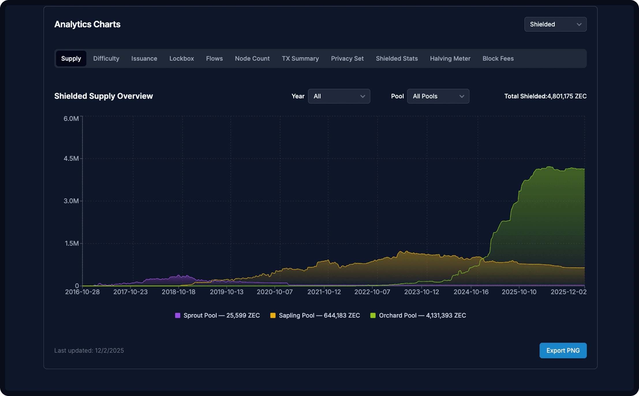
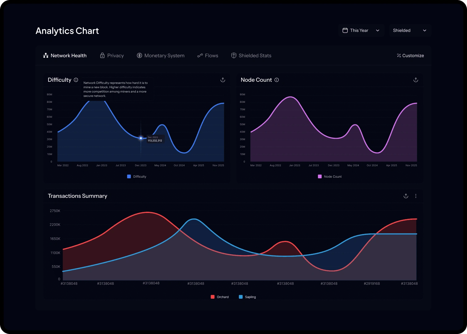
Analytics Chart
Solved information overload by grouping similar metrics and prioritizing summary data at the top.
The dashboard moved from unsorted and unscalable charts (BEFORE)
to clear hierarchy;
Rationale:
Creating groups that contained similar, related charts ALL AT ONCE helped users see related information without having to navigate between tabs.
Introduced a tooltip for each chart to assist Zechub community users who might require extra context.
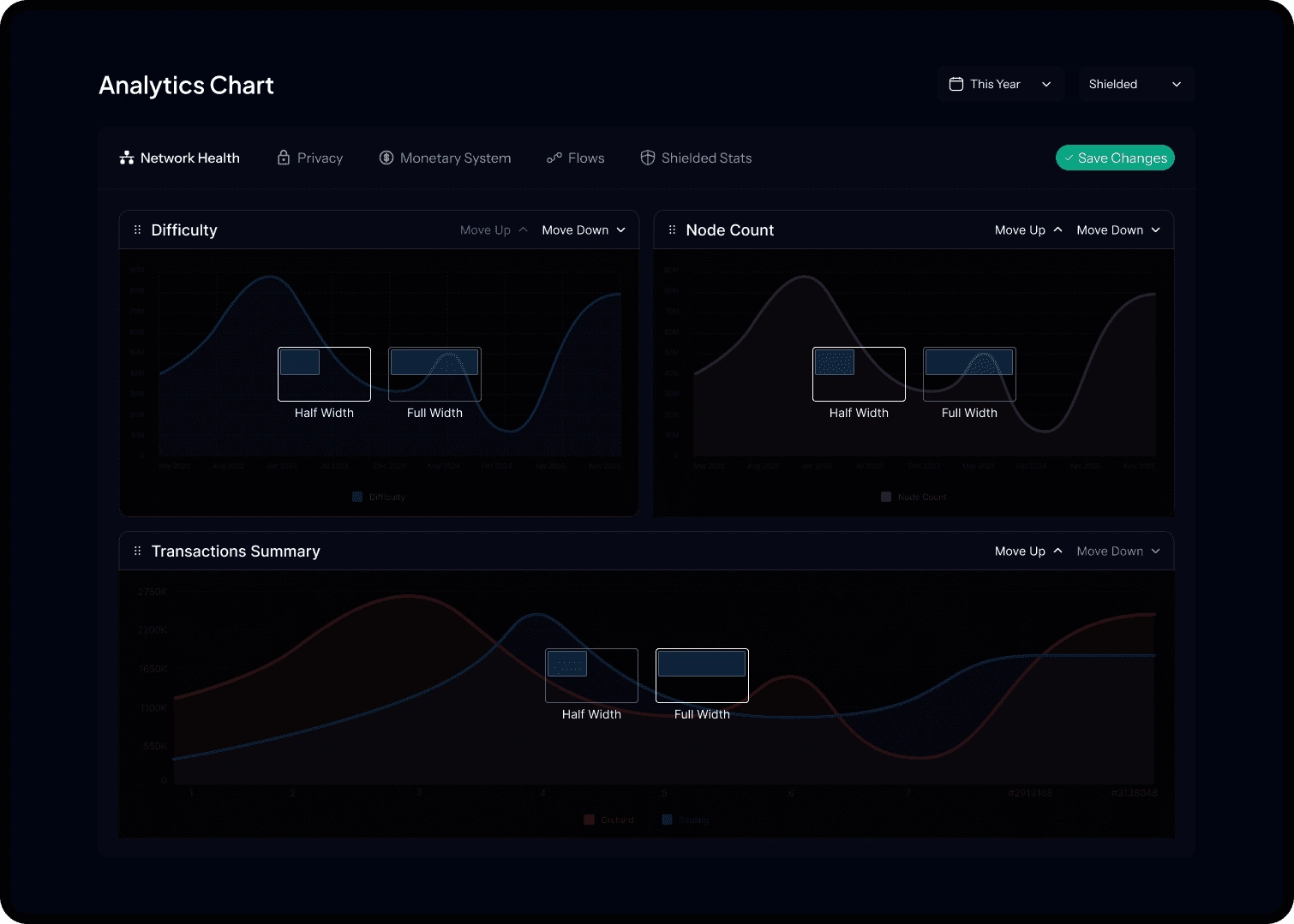
Customizable Graph View
Flexibility: Users can drag and drop graphs to reorder their dashboard.
Scalability: Users can adjust graph widths between full width (for detailed analysis) and half width.
Persistence: Users can save their custom views, addressing the varying needs for information to prioritize those identified in the research.
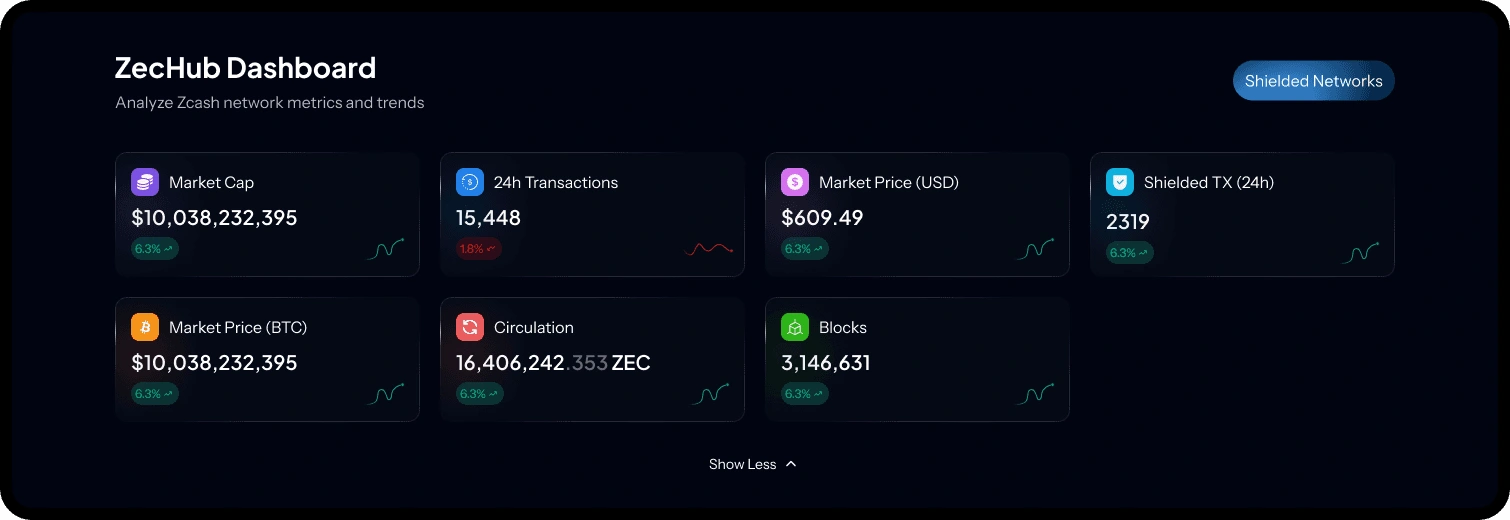
Data Visualization and Components
A Metric History Sparkline Card presents:
The current metric (e.g., Circulation)
A simple color-coded status change (green for positive change)
A small line chart (sparkline) showing 7 day history
Made the summary card section collapsible, prioritizing the most important data first(top 4). This also provides context without cluttering the main view.
The goal was to create a visual identity that felt trustworthy, technically sophisticated, and aligned with the Zcash ecosystem.
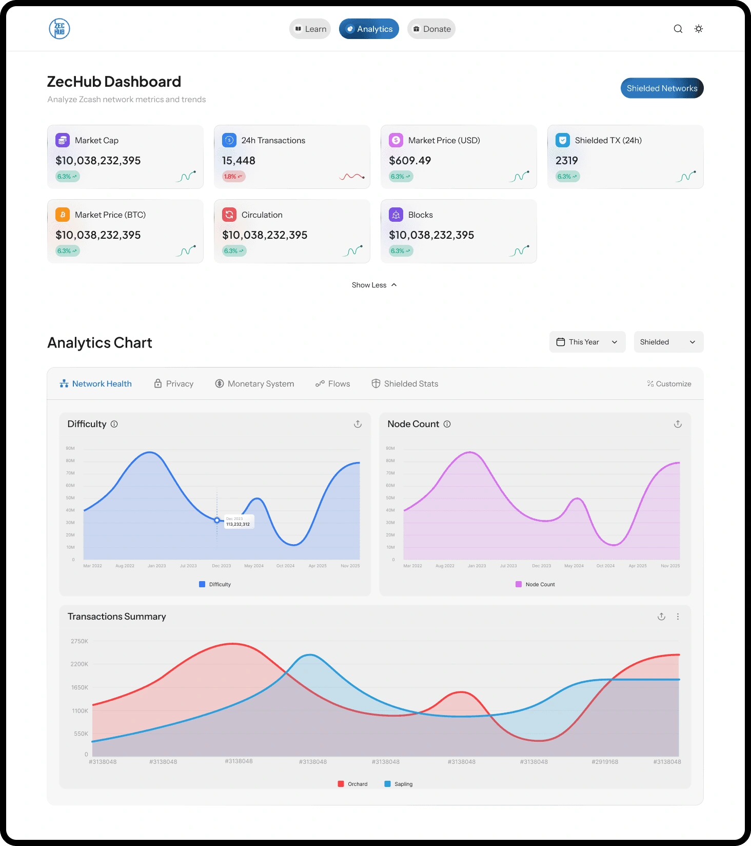
Aesthetic Theme: Z Modern
Color Palette: Dark theme as default, using deep dark blue backgrounds and high contrast typography.
Accents: Strategic use of gradients for primary buttons and status indicators to add a modern crypto-based flair and draw attention to key actions.
Interaction: Prioritized discoverability. Customize View and Load More actions remain visible.
IMPACT AND RESULTS
The redesign was validated via testing within the Zcash community, specifically measuring critical task completion times.
Legacy Dashboard
Structure: Unordered list of metrics/charts
Aesthetics: Light, sparse, outdated
Interaction: Static view, requiring scrolling and hunting for data
Redesigned Dashboard
Structure: Collapsed summary metrics at the top, followed by a customizable grid of detailed charts
Aesthetics: Dark, high contrast modern aesthetic with dynamic gradients
Interaction: Dynamic drag, drop, resize, and save custom views
CHALLENGES AND LEARNINGS
Challenge: Complex Data Integration
The biggest challenge was the complex data integration required to intuitively display tons of highly technical and dynamic data points.
Solution: We employed the layered design strategy, grouping metrics logically (IA), applying components like the Sparkline Card for quick comprehension, and giving users control via Custom View.
Learning: Balancing Flexibility and Simplicity
My most valuable takeaway: For expert users dealing with complex data, simplicity must be the clean entry point, but flexibility must be the core feature that retains and empowers advanced users.
Like this project
Posted Jan 1, 2026
Redesigned and modernized Zechub's Web3 Dashboard for improved UX.
Likes
0
Views
0
Timeline
Sep 1, 2025 - Sep 15, 2025