Inter American Development Bank
Before
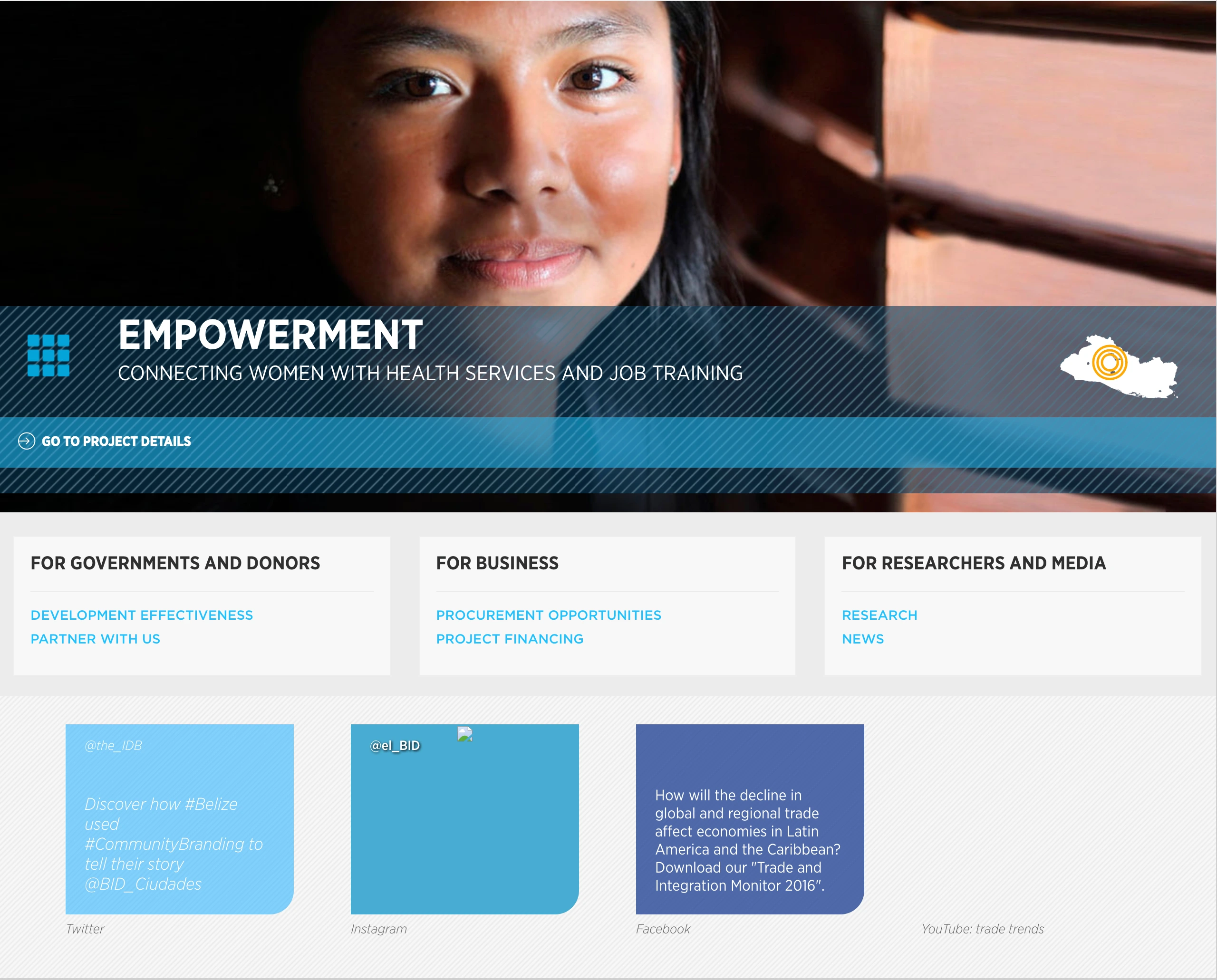
The IADB (iadb.org) wanted to renew their homepage.
At the time their homepage was all over the place. It promoted one of the bank’s projects, it promoted the bank’s social network, it wanted to be everything to everybody and in it’s loyal pursue it ended up being a complicated mess.
They wanted a clean image, a clear message and clear actions.

Approach
We started analyzing what the users wanted. We saw what pages were the most visited ones, were the users spent most time, what pages triggered more internal navigation, where was the traffic flowing.
We defined personas across the region based on this data and started getting real user flows that reflected the data we had.
We figured out the users were looking for 3 primary things:
Knowing about the bank’s projects in the region.
Having access to the bank’s knowledge products.
Finding out how to interact with bank: working in the bank, finding procurement opportunities, providing assistance and more.
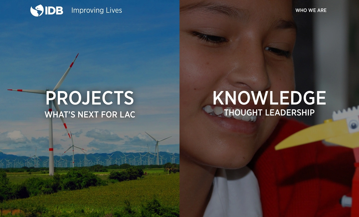
We then proceeded to design a solution that focused on these 3 main actions while still providing a main focus on branding and keeping things clean.
We reduced the footer into a row to make the site cleaner and a more focused experience.
Initial Designs

Final Result
Like this project
Posted Aug 15, 2023
The IADB (iadb.org) wanted to renew their homepage.
Likes
0
Views
2


